10 commodity charts that matter for ASX mining stocks
Those who follow my Evening Wraps on Market Index will be all too aware of the S&P ASX Resources Index’s (XJR) underperformance into the end of FY24. Since its peak of 6180.7 on 22 May, the XJR tumbled nearly 11% to its 5506 low on 24 June and has only moderately recovered a few percent to 5660.
Moves like this are rarely a coincidence for Resources companies. They’re possibly the most transparent group of stocks on the market! It is not an overreaching generalisation to say they live and die by the prices of the commodities they’re digging or hoping to dig out of the ground.
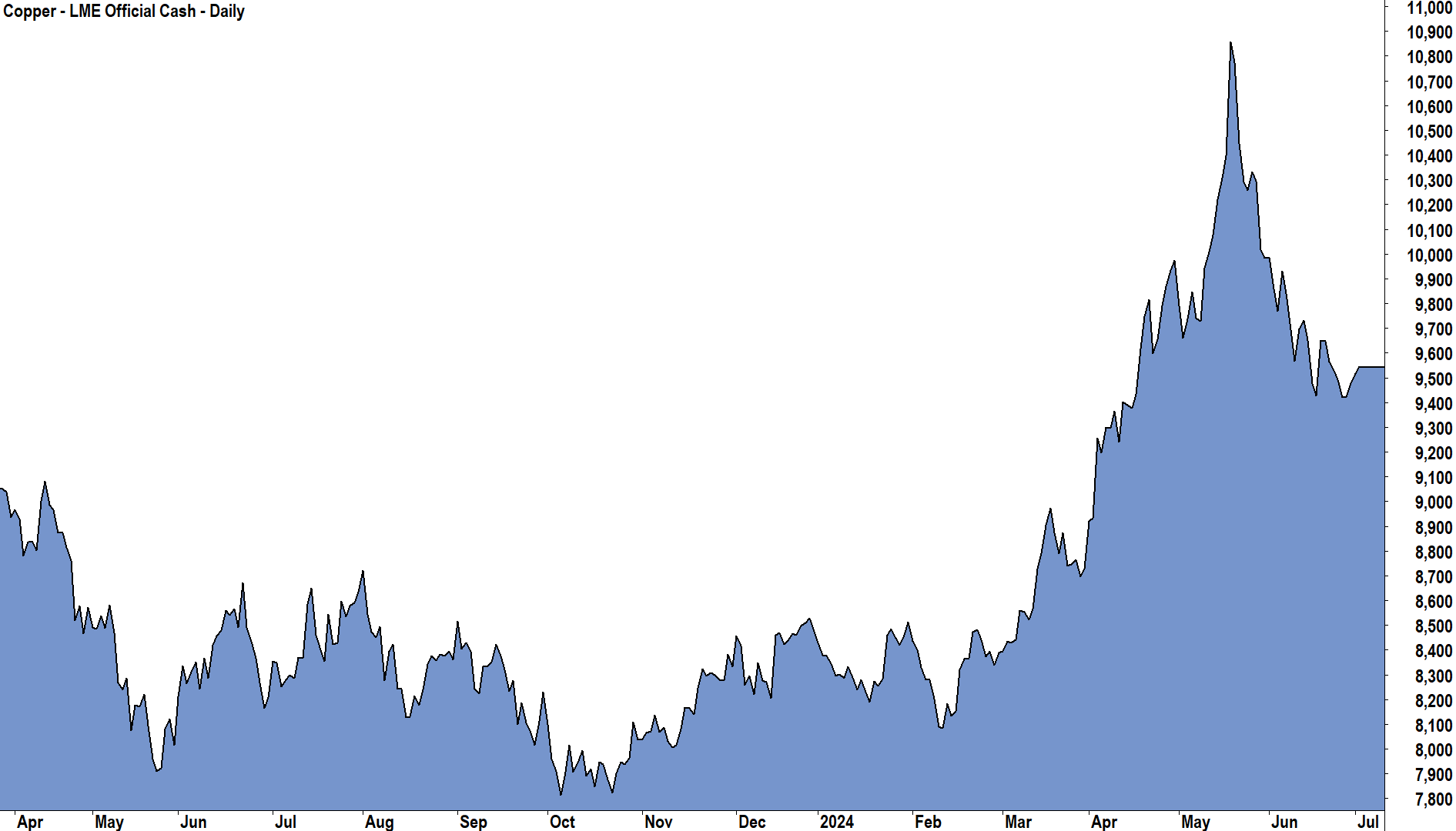
In that period since late May, a promising rally in most base metals – led by a record-breaking run-in copper but supported by strength in iron ore and precious metals also – has turned sour. Copper prices are presently 12% off their highs, iron ore around 8%, and gold around 5%.
A recent report from Morgan Stanley suggests investors in Aussie Resources stocks should stay the course. If anything, the broker believes that recent weakness in the sector creates opportunity.
At the centre of Morgan Stanley’s argument are 10 “Commodity Charts That Matter”. Let’s investigate each chart and what it means for Aussie resources stocks.
Chart 1 - RESOURCES VS BANKS
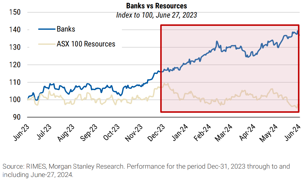
Morgan Stanley notes that their prior view investors should pivot from banks to resources “proved short-lived and ultimately too early”. That’s broker speak for “we got it wrong”!
Despite the lack of traction on their thesis so far, Morgan Stanley remains committed to their strategy of switching into resources, noting the risk-reward “remains compelling”.
Their main argument is their expectation the RBA will keep rates higher for longer, and this will adversely impact banking and financial stocks. On the other hand, commodity prices (Morgan Stanley has their favourites) are “still robust”, and this means commodity stocks should remain supported.
Chart 2 - BULL AND BEAR COMMODITY FORECASTS
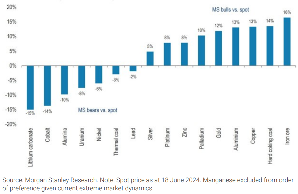
This chart shows the upside/downside of Morgan Stanley's price forecasts for various commodities versus current spot pricing. The broker notes the outlook is “constructive on the commodities we care about” such as hard coking coal (“met coal”), iron ore, copper, aluminium and gold.
Morgan Stanley is clearly bearish on commodities such as lithium (15% forecast downside), uranium (8% forecast downside), nickel (6% forecast downside), and thermal coal (3% forecast downside).
Chart 3 - RESOURCES VALUE METRICS
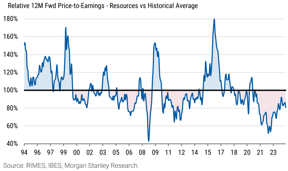
In this chart, Morgan Stanley points out that the forward price to earnings (P/E) ratio for the Resources sector is currently 11.1 times. This is a 20% discount to the sector’s historical average (since 1994) of 13.8 times.
The general rule of thumb for P/E ratios is lower means better value. So Morgan Stanley is implying here that Resources stocks could be up to 20% undervalued by historical norms.
Chart 4 - RESOURCES EARNINGS CYCLE
%20earnings%20are%20currently%20at%20cyclical%20lows.%20Source%20RIMES,%20IBES,%20Morgan%20Stanley%20Research..png)
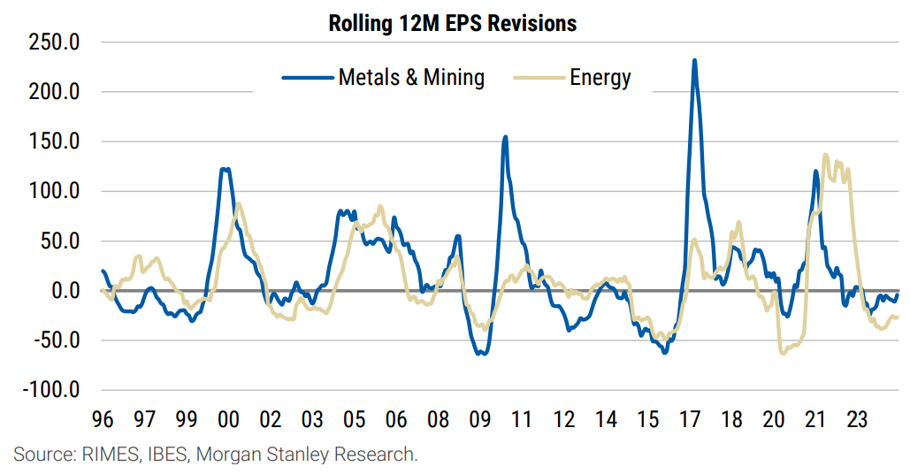
Aussie resources investors know, or are usually in the process of being taught, that commodity prices move in cycles. You don’t want to be on the wrong end of a commodity price cycle (um, lithium anyone!?), and whilst the old adage of “time in the market, not timing the market” might apply elsewhere, you generally want to get your timing right with commodity investing.
In this chart, Morgan Stanley points out that in terms of earnings revisions, Resources and Energy stocks appear to be the low point of their cycle. Note the extreme saw-tooth pattern in the chart confirms the cyclical nature of earnings for commodity stocks.
Perhaps, if you squint, the blue and beige lines are turning up?
Chart 5 - IRON ORE (INDIAN DEMAND)
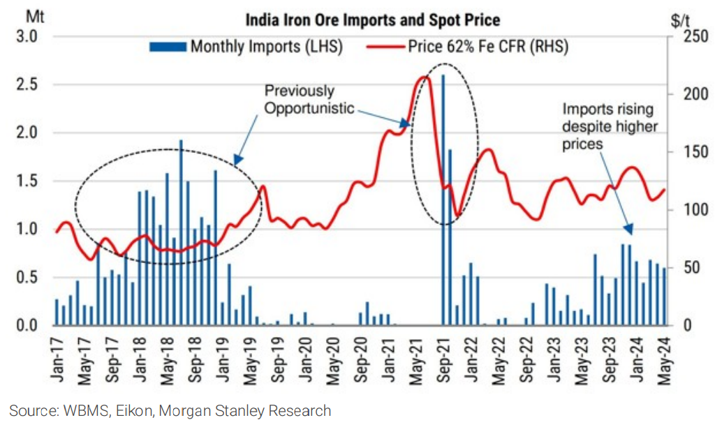
The next couple of charts relate to one of the commodities Morgan Stanley’s “cares about”, iron ore.
Usually, when you think about iron ore demand, you think about China. Certainly, right now, it is by far the biggest consumer globally. But, in this chart we can see that the demand from India is growing again.
Morgan Stanley points out that in the past, India’s imports of iron ore tended to be “opportunistic”, that is, increasing when the iron ore price dips. The broker believes that as India’s steel industry continues to grow at a rapid pace, this is less likely to be the case going forward.
Chart 6 - IRON ORE (RISING COST CURVE)
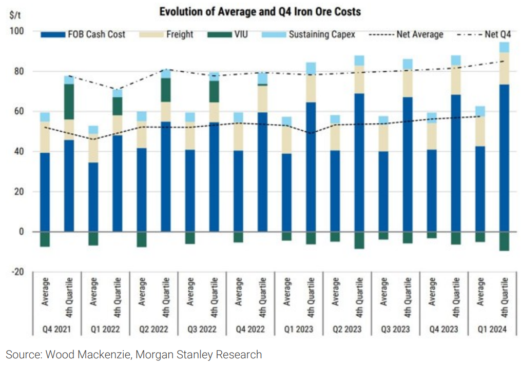
There’s a bit going on in this chart, but the gist of it is that Morgan Stanley has observed that the cost of production along with various other costs required to get iron ore to market is increasing. In theory, this should help keep “trough levels supported”
Chart 7 - COPPER
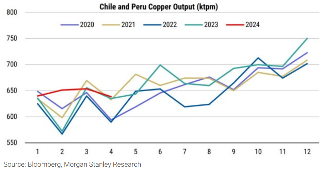
Turning to another commodity Morgan Stanley “cares about”, copper. In this chart, the broker notes that growth in output from major producers Chile and Peru is “barely holding”, despite the addition of new mines. (Note this year’s production is the incomplete dark red line).
Chart 8 - GOLD
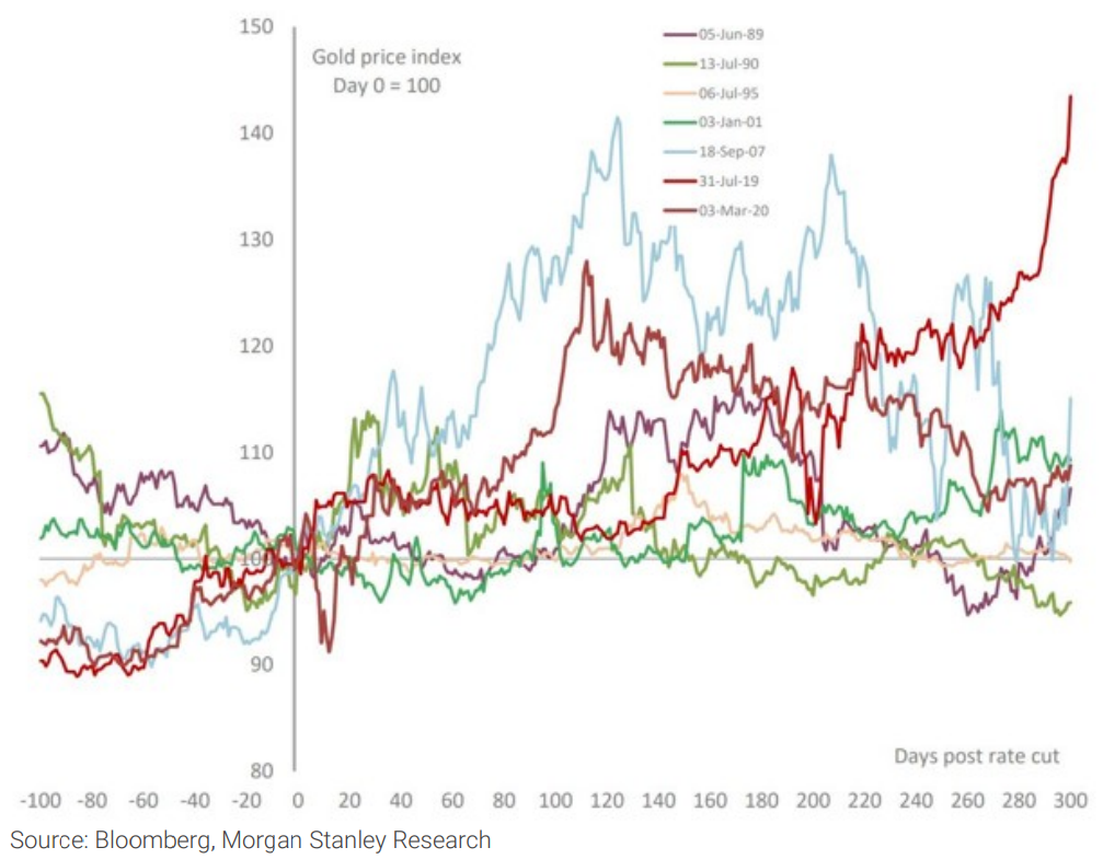
Gold is another commodity Morgan Stanley “cares about”. In this chart, the broker notes that gold tends to rise after US interest rate cuts, citing 7 historical examples.
The general consensus is that the Federal Reserve will start cutting US interest rates as early as September, with most brokers and economists expecting further cuts in 2025.
Chart 9 - ALUMINIUM

The final of Morgan Stanley’s favoured commodities, aluminium, features in Chart 9. Here the broker notes that the market is forecast to be in deficit out to 2026. The aluminium price is expected to be supported over this time, rising from around US$2,200/t to around US$2,400/t.
Chart 10 - LITHIUM
%20%E2%80%93%20oversupplied.%20Source%20Wood%20Mackenzie,%20Company%20Data,%20Morgan%20Stanley%20Research%20estimates.png)
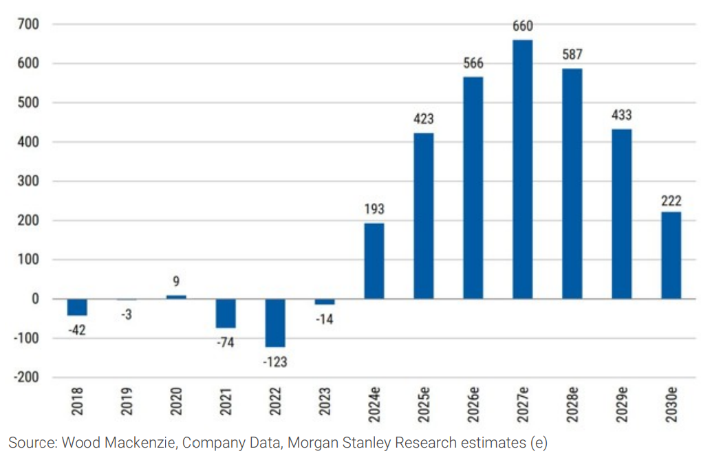
Lithium is one of Morgan Stanley’s bear case cohort. For a detailed overview of the broker’s lithium analysis, including key demand and supply factors plus price forecasts – check out this article from earlier in the week.
I’ll just note here that Morgan Stanley is forecasting large and growing supply surpluses in the lithium market until 2027, and then declining surpluses out to 2030.
This article first appeared on Market Index on Thursday 4 July 2024.
5 topics
20 stocks mentioned

