3 charts you can’t ignore
With tectonic plates shifting under the markets, we got in touch with three leading economists to get their number one chart in markets today. First up, Cameron Kusher, Principal at CoreLogic, tells us what the market’s been missing in residential housing. Next, Alex Joiner, Chief Economist at IFM Investors, looks at monetary policy and the challenges non-US central banks face. Finally, Geoff Wood, Head of Macro and Risk at Morphic Asset Management takes us to the doctor’s – Doctor Copper that is – and the results aren’t good. So, check in to our latest Collection so you can diagnose the risks early and avoid putting your portfolio in recovery position.
The downturn goes beyond Sydney and Melbourne
Cameron Kusher, Principal, CoreLogic

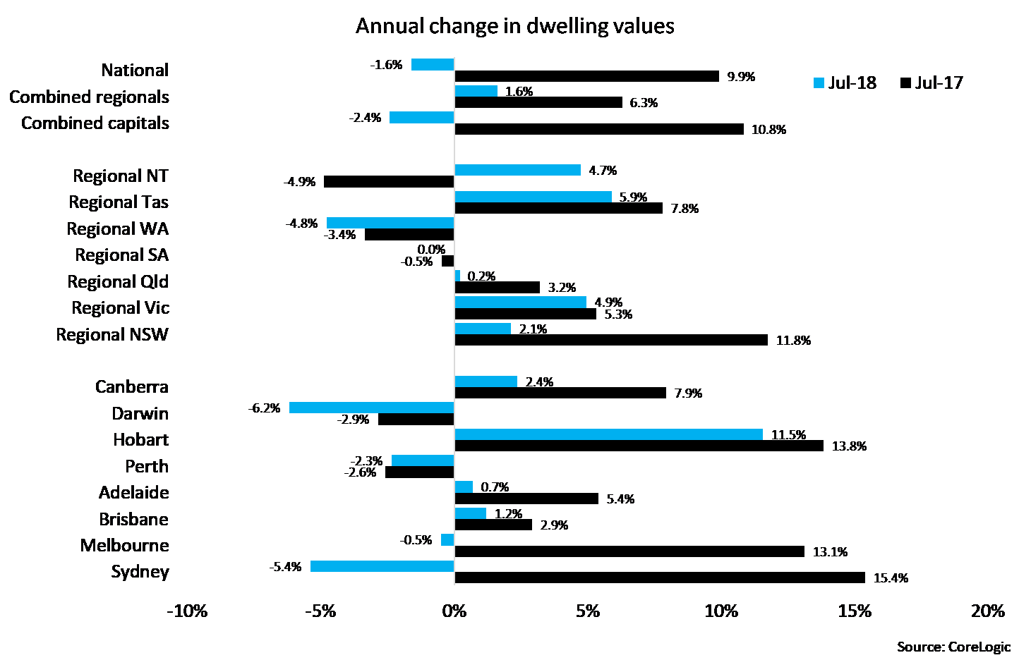
The chart above, which looks at the annual change in dwelling values from July 2017 compared to July 2018 is, to me, one of the most important charts.
Everybody has read the headlines about how the Sydney and Melbourne markets are now seeing values decline. What many people aren’t as aware of is that just about every other major region of the country has recorded a lower rate of annual value change relative to a year ago.
A deterioration in housing affordability, fewer investors (due to tighter credit conditions and higher interest rates) and an ongoing tightening of credit conditions have conspired to lead to declines in dwelling values in Sydney and Melbourne.
Outside of these two cities, affordability has been relatively steady (outside of regional NSW and Hobart) and investors have not been anywhere near as active as in Sydney and Melbourne, however, value growth is still slowing.
Tightening of credit availability is clearly having an impact on the housing market nationally, so too are entrenched economic conditions of sluggish wages growth and low inflation.
Add the ongoing headlines of national dwelling values falling (largely due to Sydney and Melbourne as well as the long-standing trend of falling values in Western Australia and Darwin) is clearly having an impact on overall housing market sentiment. I see little sign of this abating any time soon.
Downside risks building for 2019/2020
Alex Joiner, Chief Economist, IFM Investors
I like this monetary policy outlook chart as it speaks to a lot going on in the global and Australian economies. It highlights how far the RBA and other central banks are behind the Fed and the potential challenges they may face when they look to follow suit.
The US economic outlook, spurred by fiscal policy, has growth likely peaking in 2018 and downside risks building in 2019 and 2020, potentially from the Fed itself overshooting on rates.
These downside risks to economic growth are across many advanced economies, indeed the RBA is an outlier in its expectation for stronger growth going forward - other central banks are more circumspect. From a macro perspective, this outlook has asset allocators looking to potentially de-risk and become more defensive, moving from overweight international equities back to fixed income.
It highlights the RBA’s and other non-US central banks’ policy challenge – to be starting to remove accommodation and tighten Australian monetary policy when the Fed is potentially reaching the top of its tightening cycle and looking to stop, while simultaneously the global economic backdrop is potentially weakening.
The RBA would be unlikely to welcome undue exchange rate appreciation this dynamic may bring (neither would the ECB or BoJ).
Consequently, the Australian economy will need to be doing well enough to weather this eventuality as well and the impact of higher rates particularly on the housing sector and property market. It would be concerning if this was not the case, but the risk seems to be that it might not be.
While Chinese growth and population growth will still likely be underpinning the growth narrative, there is a strong case for domestic fiscal policy stimulus to support it also if the RBA is to be confidently raising rates.
Time for a check-up with the Doctor (Copper)
Geoff Wood, Head of Macro and Risk, Morphic Asset Management
It is often worth a check-up with the doctor... Dr Copper. Called the doctor for its insightful views on the global growth story, today it still provides an independent cross-check on the growth outlook.
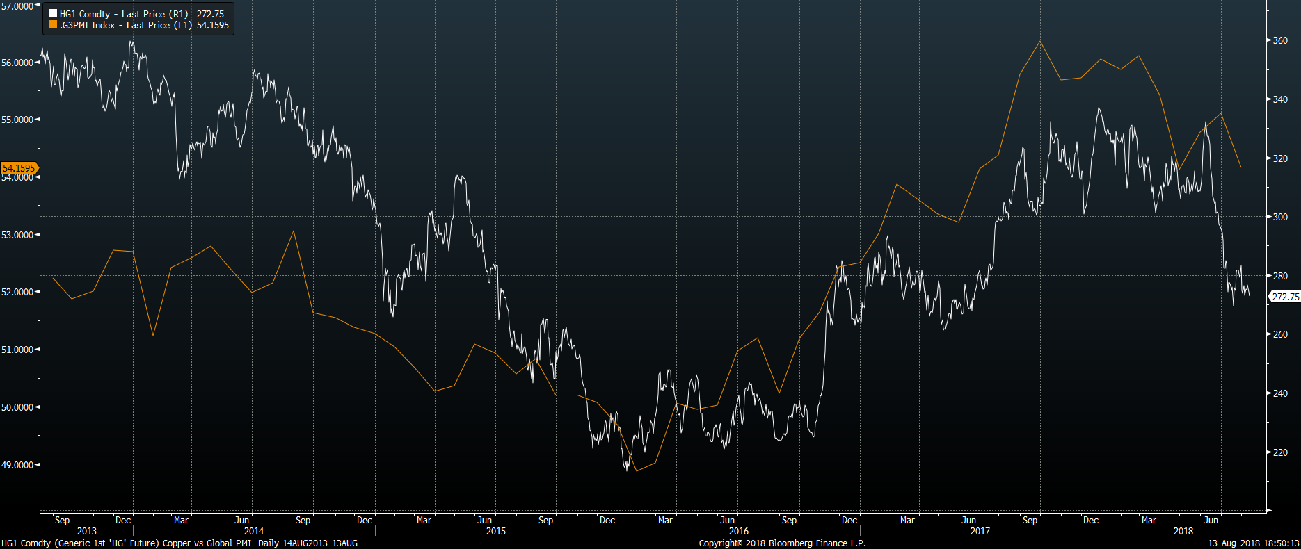
Here is the chart I like to keep an eye on; copper versus the major global Purchasing Manager Indices (PMIs). Copper in white and G3 (China, Europe and the US) PMIs index in orange are shown below for the last five years:

PMIs reflect how corporate purchasing managers see the outlook for their business – each interviewee chooses between the answers “improving”, “staying the same” or “deteriorating”.
The PMI aggregates all these views to make an economy-wide index. Given purchasing managers’ knowledge of their own order books and industry, this tends to give a good lead on economic growth.
Copper’s heavy use in new homes, autos and electronics also tends to provide a forward-looking signal on growth. Copper also has the advantage of pricing daily rather than the PMIs which are monthly.
When comparing copper to PMI, one can see if the two variables confirm or oppose one another.
Until June, copper was able to hold the psychological 3-dollar level through thick and thin, but recently it broke to the downside.
This market indicator is providing a cautionary tale for the economic growth bulls.
As China looks to offset trade concerns with local policy easing, copper will be a good indicator to watch for any responding pickup/growth signals.
5 topics

