Asset classes of 2023, Fed pivots in context and the Magnificent 7
.png)
As 2023 comes to a close, this week’s edition charts the winners and losers among asset classes and compares them to past years. As Jerome Powell suggests cheaper money is finally coming, we examine the pace of past Federal Reserve “pivots” and their effects on equities. The pivot is also affecting the dollar-yen exchange rate.
The winning asset classes of 2023: Bitcoin and oil trade places
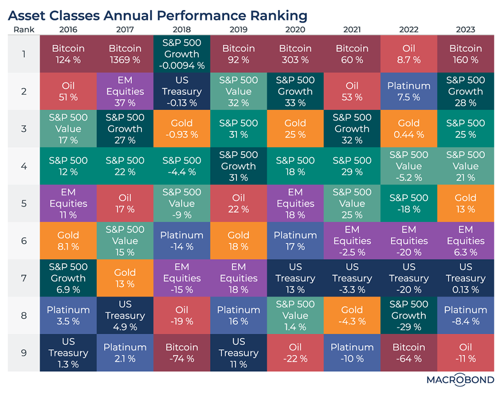
Midway through December, it’s time to revisit our asset-class “quilt” from last year. What were the winning and losing investments in 2023, and how do they compare to recent vintages?
Bitcoin was by far the best performer among the nine categories we selected, boosted by optimism that ETFs will soon allow more investors to trade cryptocurrency. It’s continuing its streak as the most “binary” asset since 2016 – either performing the best or worst in each calendar year; it trailed the pack in 2022.
Meanwhile, oil went from the best performer in 2022 (on the back of the Russia-Ukraine war) to the weakest performer in 2023 amid concerns about slowing economies and oversupply.
Equities had a strong year. Interestingly, there was little difference between “value” and “growth” stocks in the S&P 500; value held up much better than growth in last year’s bear market.
The Fed’s history of brisk rate-cutting
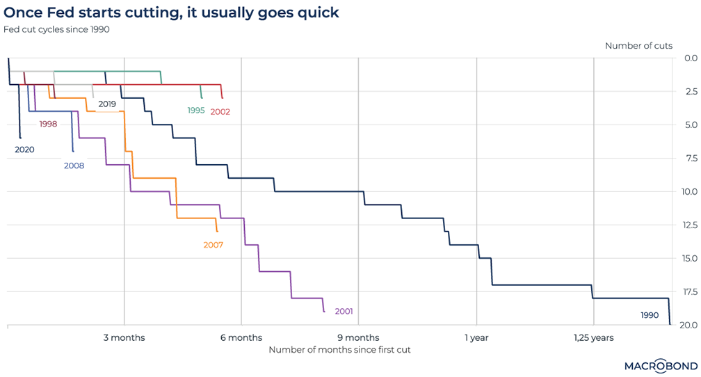
Jerome Powell stunned Federal Reserve watchers this week by discussing prospects for rate cuts. The Fed has begun its long-awaited “pivot,” according to the Wall Street Journal.
With central banks signaling that victory over inflation is near, our chart examines the lessons of history. Once the “pivot” begins, how many rate cuts follow – and how quickly?
The lines for 1995 and 2002 demonstrate the only “plateaus.” By contrast, the 1990, 2001 and 2007 pivots resulted in a series of rate cuts in rapid succession.
Futures markets are pricing in six US rate cuts next year – up from four earlier in the week, according to Bloomberg.
Visualising the Magnificent Seven
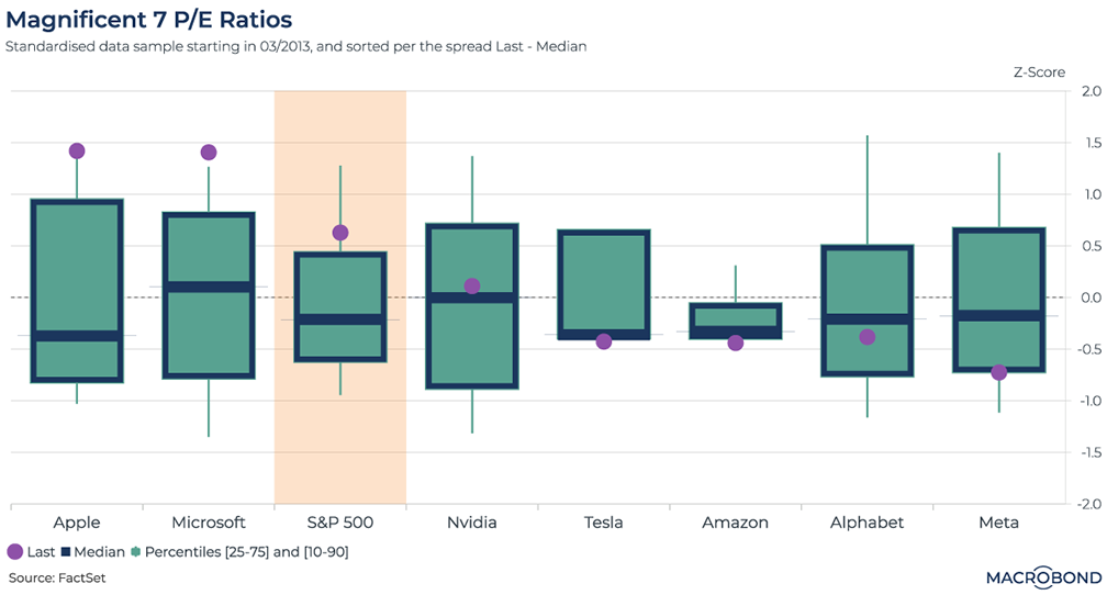
This chart uses data from FactSet via the FactSet Connector.
Apple, Amazon, Alphabet, Nvidia, Meta, Microsoft and Tesla were dubbed the “Magnificent Seven” by Bank of America strategist Michael Hartnett this year. The moniker stuck as these seven high-tech mega-stocks were responsible for much of the S&P 500’s gains in the face of a tighter rate environment and economic uncertainty.
This chart uses Macrobond’s FactSet Connector to assess price-to-earnings ratios across the Magnificent Seven (as well as the S&P 500 as a whole) since April 2013. We generated a Z-score, on the right-hand axis, showing us how far the P/E ratios are from historic averages (a Z-score of zero).
The purple dots represent the most recent reading; the “candlesticks” represent percentile ranges, with the 10-90 range the “wick.”
Apple and Microsoft are the most richly valued stocks in the group, with P/E multiples in the top 10 percent of the historic range. Meta, meanwhile, is at the bottom of its 25-75 range, even after it more than doubled this year – showing how much more “bubbly” the social-media giant’s stock has been in recent history.
Historically, rate cuts aren’t a short-term tonic for stocks
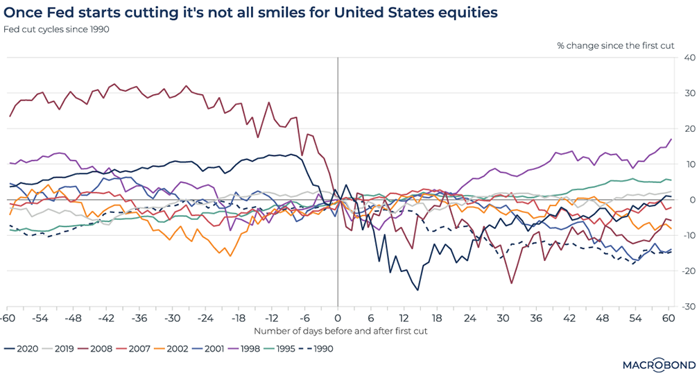
This chart can be applied to different countries using Macrobond’s change region functionality.
Back to the Fed pivot. US stocks rallied on Powell’s comments, but history shows that equity performance after the central bank’s first rate cut tends to be unimpressive – probably because looser policy usually comes in response to distress in the economy.
Since 1990, most cycles have seen the S&P 500 fall in the two months after the first cut. The notable exception: the gains of late 2007, when the global financial crisis and US mortgage meltdown was just beginning.
US-Japan interest rate differentials and the exchange rate
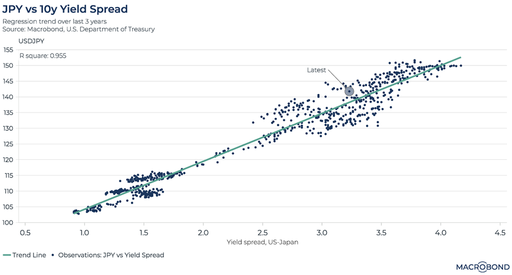
Monetary policies in the US and Japan are headed in starkly different directions in 2024. The Bank of Japan looks set to abandon the world’s last negative interest-rate policy (and its yield-curve-control interventions) as the Fed loosens.
This has implications for currencies, which are often substantially driven by rate differentials. US 10-year yields have recently contracted to about 4 percent versus 5 percent just weeks ago; yields on equivalent Japanese debt have held in a range near 0.7 percent. Roughly, this puts the rate differential at 3.3 percent at the time of writing.
This chart tracks observations of the USDJPY currency pair against that rate differential over the past three years. Broadly speaking, dots above the green trend line indicate moments that suggest dollar overvaluation. We’re slightly overvalued at the moment – even though the dollar has weakened from its peak.
We generated that green trend line through a regression analysis. It suggests fair value at a 3.3 percent differential is about 140 yen per dollar.
.png)
Macrobond delivers the world’s most extensive macroeconomic & financial data alongside the tools and technologies to quickly analyse, visualise and share insights – from a single integrated platform. Our application is a single source of truth for...
Expertise
.png)
Macrobond delivers the world’s most extensive macroeconomic & financial data alongside the tools and technologies to quickly analyse, visualise and share insights – from a single integrated platform. Our application is a single source of truth for...
.png)