ASX 200 crash playbook, pause or panic?
ASX stocks are tracking big falls in major global markets. Is it time to panic? We investigate key market timing signals - buy, hold, sell?
Ahhh the stock market. Usually, a placid and reliable money maker…yet every now and then it’s more like the Naked Gun movie scene where Frank Drebin is waving along the public in front of the fireworks factory…”There’s nothing to see here…please disburse!”
The present fireworks equate to the sharp falls (and getting sharper today) in stock prices as investors grapple with the big Trump unknown. The returning US president’s trade policies have rattled markets, which to be fair, were probably on the back foot anyway as economic growth cooled in the face of inflation-driven cost of living pressures.
President Trump’s trade war threatens to reignite inflationary pressures and pile even greater hardship on households at a time where his Department of Government Efficiency (“DOGE”) initiative, led by flamboyant billionaire Elon Musk, has already resulted in significant layoffs and slashed public spending.
There is now a growing fear among investors that all the above will tip the US economy into a recession. Let’s review some of the key recession indicators, from bonds to stocks, to the history of downturns to help put the current market volatility into context.
Bond market recession signals
When the “R” word begins to get bandied around the financial press, it usually corresponds with market volatility. Press rhetoric is hardly a rock-solid red flag that the US economy is about to tank, however. Professional investors prefer to look to the bond market for one of the most reliable indicators over the last 40 years of whether the US economy is headed for a recession, more specifically, to the US Treasury Bond Yield Curve.
A “healthy” US Treasury Bond Yield Curve, that is, one that slopes from bottom-left to top-right, is associated with solid growth prospects for the US economy. It reflects the usual cost of money principle, that investors should be compensated for locking up their money in longer term bonds with a higher rate of return.
The opposite, an “inverted” US Treasury Bond Yield Curve, is associated with a greater chance of recession. Its downward slope suggests that interest rates are likely to be cut in the future to try to jump-start the economy. For this reason, longer term bonds tend to yield less than shorter term bonds. Here’s what the US Treasury Bond Yield Curve looks like now:

We can see an inversion out until about 2-years and then it begins to revert to a healthy curve. It’s not a typical recession harbinger curve – which is important – but it does imply markets are betting we’ve potentially got a couple years of pain before a return to gain.
But there is another indicator, well known to be used by the US Federal Reserve in its calculations, that is flagging the need for greater concern. The inversion of the 3-month bond yield versus the 10-year bond yield has preceded the last 8 out of 8 US recessions going back to the 1960s. For what it’s worth, this inversion triggered on February 26 and persists until today.

Stock market recession signals
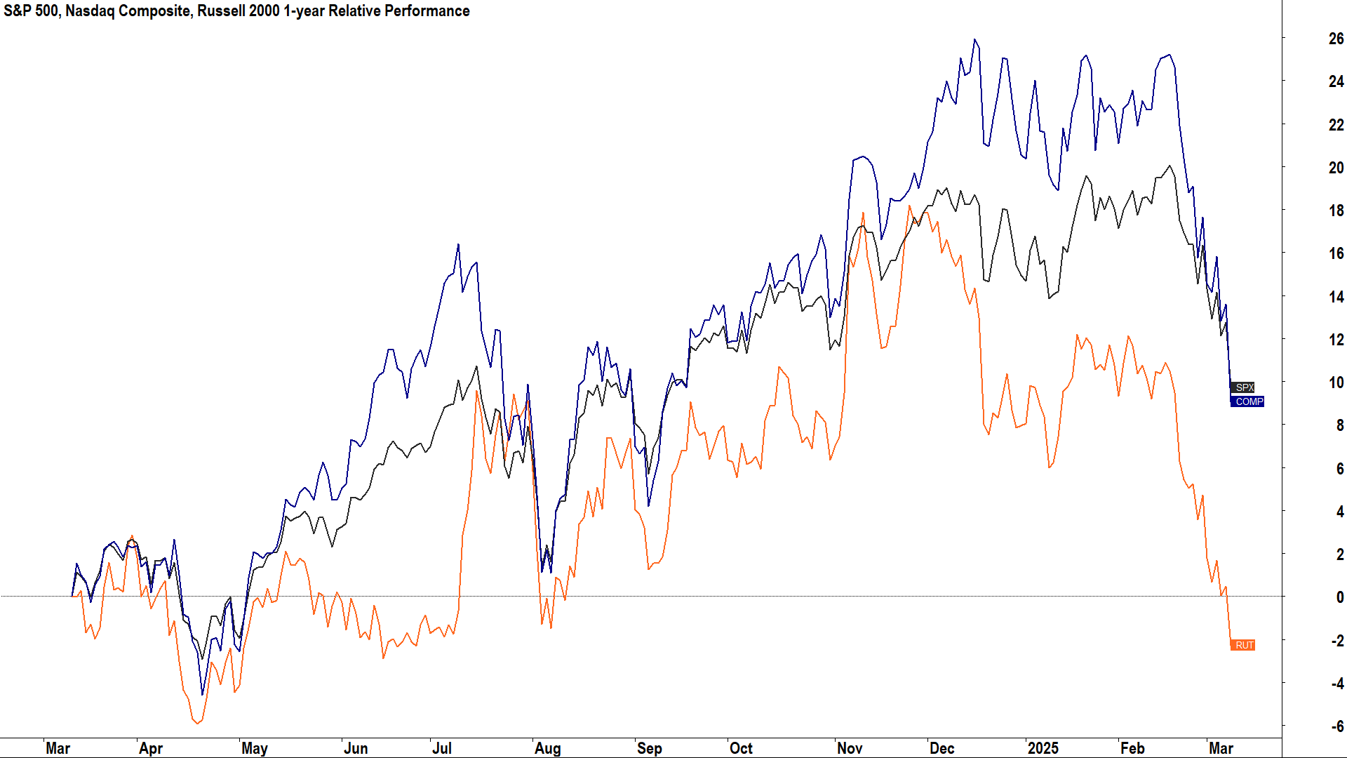
Looking at stocks, and it’s just as murky. Major US indices are giving us mixed signals on whether it’s time to hit the panic button over the US economy. There are three major US stock indices investors typically track, the S&P 500 – considered the benchmark US stock index, the Nasdaq Composite – considered the best index for tracking the health of technology and growth stocks, and the Russell 2000 – considered the best index for tracking the health of smaller capitalisation stocks.
Before we look at these, let’s cover off on some jargon with respect to how investors define various market downturns for a particular market index:
- A “pullback” is defined as a decline of less than 10%
- A “correction” is typically defined as a fall of greater than 10%, but less than 20% from a market top.
- A “bear market” is typically defined as a fall of 20% or greater from a market top (similarly, by definition, a bull market therefore begins after a rise of 20% or greater from a market bottom).

The table above shows each of the bear markets and corrections in the S&P 500 over the last 30 years. There were 7 bear markets and 15 corrections.
- The S&P 500 experienced 15 corrections that lasted on average for 2 months and wiped around 12% off stock prices. Short and sharp!
- The S&P 500 experienced 7 bear markets that lasted on average for 9.8 months and wiped around 33.6% off stock prices. Big and brutal!
- The S&P 500 spent a total of 29.8 months (2.5 years), or roughly 8.3% of the time in corrections.
- The S&P 500 spent a total of 68.6 months (5.7 years), or roughly 19% of the time in bear markets.
- With 22 correction/bear market events in 30 years, investors endured one form of major market downturn around every 7.3 months on average.
Here’s the stats on the current market downturn for the three major US indices. Note, I have used the S&P 500 Total return in these stats as it adds back the impact of companies paying out dividends:
- S&P 500 Total Return ("SPX"): 19-Feb high to 10-Mar low: -9.4%
- Nasdaq Composite ("COMP"): 16-Dec-24 high to 10-Mar low: -14.4%
- Russell 2000 ("RUT"): 25-Nov-24 high to 10-Mar low: -18.8%

We can see that the recent market turmoil constitutes a pullback for the S&P 500, and a correction for both the Nasdaq Composite and the Russell 2000 – but the latter is just 1.2% away from logging an official bear market.
We can also see in these statistics that which index you put more emphasis on can dramatically change the way you perceive a current market downturn. Arguably, the performances of the Nasdaq Composite and the Russell 2000 are flashing greater warnings that something isn’t quite right with the US economy than the more-typically referenced S&P 500.
It makes sense that these two indices tend to underperform during times of market uncertainty. For the Nasdaq Composite, it contains a greater proportion of high-growth and highly economically sensitive stocks than the blue-chip laden S&P 500. These stocks are less likely to have business models that can withstand an economic contraction.
Similarly for the Russell 2000, which is often referred to as the “Heart of corporate America”. Smaller stocks are again more economically sensitive and tend to be less able to withstand the ratcheting up in risk premia on funding that often accompanies the uncertainty of a recession.
The other thing to note is how long the Nasdaq Composite and the Russell 2000 have been in downturns for. The Nasdaq Composite peaked in mid-December, while the Russell 2000 has been declining since late-November. This correction in US stocks (let’s call it that!) began last year – not just a few weeks ago as the 19-Feb S&P 500 peak suggests.
What to watch out for next?
I suggest signals from the bond and stock markets require a high degree of alertness – not panic – as it becomes increasingly critical investors ramp up their efforts in monitoring the key market indicators presented here.
Up to this point we’ve used plenty of words to try to understand this “requisite level of investor alertness”. I’ll pick up the discussion tomorrow with a look at the price charts of the major US indices to see how previous bear markets evolved.
Can we determine if there are any regularly appearing patterns associated with bear markets that fit the current market environment? (🚨 Spoiler alert – there are – and you really want to know about them!).
This article first appeared on Market Index on Tuesday 11 March 2025.
Never miss an update
Enjoy this wire? Hit the ‘like’ button to let us know.
Stay up to date with my current content by
following me below and you’ll be notified every time I post a wire
Carl has over 30-years investing experience and has helped investors navigate several bull and bear markets over this time. He is a well respected markets commentator who specialises in how the global macro impacts Australian and US equities. Carl has a passion for technical analysis and has taught his unique brand of price-action trend following to thousands of Aussie investors.
........
Investing is risky. Inevitably you will endure losses. If you can't cope with losing, don't invest.

5 topics

Carl has over 30-years investing experience and has helped investors navigate several bull and bear markets over this time. He is a well respected markets commentator who specialises in how the global macro impacts Australian and US equities. Carl...
Carl has over 30-years investing experience and has helped investors navigate several bull and bear markets over this time. He is a well respected markets commentator who specialises in how the global macro impacts Australian and US equities. Carl...
Comments
Comments
Sign In or Join Free to comment
most popular
Equities
What a 40% year taught us: 4 lessons from the past 12 months (and 3 new stocks to buy)
Seneca Financial Solutions
Equities
How to invest $100k for growth
Livewire Markets