ASX January jitters! Aussie investors' 2024 seasonal roadmap
Happy New Year! Well, happy end of 2023 more precisely. Based upon the All Ordinaries Total Return Index* which adds dividends to capital gains, Aussie stocks stacked on an impressive 7.4% in the month of December. This was their best performance since November 2020, and it’s considerably better than the typical December over the last 40 years.
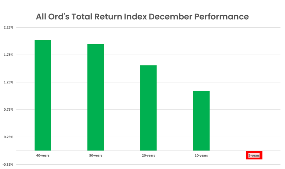
I showed you this table in my seasonal piece at the start of December. It shows the average return for Australian stocks in December ranges from 2% over the last 30-40 years, to 1.5% over the last 20 years, down to a modest 1.1% over the last 10 years, and a 0.2% decline over the last 5 years.
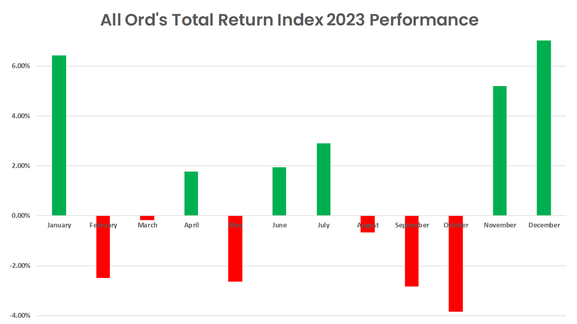
The decline in December performance in more recent lookback periods made me ponder if the Santa Claus Rally was slowly getting cancelled. Ponder no more! December 2023 was an absolute Christmas cracker! When you add in November’s 5.2% total return, the two-month close to the year added 12.6% compared to an annual total return of 13.0%.
Let that sink in. Over 97% of 2023’s performance occurred in those last two months. Without them, 2023 would have been a lousy year. Looking at the full year’s performance table below, it’s even clearer that November and December (as well as a stonking +6.4% return in January 2023) papered over a sketchy 2023. Six up versus six down months, and just three months doing the heavy lifting. Hardly a resounding bullish performance!
As good as it gets?
Longer-term investors who look at their superannuation balance a couple of times a year, one of those times probably being now, likely don’t care about the finer details of 2023’s performance. All they care about is the fact their portfolio looks as good as it ever has. Indeed, if we use the All Ords Total Return Index as a guide, the Australian stock market has never been better.
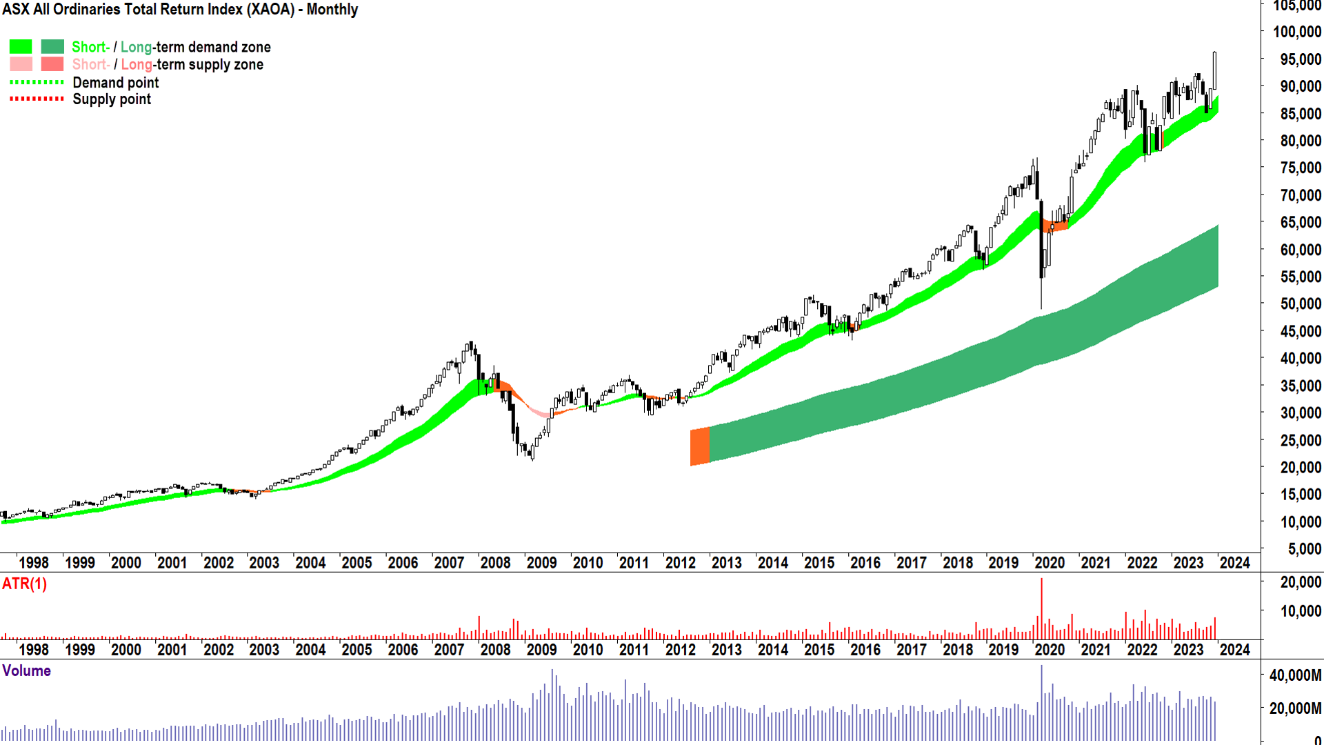
For those who aren’t familiar with my trend ribbons, the short-term trend is constructed using the 21-34 exponential moving averages (EMAs) and the long-term trend using the 144-233 EMAs. They are colour-coded for green equals uptrend, pink equals downtrend, and orange equals indeterminate trend. The chart above is a monthly chart, but the principles are the same, albeit with some consideration that short-term and long-term are both longer-term than if you were plotting on a daily chart.
Basically: Green is good! Double green trends exemplify an environment of excess demand for Aussie stocks. December’s large and full white candle further confirms the overwhelming desire for investors to want to buy and own Aussie stocks. Nothing in the above chart suggests to me there’s anything for longer-term investors to be too concerned about from a technical perspective.
January jitters
So, what can we expect from this January? The typical January over the last 40 years delivered an average return of 0.7%, this compares with 0.3% over the last 30 years, a dip of 0.1% over the last 20 years, 0.3% over the last 10 years, and 1.8% over the last 5 years. For the most part, January is a good month, but it is clearly not as good as December. Possibly, this is a result of a smidge of a hangover after November and December’s typical party performance.
If we dig into the data a little more, we find December’s performance does appear to have some influence over January’s performance. Over the last 40 years, December averaged a return of 2.1% and January averaged a return of 0.7% with reliability (i.e., delivered a positive return) of 60%. Let’s use this as our base.
Now, if we focus just on positive Decembers, of the 29 times December showed a positive return, January was also positive 17 times (i.e., a reliability of 59%), with an average return of 0.5%. A slight drop in January average performance, but not a big deal.
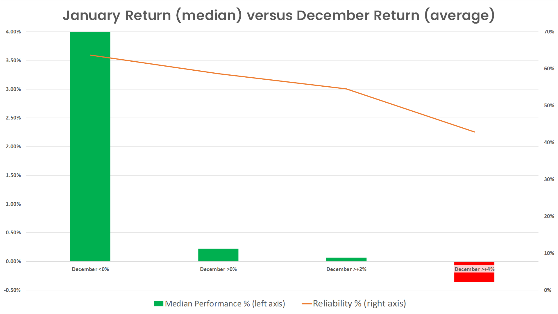
Let’s now raise the hurdle for December’s performance and see what happens to January’s performance and consider only those December’s which delivered an average return of greater than 2%, i.e. “good” Decembers. (Note, the sample sizes start to get a little small here – so as with all statistical analysis take the rest of this data with a pinch of salt. Also, just in case, I’m going to switch to median performance data to try and circumvent the impact of outliers.)
After good Decembers, January’s median performance drops to just 0.1% with a reliability of 55%. If we consider only those Decembers which delivered an average return of greater than 4%, i.e. “great” Decembers, January delivers a median loss of -0.4% with a reliability of just 43%.
The idea that January is somewhat contradictory to December is even more evident when December is a down month. There are far fewer down Decembers in the sample (11 if you do the math), but the median January return after a down December is a whopping 3.9%!
The pullback we had to have
The data suggests it’s not unusual to experience a subdued January after a party-filled December, and December 2023’s 7.4% return was quite the shindig! I suggest that given how well we finished 2023, a subdued January is likely on the cards. This is consistent with the shorter-term chart of the benchmark S&P/ASX 200.
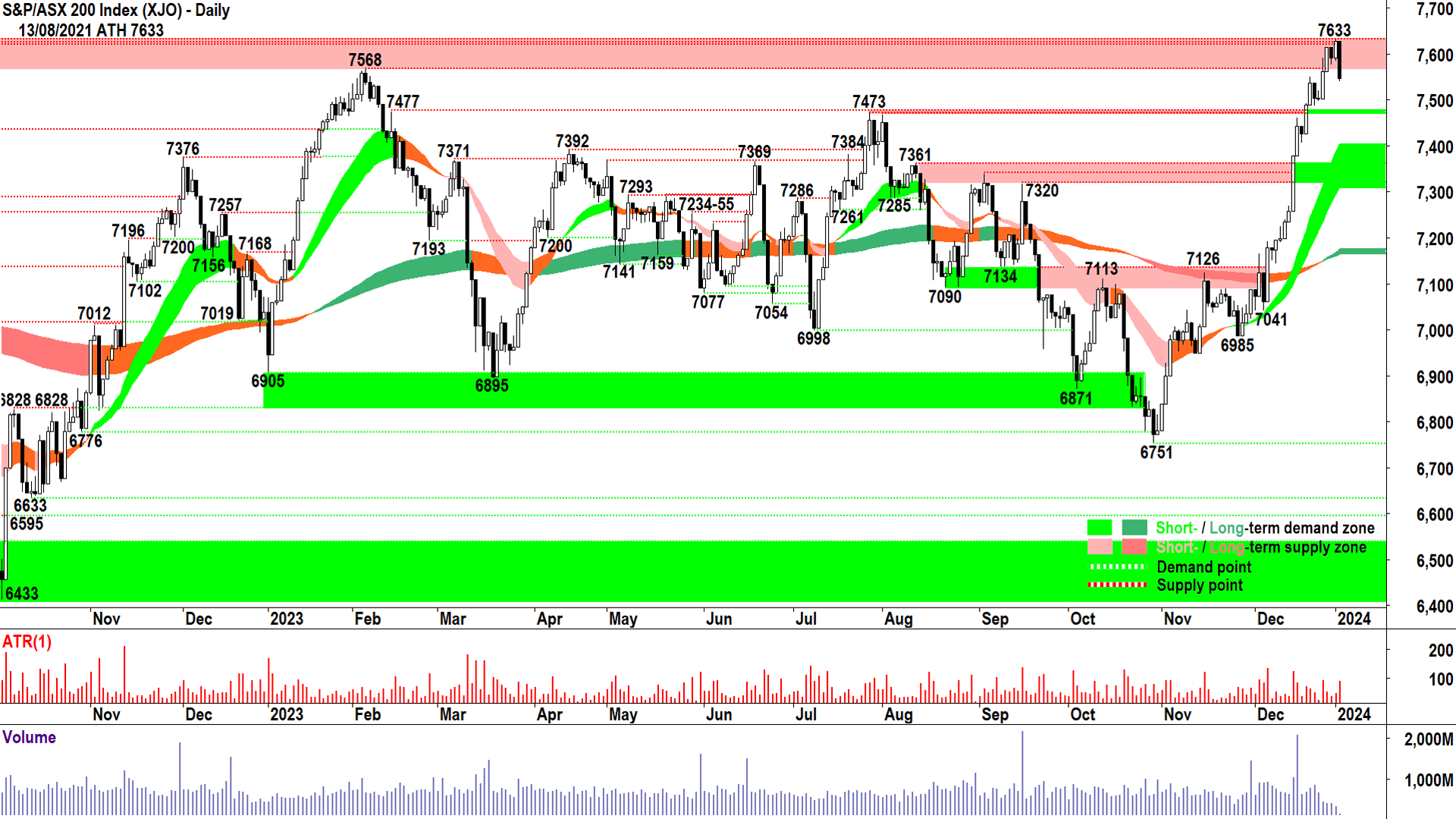
Wednsday's price action has created a large black candle which indicates supply has finally arrived in a meaningful way within the current short-term uptrend. Anyone who is a student of the charts would not have been surprised by the arrival of supply around Tuesday’s high of 7632.7. It was 0.1 below the all-time high of 7632.8 set on 13 August 2021. Previous points of excess demand tend to act as future excess points of demand.
The peak created by today’s price action now serves as a near-term point of excess demand, which must be overcome if the short-term uptrend is to re-establish. In the interim, I am closely watching previous points of excess supply, which tend to act as future points of demand and, therefore, could mark the current pullback's endpoint.
7473 is the first potential turnaround point, and failing this, is 7361. I would be surprised if this pullback sees the S&P/ASX200 trade below the short-term trend ribbon (currently 7308-7402), and if it does, we’re more in correction mode than a mere pullback.
As always, watch for white-bodied candles and/or downward-pointing shadows to signal excess demand is again working its way back into the system and the next leg of the bull market has begun.
2024 crystal ball gazing…
A pullback from the recent high wouldn’t necessarily be such a bad thing. It would shake out some of the weaker Johnny-come-lately hot money – they’re best back in cash to fuel the next leg up. A decent pullback to the levels suggested would also present better prices for longer-term institutional money, which loves to feel they’ve received enough of a discount to justify them wading back in.

Looking further out, the chart above shows a potential roadmap for 2024. If this January does turn out to be a pullback month, it may pull forward typical seasonal weakness experienced in February and March over the last 10 years. Over longer lookback periods, the start of the year is usually a moderately positive time for the Australian stock market before a seasonal peak in April.
That’s as far out as I’ll go today, but rest assured, we’ll have plenty more seasonal analysis for you in 2024!
*When doing seasonal analysis, it’s important to consider total returns. Also, the All Ordinaries index, which contains approximately 500 of Australia’s top companies is a better representation of the true performance of the Australian stock market than the benchmark S&P/ASX 200.
This article was originally published on Market Index on Thursday 4 January.
5 topics

