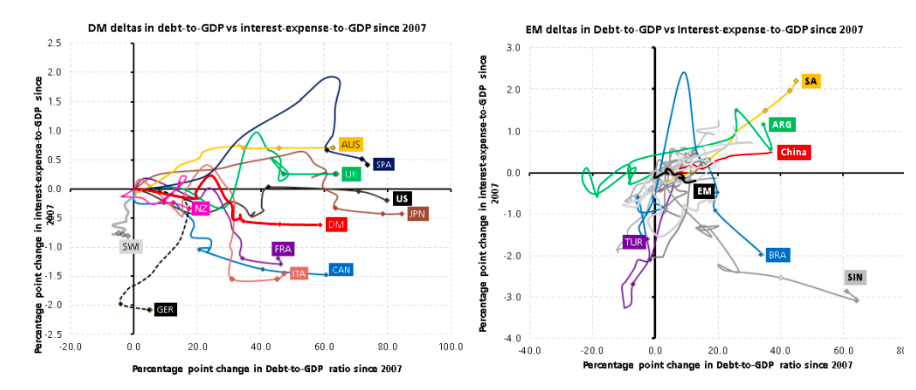
Chart of the day: Is our government debt sustainable?
“Nothing is so permanent as a temporary government program.” Milton Friedman, Economist, 1912-2006
Policy makers have responded rapidly to the pandemic-driven shutdown in global activity to reduce the longevity (and depth) of the mid-2020 recession and avoid a repeat of the GFC. A financial crisis, as opposed to an activity crisis, can typically take many years to see activity return to pre-crisis levels. Of course, the consequence of this is that government actions are underpinning a significant increase in public debt. UBS estimates world government debt will rise by 20 percentage points of GDP by end-2021 (under a scenario where COVID-19 is contained this year), taking government debt to 101% of output, more than the 12 percentage point jump during the GFC. With developed economies delivering more substantive fiscal spends, their jump in debt is much greater than that of emerging markets. The US, Australia and Canada have the largest planned debt increases by end-2021.
This raises many questions about the consequences of this debt, and whether it can be afforded—or will it create growth headwinds down the track? How much extra interest payments will governments have to make to service this debt? At least for now, for the developed economies and most of the emerging economies, this does not appear to be a major issue. Our chart of the day from UBS (…these are called spider charts) plots through time (2007-2021) the change in (not the level) of the interest bill for governments since 2007, with forecasts for 2020 and 2021. The first thing to note is that for many developed economies (but not Australia or UK), the current interest burden is lower than prior to the GFC, despite higher debt levels. Welcome to low interest rates…this is the benefit (?) of the reduction in global policy rates and bond yields!
The next thing to note is that for most countries, the last two markers on each line don’t reveal a significant (if any) increase in interest burden, despite a significant jump in debt levels. Welcome to the impact of the latest decline (to new historic lows) in policy rates and bond yields! For the next year or so central banks are absorbing the net supply of bonds and, with rates at their zero-bound, debt service costs are being contained. What could go wrong?! This happy tension contributes to why we are only slightly underweight sovereign bonds in the tactical asset allocation of our clients’ portfolios…while the upside to returns are only modest if the outlook proves worse than expected, the likelihood of a rapid rise in yields on a 6-12 month view is also relatively low. Sustained low rates is also a positive backdrop for risk assets (where we are modestly overweight).
Longer term, however, we should all be aware of this vulnerability. The greatest risk lies in an unanticipated jump in inflation potentially causing a crisis for bonds (where the demise of globalisation and just-in-time inventory management could be longer-term catalysts). More likely, funding this debt over time at moderately higher rates will just be an intergenerational headwind (potentially via higher taxes) for growth…but that’s more likely an issue when we trip over the ‘can‘ a number of years down the road.

Source: UBS, Haver (note – the charts start in 2007 and then cumulate the change in public debt and interest/GDP relative to that starting point).
Be the first to know
I’ll be sharing Crestone Wealth Management's views as new developments unfold. Click the ‘FOLLOW’ button below to be the first to hear from us.
1 topic
1 contributor mentioned

