Chart of the Week - Higher for Longer?
This week central bankers from around the world will descend on Jackson Hole for their annual Economic Symposium, where they will be discussing "Structural Shifts in the Global Economy" (stemming from the impact, response to, and flow-on effects of the pandemic).
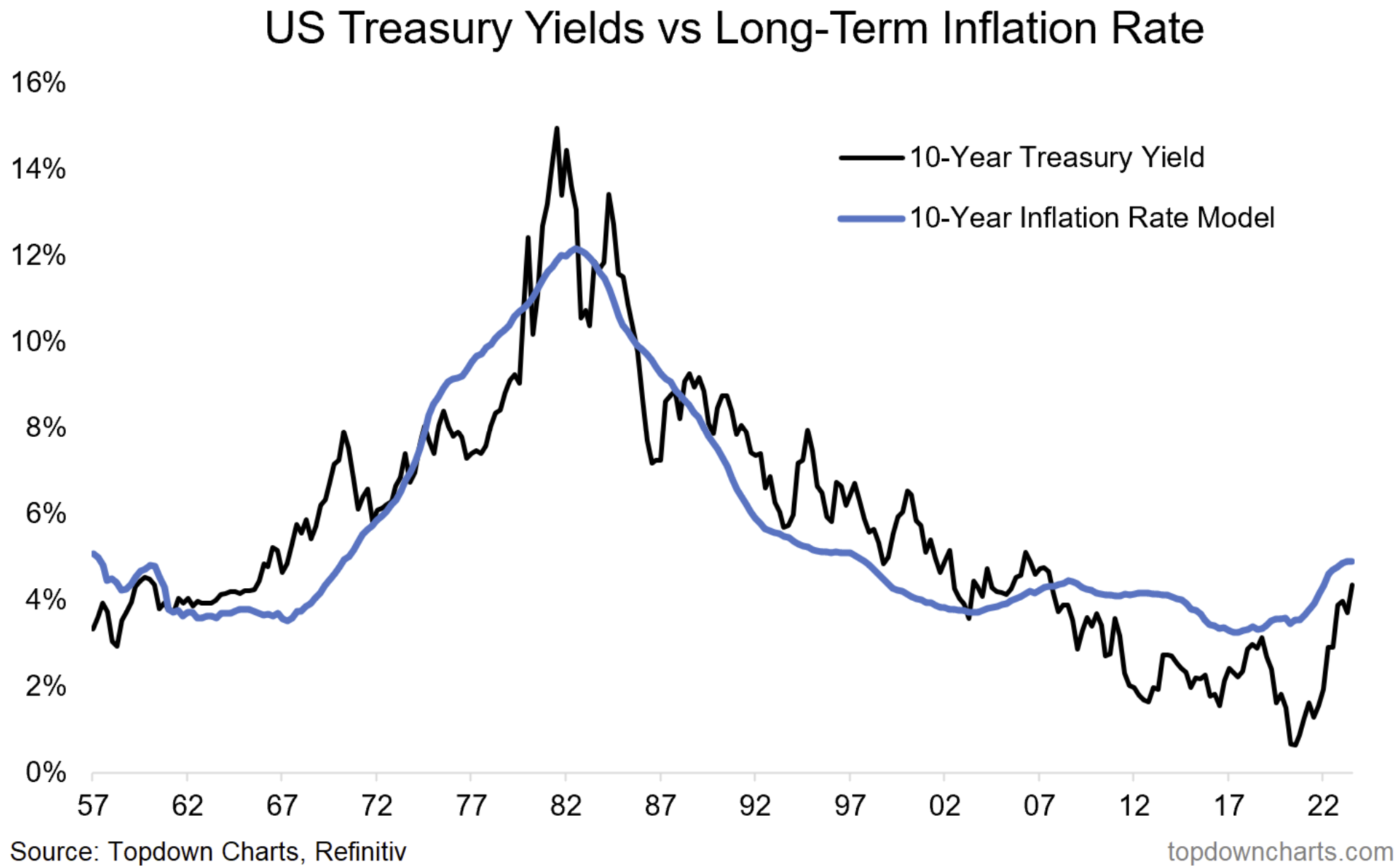
Among the topics up for discussion will likely be talk around inflation targets, neutral cash rates, and longer-term bond yields. So it’s timely to check in on the long-term rate of inflation model for US 10-year bond yields.
Over time, the long-term rate of inflation and US 10-year bond yields have traced a fairly similar path, the structural disinflation of the past couple decades reinforced the move lower in both monetary policy cash rates and bond yields.
But in 2020 that all changed with a series of big bangs: global supply shock (logistics and supply chains were sent into disarray thanks to rolling lockdowns), global demand shock (central bankers and finance ministers applied an unprecedented scale of economic stimulus), and in the background; years of underinvestment in shipping and commodities, so of course what followed was a surge in inflation.
What comes next is going to be determined by a number of factors from a structural standpoint, but a key one is going to be how central bankers decide to conduct and communicate monetary policy. Talk of increasing inflation targets or acceptance and adoption of new higher neutral policy rates is likely going to reinforce the notion of higher for longer for bond yields.
But from a cyclical standpoint, the outlook for bond yields is still a tension between growth risks and inflation risks. I am firmly of the view that a cyclical downturn (recession) will pull down rates and inflation (and bond yields). And given that most of the leading indicators I monitor still point to recession, I can’t get too excited about the higher-for-longer narrative.
But if we get the much fabled “no landing” or even a mild non-disinflationary soft landing, that’s going to underpin a new normal higher rate of inflation and bond yields, and at the very least likely scuttle any ideas of a quick drop in yields.
So it’s an interesting chart in that it highlights both structural and cyclical issues, but especially the ongoing tension of growth risk vs inflation risk in the battle for bond yields.

Key point: A higher long-term rate of inflation would justify higher long-term yields.
5 topics

