Charts of the Week - Pension tensions, OPEC production cuts and modelling US payrolls
.png)
This week’s charts begin by examining the Spanish population pyramid as an example of the challenge facing pension systems. We show how OPEC’s surprise cut was less unexpected when you consider pressures on oil producers’ budgets. Turning to the US, we check out commercial real estate exposure at small banks, track state-level layoffs to predict jobless claims, and build a model for non-farm payrolls. We break down German inflation trends, and show how the BRICS nations have steadily taken a bigger share of the world economy. Finally, with Easter here, we examine the extreme volatility in the egg market.
Demographics and pensions in Spain
Countries are looking for ways to shore up creaking retirement systems after years of expensive promises. Riots in France are in the news after President Macron’s plan to lift the retirement age to 64 from 62. But similarly contentious changes are underway in neighbouring Spain – where the retirement age has been 65 for some time. Younger people and higher earners will pay more.
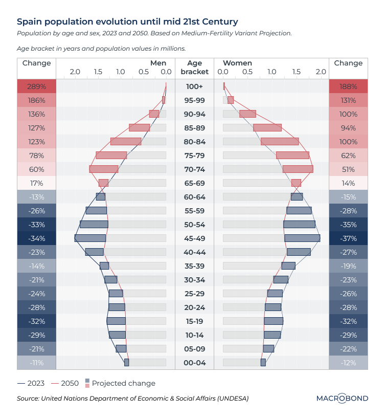
Our chart compares the population pyramid today (the blue line) with the UN projection for 2050 (the red line) As the “bulge” shifts upward, there will be just 1.7 working-age Spaniards instead of 3 for every retiree.
Spaniards have a life expectancy of 83. The nation’s “baby boom” also differs from other Western countries. Though its civil war ended in 1939 and the nation was neutral in WWII, the birth rate only began to climb in the late 1950s, and that wave of Spaniards is just beginning to retire.
OPEC cuts amid budget pressure in oil producing nations
Oil prices have whipsawed this year. The Brent crude benchmark slid from about USD 85 to below USD 75 in the first two weeks of March on concern that banking turmoil and recession fears would dent demand.
But Brent snapped back above USD 80 after Saudi Arabia and its OPEC+ partners announced unexpected production cuts.
Looking at some of the national budgets for countries that produce oil, however, perhaps the move shouldn’t have been a surprise. Oil prices have been on a downward trend since the Brent price topped USD 120 a barrel last summer, and some countries could use more fiscal room.
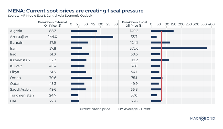
Our visualisation graphs the current and 10-year average Brent prices against the “fiscal breakeven” price needed for various countries to start posting budget surpluses. It also charts the “external breakeven” oil price at which a nation’s current-account balance is zero, i.e. It covers its import bill.
OPEC and OPEC+ members on the wrong side of the orange budget line in our chart include Algeria, Bahrain, Iran and Kazakhstan.
Modelling the future of non-farm payrolls
As the Fed continues its quest for a soft landing, economists are keeping their eyes on the labour market.
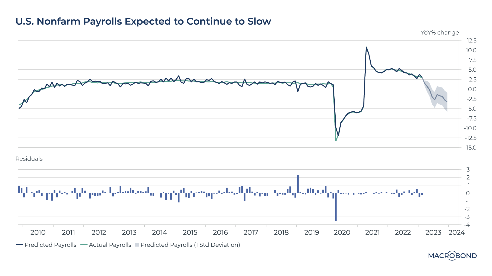
We’ve created a vector autoregression model to predict non-farm payrolls (NFP) over the next year.
As our chart shows, the model is predicting slower payroll growth, based on inputs such as job openings and personal consumption expenditures (PCE).
.png)
(The “residuals” pane reflects the difference between the observed values and the predicted values in a model; as the 2020 pandemic spike shows, forecasting becomes more difficult during times of turbulence.)
The resilient US labour market has meant recent NFP figures surprised on the upside. Economists therefore expect the Fed to leave the possibility of a rate hike on the table as long as inflation persists and labour markets can accommodate a hike.
Anticipating US jobless claims by tracking layoffs
Another argument for a slowing labour market is the current wave of US layoffs, ranging from Big Tech to Walmart and head-office jobs at McDonald’s.
This chart aims to measure layoffs on a national basis by summing up state-level worker adjustment and retraining notices (WARN), which require firms to provide early warning in case of events like plant closings.
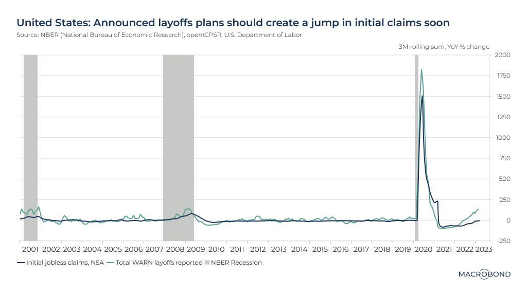
Every state has different peculiarities, and not all of them report WARN notices, so the sample charted uses 39 of the 50 states.
As the chart shows, WARN notices are increasing significantly; the year-on-year rate of change level is comparable to that seen in 2001 and 2008-09s. Those were periods where initial jobless claims also rose, as the charts show; as laid-off staff begin claiming unemployment benefits, history is likely to repeat itself.
Watching for commercial real estate distress at small US banks
The health of US banks remains in the news after the SVB rescue. Last week, we examined how deposits are flowing out of both larger and smaller institutions.
This week’s charts look at their loan books over two decades, showing how commercial real estate could be the next issue.
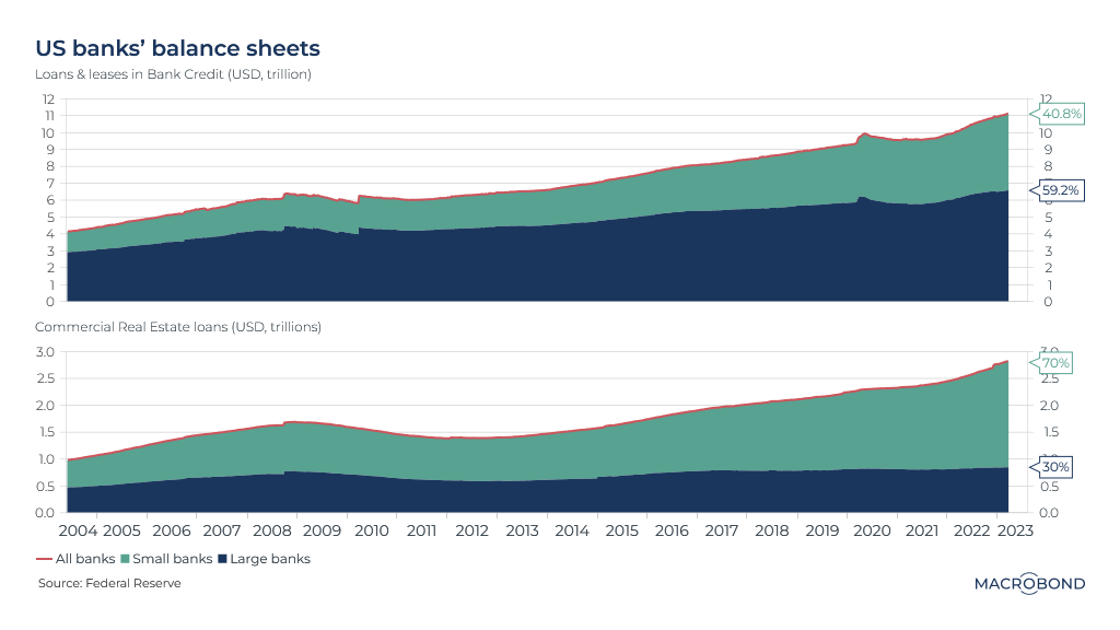
Fed figures show that commercial banks’ total loans almost tripled since 2004, reaching USD 11 trillion. But the distribution between institutions has remained roughly stable: large banks account for 60 percent of the loans. (Large banks are defined as the top 25 by assets.)
The second panel focuses only on commercial real estate (CRE) loans. Smaller banks have 70 percent of this asset class after years of taking an ever-greater share versus their larger counterparts. With more observers warning about stress in the commercial real-estate market, smaller banks could suffer disproportionately.
The BRICS surpass the GDP of non US developed nations
Two decades ago, former Goldman Sachs economist and emerging-market bull Jim O’Neill coined the BRIC acronym (Brazil, Russia, India and China). The concept was later expanded to include South Africa to become the BRICS.
Another acronym predates the BRICS: the G7, or Group of Seven, a political forum for the biggest industrialised democracies: the US, UK, Germany, France, Italy, Japan and Canada.
O’Neill posited that the BRICS were so big and dynamic that they would converge with western income levels and grab an ever-greater share of the world economy while the G7’s share shrank.
Our chart shows how O’Neill’s prediction is gradually coming true – at least if you exclude the US.
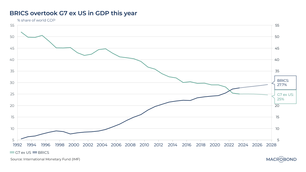
(This takes an expansive view of the G7, including the entire European Union economy since the group's summits include EU representatives.)
The IMF estimates that the BRICS share of global GDP surpassed that of the G7-ex-US in 2022. That trend is expected to continue.
The timing is interesting; China, the biggest BRIC economy, notably outperformed western GDP growth in the early stages of the pandemic.
Components of German inflation are shifting around
We have dedicated several charts to European inflation in recent weeks. In February, there was evidence of a broad disinflationary trend across the region, though inflation remained elevated in absolute terms.
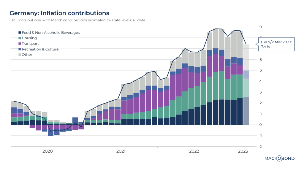
Last week’s German CPI figures demonstrate the dilemma facing analysts and central bankers. Price increases were more than analysts expected, even though the inflation rate slowed from 8.7 percent to 7.4 percent year-over-year.
The statistics office has not yet released a breakdown of inflation contributions by sector: housing, food, etcetera. But we can aggregate regional CPI figures to get an early sense of what’s driving the slowdown in inflation.
As our chart shows, food prices are climbing at an ever-increasing rate. That’s been offset by slowing inflation for transportation and housing.
WALKING ON EGGSHELLS FOR EASTER
As we head into the Easter weekend, consider the tensions around the humble egg. (The ones laid by hens, not the chocolate version.) This grocery staple has been notable for post-pandemic price surges and shortages in several nations, particularly the UK.
In the US, eggs cost almost double the price of a year ago, according to the Bureau of Labor Statistics. Opponents of President Biden have specifically cited the egg market as they critique his inflation policy. Some observers have accused egg suppliers of collusion.
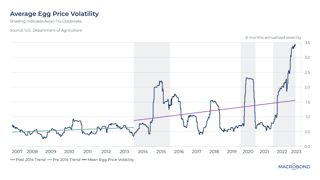
Our chart tracks volatility, rather than price. It indicates how there is something else going on besides the general inflation and disruptions to agriculture in the wake of Russia’s war on Ukraine.
That something is avian flu. In 2014-15, the US experienced the largest outbreak of that disease in recorded history.
That’s when the chart becomes steadily more volatile, as poultry farmers culled and then rebuilt their flocks – only to have an even worse bird flu outbreak occur in 2022-23, following another outbreak in 2020. We have shaded the outbreaks on the chart.
Lent might be coming to an end, but until prices fall, some shoppers are likely to keep avoiding eggs.
4 topics
.png)
Macrobond delivers the world’s most extensive macroeconomic & financial data alongside the tools and technologies to quickly analyse, visualise and share insights – from a single integrated platform. Our application is a single source of truth for...
Expertise
.png)
Macrobond delivers the world’s most extensive macroeconomic & financial data alongside the tools and technologies to quickly analyse, visualise and share insights – from a single integrated platform. Our application is a single source of truth for...
.png)