Charts of the Year: 2023’s most popular visualisations, Part 1
.png)
Jan. 13: Our bearish “nowcasts” for US GDP
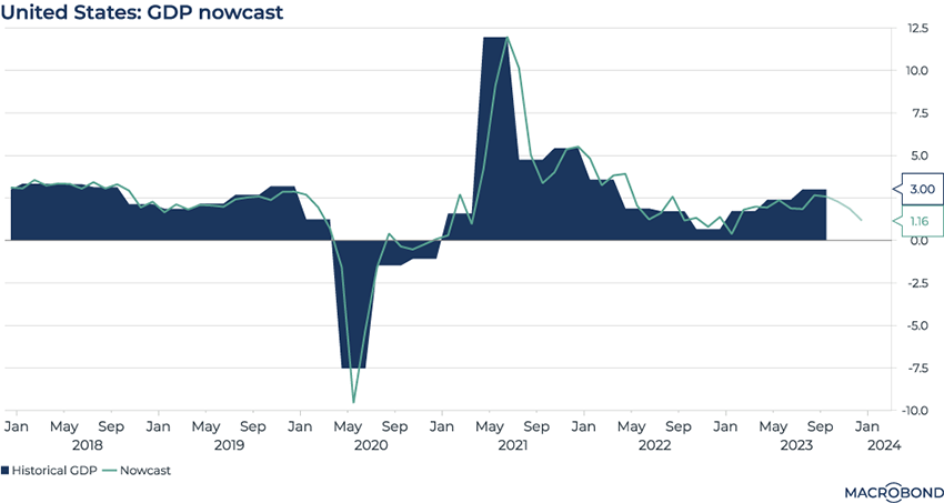
First featured in Charts of the Week on Jan. 13.
Nowcasts offer an early glimpse under the hood of an economy, given the time lag before governments release traditional datasets. In this case, our nowcast was wrong-footed by the resilience of the US economy.
This nowcast – the first of several we published in 2023 – estimated US gross domestic product in real time. It used industrial production, business surveys, financial market data and more to feed Macrobond’s built-in principal component analysis and vector autoregression model.
We’ve overlaid actual GDP data (in blue) on top of the green nowcast line. As you can see from the January 2023 datapoint on our chart, the nowcast called for a sharp growth slowdown that stopped short of a contraction. Instead, GDP growth accelerated.
Some 11 months later, our nowcasting model is again predicting deceleration to start the year. Will it be more accurate this time, given the Federal Reserve has finally “pivoted” and indicated it’s worried about overtightening?
Feb. 24: Geopolitical risk perceptions: Ukraine and Gaza from Germany to the US
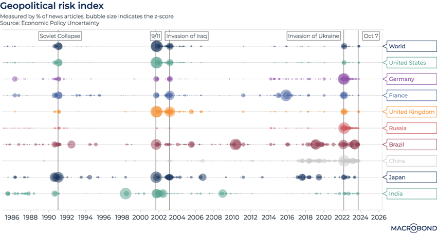
First featured in Charts of the Week on February 24.
In February 2023, almost a year after Russia invaded Ukraine, we thought it apt to compare this event to previous geopolitical shocks. We used a measure of perceived risk generated by Economic Policy Uncertainty, an academic group that tracks newspaper headlines.
Our “bubbles on a string” attempt to visualise the level of concern about various events in different countries. In the US, for instance, nothing compares to 9/11 as a moment of perceived maximum risk. For Germans, whose economy was so linked to Russian natural gas, the invasion of Ukraine caused much more worry.
Since we first published this visualisation, a smaller “pulse” has appeared from October – when Hamas attacked Israel and Israel invaded Gaza in response. But the size of the pulse hasn’t been uniform among nations.
Apr. 21: US small business was – and is – worried about credit conditions
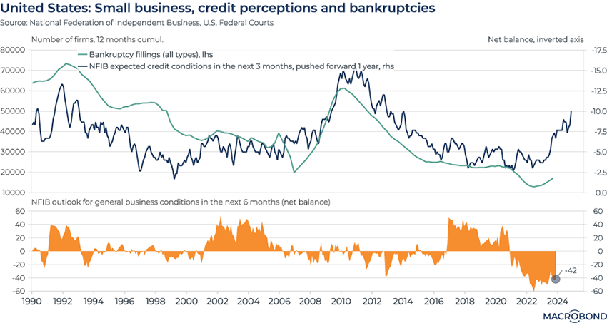
First featured in Charts of the Week on April 21.
The National Federation of Independent Business surveys smaller US enterprises about their expectations for access to credit in the near term.
Our chart shows how the results of this sentiment survey – pushed one year ahead – can be a leading indicator for US bankruptcy filings. Bankruptcies slid to a multi-decade low during the pandemic due to state support programs, but have been creeping higher.
We first published this chart in April, when worries about a credit crunch were exacerbated by the failure of Silicon Valley Bank and other small lenders.
The second pane more directly expresses the “net balance” of the NFIB survey on a six-month time horizon. As the Fed moves to “pivot” to looser policy, survey respondents are slightly less pessimistic than they were eight months ago.
May 5: The great global growth surprise of (early) 2023
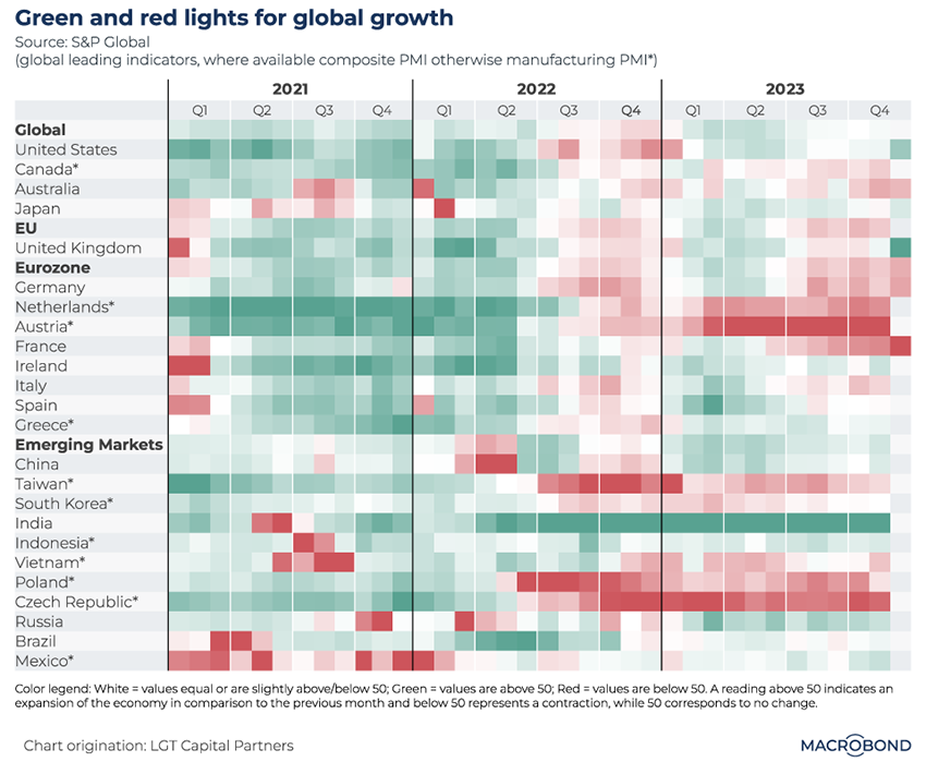
First featured in Charts of the Week on May 5.
This visualisation tracks the purchasing managers index (PMI) for manufacturing in economies around the world. PMI is an important indicator; it surveys executives about prevailing trends in their industry, and whether they expect contraction (red) or expansion (green).
Resilient global growth after a record-breaking tightening cycle was the surprising story of early 2023. The wave of green at that time is clearly visible – and the return of more red squares in late 2023 shows how that optimism has dissipated for developed markets since we first published this heatmap.
The pessimistic turn in Germany and France is notable. Emerging markets have seen less change in the second half.
Jul. 7: The OECD labour dashboard
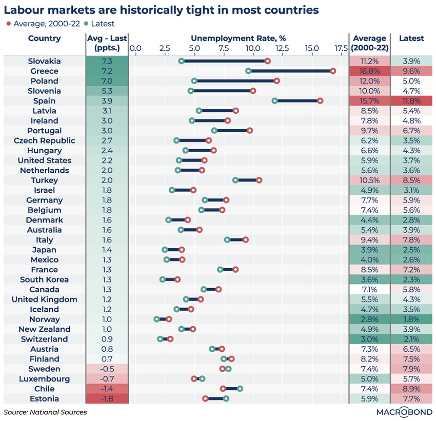
First featured in Charts of the Week on July 7.
This birds’ eye view of unemployment trends in 35 OECD member states showed how tight labour markets were – and how much progress southern and eastern Europe had made in lowering joblessness from past norms.
This analysis was motivated by the comments of European Central Bank President Christine Lagarde, who remarked that service-sector companies scarred by the pandemic may have been engaging in “labour hoarding,” fearful that it would be tougher to recruit should growth strengthen.
Five months later, the story remains broadly the same. Notably, Greece and Spain have lowered unemployment even further. Finland, Sweden, and Luxembourg all stand out as nations whose labour markets have deteriorated this year.
Aug. 11: “Early hiker” central banks have changed course
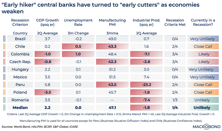
First featured in Charts of the Week on Aug. 11.
Emerging-market central bankers are generally more used to fighting elevated inflation than their developed-market peers – especially during the past two decades. In August, we decided to see how nine “early hikers” fared in the inflationary cycle. Did inflation hawks send their countries into recession prematurely or unnecessarily?
We considered four “recession criteria”: GDP, unemployment, manufacturing PMI and industrial production. By our metrics, only Hungary faced recession at the time of publication in August; indeed, the country was in technical recession for the first three quarters of 2023.
Fast-forward to today: global monetary policy dynamics have changed, with many of these nations – Brazil, Chile, Peru, Poland, and Hungary in particular – among the avant-garde in cutting rates. Against this new backdrop, our dashboard is flashing a lot more red and amber. Colombia and Czechia are quite likely in recession; Peru, Chile, and Poland face a close call. Hungary, meanwhile, has returned to a rosier outlook.
Aug. 18: Americans’ pandemic-era savings dwindle (but get revised upward!)
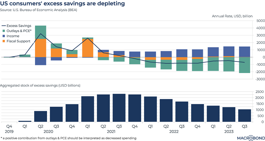
First featured in Charts of the Week on Aug. 18.
The US consumer’s resilience in the face of inflation and higher borrowing costs was often linked to the stock of excess savings that built up during the pandemic. We examined this phenomenon several times over the course of 2023.
Our chart tracks how this cushion is gradually deflating, leading observers to ponder when, and whether, Americans will finally tighten their belts. It also shows the role of fiscal support in building that cushion in 2020-21.
This chart is also notable, however, because it has substantially changed since we first published it. The Bureau of Economic Analysis revised the underlying data points to reflect Americans’ surprisingly deep pockets.
Aggregate excess savings for the second quarter of 2023 are now estimated at about USD 1.25 trillion – indicating that in August, we were working off an undercount of roughly USD 400 billion.
Sep. 22: The Fed’s hiking cycle and timing of recessions
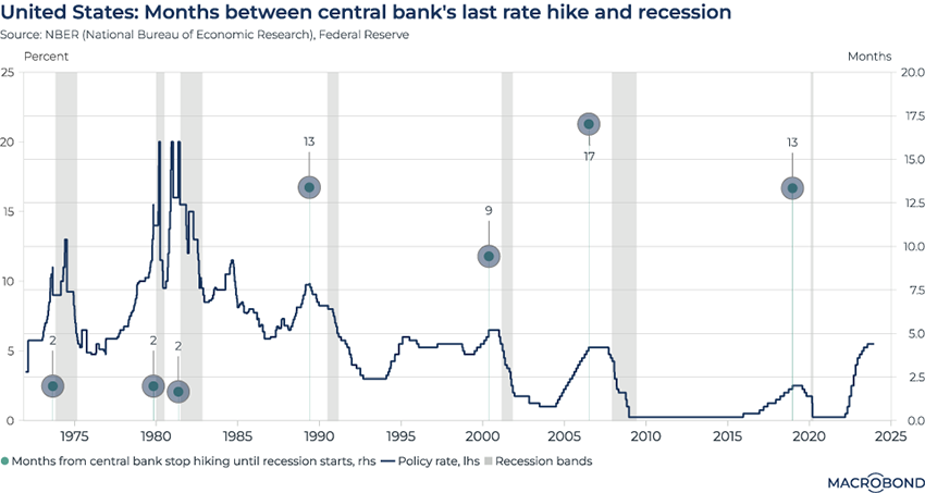
First featured in Charts of the Week on Sept. 22.
This chart can be applied to different countries using Macrobond’s change region functionality.
This chart headlined the 100th anniversary of Charts of the Week in September. It was published against a backdrop of intense speculation about the end of the Fed’s hiking cycle and whether a recession would soon follow.
Our chart examined recent US history to calculate the time between the end of previous hiking cycles and the onset of a recession. (Recessions are shaded in gray; the line tracks the Fed’s key interest rate; and dots reflect the months before a recession kicked in.)
Recessions followed quickly in the 1970s and 1980s. But for the last 30+ years, more than a year often passed between the end of a rate cycle and a recession.
No recession has kicked in yet, so our chart hasn’t changed. With the Fed strongly indicating this month that its next move is a rate cut, it’s probably time to retroactively start the stopwatch from July’s hike.
Oct. 13: Gaza, geopolitical events and the effect on oil prices
First featured in Charts of the Week on Oct. 13.
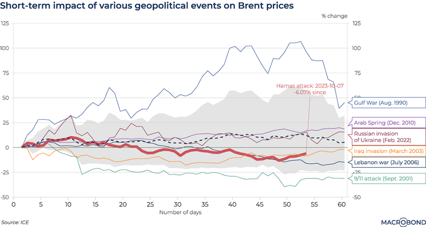
Like the risk-perception chart, this visualisation examined the impact of individual geopolitical events – this time, on the energy market. Amid concern that the Israel-Hamas war might spread and entangle oil-producing nations, we charted the repercussions that 9/11, the Arab Spring and other events had on crude.
Saddam Hussein’s invasion of Kuwait stands out. Oil prices almost doubled soon afterwards. By contrast, 9/11 resulted in a price drop amid concern that the terror attack would result in recession.
More than two months have passed since we first published the chart in the wake of Hamas’ attack. An initial increase in the price of Brent crude did not last; concern about oversupply and slowing economies has driven prices down.
That could change should attacks on Red Sea shipping by the Iran-linked Houthi forces in Yemen continue.
Oct 13: Green and red lights across the global economy
First featured in Charts of the Week on Oct. 13.
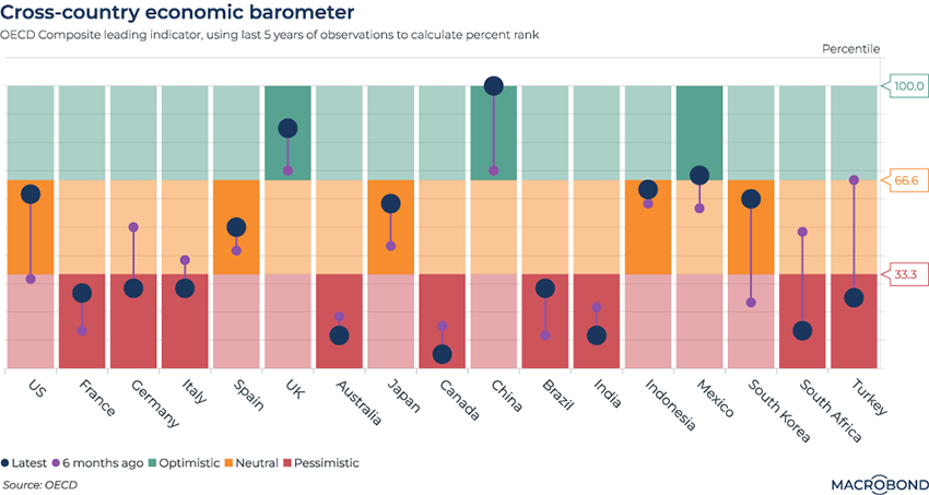
This chart used the OECD’s Economic Composite Leading Indicator – based on particularly future-sensitive economic data – to contrast 17 countries.
Comparing the most recent readings to the past five years, we assigned each country a red, yellow or green “traffic light” depending on the percentile range. We added an extra bubble to show the six-month direction of travel.
At the time of publication, the UK and China stood out, despite the post-Brexit travails and disappointing post-Covid reopening respectively: the OECD indicator was predicting a strong pick-up in prospects for both nations versus six months prior.
Our chart looks similar two months later, but China bulls can rejoice: with a record reading, its bubble is now literally off the chart. The outlook appears to be brightening for the US and Mexico, too. Italy is notable for reversing its optimistic trend since October; our traffic light is flashing red.
.png)
Macrobond delivers the world’s most extensive macroeconomic & financial data alongside the tools and technologies to quickly analyse, visualise and share insights – from a single integrated platform. Our application is a single source of truth for...
Expertise
.png)
Macrobond delivers the world’s most extensive macroeconomic & financial data alongside the tools and technologies to quickly analyse, visualise and share insights – from a single integrated platform. Our application is a single source of truth for...
.png)