Charts of the Year: 2023’s most popular visualisations, Part II
.png)
These visualisations were among the most popular with the Macrobond community; this round focuses on the long road to central banks’ pivot, sinking housing markets, China’s uneven recovery and the peculiar behaviour of US equities.
The markets’ call on rate peaks proved to be somewhat too low
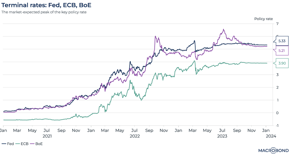
First featured in Charts of the Week on Jan. 27.
At the start of 2023, inflation was still running hot. But many observers were confident that central banks had cooled their economies so much that rate hikes surely couldn’t continue for much longer.
Where would rates top out? This chart tapped the futures markets to track the changes to the forecast peak rate (rather than project a rate curve) for the Federal Reserve, the Bank of England and the European Central Bank.
Ultimately, the futures markets were too dovish. As our chart flattened at the end of 2022, terminal rates were predicted at 4.91 percent, 4.42 percent, and 3.35 percent for the Fed, BoE, and ECB respectively in January of 2023.
But there was another leg higher as inflation persisted in mid-2023. By the end of the year, as our updated chart shows, the terminal rates had adjusted to 5.33 percent, 5.21 percent, and 3.90 percent respectively.
(With Chair Powell almost certainly finished raising rates this cycle, the Fed funds rate was kept at 5.25-5.5 percent for a third straight meeting in December; the market settled on its correct prediction of that outcome in mid-summer.)
A reopening index for China
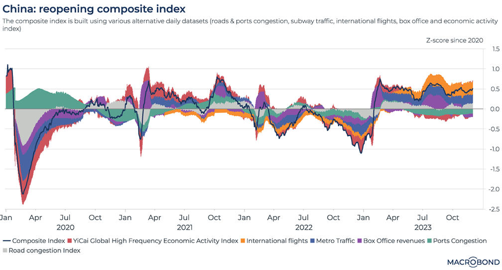
China dismantled its “zero Covid” restrictions at the end of 2022, and as the new year began, there was optimism about Asia’s biggest economy roaring to life.
In March, we built a composite index aiming to capture what economic “reopening” actually means. It used a broad range of daily alternative datasets, including port activity, road congestion, subway use, movie-going and international flights. The chart expressed this composite index in the form of a z-score, or deviation from the historic mean.
The snap-back at the start of 2023 is clearly visible (as is the extent of the plunge in early 2020).
Interestingly, box office revenues and port congestion stayed below the historic mean through most of last year.
Housing slides in Germany, plateaus in Canada, but US resumes records
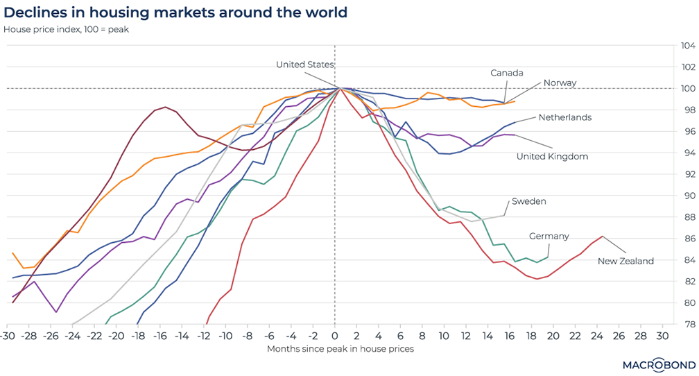
First featured in Charts of the Week on March 31.
By early 2023, the transmission mechanism of monetary policy meant higher rates were making mortgages more expensive. In March, we created a chart tracking home prices before and after their peaks.
Germany and New Zealand were notable for earlier peaks than other countries and substantial declines; Prices in Canada and Norway had barely budged after peaking just six months earlier. The US was somewhere in between.
Fast forward to the present moment: we expanded our chart’s time horizon to 30 months pre- and post-peak for all nations. The US has “reset” to the centre of the chart – i.e., it’s setting new highs again.New Zealand and the Netherlands are recovering; Germany, not so much. And Canada and Norway have still barely budged from their flat line.
Stock sectors’ relationship to the PMI
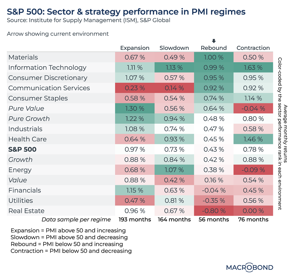
First featured in Charts of the Week on April 14.
In 2023, we repeatedly revisited the Institute for Supply Management’s purchasing managers index, a key indicator that surveys manufacturing sentiment.
Last spring, we examined its relationship with the stock market. We analysed 40 years of data to create PMI “regimes” for perceptions that the economy was expanding, slowing, contracting or rebounding. We then tracked how different S&P 500 sectors performed in each “regime.”
In April, PMI had worsened to 46.3, representing a fifth straight month of contraction. In a contraction regime, it tends to be best to own health care or tech – as the right-hand column indicates.
Since then, three more “contractionary” prints were released, along with five prints indicating a “rebound,” the column we are in today – barely – with a 47.4 reading. In this environment, the materials and IT sectors have historically outperformed the most; utilities and, especially, real estate tend to underperform.
The market rally was reliant on a few big stocks – but broadened, a bit
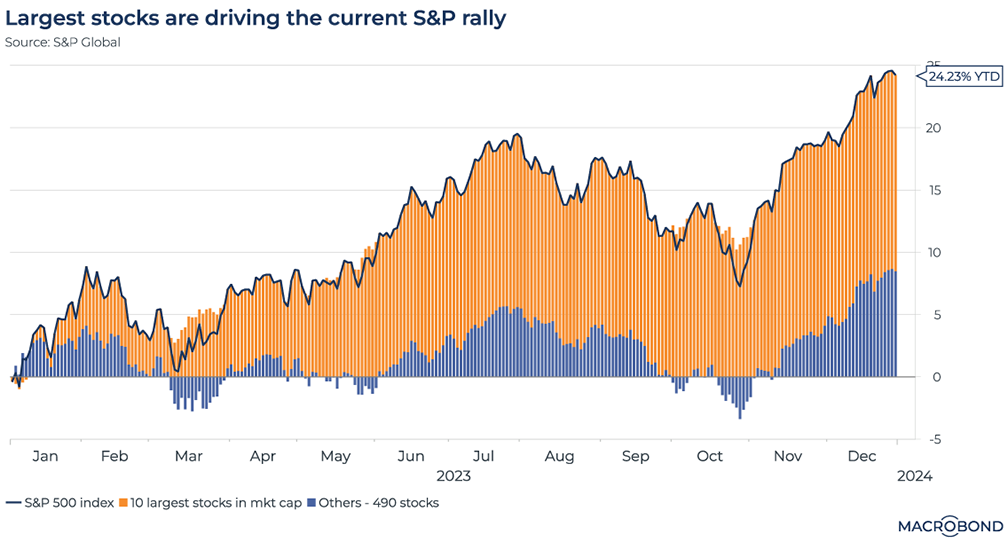
First featured in Charts of the Week on May 5.
The “narrow” nature of this year’s equity gains were a perennial market theme as investors piled into stocks associated with artificial intelligence, like Nvidia and Microsoft.
In May, our chart broke down the year-to-date gains of the S&P 500 by separating the 10 stocks with the largest market capitalisations from the rest. Indeed, as this chart still shows, the “Big 10” were responsible for the entirety of the market rally at the time – especially after bank failures in March dented confidence outside the world of tech.
Revisiting this chart at year-end, the Big 10 were still responsible for the majority of the gains – but the market had finally broadened, and the “Smaller 490” posted an 8 percent advance for 2023.
(Note to Macrobond users: we’ve “fixed” the end date in this chart; for the original rolling year-to-date visualisation, click through to the May chart page.)
Equities defy their usual correlation with central bank balance sheets
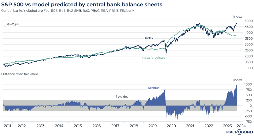
First featured in Charts of the Week on June 9.
This chart can be applied to different countries using Macrobond’s change region functionality.
In February, we examined a mystery: Japan’s unorthodox monetary policy seemed to be helping global equity markets, offsetting the Fed’s tightening cycle. We followed this up with a broader analysis in June.
This regression model indicated that there was a 96 percent historic correlation between the combined balance sheets of the world’s major central banks and the performance of the S&P 500.
However, in June, this correlation was breaking down; we questioned if a correction was overdue as central banks drained liquidity, or whether markets would defy shrinking balance sheets as they did during the tech-driven surge of 2018-19.
Today, with markets assuming rate cuts and a soft landing are coming soon, the answer seems to be the latter. As the second pane of our chart shows, the model suggests the S&P 500 is steadily levitating away from what would normally be considered fair value.
Borrowing behaviour in China
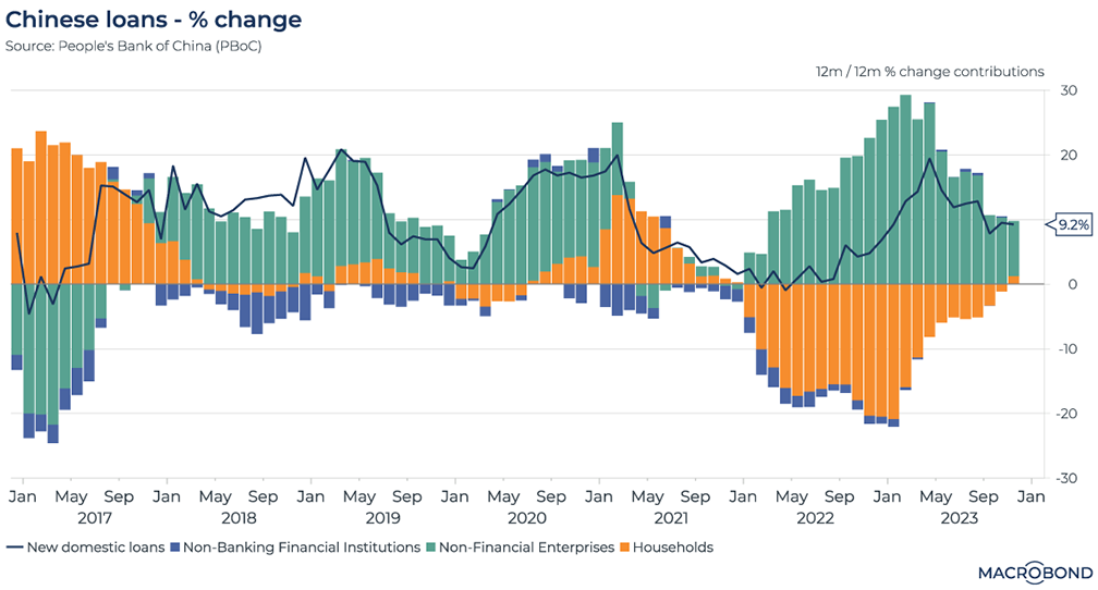
First featured in Charts of the Week on June 23.
As concern about China’s economy grew mid-year, we published a chart on domestic credit growth in June, breaking it down into loan demand from non-banking financial institutions, non-financial enterprises and households.
The swath of orange-coloured bars starting in early 2022 indicated that household loans had been shrinking, something rarely seen over the past half-decade. This bifurcation with rising private-sector credit formed part of the broader context for China’s rate cuts in mid-2023.
At the end of 2023, the consumer appears to have been in better shape; credit demand had stopped shrinking on a cumulative, year-on-year basis.
Futures markets take on the Fed pivot …
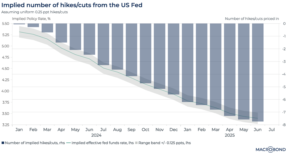
First featured in Charts of the Week on Sept. 1.
This visualisation calculates both the Fed’s implied future policy rate and the implied number of hikes and cuts, as demonstrated on the double Y axes.
Our chart looks quite different than it did in September, when a December hike was still considered a possibility, a pivot was foreseen for late spring 2024 and we were only looking as far as January 2025.
Remarkably, markets are now projecting rate cuts in a steady line through 2025, reaching 3.5 percent by June. Meanwhile, markets think the true ”pivot” to the first cut could come as early as February. While Powell switched to a dovish rhetorical stance in mid-December, he has still suggested that the market must wait until later in 2024 for looser policy.
… And then turn their attention to the ECB
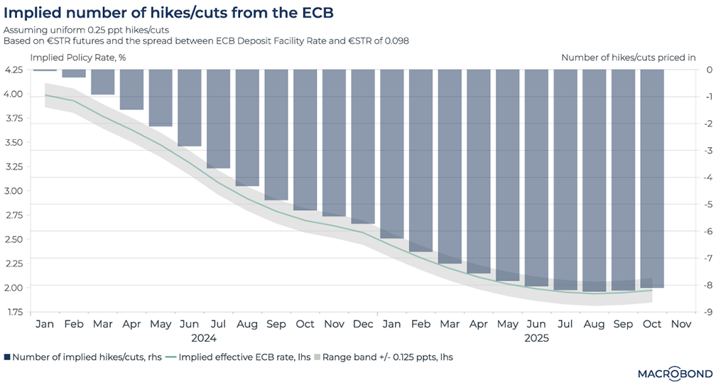
First featured in Charts of the Week on Sept. 15.
This chart applies the equivalent of the Fed futures analysis to its European counterpart. In short, both central banks are expected to cut steadily, but the ECB will bottom out at a lower level in mid-2025.
In a split decision in September, the ECB lifted its key interest rate to 4 percent, the highest level since its creation. With a simultaneous lowering of growth projections, the move was interpreted as a “dovish hike.” Still, some participants were still expecting one more rate hike.
This chart has also changed significantly. Today, the consensus view is that cuts are over; the key rate is expected to sink to 3 percent by September 2024, instead of January 2025 as was predicted less than four months ago.
Markets declare the definitive end of global tightening
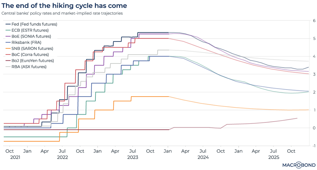
First featured in Charts of the Week on Dec. 1.
This chart looks pretty much the same as it did at the start of December. For most of the major central banks, futures markets expect rate cuts to kick in from about April. Australia looks to be cutting rates more slowly than its peers; Japan is a far greater outlier, leaving its negative interest rate policy behind and probably moving into positive territory in the autumn.
However, the Federal Reserve’s rhetoric has changed markedly in the month since this chart was published. Jerome Powell’s dovish remarks on Dec. 13 could be interpreted as the Fed chairman catching up with our chart.
3 topics
.png)
Macrobond delivers the world’s most extensive macroeconomic & financial data alongside the tools and technologies to quickly analyse, visualise and share insights – from a single integrated platform. Our application is a single source of truth for...
Expertise
.png)
Macrobond delivers the world’s most extensive macroeconomic & financial data alongside the tools and technologies to quickly analyse, visualise and share insights – from a single integrated platform. Our application is a single source of truth for...
.png)