ChartWatch: ASX copper producers, sure they’re soaring, but is the trend still your friend?
Today’s ChartWatch is a follow up from the fundamental analysis-based article I wrote on Tuesday: Everything you need to know about every ASX copper producer. Once again, I cover each stock in alphabetical order. All analysis is based upon the last candle, which at the time of writing, is live. Keep in mind that ideally technical analysis is conducted on a closed candle basis, and the analysis may change slightly based upon how the candle appears at today’s close.
29Metals (ASX: 29M)
.png)
ST/LT Trends: ⬆️/⬇️
Price action: 📈

Candles: ⬜
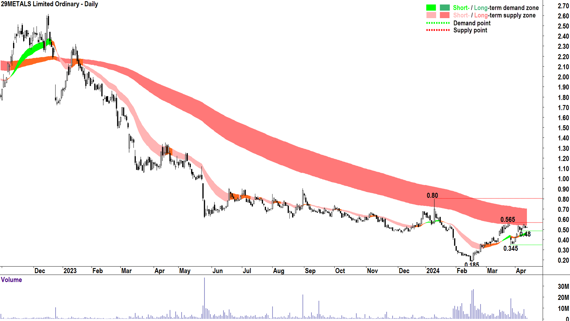
Key Demand / Supply: 8 Apr trough low @ 0.48 / 22 Mar peak high @ 0.565
Commentary: 29Metals has had its fair share of operational challenges and the result of these can be seen in its enduring long term downtrend. The gap lower on 25 March was caused by the announcement of the suspension of operations at its Capricorn Copper Mine in Queensland due to severe flooding.
It has recovered strongly from then, logging several full-bodied white candles. It’s also reverted to the rising peaks and rising troughs it was exhibiting prior to the announcement. For the rest of this article, I will refer to this state as “good price action” as it demonstrates a buy the dip mentality among market participants.
The short term trend has swung back to up and is now challenging two crucial points of supply. The first is the historical point of supply at 0.565, but far more sinister, is the dynamic supply expected at the long term downtrend ribbon. It’s clear just how powerful this ribbon has been at beating down promising rallies in the past.
Volume shows substantially increased interest, and along with the price action that occurred around February and early March, is consistent with the stamping out of a major low.
Despite the setback from 25 March, the short term trend here looks very much intact, and I would not be surprised to see that 0.565 is challenged. A close above this point of supply, and ultimately the long term trend ribbon, is required to commence a new long term uptrend, however.
On the other hand, a close below the nearest point of demand at 0.48 would indicate the supply side is regaining control. A close below major demand at 0.345 would indicate the long term downtrend has reasserted itself.
Aeris Resources (ASX: AIS)
.png)
ST/LT Trends: ⬆️/⬇️
Price action: 📈
Candles: ⬜
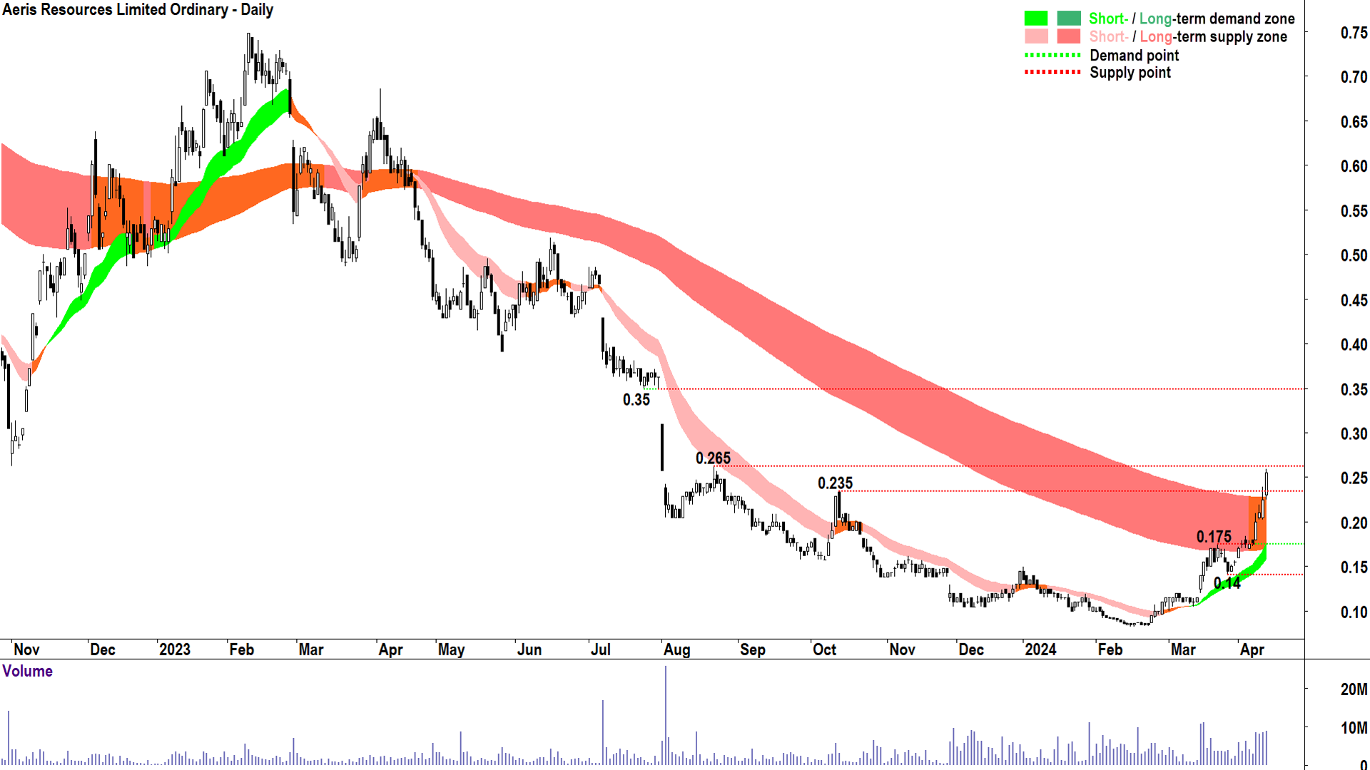
Key Demand / Supply: 21 Mar peak high @ 0.175 / 12 Oct 2023 peak high @ 0.235
Commentary: Aeris is showing a strong short term uptrend with good price action and predominantly demand-side candles (i.e., those with full white bodies and/or downward pointing shadows).
The long term trend has transitioned to neutral from down, and the price action has made great progress in nullifying this known zone of dynamic supply.
Whilst Thursday’s candle showed some difficulty in closing above the long term trend ribbon and the key historical point of supply in 0.235, today’s emphatic demand-side candle looks to be the one to crack it. We will have to see by the close.
The short term trend, price action, and candles suggest the demand-side is very much in control here, so it would not be surprising to see supply at the long term trend ribbon and at 0.235 successfully dealt with.
The next key point of supply is 0.265. Keep an eye out for increased frequency of supply-side candles (i.e., those with full black bodies/and or upward pointing shadows) near here as it would signal the supply-side is still lurking.
Until this occurs, the demand-side is very much in control here. A close below the key point of demand at 0.175 would signal the supply-side has regained control.
AIC Mines (ASX: A1M)
.png)
ST/LT Trends: ⬆️/➡️
Price action: 📈
Candles: ⬜
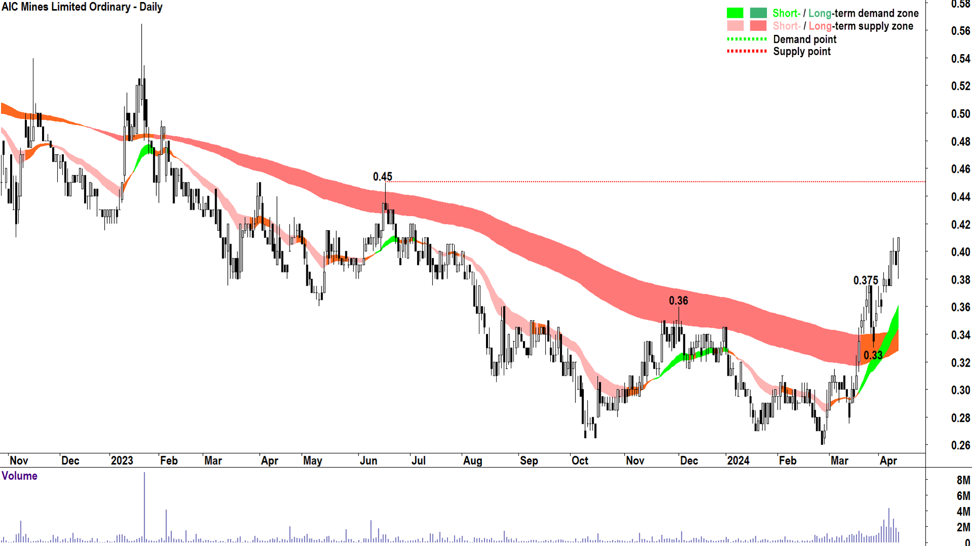
Key Demand / Supply: 26 Mar peak high @ 0.375 / 19 Jun 2023 peak high @ 0.45
Commentary: Another chart with a strong short term uptrend, but the strongest indication so far that the long term trend is transitioning from down to up.
I note the characteristic break above, retest, and hold of the long term downtrend ribbon. The long term trend is neutral, but is contracting and rising – both signs of a transition to uptrend.
Given the above, the long term trend ribbon will now likely act as a key area of dynamic demand.
Trends, price action, and candles are consistent with demand side control.
0.45 is the next key point of supply.
0.375 is the nearest point of demand, but the short term uptrend ribbon will also likely act as a zone dynamic demand.
As long as the price continues to close above the short term trend ribbon the short term trend remains intact.
Alara Resources (ASX: AUQ)
.png)
ST/LT Trends: ⬆️/⬆️
Price action: 📈
Candles: ⬜
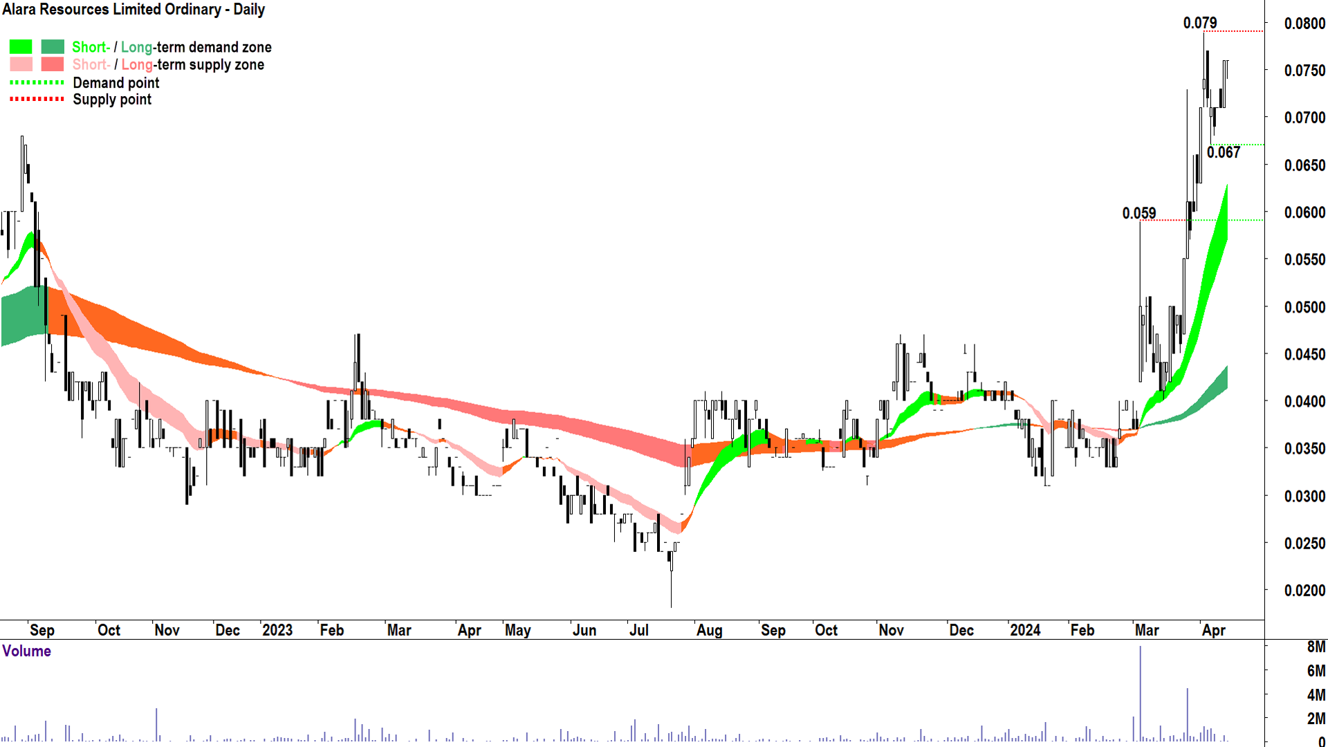
Key Demand / Supply: 5 Apr trough low @ 0.067 / 3 Apr peak high @ 0.079 then 11 Feb 2022 @ 0.12
Commentary: The best set of short and long term trends seen so far. A strong short term uptrend with excellent price action and predominantly demand-side candles. It’s clear the demand-side is in control here.
I note some minor but pesky supply coming in at 0.079, but there’s nothing in the price action, candles, or volume that suggests the short term trend can’t continue.
Once the price closes above 0.079 the next major point of supply isn’t until 0.12 set on 11 Feb 2022 (can be found by looking at the weekly chart).
0.067 nearest point of demand, but the short term uptrend ribbon will also likely act as a zone dynamic demand.
As long as the price continues to close above the short term trend ribbon the short term trend remains intact.
Aurelia Metals (ASX: AMI)
.png)
ST/LT Trends: ⬆️/➡️
Price action: 📈
Candles: ⬜
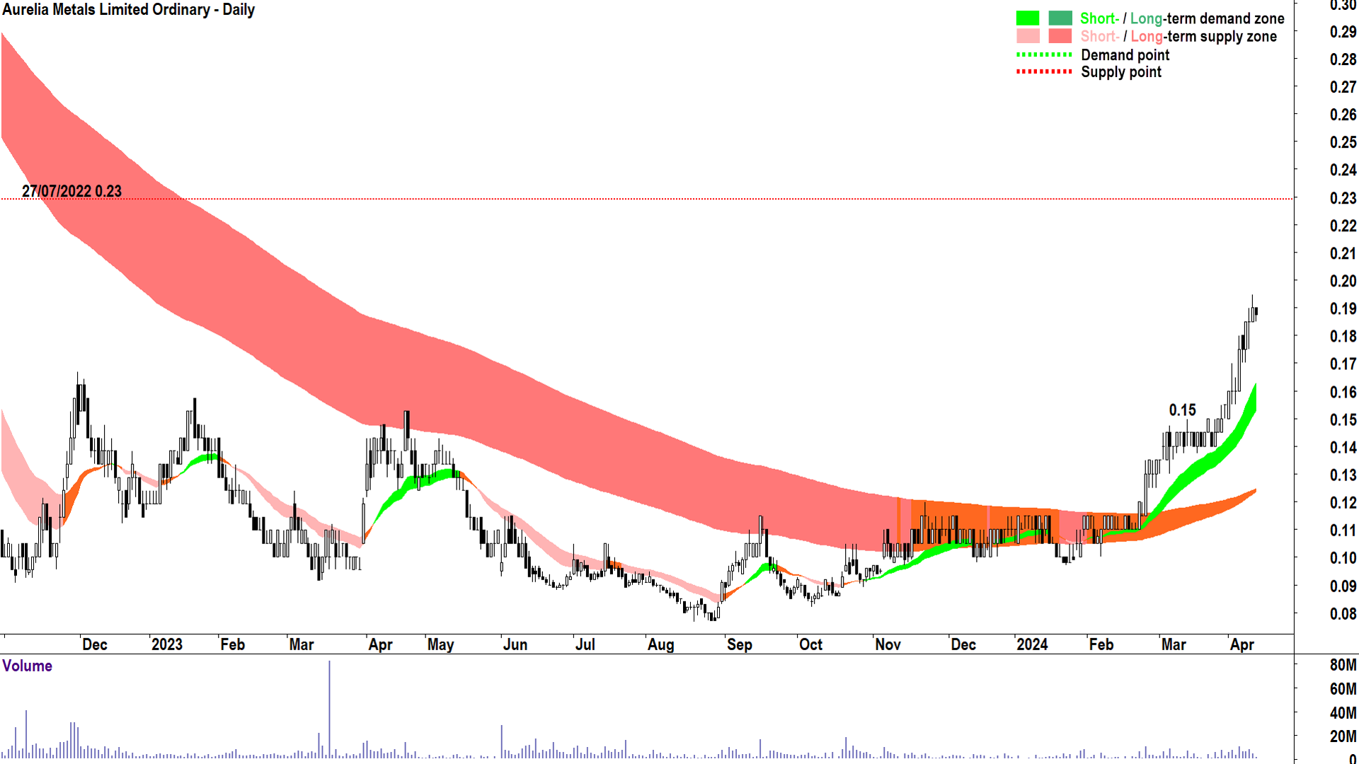
Key Demand / Supply: 13 Mar peak high @ 0.15 / 27 Jul 2022 trough low @ 0.23
Commentary: Another strong short term uptrend with excellent price action and predominantly demand-side candles. Again, it’s clear the demand-side is in control here.
The long term trend is in the late stages of transitioning from down to up. It should now act as a zone of dynamic demand.
The next major point of supply isn’t until 0.23 set on 27 July 2022 (can be found by looking at the weekly chart).
0.15 nearest point of demand, but the short term uptrend ribbon will also likely act as a zone dynamic demand.
As long as the price continues to close above the short term trend ribbon the short term trend remains intact.
BHP Group (ASX: BHP)
.png)
ST/LT Trends: ➡️/➡️
Price action: 📈
Candles: ⬛⬜
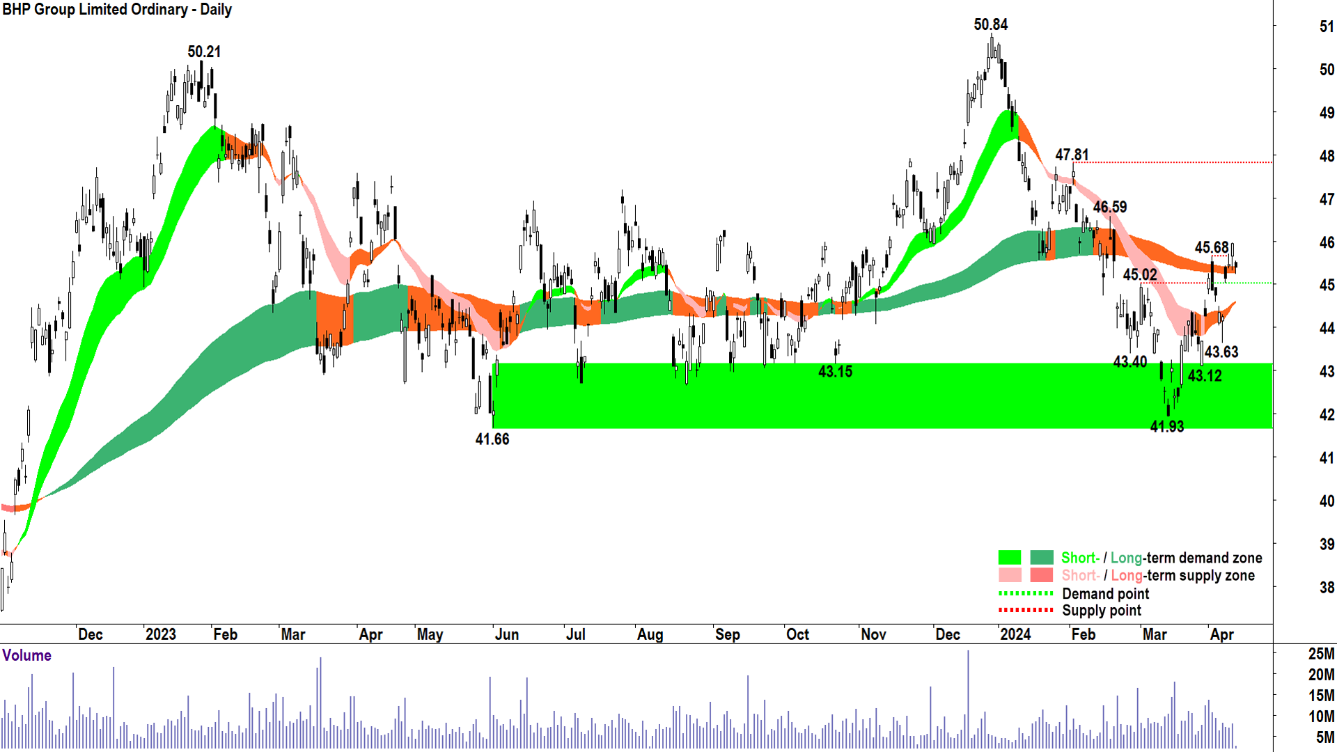
Key Demand / Supply: 1 Mar peak high @ 45.02 / 19 Feb peak high @ 46.59 then 2 Feb peak high @ 47.81
Commentary: The technical picture is more neutral at BHP. The short term trend is neutral, but it is close to turning up, the long term trend is neutral and flat – it really could go either way!
The price action is good, however, and candles are skewing back to the demand-side. I particularly like the large gap up on 9 April. Thursday’s candle and its close above 45.68, plus the fact it also confirms the long term trend is again behaving as a zone of dynamic demand are two further important ticks.
All in all, there’s some encouraging signs that the demand-side is wrestling back control here, so I’m going to call it for them – demand side control.
This makes today’s candle acutely disappointing! Hopefully we get a strong close or it will be back to…you guessed it…neutral again!
The next two key points of supply are 46.59 and then 47.81 (more likely).
45.02 is the nearest point of demand. A close below here (and therefore also the long term trend ribbon) would indicate the supply-side is back in control.
Evolution Mining (ASX: EVN)
.png)
ST/LT Trends: ⬆️/⬆️
Price action: 📈
Candles: ⬜
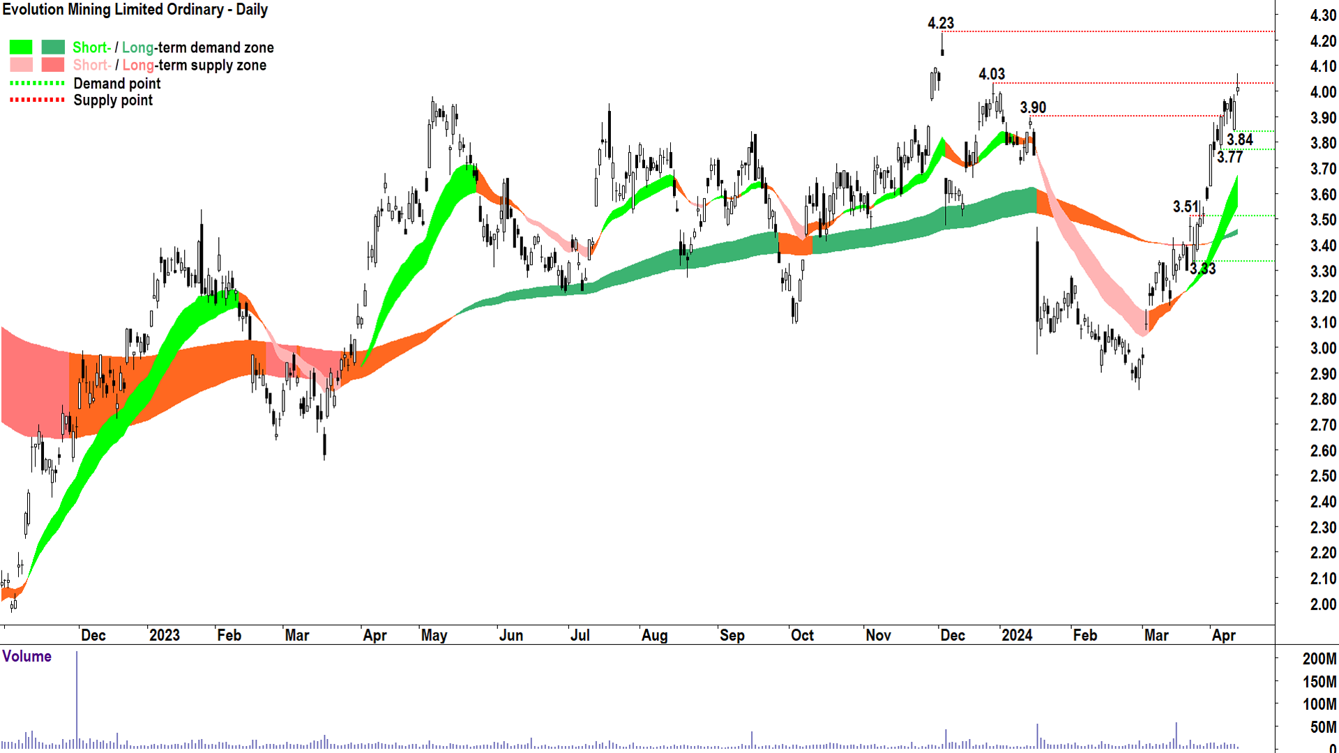
Key Demand / Supply: 5 Apr & 11 Apr trough lows @ 3.77-3.84 / 28 Dec 2023 peak high @ 4.03 then 4 Dec 2023 peak high @ 4.23
Commentary: Evolution is showing a constructive technical picture. I note a well established short term uptrend and a reestablished long term uptrend, as well as good price action, and predominantly demand-side candles.
The only problem I have here is the proximity of some pretty heavy hitters in terms of major historical points of supply. It will likely take some time, and a great deal of continued demand-side control, to work through 4.03, but more importantly, 4.23.
There’s nothing to suggest the demand-side can’t be successful in their endeavour, but in terms of getting in at the current price, it is hard to make the risk to reward maths work.
Still, this is a very strong set of technicals, and as long as the price continues to close above the zone of demand between 3.77 and 3.84, the short term trend is intact.
Hillgrove Resources (ASX: HGO)
.png)
ST/LT Trends: ⬆️/⬆️
Price action: 📈
Candles: ⬜⬛
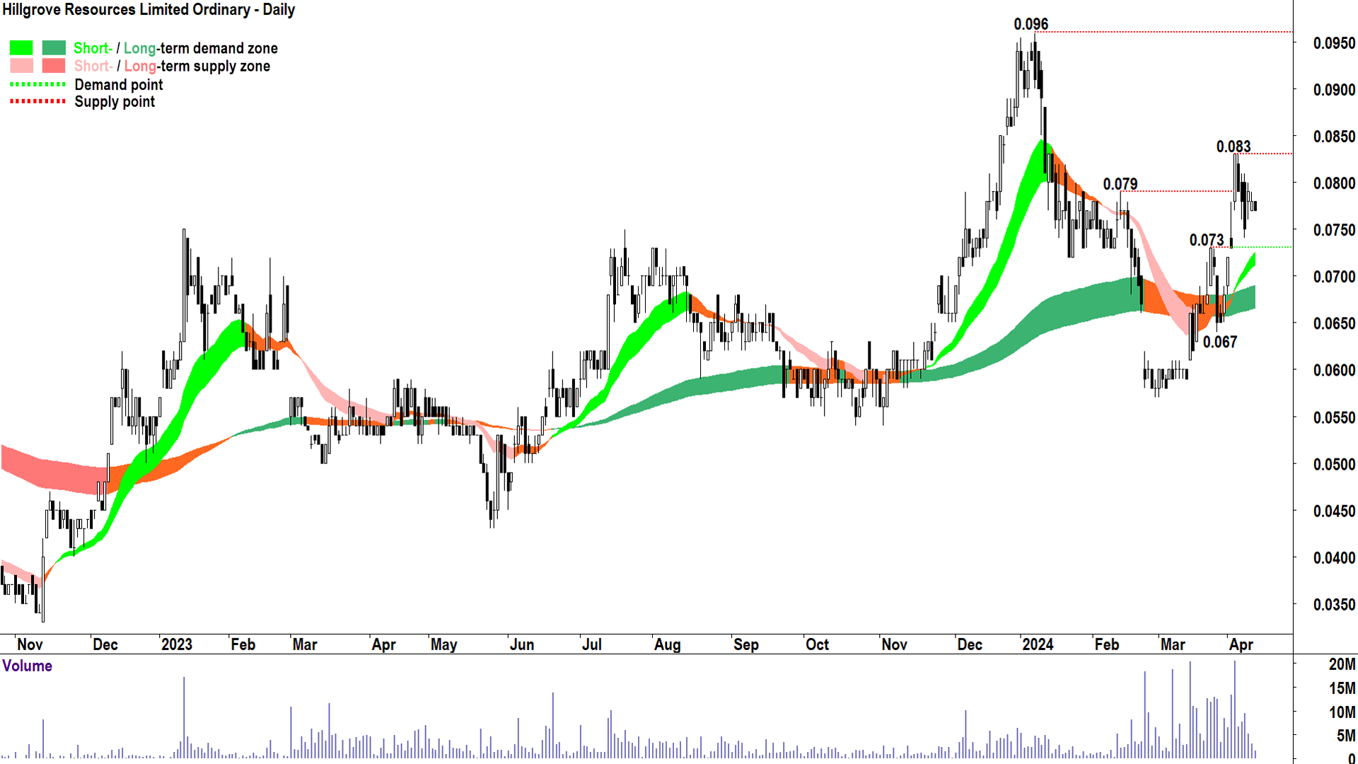
Key Demand / Supply: 22 Mar peak high @ 0.073 / 4 Apr peak high @ 0.083 then 8 Jan peak high @ 0.096
Commentary: A commendable set of technicals here, short and long term uptrends, good price action, and until the 4 Apr peak at 0.083, predominantly demand-side candles.
It may take some time to work through the supply which appears to be manifesting itself from that level in the form of black candles. Watch out for a strong demand-side candle to resume the prevailing short term uptrend.
0.073 is the nearest point of demand. As long as the price continues to close it and the short term uptrend ribbon the short term trend remains intact.
Metals Acquisition Ltd (ASX: MAC)
.png)
ST/LT Trends: ⬆️/N/a
Price action: 📈
Candles: ⬛⬜
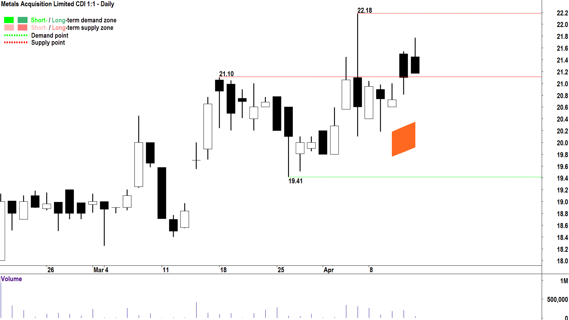
Key Demand / Supply: 18 Mar peak high @ 21.10 / 5 Apr peak high @ 22.18
Commentary: Metals Acquisition is such a new listing, there’s not a great deal to go on in the chart just yet. I do note a short term uptrend is about to appear (once it makes it past my 5-day minimum period of existence!).
The price action is good, although a little overlapping. The candles are a bit mixed, but I’m going to give MAC a pass here. Today’s supply-side candle could jeopardise this pass, though, even if it might be the first to close above the 21.10 point of supply.
22.18 is the next key point of supply.
In theory, 21.10 is the next key point of demand, but this assumes we close above it today. It’s 19.41 if we don’t.
As long as the price continues to close above the short term trend ribbon the short term trend remains intact.
Newmont Corporation (ASX: NEM)
.png)
ST/LT Trends: ⬆️/N/a
Price action: 📈
Candles: ⬜
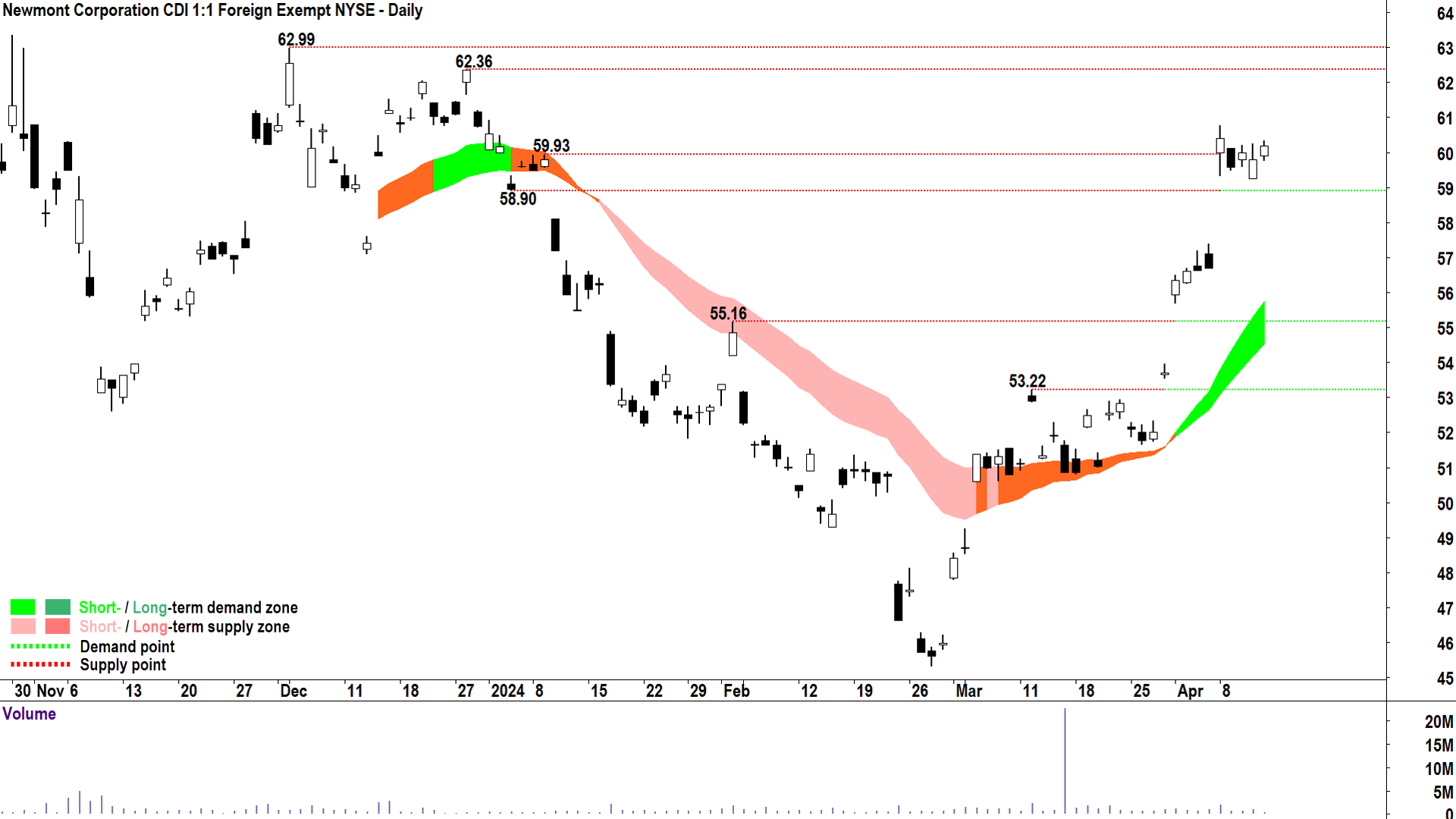
Key Demand / Supply: 4 Jan trough low @ 58.90 / 4 Dec 2023 Mar peak high @ 62.99 then 28 Dec 2023 Mar peak high @ 62.36
Commentary: Once again, a new listing, so limited price data to decipher. But I note a solid short term uptrend, excellent price action, and predominantly white candles that indicate almost unanimous demand-side control.
Like Evolution, the only issue here is a couple of potentially very pesky historical points of supply – namely 62.36 and 62.99.
There’s nothing in the chart to suggest that Newmont can’t successfully deal with these levels, and whilst the candles remain white, it probably will.
Conversely, watch out for the prevalence of supply-side candles near or between 62.36 and 62.99 which could indicate the supply-side is working its black magic on price.
58.90 is the nearest point of demand.
As long as the price continues to close above the short term trend ribbon the short term trend remains intact.
Rio Tinto (ASX: RIO)
.png)
ST/LT Trends: ⬆️/⬆️
Price action: 📈
Candles: ⬜
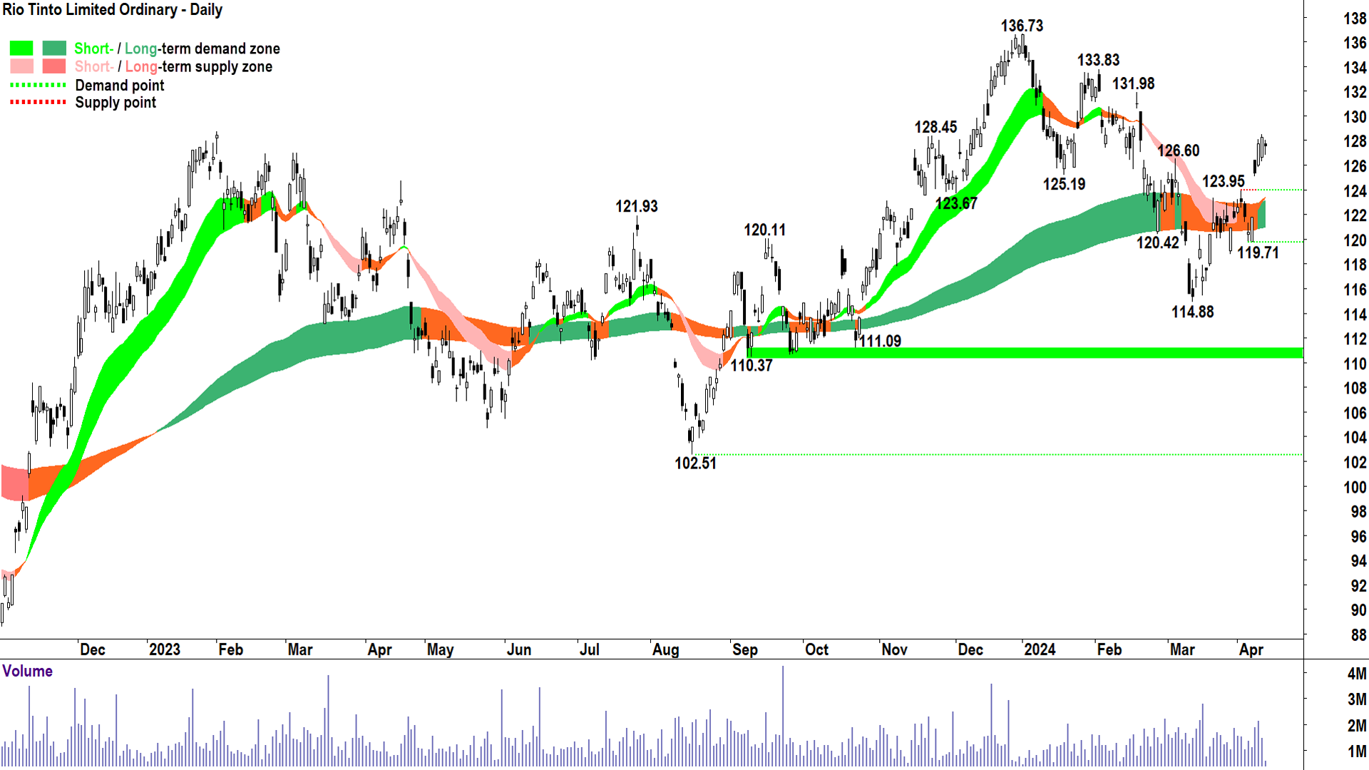
Key Demand / Supply: 3 Apr trough low @ 123.95 / 19 Feb peak high @ 131.98
Commentary: Rio’s technical picture looks decidedly better than main rival BHP’s. The long term uptrend has reestablished, the price action is more clearly above the long term uptrend ribbon, and at least since the last trough at 119.71, the candles are skewed more clearly to the demand-side.
There are a few points of supply to deal with, the closest being 131.98, and these could impede upside momentum in the short term.
123.95 is the nearest point of demand. The short and long term trend ribbons will also likely act as dynamic zones of demand.
As long as the price continues to close above 123.95 the short term uptrend remains intact.
Sandfire Resources (ASX: SFR)
.png)
ST/LT Trends: ⬆️/⬆️
Price action: 📈
Candles: ⬜
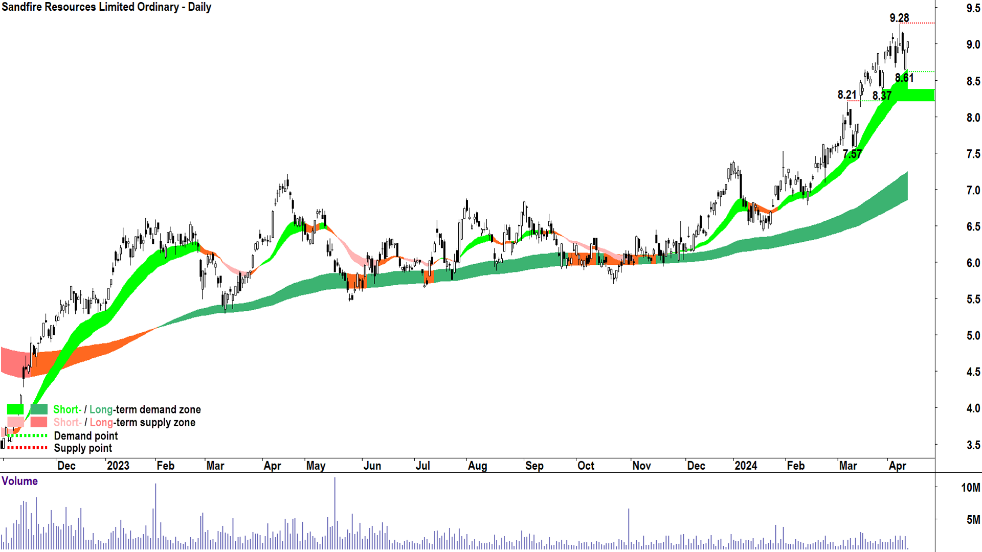
Key Demand / Supply: 11 Apr trough low @ 8.61 / 9 Apr peak high @ 9.28
Commentary: Clearly the strongest showing of demand-side control of any of the charts we’ve investigated so far. But, making Sandfire superior to the double uptrends seen in Alara and Rio, it’s all blue sky past the next point of supply.
Strong trends, yes, but the tiniest of criticisms in terms of the price action showing falling troughs as well as becoming quite overlapping recently. I also note a cluster of rather nasty supply-side candles between 3 and 10 April.
The comeback Thursday and today (so far) is impressive, and therefore is enough to allay any major concerns about the sustainability of demand-side control in this chart.
8.61 is the nearest point of demand.
As long as the price continues to close above the short term trend ribbon the short term trend remains intact.
South32 (ASX: S32)
.png)
ST/LT Trends: ⬆️/⬇️
Price action: 📈
Candles: ⬜
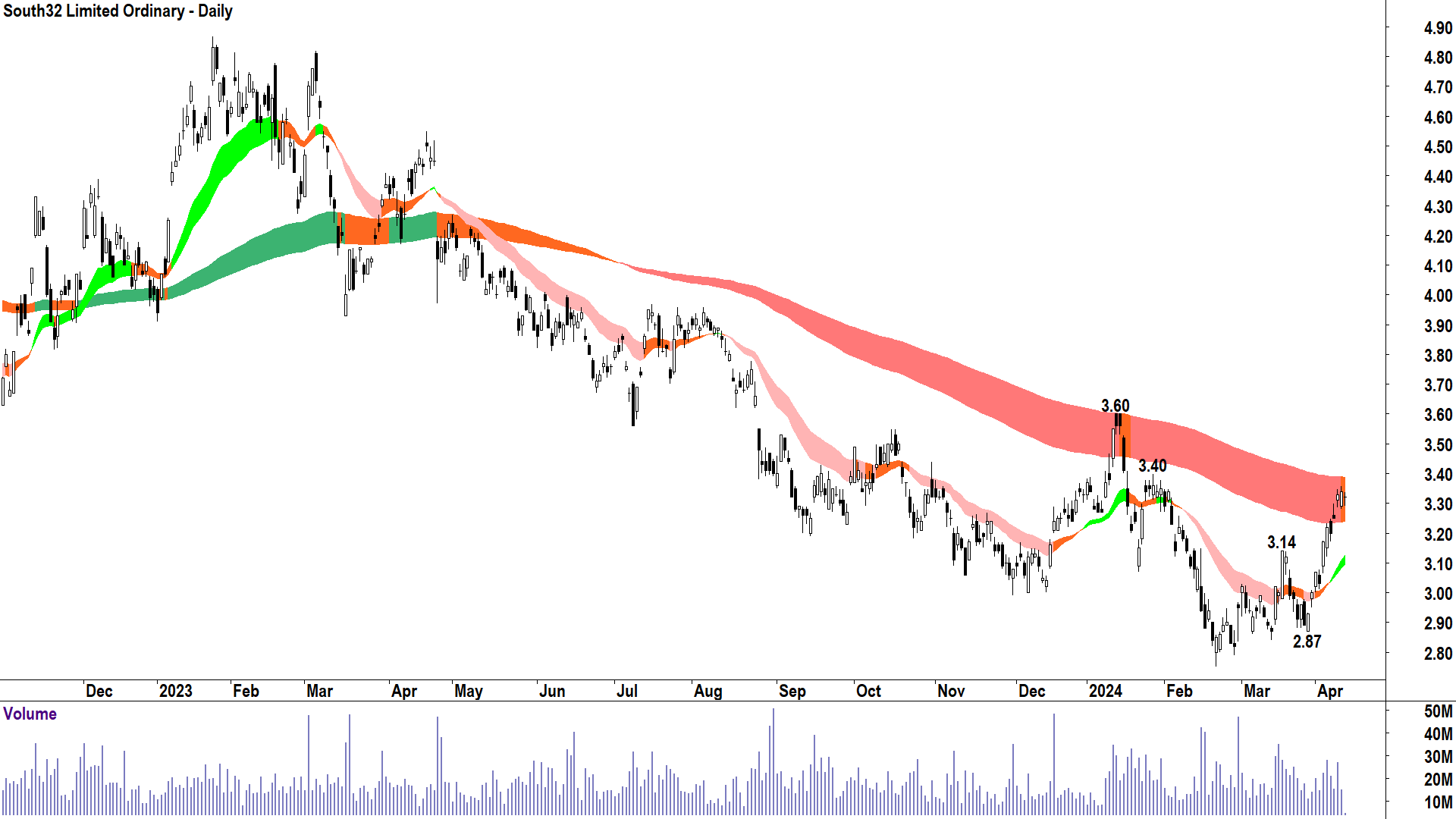
Key Demand / Supply: 18 Mar peak high @ 3.14 / 29 Jan peak high @ 3.40 then 12 Jan peak high @ 3.60
Commentary: It’s a toss up between this and 29Metals who have the least bullish set of technicals. I’m going to say, South32 is not the least, sorry 29Metals!
There’s quite a bit to like about South32’s technicals, actually, including a predominance of demand side candles and good price action.
The elephant in the room is literally an elephant sized long term downtrend ribbon. It has sat on many fledgling rallies in this long term downtrend, and until we close above it with decisive price action and candles, it should continue to be respected.
Interestingly, today’s candle so far is enough to turn the long term trend orange, and therefore neutral. We shall see!
The next key point of supply is 3.40 – it’s likely it’s impacting price action right now. Above this, 3.60 is likely to be a major point of supply.
The nearest point of demand is 3.14.
In conclusion, there’s plenty of work to be done to swing the South32 long term trend back to up, but in the meantime, as long as the price continues to close above the short term trend ribbon at least the short term trend remains intact.
Carl’s Technical Analysis Methodology Key
Trends (ST Trend ribbon: 21 & 34 EMAs || LT Trend ribbon: 144 & 233 EMAs)
⬆️ = Uptrend, the ribbon is rising indicating a higher probability the market is in a general state of excess demand
⬇️= Downtrend, the ribbon is declining indicating a higher probability the market is in a general state of excess supply
➡️ = No trend, the ribbon is flattening indicating a higher probability the market is in equilibrium
Price Action
📈 = Rising peaks and rising troughs indicating buy-the-dip activity and supply removal (i.e., indicating a higher probability market is in a general state of excess demand)
📉 = Falling peaks and falling troughs indicating sell the rally activity and demand removal (i.e., indicating a higher probability market is in a general state of excess supply)
⬅️➡️ = Neither of the above scenarios, market price action is indecisive
Candles
⬜ = Predominantly demand-side candles in the recent past, i.e., white bodies and or downward-pointing shadows (i.e., indicating a higher probability market is in a general state of excess demand)
⬛ = Predominantly supply-side candles in the recent past, i.e., black bodies and or upward-pointing shadows (i.e., indicating a higher probability market is in a general state of excess supply)
⬜⬛ = Mixed, i.e., indicating no discernible trend towards demand-side or supply-side candles in the recent past
This article first appeared on Market Index on Friday 12 April 2024.

5 topics
13 stocks mentioned
