China deflation, US stock market performance and falling energy prices in the Middle East
.png)
In this week's charts we take a fresh look at July's US stock market performance and consider the impact of London Tube and New York Subway usage on commercial real estate prices. We compare government bond yields for Spain, France, and Germany with the EU, and highlight concerns of possible deflation in China. Additionally, we examine the effects of falling energy prices on fiscal balances in the Middle East and Africa and highlight immigration trends in the UK. Finally, we assess the link between parliamentary terms and income growth from Blair to Sunak.
Decoding July performance patterns: analysing the US stock market (S&P 500)
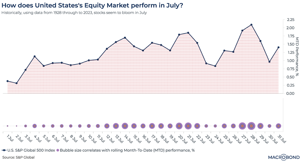
This chart analyses the performance of the US stock market (S&P 500) during the month of June. It uses data from 1928 to 2023 to show the average performance of the index up to a specific date within the month. For instance, the values on July 4th represent the average performance of the S&P 500 index up to that date for every July 4th from 1928 to 2023.
The chart consists of two sections. The first section is a simple line chart that illustrates the typical pattern of the US stock market. It shows that the market tends to have a strong start at the beginning of the month, levels off and slightly declines around two-thirds of the way in, and then rebounds towards the end. On average, by the end of July, the month-to-date performance of the market is 1.4%.
The second section is a unique bubble chart where the size of each bubble corresponds to the strength of the month-to-date performance figure. The bubble representing July 2nd, for example, has a month-to-date figure of 0.3% and is the smallest bubble. Conversely, the bubble representing July 28th has a month-to-date performance of 2.1% and is the largest bubble.
Recovery trends and real estate implications: London tube and New York subway usage
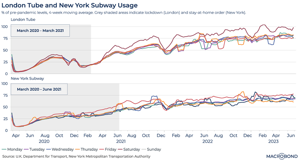
This chart looks at London Tube and New York Subway usage from 1st March 2020 through to 2023. It uses daily data to track passenger levels across each day of the week and expresses these levels as a percentage of pre-pandemic levels.
We can see that on average, both London and New York are seeing a gradual move back towards what was considered “normal”. London underground usage is around 80% of pre-pandemic levels, while New York City subway usage is around 70%. Could the rising trends in these charts bode well for a recovery over time in office, retail, and commercial real estate more broadly? Or will the “new normal” of reluctance to travel on Monday and Friday continue to weigh on these sectors?
Comparative analysis of government bond yields: Spain, France, Germany, and the EU
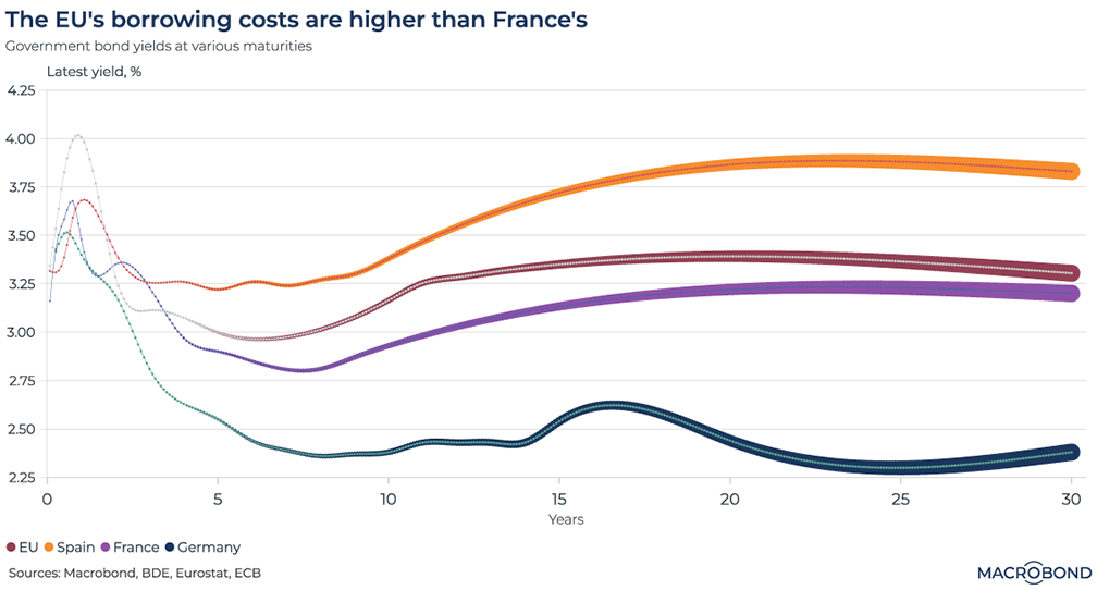
This chart uses Macrobond’s Yield Curve analysis to illustrate the full term structure of a selection of European countries’ government bonds. We chose Spain, France and Germany, and compared this to the EU.
The EU is paying more to borrow with its joint bonds than the bloc's leading members, denting the appeal of common issuance for those countries and emboldening opponents of fresh debt sales. During the global bond sell-off of the past year, the EU's borrowing costs rose more swiftly than those of many member states.
Today, they have risen above French borrowing costs, even though the EU's AAA credit rating outshines France's AA status. At shorter maturities, Brussels’ yields are even higher than those paid by Spain and Portugal - long considered among the bloc's riskier debt markets.
Deflation concerns in China: Unravelling the rapid decline in CPI
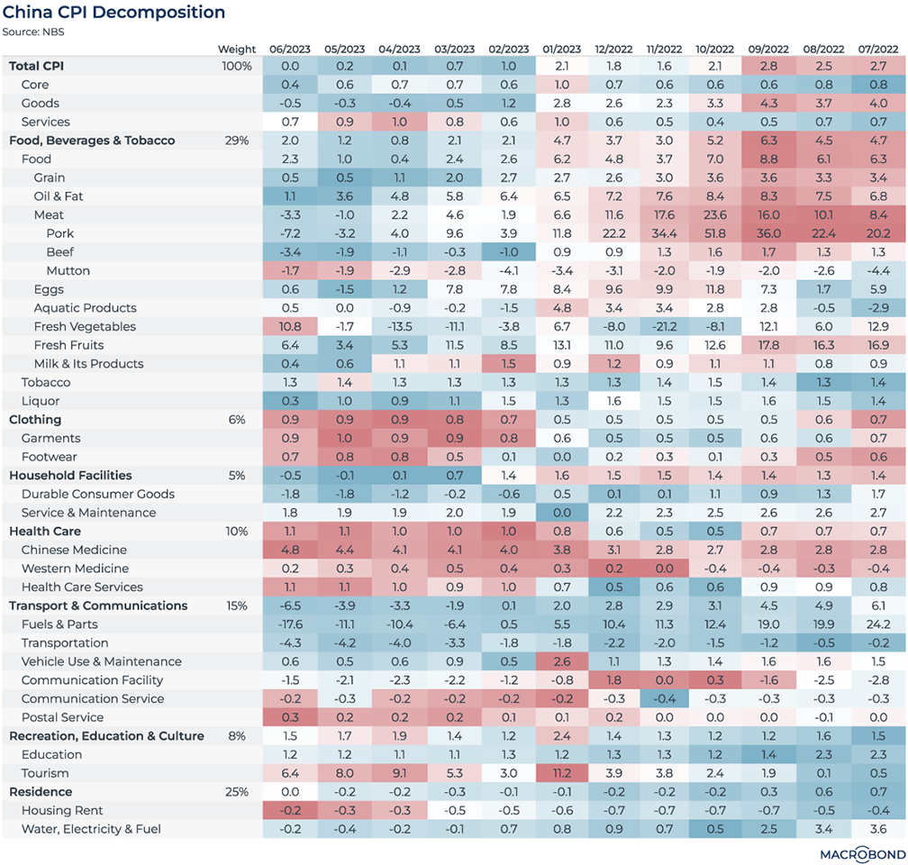
As the world is gratefully watching the apparent cooling of US inflation, the latest CPI numbers from China are potentially dropping too quickly, raising concerns about deflation in the world’s second-biggest economy.
In the heatmap above, we have decomposed the China CPI data, highlighting a rising trend in red and a slowing trend in blue. The latest headline CPI number dropped to 0% in June, but we can still observe a significant rise in Clothing and Tourism, which may have been boosted by China’s reopening. Worryingly, there are large areas of blue in Food and Energy, which sum up to 45% of the weight of the headline CPI. Specifically, pork and beef prices are cooling down significantly, as well as fuel and transportation.
Fiscal balance trends in emerging markets: Impact of falling energy prices in Middle East and Africa
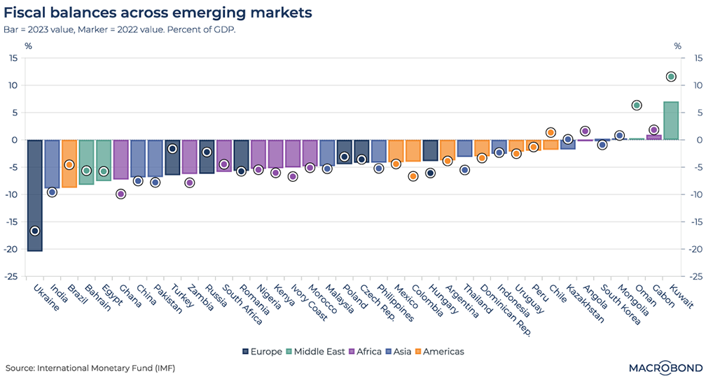
This chart looks at fiscal balances across a universe of emerging markets and expresses them as percentages of their respective GDPs. Bars represent the 2023 value, while markers represent the 2022 values. Countries are colour-coded by the region they belong to, as shown by the legend.
This colour coding helps shed light on some interesting broad trends across emerging markets. Firstly, we can see that nearly all Middle Eastern countries’ fiscal balances have worsened, perhaps as a result of falling energy prices. African countries seem to have improved their situations over the last year, possibly for the same reason?
Unveiling UK immigration trends: Shifts in EU and non-EU migration and labour shortages
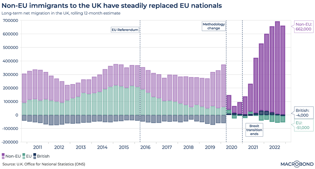
This chart examines UK immigration levels from 2010 to the end of 2022 using data on long-term migration. The figures are based on rolling 12-month estimates and are categorized into EU immigrants, Non-EU immigrants, and British. Over time, EU migration has gradually decreased while Non-EU immigration has increased, with a significant shift occurring after Brexit. Given overall immigration has actually increased, it is interesting that the UK suffers from acute labour shortages and the jury split on whether the pandemic or Brexit is to blame.
Exploring UK real income trends: Assessing the impact of parliamentary terms on income growth from Blair to Sunak
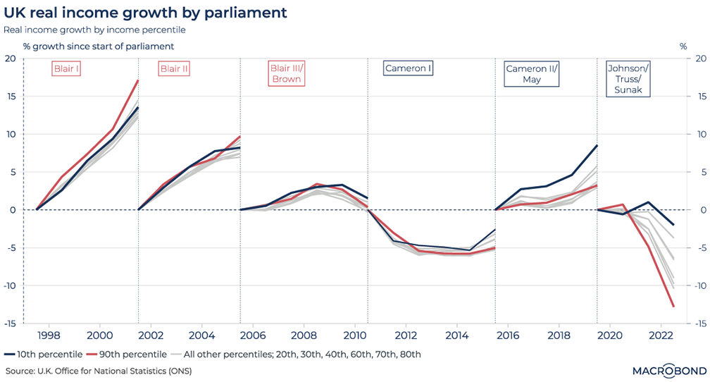
This chart looks at real income growth across percentile bands over the course of the last 6 parliaments in the UK. Starting from Blair’s landslide victory in 1997, through his second term (the kaleidoscope has been shaken), all the way to Sunak today, we look at how real incomes changed over the course of parliamentary terms. We highlight the 10th and 90th percentiles in midnight blue and crimson red respectively to display the divergence in real income growths. All other grey lines in between represent the other income percentile bands (20th, 30th, 40th, 60th, 80th). It's clear that UK income growth has been declining for some time but what could the culprits be? The GFC? Austerity? Brexit? The pandemic? Or perhaps it is the combination of them all...
4 topics
.png)
Macrobond delivers the world’s most extensive macroeconomic & financial data alongside the tools and technologies to quickly analyse, visualise and share insights – from a single integrated platform. Our application is a single source of truth for...
Expertise
.png)
Macrobond delivers the world’s most extensive macroeconomic & financial data alongside the tools and technologies to quickly analyse, visualise and share insights – from a single integrated platform. Our application is a single source of truth for...
.png)