Daily data on China, UK borrowing plans and record bond short bets
.png)
This week’s charts begin with a look at a daily time series for the Chinese economy, suggesting an upturn is underway. In the UK, we visualise month-by-month borrowing under Jeremy Hunt’s stewardship of the public finances. Turning to US debt, we show the record short position that has emerged for Treasuries as hedge funds pile into an arbitrage trade. In Europe, we examine the strong Swiss franc and cooling eurozone inflation. Finally, we demonstrate how the global balance of hiking and cutting central banks is shifting again, and show how a measure of geopolitical risk is reflecting the conflict in Gaza.
An innovative daily data series that’s pointing up for China’s economy
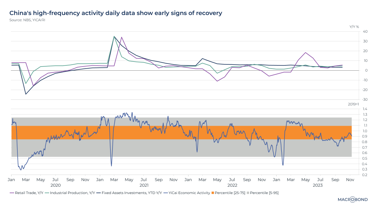
We’ve been posting charts pointing to a nascent recovery in China. Here’s another: the high-frequency YiCai Economic Activity Index.
This indicator, which is updated daily, is an innovative amalgamation of data: it tracks traffic congestion, air pollution, a commercial housing sales index, and unemployment and bankruptcy indices based on internet searches.
This chart compares YiCai’s track record (in the lower pane) to growth rates for three conventional economic indicators in the top pane: retail sales, industrial production and fixed asset investment. (All three of these macro data figures will be released on Nov. 15.)
The YiCai index has been creeping higher lately. Will it once again prove to be a key leading indicator, as it was through the strong rebound of 2020-21 and the disappointments of 2022?
UK government borrowing in context
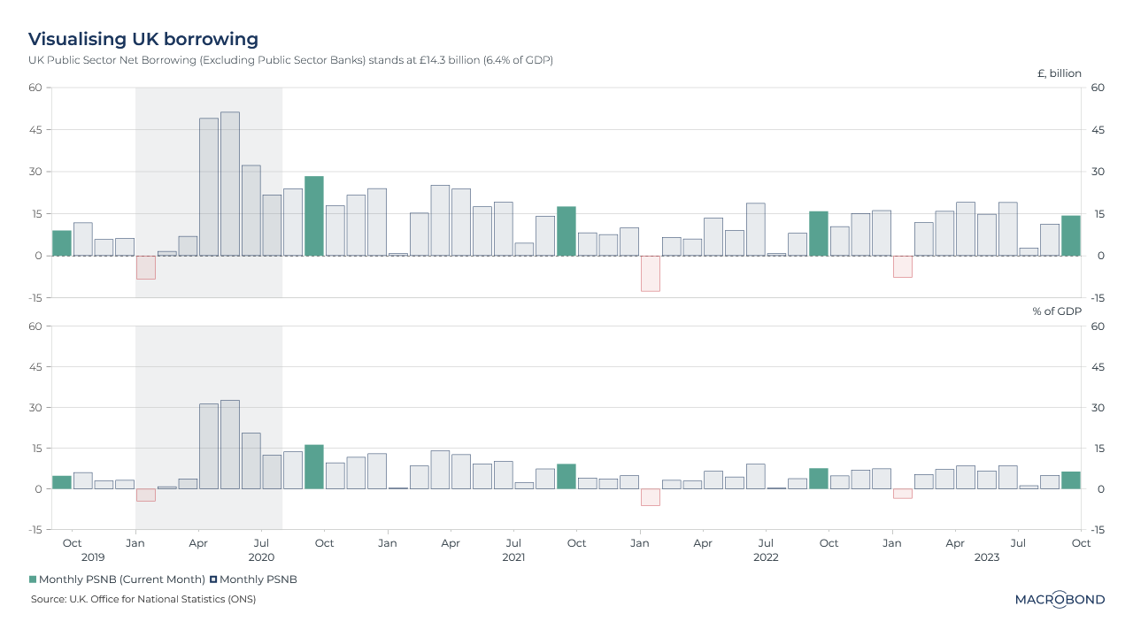
It’s been a year since the debacle of the Truss-Kwarteng “mini-budget” that would have seen Britain run massive deficits to fund tax cuts. By contrast, the Sunak-Hunt era has seen a quiet continuity of fiscal orthodoxy, as our chart demonstrates.
Chancellor of the Exchequer Jeremy Hunt, worried about higher borrowing costs, has fended off pressure for tax cuts. He also presided over a healthier-than-expected turn in the public finances as the UK economy defied some of the gloomier predictions of 2022.
This double-paned visualisation tracks the UK’s public sector net borrowing (excluding public sector banks) month by month – both in absolute terms and as a percentage of gross domestic product (GDP).
The blowout borrowing of the pandemic era is highlighted in gray. Today, borrowing is roughly in line with the pre-pandemic era, at least in percentage-of-GDP terms.
This week’s King’s Speech suggested there will be more of the same. The government will “support the Bank of England to return inflation to target by taking responsible decisions on spending and borrowing,” the monarch told Parliament.
The record short Treasury bets that have regulators worried
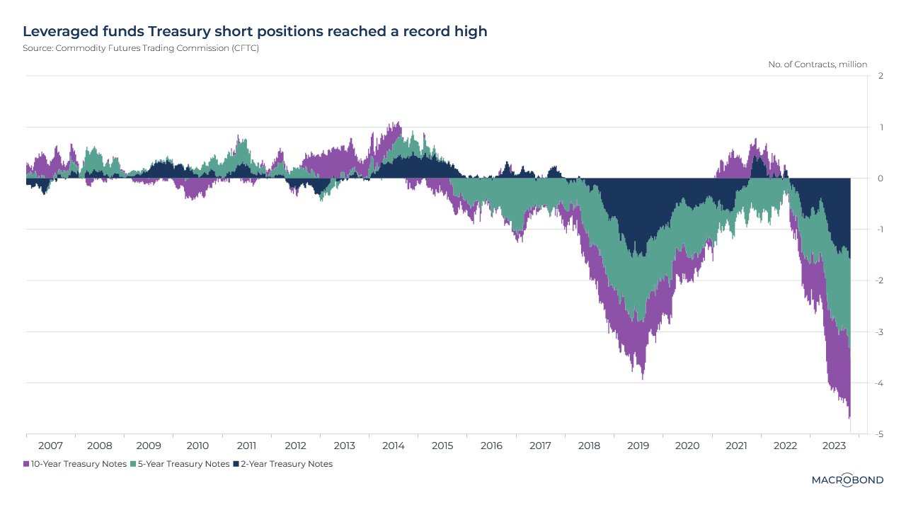
Hedge funds are making a record bet against US Treasuries.
This chart uses data from the Commodity Futures Trading Commission to compile net long and short positions in US government debt. There are large short positions against two-, five- and ten-year securities.
While there will be some “fundamental” positioning betting Treasuries have further to fall amid sticky inflation and “higher for longer” Fed rates, most of the short bet is attributed to the “basis trade” – an arbitrage of price differences between cash bonds and futures. Hedge funds borrow a lot of money for such trades – hence the “leveraged funds” referred to in the chart title.
The size of the bet reportedly has regulators worried about financial stability risks – especially since yields fell in the first week of November (which some observers say was short-covering of that very same bet, as well as the result of optimism about a “soft landing” for the economy). Notably, the well-known hedge-fund manager Bill Ackman recently exited his own short bet against 30-year Treasuries, saying the trade (and the world) had become too risky.
Europe’s cooling inflation heatmap might show why Lagarde paused
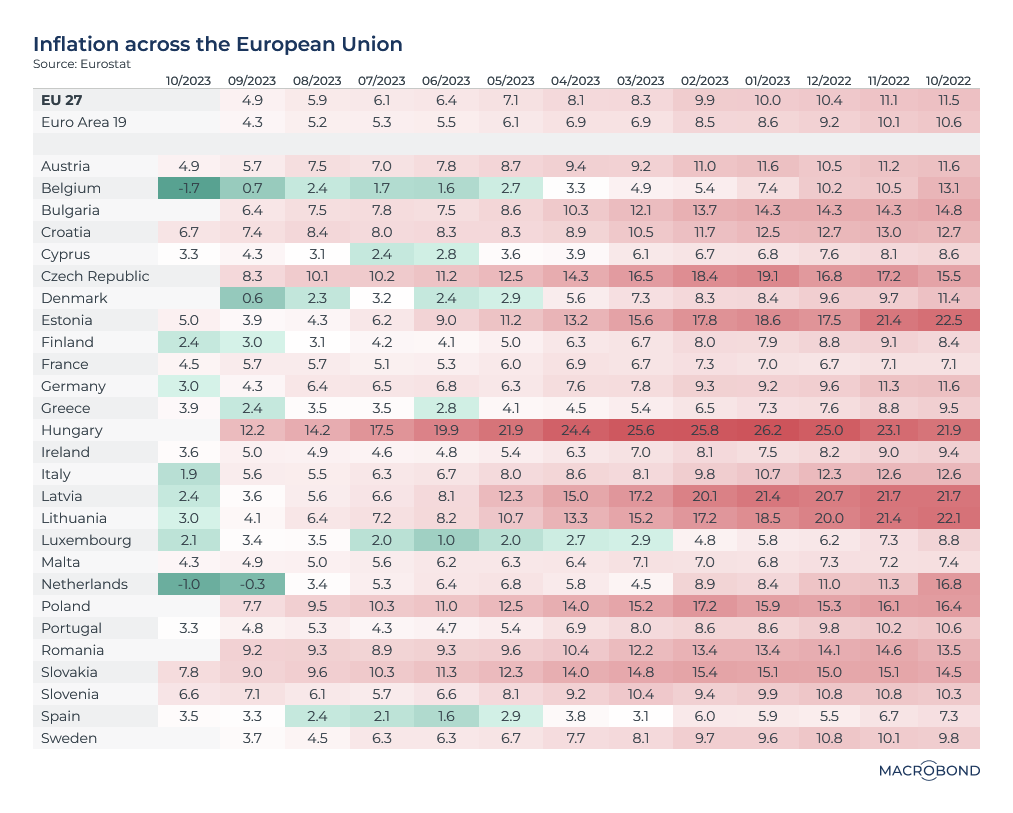
This visualisation revisits one of our favourite themes: an inflation heatmap. Less than a year ago, eurozone inflation was broadly advancing across sectors and geographies.
Today, the harmonised index of consumer prices (HICP) measure of inflation is slowing in almost every country in the currency region – and it has even turned negative in the Netherlands and Belgium.
Will inflation keep cooling off? That’s “certainly our forecast,” European Central Bank President Christine Lagarde recently said after she hit the pause button on rate hikes.
An analysis showing the strong Swiss franc is overvalued
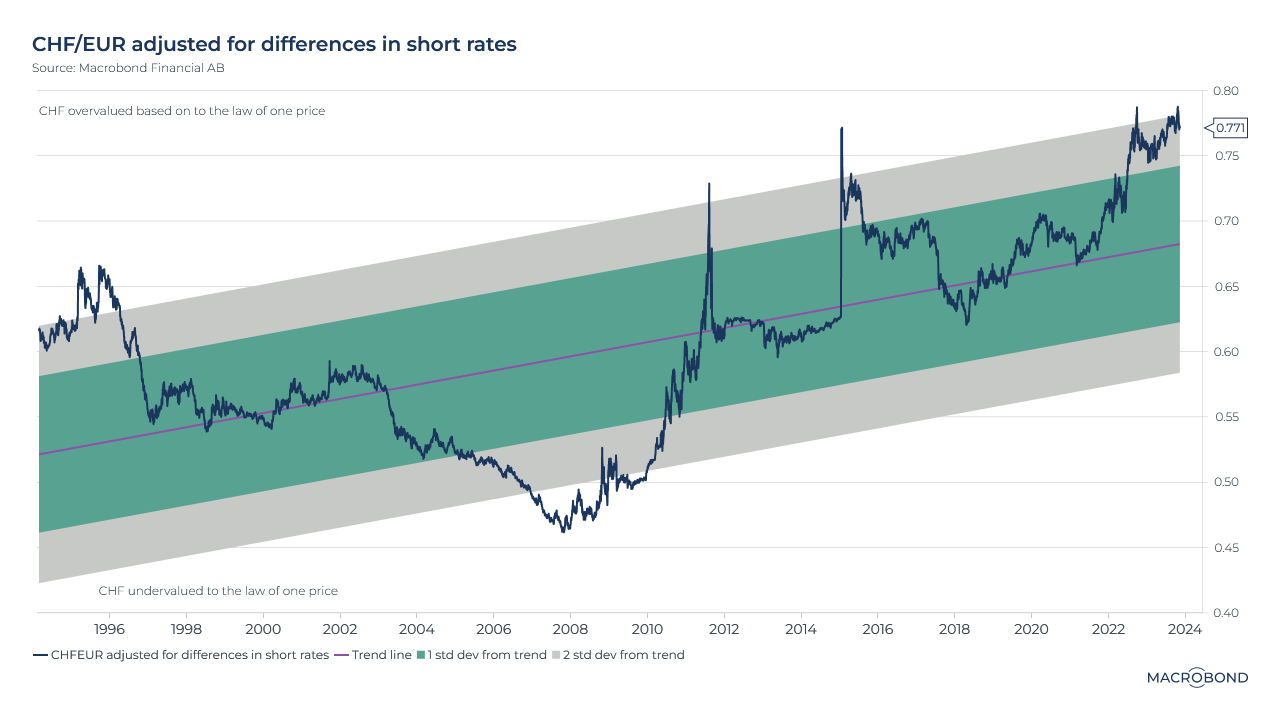
This chart can be applied to different countries using Macrobond’s change region functionality.
The Swiss franc has been the strongest performer among the G10 currencies this year. Observers are attributing this to the franc’s safe-haven appeal at a time of geopolitical stress, as well as the central bank’s vow to support the currency if necessary to reduce inflation.
This chart models the franc over the long term, aiming to identify periods of overvaluation and undervaluation based on economic theory including the “law of one price” and interest-rate parity*. The blue line tracks the CHF/EUR rate but multiplies it by the spread in short-term interest rates, and then generates a trend line. (If the Swiss are offering a higher interest rate versus the ECB, the franc is expected to appreciate versus the euro, and vice versa.)
We’re in a period of overvaluation versus the euro by this metric, two standard deviations away from the trend. The franc hasn’t been substantially undervalued under this analysis in more than a decade.
*An academic paper discussing these theories can be found here.
Rate-cutting central banks are returning
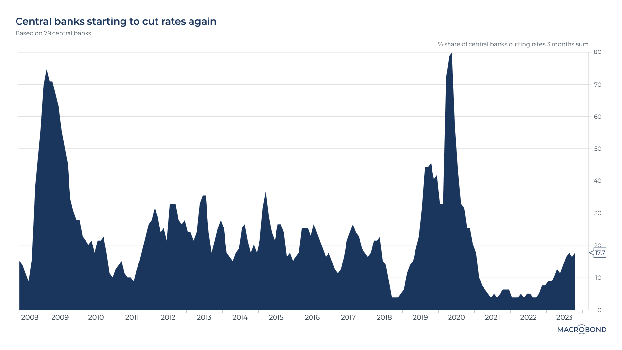
We can’t really say we’re in a globally synchronised hiking cycle anymore. As our chart shows, almost one-fifth of the 79 central banks we track are now cutting rates.
Last week, Brazil's central bank lowered its key policy rate, joining its counterparts in Peru, Costa Rica, Poland, Chile and Hungary.
Emerging markets were some of the leaders in hiking rates to control inflation, and they’ve similarly taken leadership in a cutting cycle.
Our geopolitical risk index is spiking again
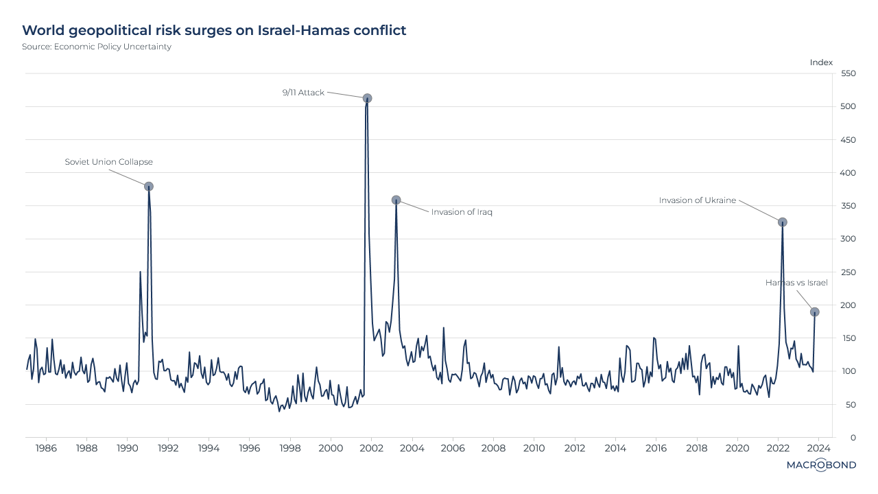
This chart can be applied to different countries using Macrobond’s change region functionality.
As the conflict between Israel and Hamas enters its second month, and Iranian proxies attack both Israel and American targets, we’re revisiting this geopolitical risk index from Economic Policy Uncertainty.
This academic group creates indices relating to policy challenges ranging from infectious diseases to wars, tracking newspaper archives going back decades.
The situation in Gaza has driven the risk index sharply higher, but it remains well below the shock of Russia’s invasion of Ukraine in early 2022.
3 topics
.png)
Macrobond delivers the world’s most extensive macroeconomic & financial data alongside the tools and technologies to quickly analyse, visualise and share insights – from a single integrated platform. Our application is a single source of truth for...
Expertise
.png)
Macrobond delivers the world’s most extensive macroeconomic & financial data alongside the tools and technologies to quickly analyse, visualise and share insights – from a single integrated platform. Our application is a single source of truth for...
.png)