How Trump’s win has impacted markets in 10 incredible charts
It appears the US election result surprised at least 49% of the US population, but it also appears to have been a major surprise for many parts of the world’s financial markets. Perhaps the biggest surprise was that President-elect Donald Trump’s win would be so emphatic, with Republicans now looking very likely to control both chambers of US Congress.
Whilst stopping short of a filibuster-proof two-thirds majority in the Senate (anti filibuster provisions allow legislation in the US Senate to pass despite any procedural hurdles the other side may throw at it) - Trump will likely have a strong platform to implement his agenda.
A Trump-Republican controlled Congress was widely seen as the most bullish outcome for stock markets, as policies flagged by Trump before the election were seen as the most beneficial for US economic growth. Certainly, the massive gains in US stocks we’ve seen in the last 24 hours appear to reflect this.
However, the outcome doesn’t necessarily benefit all financial instruments and all financial markets around the world. Many markets, indeed potentially economies, stand to come out big losers from events likely to unfold in Washington over the next four years.
Some would argue that when it comes to markets, talk is cheap – it’s what the money does that matters. So, rather than provide you with a 5,000-word essay on the intricacies of how a Trump win will impact various parts of the global financial markets, let’s instead see what the money did in the last 24 hours. In pictures – in charts.
Here are the 10 most incredible charts in financial markets from the last 24 hours:
Charts 1, 2, & 3: US stocks are big Trump winners 🏆
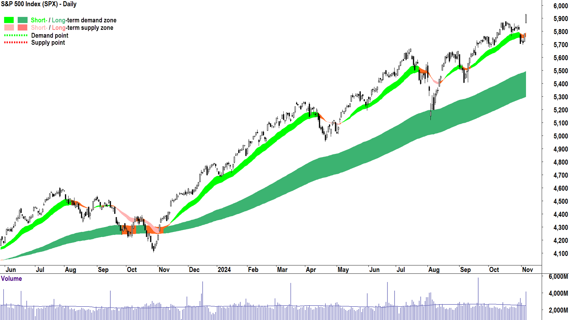
Note, I will use charts displaying my technical model in this article. For more details on how my technical model works, please read this Technical Analysis and ChartWatch Primer.
The benchmark US stock index, that is, the most widely referenced by financial professionals and the media, is the Standard and Poor’s 500 (“S&P 500”). The S&P 500 contains 500 of America’s largest stocks by market capitalisation (i.e., the value of all their outstanding shares).
It’s clear from the chart above that investors believe US stocks are likely to benefit from a Trump-Republican win, or a “Red Sweep” as it has been more commonly referred to.
The S&P 500 “gapped” higher on Wednesday (i.e., there is a difference between the candle’s low and the preceding candle’s high), and then continued to rise to close very near its high of the session. This is called a “gap and run” in technical analysis parlance, and it’s considered to be indicative of very strong excess demand in a market.
Basically, there was a great deal of cash seeking stock, but stockholders (i.e., the “supply side”) were reluctant to part with their shares unless compensated by higher prices. Cash holders (i.e. the “demand side”) were only too eager to pay those higher prices.
A gap represents a sudden and substantial increase in the market’s perception of S&P 500 earnings in the future, but also likely how investors are choosing to value those earnings.
When markets are fearful, they tend to be more conservative in how they discount (i.e., punitively mark down) uncertain future earnings. This is often called a “risk-off” market. Markets on Wednesday swung decidedly “risk-on”.
Finally, consider the substantially elevated volume on Wednesday. It represents a wall of cash seeking shares in S&P 500 stocks. There were just as many sellers happy to part with their shares too – that’s how volume works – it represents each share bought and sold. But when we consider the elevated volume with the price action (i.e., the gap and run), it suggests the supply side was in retreat, and it must also correspond with a great deal of supply removal.
This means many previous stockholders who were incapable of perceiving higher prices are now sitting on a pile of cash – in a rising market – when sentiment is very bullish. In these scenarios, that cash often simply equates to a pool of latent demand (as these investors begin to regret their decision to sell), and this is generally supportive of higher prices.
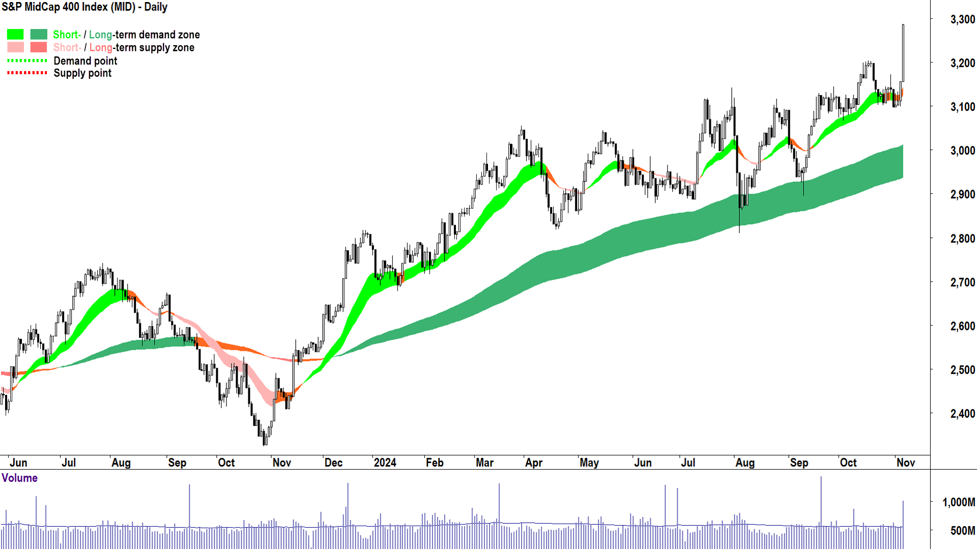
A Red Sweep is anticipated to boost US economic growth and, therefore, US corporate profits, but not all companies are expected to share in these profits in the same way. The S&P 500 is dominated by massive multinational corporations that, in many cases, earn a large portion of their profits from ex-US operations. This is less likely to be the case the smaller down the market capitalisation scale you go.
For this reason the S&P MidCap 400, and the next chart, the Russell 2000, deserve places in my Top 10 list today. The S&P 500 rose an impressive 2.53% on Wednesday, but the MidCap 400 popped 4.2%. As I intimated at the start of this article: Follow the money! 💰
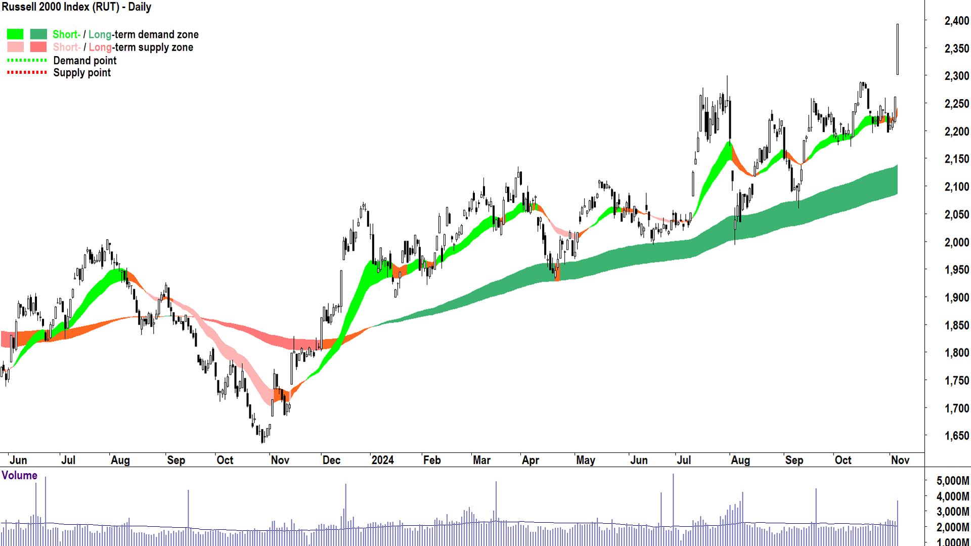
The Russell 2000 contains 2,000 smaller capitalisation US stocks making it a proxy for the heart of corporate America. This is the base likely to benefit the most from a newly elected President Trump’s “Make America great again” mantra. The Russell 2000 gained an impressive 5.8% on Wednesday – more than any other major US stock index.
Putting aside Wednesday’s heroics, I’ll leave US stocks here with the observation that a bull market in US stocks was very much in place prior to the events of 6 November. Moving forward, I suggest you continue to monitor my trend ribbons – presently both indicating short and long term excess demand – as well as price action (I prefer rising peaks and rising troughs) and candles (I prefer a predominance of demand-side candles).
It's also important that the prices of the three indices mentioned above continue to trade above their respective short and long term uptrend ribbons. If any of these factors change (i.e., trend, price action, candles, and dynamic demand), then the bull market in US stocks may be losing momentum.
Note that I regularly update the charts on US stock indices in the ChartWatch section of the Market Index daily Evening Wrap.
Chart 4: Bring on Bitcoin 🏆
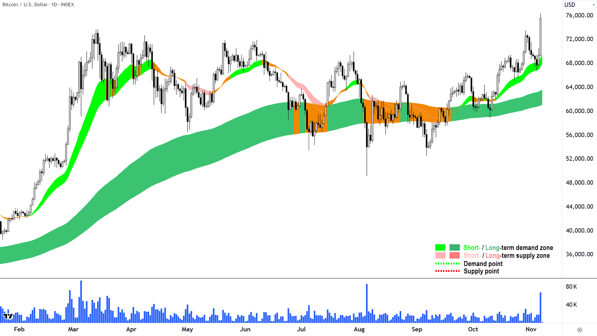
President-elect Trump has taken a well-publicised pro-Bitcoin-pro-crypto stance in the lead-up to the presidential election and his win is very likely to give Bitcoin greater prominence going forward.
Wednesday’s long white candle and high close suggests a strong demand side response to news of the Red Sweep. As with US stocks, the gain occurs in a general bull market for Bitcoin as evidenced by the rising long term uptrend ribbon.
Significantly above-average volume also indicates a great deal of interest and and a great deal of supply removal – both are consistent with continued demand-side control.
The key positive for me in this chart (apart from the accompanying strong short term uptrend, good price action and predominance of demand-side candles), is that Wednesday’s candle closed above the top of the well-defined trading range that was capped by the 14 March high of 73,758.
If one zooms out to the weekly chart (not shown), one will see that Bitcoin is now trading at all-time highs and without any clear static points of supply to contend with. In these scenarios, I defer to major round numbers as potential short and long term upside targets. For me, this puts 80,000 and then 100,000 as the most likely next key points of potential supply.
Chart 5: All hail King Dollar 🏆
%20chart%206%20November%202024.png)
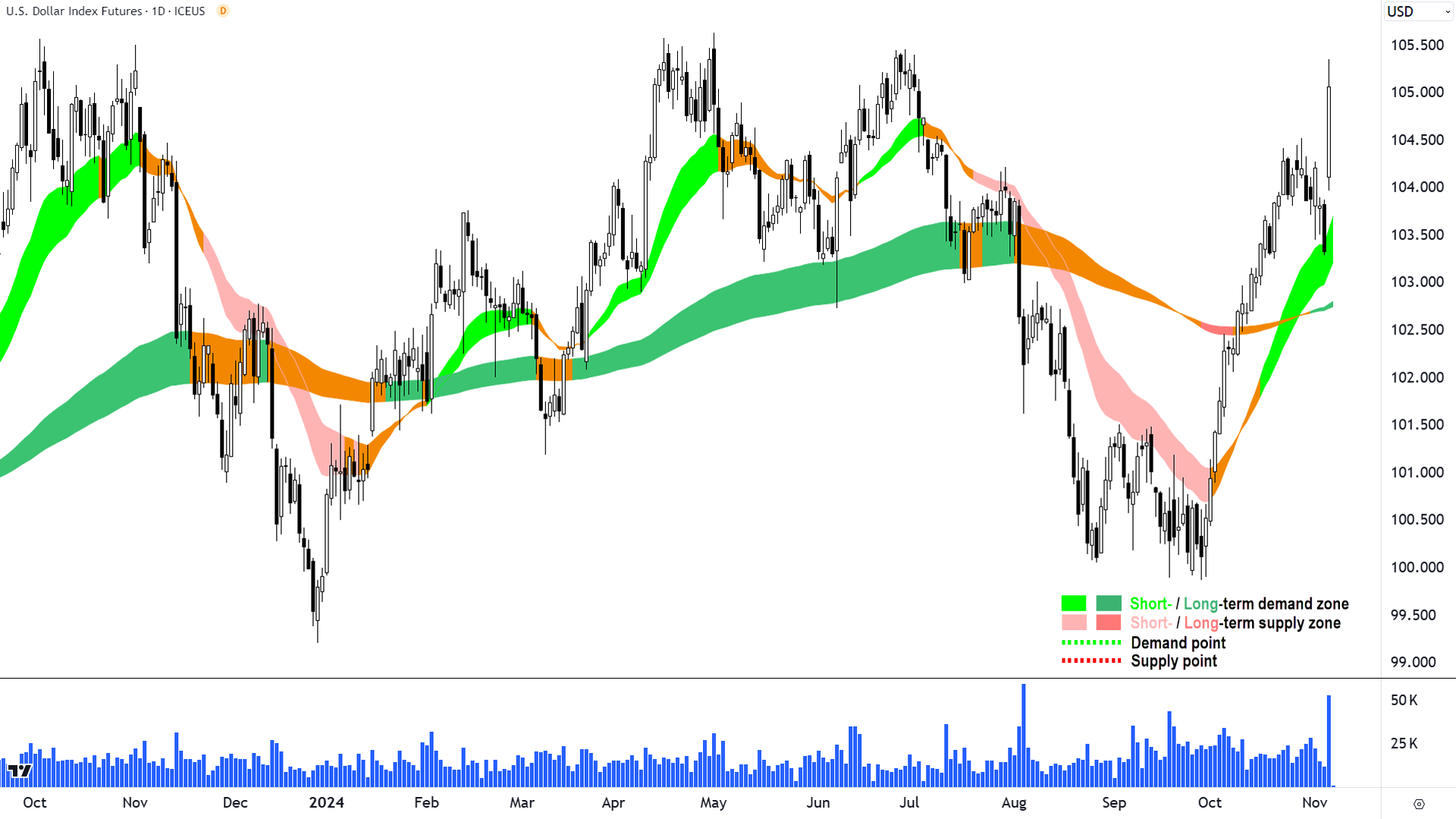
The most logical winner from a perceived impending resurgence of the US economy is the US dollar. If you’re an international fund manager, and you want a piece of the “Trump trade”, you better get your hands on some greenbacks to buy into assets leveraged to US economic growth.
The US dollar index (DXY) compares the performance of the US dollar against a basket of foreign currencies. If the chart above is rising, it means the US dollar is generally appreciating against other global currencies, and vice-versa.
The DXY is also showing a gap and run, commensurate with the stock indices charts where it's quite likely many of the greenbacks being purchased are heading. I also note a strong short term uptrend heading into the election, but more broadly, a relatively flat long term trend compared to the charts we’ve seen so far.
This is because the DXY has been trading in a range between 99.20 and 105.56 for over a year. If one zooms out to the weekly chart (not shown), one will see that the DXY can close above 105.56 it will be trading at 2-year highs and with little overhead static supply points until the September 2022 major peak of 111.80.
A stronger US dollar will benefit those companies that earn a portion of their profits in US dollars – particularly if their local currency weakens against the US dollar. On the ASX, this includes companies like Life360 (ASX: 360), Aristocrat Leisure (ASX: ALL), Resmed Inc (ASX: RMD), Block (ASX: SQ2), and News Corporation (ASX: NWS) – each regulars in my ChartWatch Daily Scans Uptrends lists.
Chart 6: Bond market Trumped! 📉
Those were the Top 5 winners from Trump’s election success. The next 5 were the biggest losers over the last 24 hours, and quite possibly could continue to be so moving forward too.
First up is the bond market. Bonds are a fixed interest asset. If interest rates are expected to rise, the fixed yield on a particular bond doesn’t look as attractive. This means investors will generally want to pay less for that bond, likely causing the bond’s price to decline. As a bond’s price declines, its yield to a new owner therefore increases.
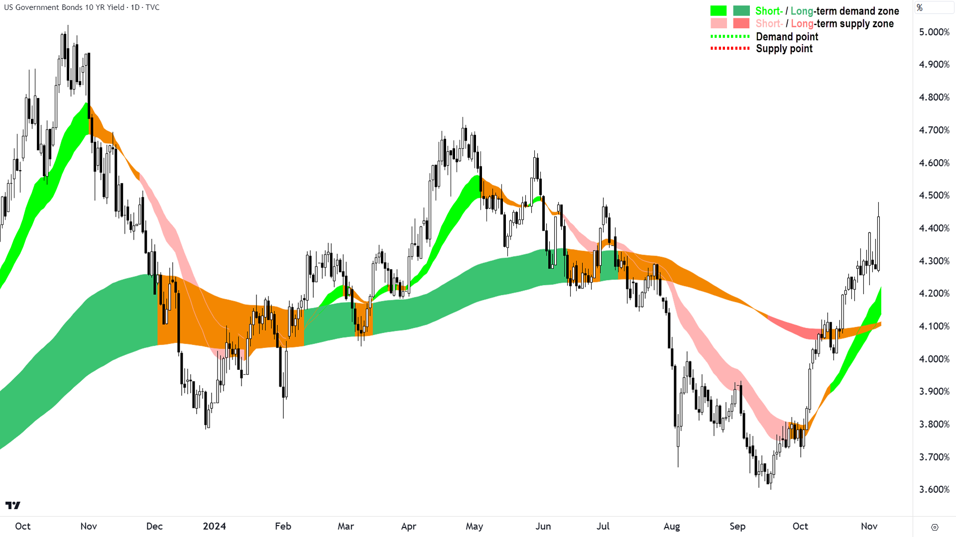
The chart above shows the yield for US 10-year Treasury Bonds or “T-Bonds”. We can see that yields have spiked in the wake of the election result, meaning that bond prices have fallen.
Investors have been selling their bonds in anticipation that President-elect Trump’s expansionary fiscal policies will lead to stronger growth in the US economy and less need for the US Federal Reserve to cut interest rates.
Bond yields rose 0.16% or 16 basis points (“bp”) on Wednesday – which doesn’t sound like very much – but it is, in fact, massively substantial when one considers the Fed usually deals in increments or decrements of 25bp. Markets effectively applied more than half a typical interest rate hike upon Trump’s win.
This will have ramifications for mortgage holders, whose interest repayments are pegged to longer duration T-Bonds, as well as a potentially negative impact company profits via higher borrowing costs. It also increases the discount rate that analysts punitively discount future company earnings.
Overall, higher bond yields are usually considered a bearish factor for the stock market.
For now, rising bond yields aren’t hurting the stock market because they are associated with greater economic growth. However, there is a chance that this chart will be viewed far more negatively soon – particularly if the Federal Reserve begins to dial back its recently begun interest rate cutting cycle.
Chart 7: Gold loses its lustre 📉
%20COMEX%20chart%206%20November%202024.png)
Gold is the age-old hedge against uncertainty and it potentially has the most to gain or lose following the resolution of such a major global risk event. This potentially explains why it underperformed over the last 24 hours – in many ways, a Red Sweep is the worst of the possible election outcomes for gold.
Firstly, a Red Sweep outcome removes a great deal of uncertainty in terms of the new US government’s policy agenda and the ability to implement it. Secondly, as noted above, this scenario is bullish for the US dollar and at the same time supportive of bond yields – both acutely bearish for gold.
On the last point, note that gold is typically benchmarked in US dollars, so all things being equal, a stronger US dollar generally translates into a weaker gold price. Also note, gold does not have a yield, so there is an opportunity cost to holding it. The higher the prevailing risk-free yield (i.e., the T-Bond yield), the greater the opportunity cost of holding gold.
The only positive for gold in all of this, and it may help gold resume its previous strong short and long term uptrends – is that a Red Sweep increases the likelihood of a bigger US deficit. Also, should a major tariff war break out because of Trump’s anti-imports policy stance, it may create greater uncertainty down the track. Both factors support the acceleration of prevailing de-dollarisation trends.
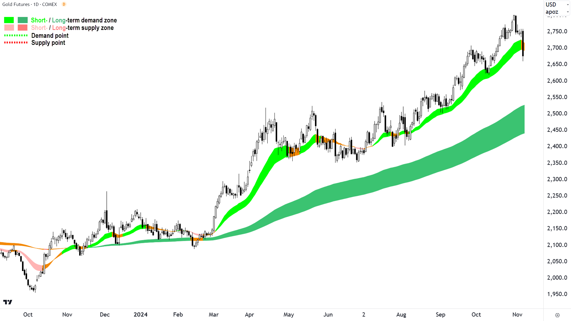
Again, I cover gold regularly in my Evening Wraps, but for now, note that the gold chart has suffered a major setback here. The long black candle on Wednesday is indicative of an influx of excess supply.
The price has closed below the short term trend ribbon, and the ribbon has transitioned to neutral. The long term uptrend remains intact and robust, however.
I’ll be watching closely at how the gold price responds at the recent 2618 point of demand. A strong demand-side response there or earlier would be positive for gold, but only a quick resumption of demand-side candles and price action will stave off a more likely “sideways at best for some time ” scenario here.
Chart 8, 9 & 10: China tariff terror! 📉
%20COMEX%20chart%206%20November%202024.png)
Clearly, the biggest losers from President-elect Trump’s big win are commodities consumed in large quantities by China and, by extension, those companies focussed on supplying them.
In a speech at a rally in Michigan last Thursday, President-elect Trump said China could face tariffs of up to 200% on its auto industry. Tariffs on other Chinese industries of around 60% have also been flagged.
China is a major consumer of raw materials, the most important for Australian commodity producers being iron ore (chart below), copper (chart above) and many others not shown in charts here (the prices of nickel, lead, tin, zinc, coal, oil, lithium, and other major Australian commodity exports have also fallen sharply in the last 24-hours).
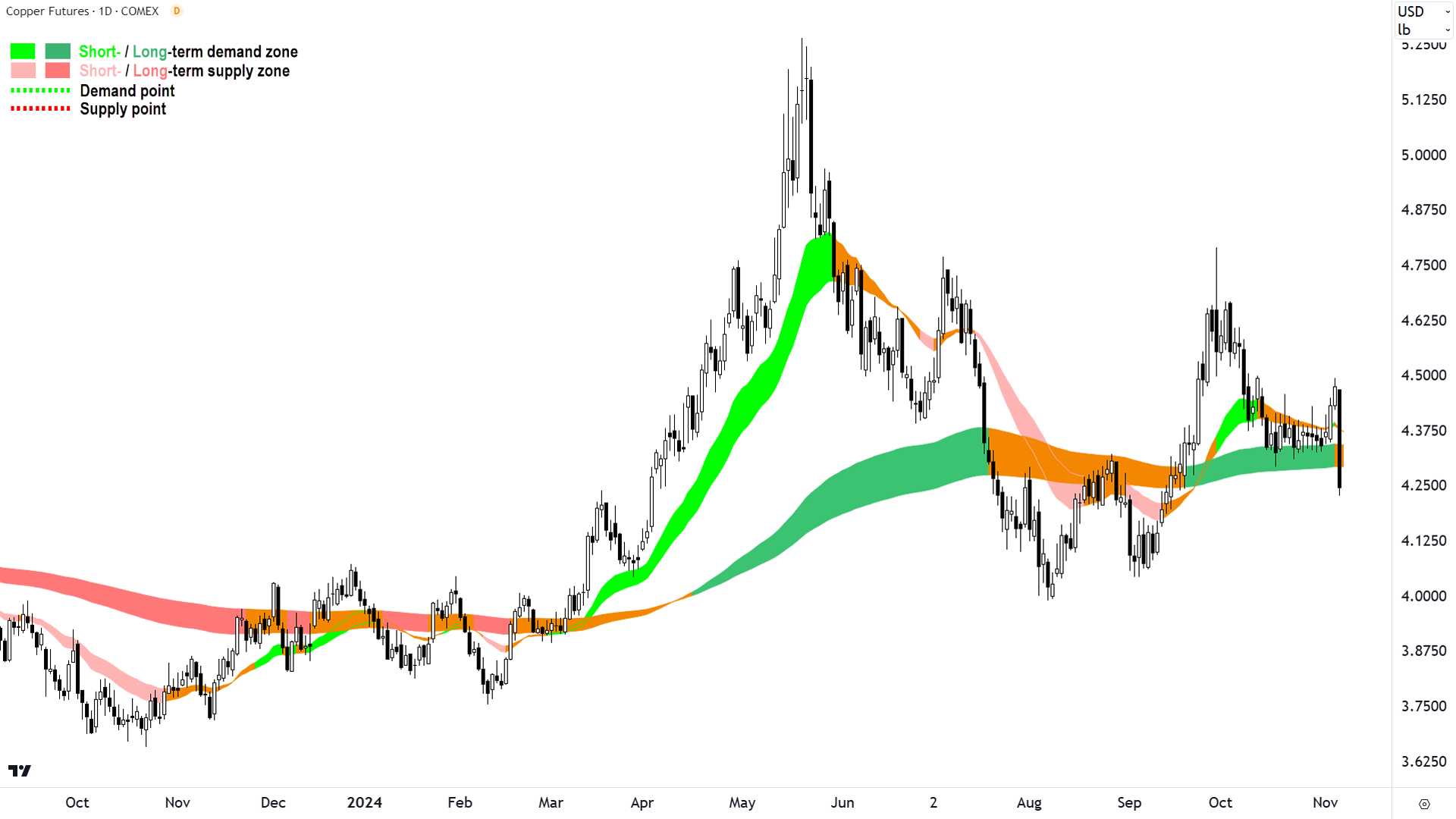
The chart of high-grade copper futures above shows a massive black candle with low close wiping out what was a promising rally from the long term uptrend ribbon. The close below the long term trend ribbon and also below the 4.29 October low has neutralised both short and long term trends.
The 5 November peak of 4.493 now stands as a critical point of supply. The copper price must at least reclaim this point to resume its long term uptrend. More likely now, is the probing of lower points of demand, for example, the 4 September trough at 4.043.
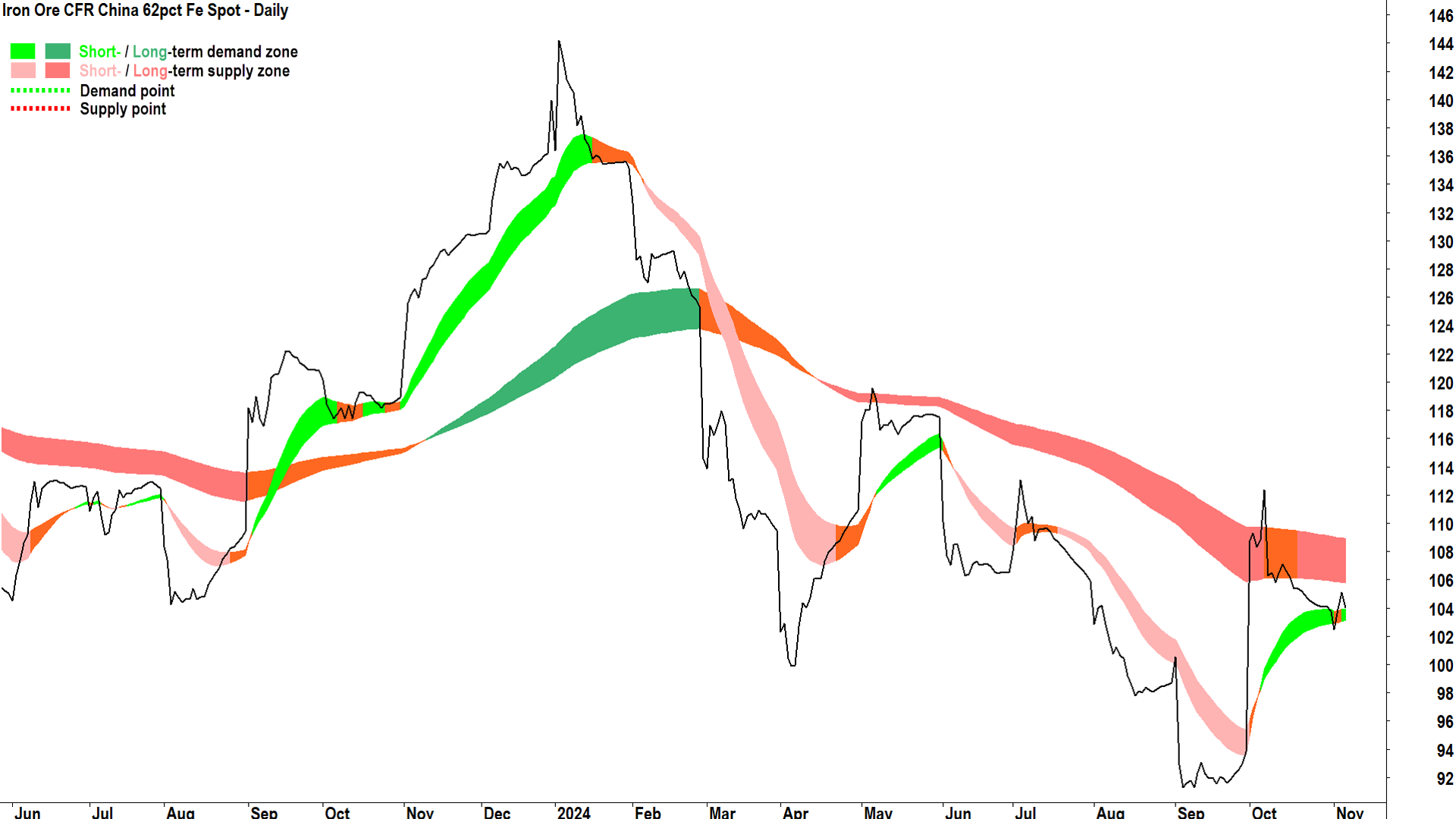
So far, we’ve only seen a modest dip in the iron ore price after the US election results – but short and long term trends were hardly inspiring here beforehand.
I note the short term trend here is still up, though, and as long as the price remains above the short term uptrend ribbon this will continue to be the case.
Given the long term downtrend, the broader path of least resistance remains to the downside for iron ore, with only a close above the 7 October peak of 112.39 likely to change this.
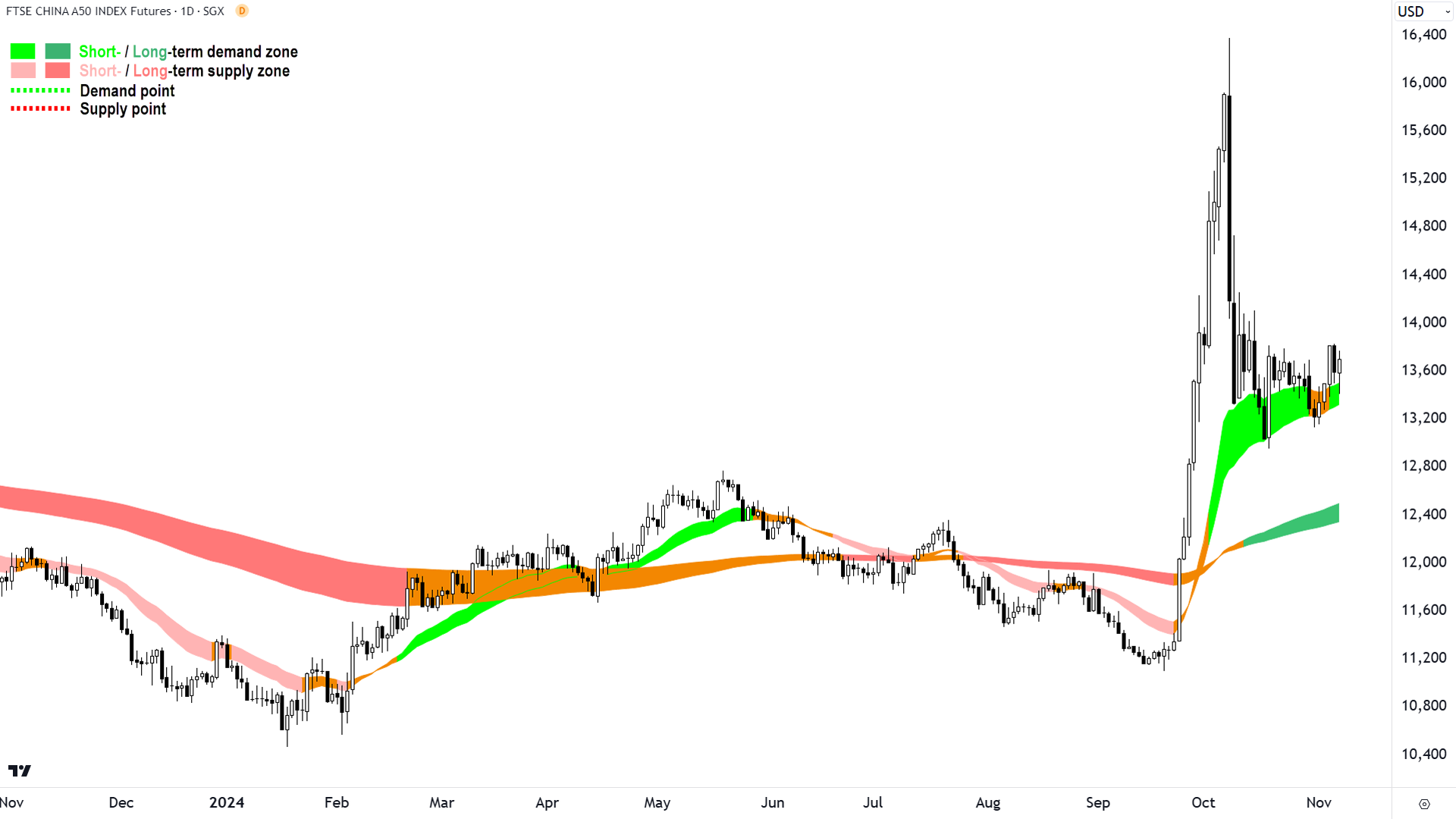
There’s plenty of talk about the impact on Chinese exporters and, more broadly, on the Chinese economy, but so far, the impact on the Chinese stock market has been relatively muted compared to some of the other moves we’ve reviewed here.
China A Shares did dip on Wednesday as news of President-elect Trump’s success reverberated through Asia, but it’s rallying back in Thursday trade. This suggests investors don’t appear to be too fussed about the potential impact of President-elect Trump’s tariffs. At least, not yet!
From a technical perspective, this chart appears to be digesting the massive stimulus news-led rally in September. The long term trend ribbon is rising again, and the short term uptrend ribbon appears to be supporting the price nicely.
Price action and candles are somewhat mixed, however, and really we’re waiting for the next definitive move here. Demand-side candles (i.e., those with white bodies and or downward pointing shadows) would likely kick off a next leg up scenario, while supply-side candles (i.e., those with black bodies and or upward pointing shadows) plus a close below the short term uptrend ribbon would likely kick off a next leg down scenario.
This article first appeared on Market Index on Thursday 7 November 2024.
5 topics
20 stocks mentioned

