Indebted companies and the rate-pause consensus
.png)
This week’s edition begins with an assessment of global futures markets, indicating that the “rate pause” is assumed around the world. We also chart US inflation and EU nations in recession. We correlate China’s exports with slumping business confidence in the West and create a dashboard to examine corporate debt using FactSet data.
Futures markets agree: the hiking cycle has ended (except in Japan)
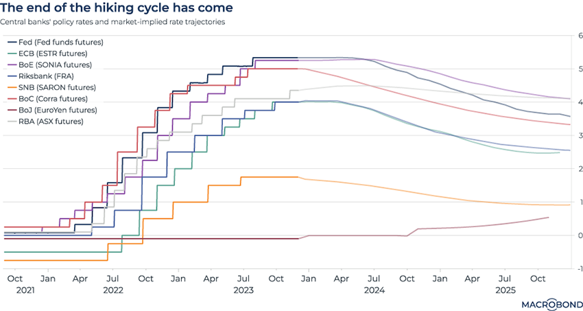
Is the global interest-rate “pause” here? Communications from central banks are trending that way: Federal Reserve Governor Christopher Waller said policy is “well-positioned,” while Bundesbank President Joachim Nagel said the inflation outlook is “encouraging.”
Futures markets, meanwhile, are almost unanimous in suggesting we have seen our last rate hike.
This chart tracks various futures markets (SONIA, ESTR and Fed funds, for instance) to show the rate path priced in by different central banks. Not only is the current level seen as the peak rate in most cases, the long-awaited “pivot” to cuts is priced in for 2024 – something Nagel and others have signaled is too early to contemplate. (Interestingly, the Reserve Bank of Australia is seen as staying on hold for slightly longer than its peers.)
As ever, the big outlier is Japan. As we’ve written before, it’s the last central bank with negative rates, and “lift-off” is expected next year.
A simultaneous slump for Western sentiment and Chinese exports
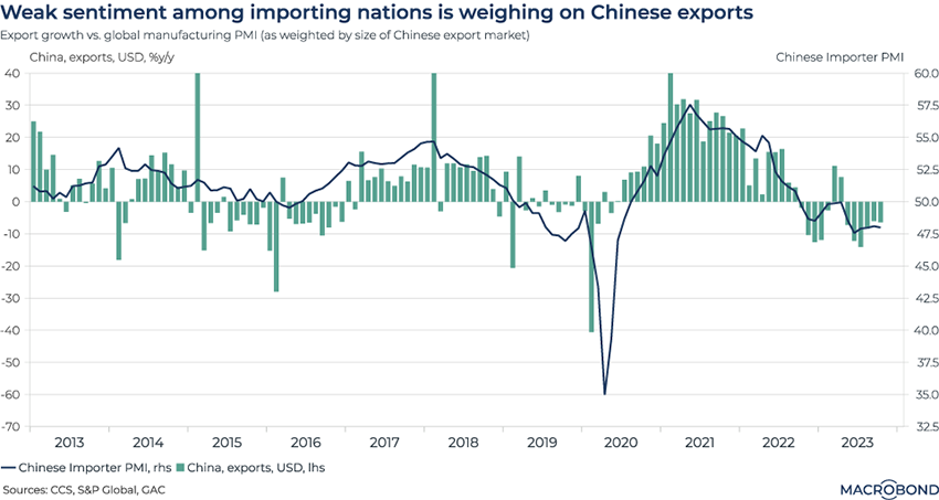
We’ve previously written about China’s disappointing exports. This chart links that performance to worsening sentiment in the country’s predominant export markets.
We’ve created “Chinese Importer PMI” (the blue line, and the right-hand axis) by compiling purchasing managers index readings in China’s biggest markets: the US and the European Union (about 40 percent of the weighting when combined) but also Japan and the ASEAN nations. It also includes Hong Kong, which re-exports Chinese goods.
The PMI, a measure of sentiment among manufacturing executives, indicates contraction when it’s under 50 – where we are today. It has tracked the year-on-year rate of change in Chinese exports reasonably closely since the pandemic.
A corporate dashboard for debt-laden AT&T using FactSet
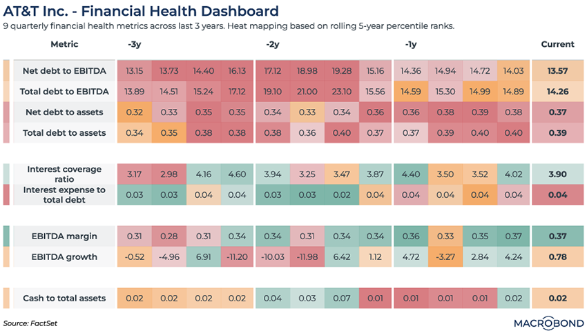
This chart uses data from FactSet via the FactSet Connector.
We’re returning to a theme: corporate debt burdens after the historic increase in borrowing costs.
The FactSet Connector simplifies the integration of comprehensive company, financial, and portfolio data into the Macrobond platform. We used it to highlight US telecoms giant AT&T in this dashboard, but it could be easily applied to many companies.
This heat map uses FactSet’s Fundamentals data to shed light on the evolution of AT&T’s financial health across the last three years. It looks across four broad categories: Leverage (rows 1-4); debt-servicing capacity (rows 5-6); profitability (rows 7-8); and liquidity position (row 9).
The “heat” in the map describes how each quarterly observation ranks in the last five years of data for that metric. Broadly, AT&T’s leverage metrics have improved after flashing bright red two years ago.
More of the EU enters recession – technically, at least
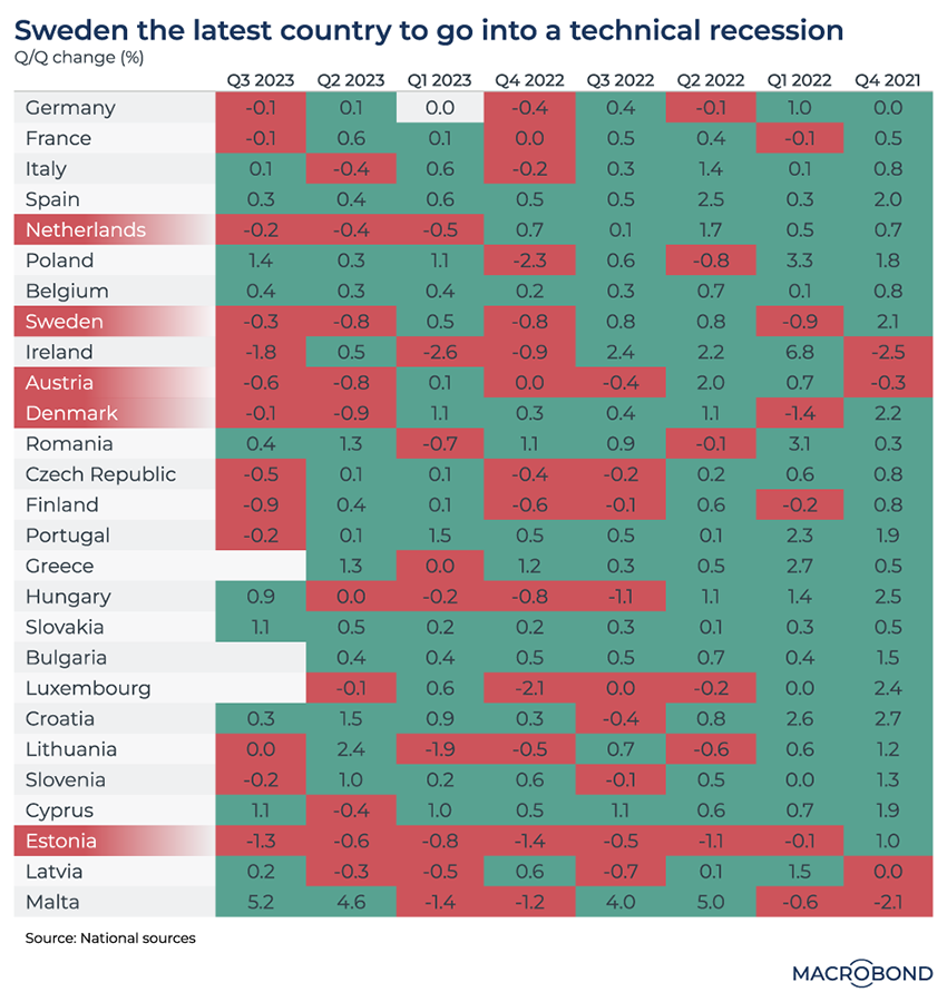
The term “technical recession” refers to two consecutive quarters of negative economic growth. Economists consider other measures to assess whether a nation is “truly” in recession, given the vagaries of revised data and sometimes tiny quarterly moves. Nonetheless, the march of technical recession across Europe on this heat map gives cause for concern.
Almost all of the third-quarter figures have trickled in from across the European Union. Sweden has joined the Netherlands, Austria, Denmark, Czechia and Estonia in technical recession.
Germany’s economic malaise has seen Europe’s industrial engine dip in and out of contraction over the past two years, but avoid technical recession – for now.
US inflation: the importance of the base effect
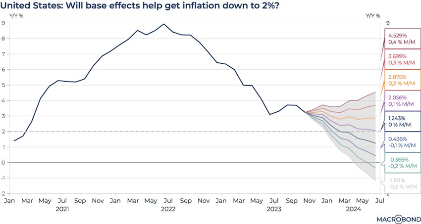
This chart can be applied to different countries using Macrobond’s change region functionality.
The “base effect” refers to the importance of the year-earlier figure when considering a year-on-year analysis. Put another way, it’s important to be mindful of an outsized surge or drop a year earlier; the month-on-month trend might be more meaningful.
This chart points out the help that base effects can give to US inflation readings, considering that the worst of the price surge took place in 2022. It charts scenarios for year-on-year inflation figures, assuming different month-on-month trends.
Even if the month-on-month change is marginally positive, the year-on-year figure might still decelerate – as the purple line shows.
5 topics
.png)
Macrobond delivers the world’s most extensive macroeconomic & financial data alongside the tools and technologies to quickly analyse, visualise and share insights – from a single integrated platform. Our application is a single source of truth for...
Expertise
.png)
Macrobond delivers the world’s most extensive macroeconomic & financial data alongside the tools and technologies to quickly analyse, visualise and share insights – from a single integrated platform. Our application is a single source of truth for...
.png)