Is the stock market about to crash? How to spot the next bear market in advance
Stock markets globally have faltered in recent weeks on fears that a US recession could trigger a global economic slowdown, the unwinding of the lucrative and pervasive carry trade, and the prospect of an escalation of the conflict in the Middle East.
If you’ve been in markets long enough to have experienced previous major market tops, you’re probably getting that feeling that “bad stuff” is starting to happen all at once again. If you haven’t been around long enough, in my experience (which goes back 30 years), major market tops have generally occurred when there’s been a confluence of negative factors that suddenly tipped the tide of prevailing bullish sentiment.
Whether you’ve been in the markets for a long time or a short time, it’s always a good time to learn from past market mistakes. There’s an old saying in markets: History doesn’t necessarily repeat, but it sure does rhyme!
As you will see from the charts I’ll show you below, there are several key characteristics that are consistent with major market tops. The big question I intend to answer here is: Are those key characteristics present now? Let’s dive in!
Starting point: Zoom out!
In today’s article, we’re going to mainly consider the benchmark of US stocks, the S&P 500. This is because, in many ways, it’s the driver of global stock markets, and to be fair, when we’re talking about major market tops and the bear markets that followed, the local Australian share market has generally tracked its US counterpart. We will, however, check out the current S&P/ASX 200 situation at the end.
The chart below of the S&P 500 zoomed out for the last 30 years is quite telling. Note also, when looking at this type of a chart it is important to use a logarithmic scale, this means every up and down move we consider is consistent in percentage terms.
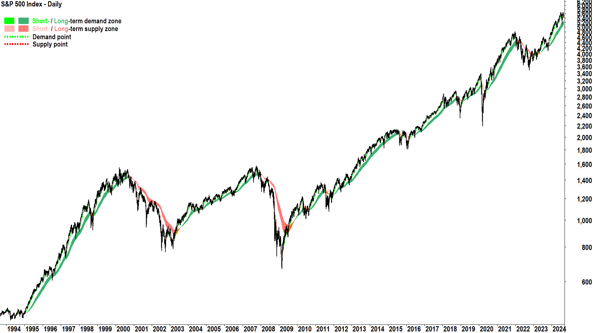
What strikes me about the above chart, is that most of the time over the last 30 years stocks have generally been rising. I suggest there are around half a dozen distinct periods of relatively sharp declines, and one broadly sideways period between 2000 and 2012.
What I hope to show you here at the start, is that the natural state of the stock market is an uptrend. Bear markets are important – they’re the bits we’d ideally like to avoid – but usually, the stock market is a pretty good place to park your money.
Bear markets are typically defined as “A fall of 20% or greater from a market top”. Similarly, by definition, a bull market therefore begins after “A rise of 20% or greater from a market bottom”. You may also have heard the term “correction” being used in the media. This is typically defined as “A fall of greater than 10%, but less than 20% from a market top”. Finally, a “pullback” is defined as “A decline that is less than 10%”.
Before we get into the nitty gritty of every bear market and correction over the last 30 years, I will leave you with one final observation from the chart above. I’ve added my short and long term trend ribbons. Note, if you zoom out enough, the short term trends become difficult to decipher – and this isn’t such a bad thing sometimes – it allows the long term trend to stand out more.
This is important, because I propose the long term trend ribbon appears to be quite useful in taking the market’s temperature. Green is usually pretty good, and red is usually pretty bad. The good news is that right now, the long term trend ribbon is still flashing green.
Every bear market and correction for the last 30 years

The table above shows each of the bear markets and corrections in the S&P 500 over the last 30 years. There were 7 bear markets and 15 corrections. I should point out here that the above table does not consider dividends. I also did the research on the S&P 500 a total return basis, that is, adding back dividends. Note that:
- Two bear markets dropped out because they dipped below the 20% decline threshold – but both were over 19%.
- Three corrections dropped out because they dipped below the 10% – but each was over 9%.
I suggest these are semantics. The 19% correction still very much felt like a bear market, and the 9% pull back still very much felt like a correction. For this reason, I’ll just stick with dividend-free data from here. On this basis here are some interesting correction and bear market facts for the S&P 500 over the last 30 years:
- The S&P 500 experienced 15 corrections that lasted on average for 2 months and wiped around 12% off stock prices. Short and sharp!
- The S&P 500 experienced 7 bear markets that lasted on average for 9.8 months and wiped around 33.6% off stock prices. Big and brutal!
- The S&P 500 spent a total of 29.8 months (2.5 years), or roughly 8.3% of the time in corrections.
- The S&P500 spent a total of 68.6 months (5.7 years), or roughly 19% of the time in bear markets.
- With 22 correction/bear market events in 30 years, investors endured one form of major market downturn around every 7.3 months on average.
On that last point, considering the last major downturn event was July-October’s 2023’s 10.9% correction, the current market volatility is roughly in line with the average frequency of such events. It’s also worth noting the current market downturn is a whisker shy of an official correction at a peak to trough loss of 9.7% – assuming it’s over, that is!
A picture tells a thousand words – S&P 500 bear markets in charts
Those are the key stats relating to bear markets over the last 30 years. They show us that bear markets are not to be trifled with. The S&P 500 is in a major market downturn roughly a quarter of the time, and investors could see roughly one-third wiped from their portfolios.
Clearly, bear markets are a market phenomenon investors definitely want to avoid. But historical statistics do nothing for us in this regard, that is, in helping us avoid bear markets. This is where the charts come in. In my experience, bear markets have very consistent traits with respect to their trends, price action, and candles. I have spent many years studying the transition from a bull to bear market, and I feel I have come up with a set of strong predictive criteria.
Let’s now look at the chart of the S&P 500 in the lead up to every bear market over the last 30 years. We’ll investigate my key technical criteria for identifying a bear market so you can spot if one is developing well before the media splashes it across their front-page headlines!
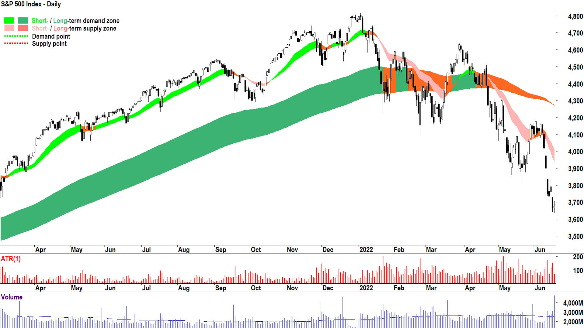
The 2021 Bull Market top and ensuing 2022 bear market was a classic bull-to-bear transition pattern. You will see these consistent themes in each of the six case studies we investigate:
Candles: Transition from predominantly demand-side (i.e., white-bodied and or downward pointing shadows) to predominantly supply-side (i.e., black-bodied and or upward pointing shadows)
Price Action: Transition from rising peaks and rising troughs (i.e., supply removal and demand reinforcement) to falling peaks and falling troughs (i.e., supply reinforcement and demand removal)
Trends: Transition from double green to pink (short term) / orange (long term), to doubly pink. Also, the most important aspect: Trend ribbons transition from offering dynamic demand (i.e., a zone from which the price bounces) to offering a dynamic supply (i.e., a zone from which the price is repelled lower).
My rule is that when the long term trend ribbon has transitioned to neutral (i.e., orange), is accompanied by supply side candles and price action – and then no longer offers dynamic demand but has transitioned to dynamic supply – the long term trend is now down. When this occurs, the bull market is over, and a bear market is highly likely to begin. The bear market tends to be unequivocal (by any technical or magnitude of decline-based definition) once the long term trend ribbon transitions to dark pink.
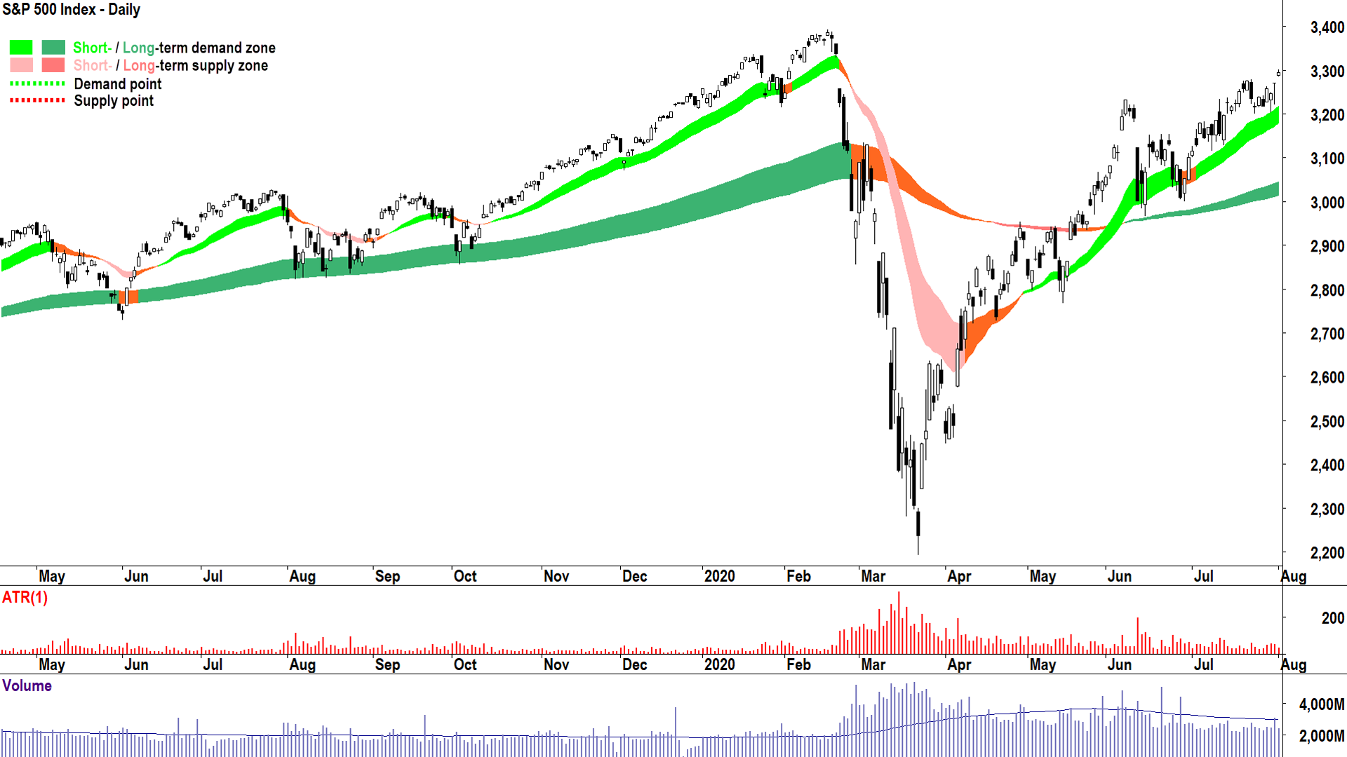
This is a nice segue. An extremely non-typical bear market. It is rare for the candles, price action, and trends to change so quickly – such was the unprecedented panic caused in the financial markets by the COVID-19 pandemic. This is the kind of bear market that keeps a technical analyst up at night! There was nothing in the technicals prior to the February 2022 peak to indicate what was coming next, however, once begun, candles, price action and trend ribbons each did their part in confirming what was happening.
Note how in late February the price sliced through the long term uptrend with strong supply-side candles. There was only a modest rally back into the long term uptrend, which was then decisively repelled by early March. The transition of the long term uptrend ribbon from dynamic demand to dynamic supply was completed, and the price action swung to falling peaks and falling troughs quickly from there.
What’s even more incredible about the 2020 bear market was how quick it was. The S&P500 had recouped all of its losses and was at new record highs by mid-August.
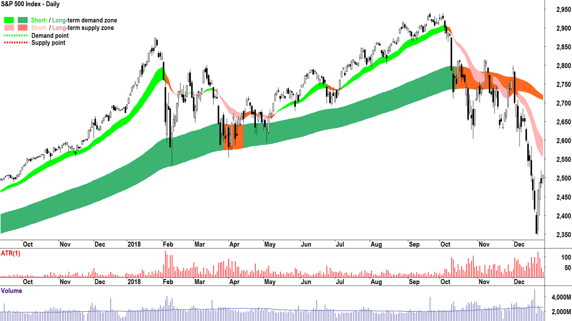
The 2018 bear market is less interesting with respect to its technicals – those are relatively straightforward compared to its 2020 counterpart – but it is interesting in that it was preceded by a correction in February of that year. It is not uncommon for bear markets to be preceded by corrections within 12 months of their occurrence. In fact, if you review Table 1, you will find that the 2020 bear market was the only instance in the last 30 years that was not preceded by a correction within approximately 12 months.
.png)
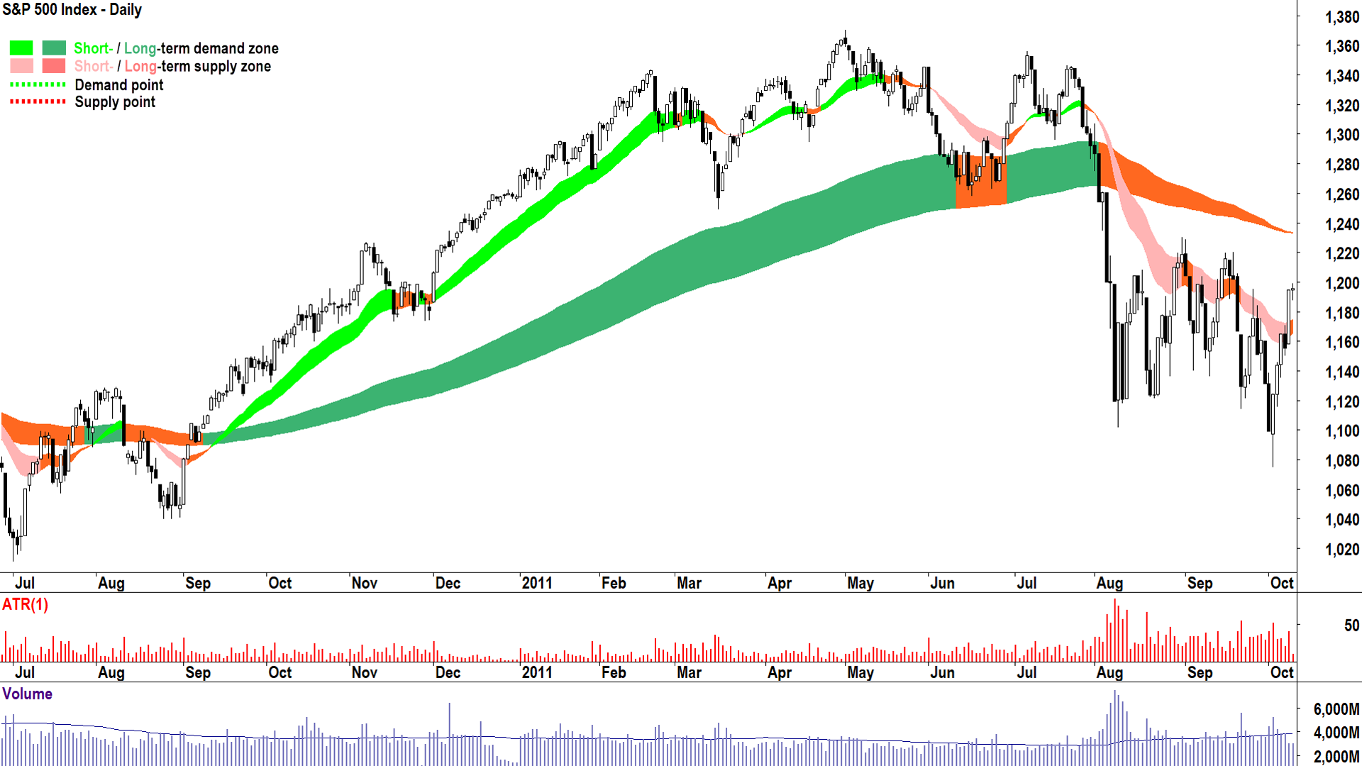
I would classify the 2012 bear market as a plain-vanilla bear market like 2018 and 2022. There was plenty of warning here if investors could read the tell-tale technicals of changing candles, price action, and trends.
Note how there was significant loss of momentum in the short and long term uptrends with relatively sideways movement between February and July. The critical factor, as it often is, was the slicing through the long term uptrend ribbon with strong supply-side candles. When the price action was unable to penetrate back above the ribbon in late August and again in September, the transition to long term downtrend was complete.
.png)
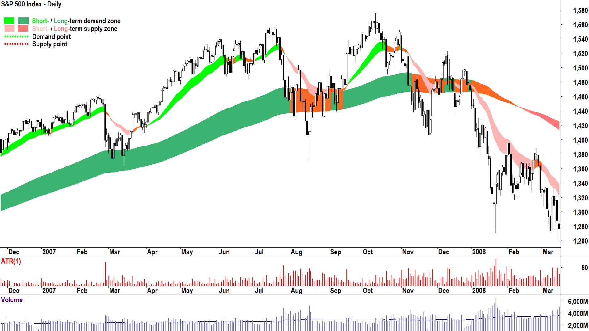
This is the “Big One”. The GFC is widely regarded as one of the worst financial crises in history. But, there was nothing very unusual about it at all in terms of its technicals. Same old-same old of predominantly supply side candles, choppy price action, and major loss of momentum in the prior bull market trends.
Note the proximity here to the July-August correction where the dynamic demand of the long term trend ribbon was tested – but importantly – did not transition to dynamic supply. That transition was particularly drawn out through late 2007 as the price action filtered with the long term trend ribbon several times, each time making lower major peaks.
January’s sharp drive lower, followed by only a feeble attempt to rally back to the uptrend ribbon, was the final death knell for a bull market that began all the way back in March 2003 – considered to be one of the best bull markets of all time.
.png)
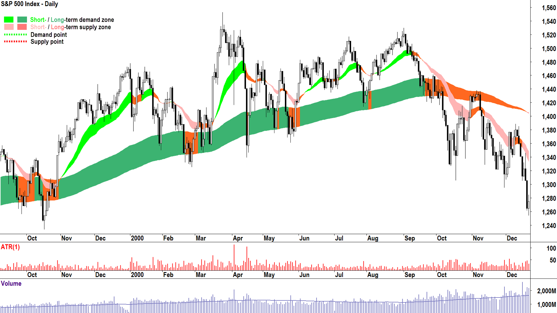
To call this the Dot-com crash is somewhat of a misnomer for the S&P 500. The crash actually occurred in its tech-laden NASDAQ counterpart, but there was still a substantial fallout in the broader US stock market.
Another typical transition between bull and bear here – hopefully your eye is beginning to be tuned in to the common traits between each historical event. The circumstances that caused each transition might have been different, but it is clear from these charts that the technicals were very similar. Candle, price action, trend ribbons – they very rarely lie!
.png)
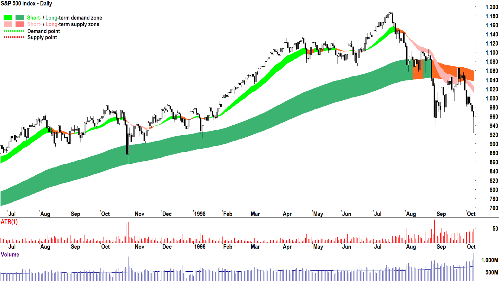
This is the seventh and final bull-to-bear market transition of the last 30 years we’ll review. It is another text-book example of how my technical method identifies when excess demand gives way to equilibrium, and then eventually, to excess supply.
Candles from demand-side to supply side: ✅
Rising peaks and rising troughs to falling peaks and falling troughs: ✅
Trend ribbons transitioning from dynamic demand to dynamic supply: ✅
The most remarkable thing for me about this bear market will be forgotten by history: It was my first experience of one! I made a great deal of money in the relatively low volatility 12-18 months prior to this bear market – only to give the vast majority of it back in the 2.6 months and 22.4% decline that was the South-East Asian Financial Crisis. If only I knew then what I know now…🤔
What’s happening now, is the stock market about to crash?
Which brings us to today. Perhaps this is the article that helps you avoid the mistakes I made back in 1998 (and on at least the next two bear markets after that!). What do the current technicals indicate about the likelihood of another bear market developing? Take a look at the chart below and draw some conclusions before you read the final paragraph!
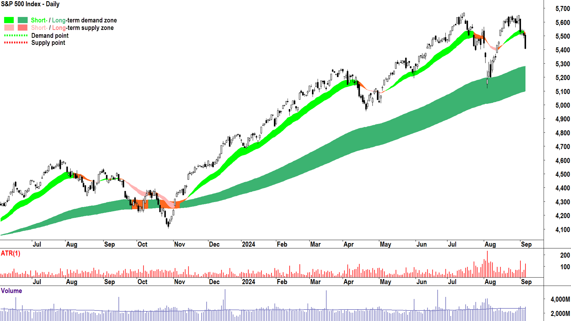
The good news for investors is that so far, the key technical factors I use to identify a bull market transitioning to a bear market are largely absent. Most importantly, the long term trend ribbon is still offering dynamic demand (note how perfect it was at repelling the July-August pullback). This means that we are potentially at least weeks or even months away from the price action interacting sufficiently with this zone to confirm a potential transition to long term downtrend.
However, there are some concerning developing signals that warrant extra attention going forward:
- Friday’s candle for me tips the balance towards an increasing frequency of supply-side candles. I prefer to stop short of saying there is a “predominance” of supply-side candles at this stage, but I wouldn’t like to see the recent increase in their prevalence continue.
- The price action is less consistently rising peaks and rising troughs. The price action since the July peak shows increased volatility (i.e., less consensus about the underlying fundamentals), and a greater prevalence of periods of falling peaks and falling troughs. Overall, one could argue the broader price action is flattening out (possibly like it did in 2012)
- The July-August pullback of 9.7% (so far) is consistent in order of magnitude with corrections that preceded the majority of bear markets over the last 30 years. Corrections like this were often the market’s first response to a developing set of bearish fundamentals that became too much to ignore down the track…
In conclusion, the candles, price action, and trends of the S&P 500 are not yet fully consistent with an impending transition to a bear market. Note however, there are some signals that indicate the demand-supply environment is potentially (I would go so far as saying likely) transitioning from a state of excess demand to a state of equilibrium. This developing scenario must be watched carefully by investors.
As always, it is up to you how you do your analysis, and which factors – technical, fundamental, or otherwise, that drives your decision making process. I trust that this article has demonstrated that corrections and bear markets in stocks are frequent over the last 30 years, and that whilst their impact can at times be devastating, there exists a set of technical criteria that has consistently assisted in identifying when they might occur.
This article first appeared on Market Index on Monday 9 September 2024.
5 topics

