Is the trend still your friend?
In last quarter’s commentary we spoke about the strong price trends we’ve seen in the largest shares of each sector. Very little has changed since then, although trending in some sectors has become less extreme (e.g. Consumer Staples) and in others more extreme (e.g. Real Estate).
This Quarterly Commentary is split into three sections. The first section provides a high-level overview of sector valuations relative to history. The second discusses whether fundamentals have contributed to the strong trending in large caps that we wrote about last quarter. The third section outlines what we’ve been doing in the Allan Gray Australia Equity strategy.
1. Sector valuations today relative to history
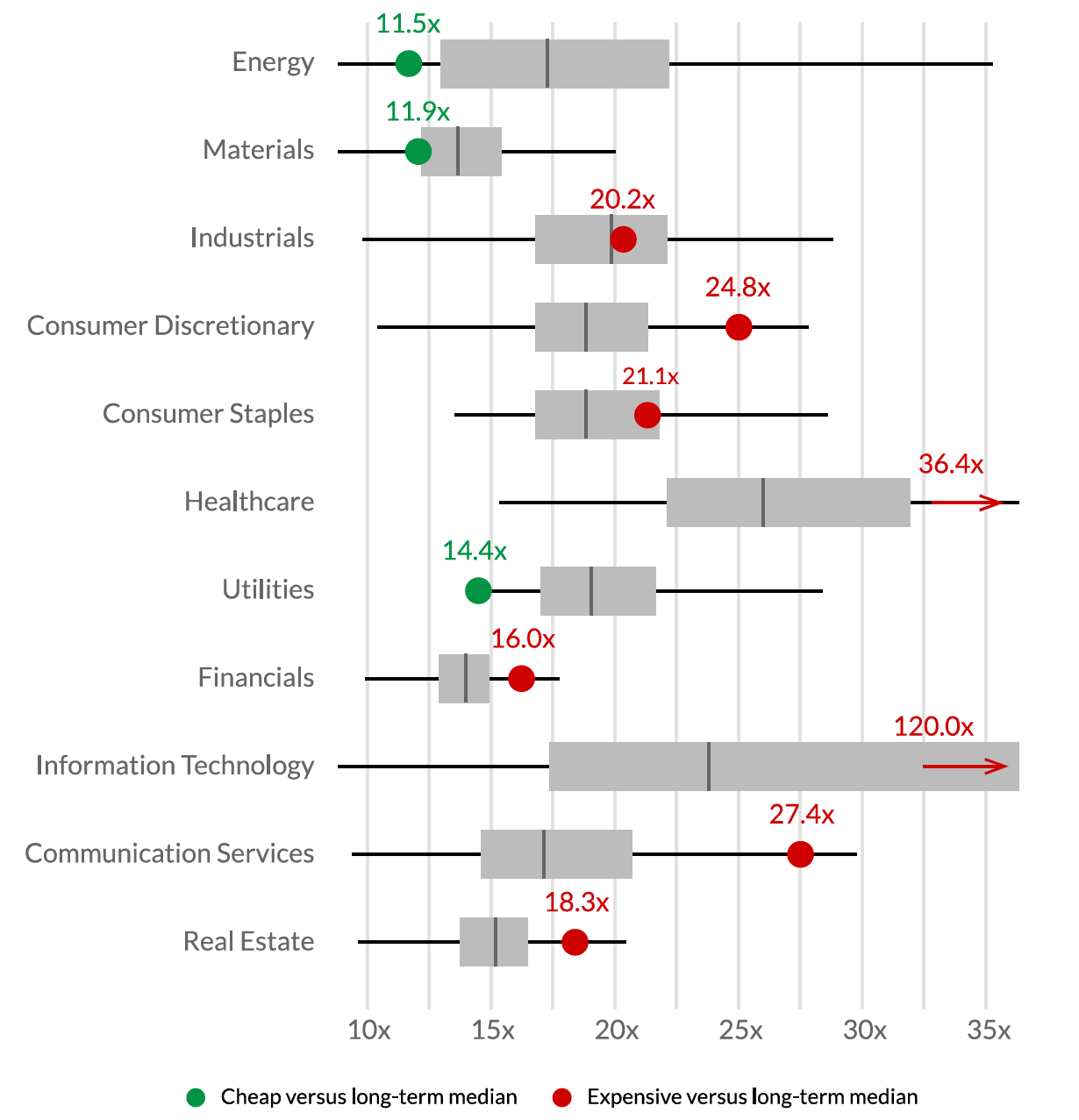
Graph 1 uses weekly weighted-average sector valuations since 2000. Valuations represent next year’s forecast price to earnings ratios (or forward P/E multiples). It is a box and whisker plot, where the ‘box’ reflects the historical interquartile range (25th percentile to median and median to 75th percentile) of these weekly valuations (forward P/E multiples). The ‘whiskers’ (the horizontal lines on either side of the box) show the bottom 25% and the top 25% of valuations since 2000. The green and red dots show today’s valuation, with red being expensive versus the long-term median valuation and green being cheap.
By way of example, if we focus on the Real Estate box and whisker from Graph 1, the median weekly forward P/E ratio since 2000 is about 15 times (the vertical line inside the box). Valuations have traded in a tight band, as depicted by the small size of the box and the length of the whiskers. The sector currently trades for 18.3 times next year’s earnings (the dot) which is above (more ‘expensive’ than) the median valuation, hence the red colour of the dot.
A few key takeaways from Graph 1 are worth noting:
- Only Energy, Materials and Utilities trade below their historical valuations;
- Consumer Discretionary and Communication Services trade at elevated levels relative to history (the current valuation is well into the upper whisker of the historical range);
- and Healthcare and Information Technology are trading at extreme levels relative to history.
Graph 1 | Today’s sector valuations versus history

Source: LSEG, Orbis, 15 March 2024.
The multiple of a company’s earnings is important, but so too is the level of those earnings relative to future sustainable levels and the growth rates of those earnings. For example, it could be argued that a large part of the Materials sector’s earnings are inflated by high iron ore prices (embedded into consensus earnings forecasts for next year) and so its depressed multiple might in fact be deceiving. A similar outcome may be true for Utilities, where the two largest constituents are currently experiencing earnings tailwinds from inflated electricity prices. And, the high multiples we see in some sectors may well be justified by their earnings growth trajectories.
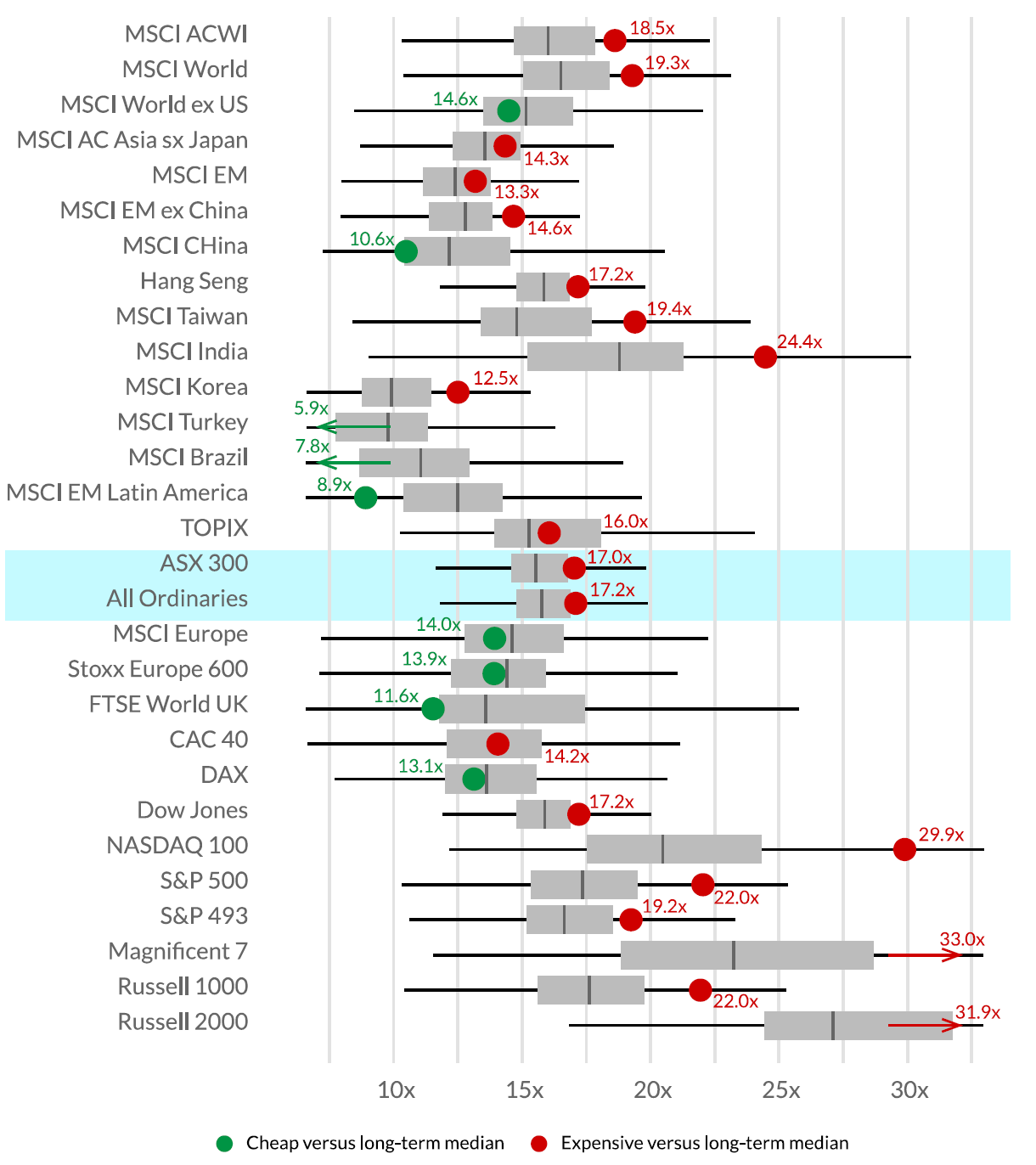
Graph 2 depicts similar valuations for a number of sharemarkets, including the S&P/ASX 300 Index. Based on historical valuations (forward earnings multiples), the S&P/ASX 300 Index looks a little expensive relative to its history but not as expensive as the likes of the NASDAQ 100 or MSCI India.
Graph 2 | Not many cheap sharemarkets

Source: LSEG, Orbis, 15 March 2024.
2. Do fundamentals explain the relative performance of the large caps?
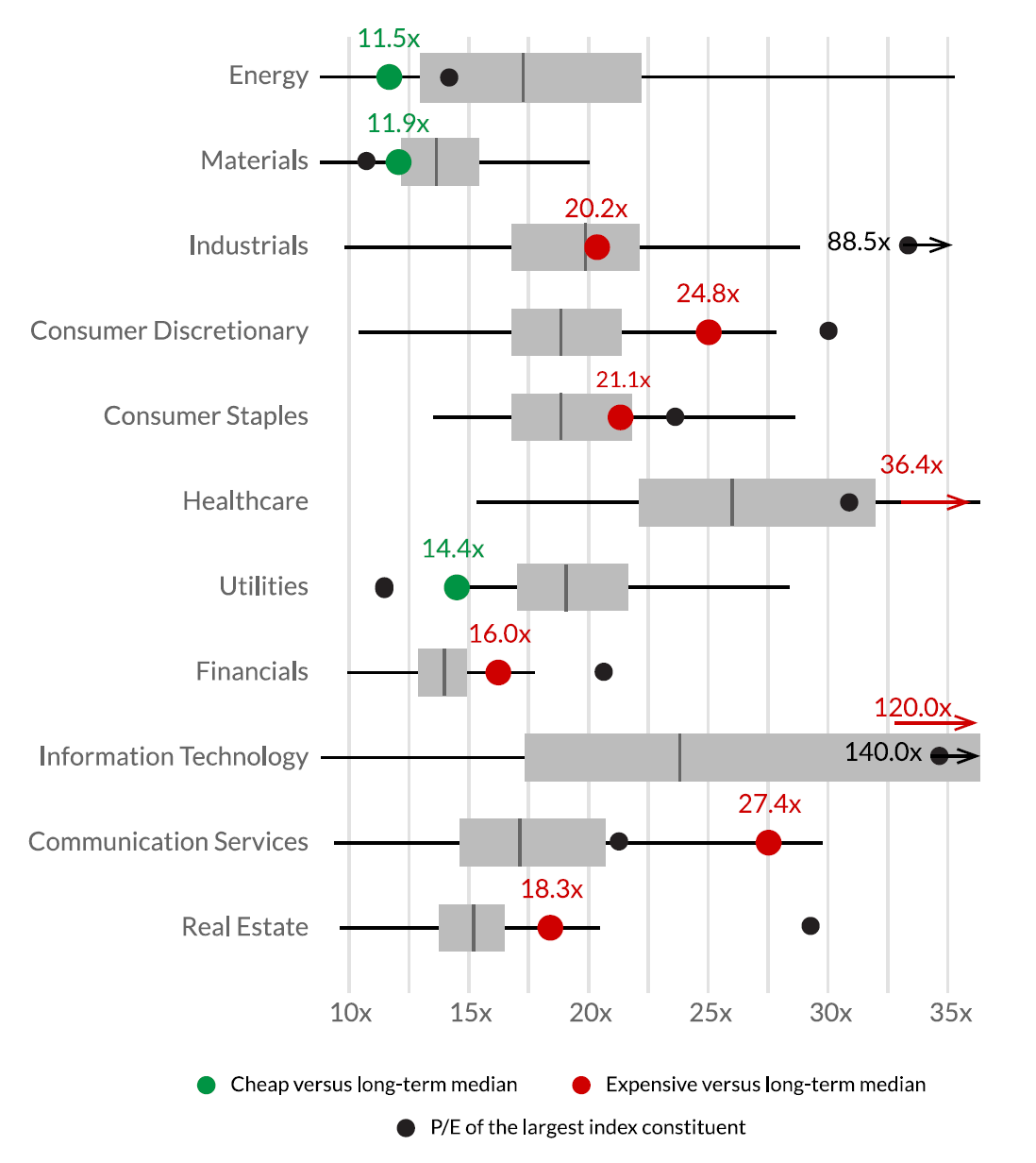
Large cap outperformance cannot be explained by their fundamental earnings profiles. To attempt to illustrate this, we have reproduced Graph 1 with an additional black dot in Graph 3. This shows the one-year forward P/E multiple of the largest index constituent (the same companies we graphed in our Q4 2023 Quarterly Commentary).
For seven of the eleven sectors, the largest constituent is meaningfully more expensive than the median (note that for Industrials, the largest constituent is Transurban (ASX: TCL), a toll-road owner whose earnings might not be a fair representation of value, as its cashflows exceed earnings during the life of any single concession; the second largest constituent, Brambles (ASX: BXB), is in line with the median).
Graph 3 | Forward P/E multiple of the largest company in each sector

Source: Orbis, LSEG, FactSet, 15 March 2024.
The four instances where the largest capped stock has a lower valuation than its sector average each have their own nuances:
- In Materials, BHP (ASX: BHP) is the largest constituent and there are two good reasons why its multiple is lower than the sector median. First, earnings for all iron ore miners are forecast to fall in future years and BHP is no different (still BHP, the largest iron ore miner, still trades at meaningfully higher multiples than other close peers, such as Rio Tinto (ASX: RIO) and Fortescue (ASX: FMG)). Second, the sector median skews upwards due to the depressed earnings factored into forecasts for the lithium, gold and base metal miners.
- For Healthcare, the largest constituent, CSL (ASX: CSL), is a noticeable exception. Today’s sector valuation is skewed upwards by Pro Medicus (ASX: PME) and PolyNovo (ASX: PNV) on 130 times and 386 times earnings respectively. If one of these companies were removed, the Healthcare sector would not be an exception, i.e. CSL would be more expensive than the average healthcare company.
- The Utilities sector is dominated by Origin (ASX: ORG) (50% of the sector), whose earnings are inflated. What’s more, there are only three constituents in the index (AGL Energy (ASX: AGL) and APA Group (ASX: APA) being the other two), so the analysis on a small data set is less meaningful.
- For Communication Services, the largest constituent (Telstra (ASX: TLS)) is unlike any of the other sector heavyweights, which include a handful of very high-multiple growth stocks like CAR Group (ASX: CAR), Seek (ASX: SEK), REA Group (ASX: REA) and Domain (ASX: DHG).
We mentioned earlier that a focus on P/E ratios alone is flawed and it is important to also assess the growth trajectory of earnings in this valuation metric. We have not detailed our findings here (perhaps a topic for a future quarterly commentary), but it is clear that earnings growth does justify somewhat higher valuations (P/E multiples) in some sectors than in others (e.g. Technology versus Materials). However, within a given sector, our research suggests that the earnings growth of the largest company is not meaningfully different to the earnings growth of the sector as a whole and is often lower.
It appears that the underlying fundamentals don’t explain why the largest capped shares have significantly outperformed the smaller capped shares. They, for the most part, trade on higher multiples of earnings and their earnings growth does not appear to justify their elevated multiples.
3. How we’ve positioned the Equity strategy
The Equity strategy continues to skew away from the largest capped stocks. The Energy sector is one exception where our largest sector overweight is also the largest constituent of the sector, namely Woodside. In this instance, we think the longevity of Woodside’s earnings (from its oil and gas reserves) justifies the premium to the sector multiple whose reserve lives are, on average, far shorter.
In most other cases, we see merit in owning companies other than the largest sector constituents, or not having exposure to the sector at all. We are heavily skewed towards Energy and Materials, the two sectors that screen the cheapest relative to their history. While these sectors are exposed to a precariously positioned economic cycle, they are priced well below their historical medians with uncertain economic headwinds at least partly (we think more than fully) factored into the price.
We have no, or very low, exposure to the sectors which screen ‘expensive’ relative to their own history, in particular, Healthcare (we hold Ansell which is a constituent of Healthcare, but we view this as a constituent of Industrials), Information Technology and Consumer Discretionary.
At the time of writing, based on consensus forecasts our portfolio trades at 12.9 times next year’s earnings, a significant discount to the broader sharemarket, as shown in Table 1. And what’s more, those earnings are not growing meaningfully slower than the broader sharemarket.
TABLE 1 | The Equity strategy trades at a significant discount to the sharemarket

Source: FactSet, Allan Gray, 21 March 2024. (A) = Actual; (F) = Forecast.
The above wire is an extract from Allan Gray Australia’s March 2024 Quarterly Commentary, which you can read in full here.
Want to learn more?
Contrarian investing is not for everyone, however, there can be rewards for the patient investor who embraces Allan Gray’s approach. Visit the Allan Gray Australia Equity Fund profiles to find out more.


16 stocks mentioned
2 funds mentioned

