Is there any incentive left to own stocks?
Financial Twitter - or FinTwit to those in the know - is a weird and wonderful place. Apart from the banter, the best thing about the community is the charts that float around. In many instances, they open up new ideas for investors and democratise research in a way that they may not otherwise have had access to.
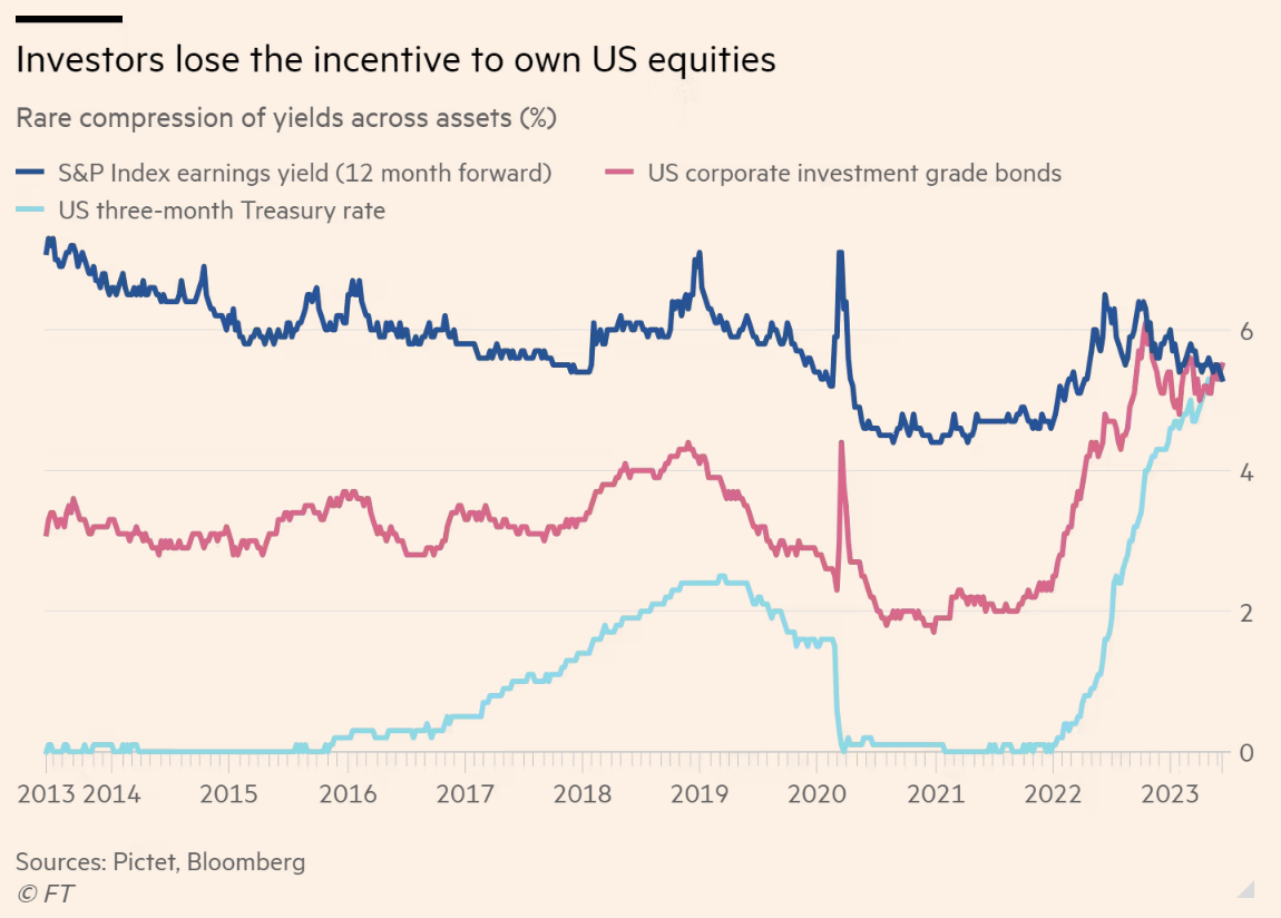
One such chart is this one, which was reproduced in a Financial Times article recently. The premise is really simple - you can now earn as much yield from a 3-month US Treasury note as investing in the investment grade corporate bond market or even in the S&P 500 based on today's forward earnings multiple.

The team at Zurich-based Pictet Asset Management argues this chart is the best reason to buy bonds. Some investors also believe it's a good cue for the end of the most recent bull market in equities.
So, does the argument have any merit? In this wire, I'll show you two other versions of this chart, with help from the team at Macrobond Financial. We'll also get some insights from Kerry Craig of J.P. Morgan Asset Management.
The chart widened out
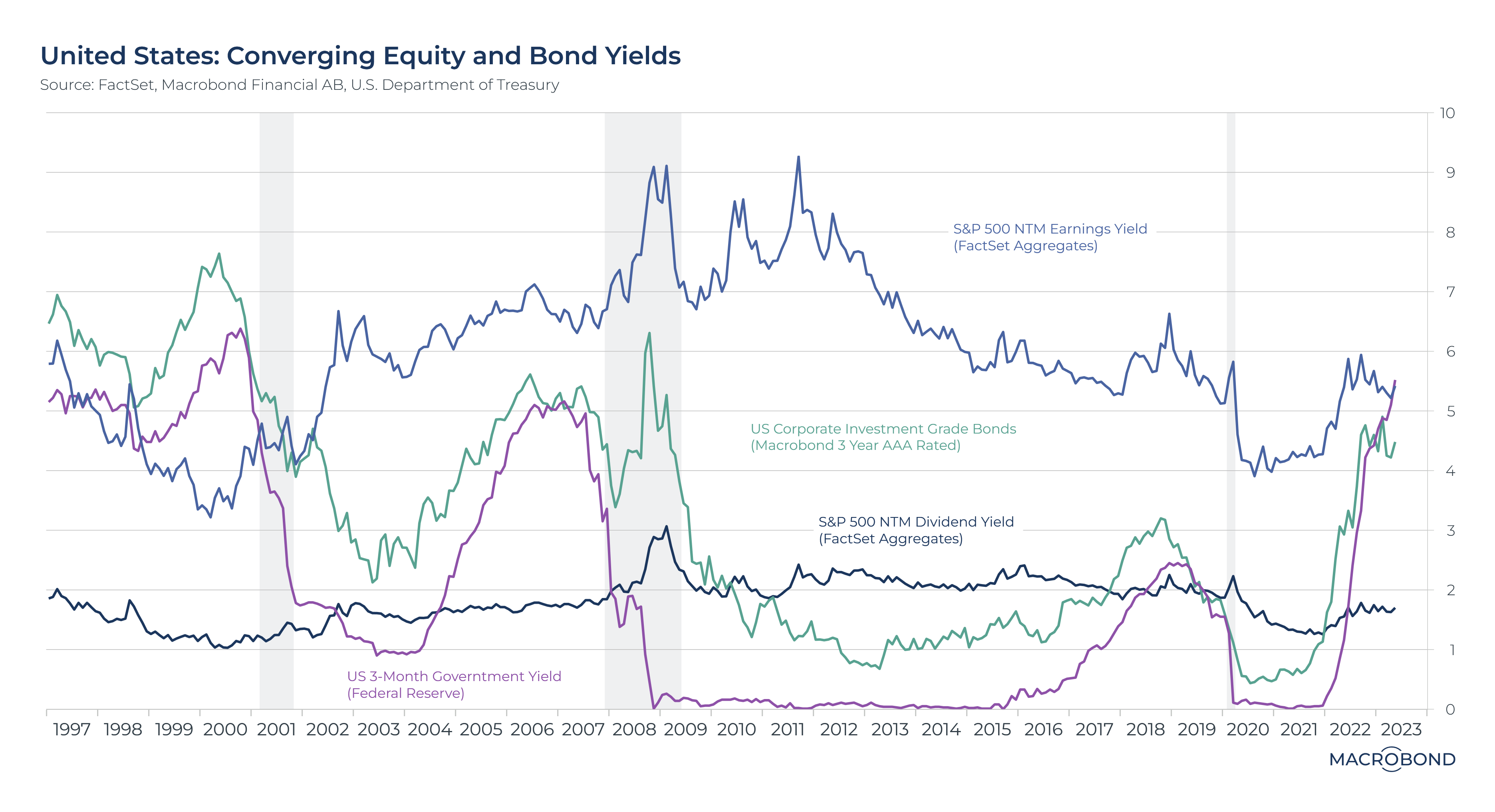
The original chart only goes back to 2013. And while that may seem like an eternity ago in today's market, it does not encompass many market cycles. I asked the team at Macrobond to recreate this chart with as long a timeline as possible. Their version of the chart, seen below, goes back to the 1997 Asian Financial Crisis.

What does the longer time horizon prove? A few things:
- Equities are expensive currently, relative to bond prices, but they have been before and they will be again.
- There have been times (for example, in the late 1990s) when equities were the cheapest of the three asset classes.
- All roads lead back to interest rates and liquidity. Taking away the punchbowl has made the equity risk premia far less attractive (that is, people are less willing to pay up for the risk of owning equities, given the uncertainty around how earnings may turn out).
Shrewd observers will also notice a fourth line that has been added to this chart which isn't in the original chart - the S&P 500 Dividend Yield. The US stock market is not known for its dividends (companies prefer to reward shareholders with buybacks) but the huge gap between dividend income (dark blue) and investing in a short-duration bond (purple) is worth highlighting all by itself.
The Australian version
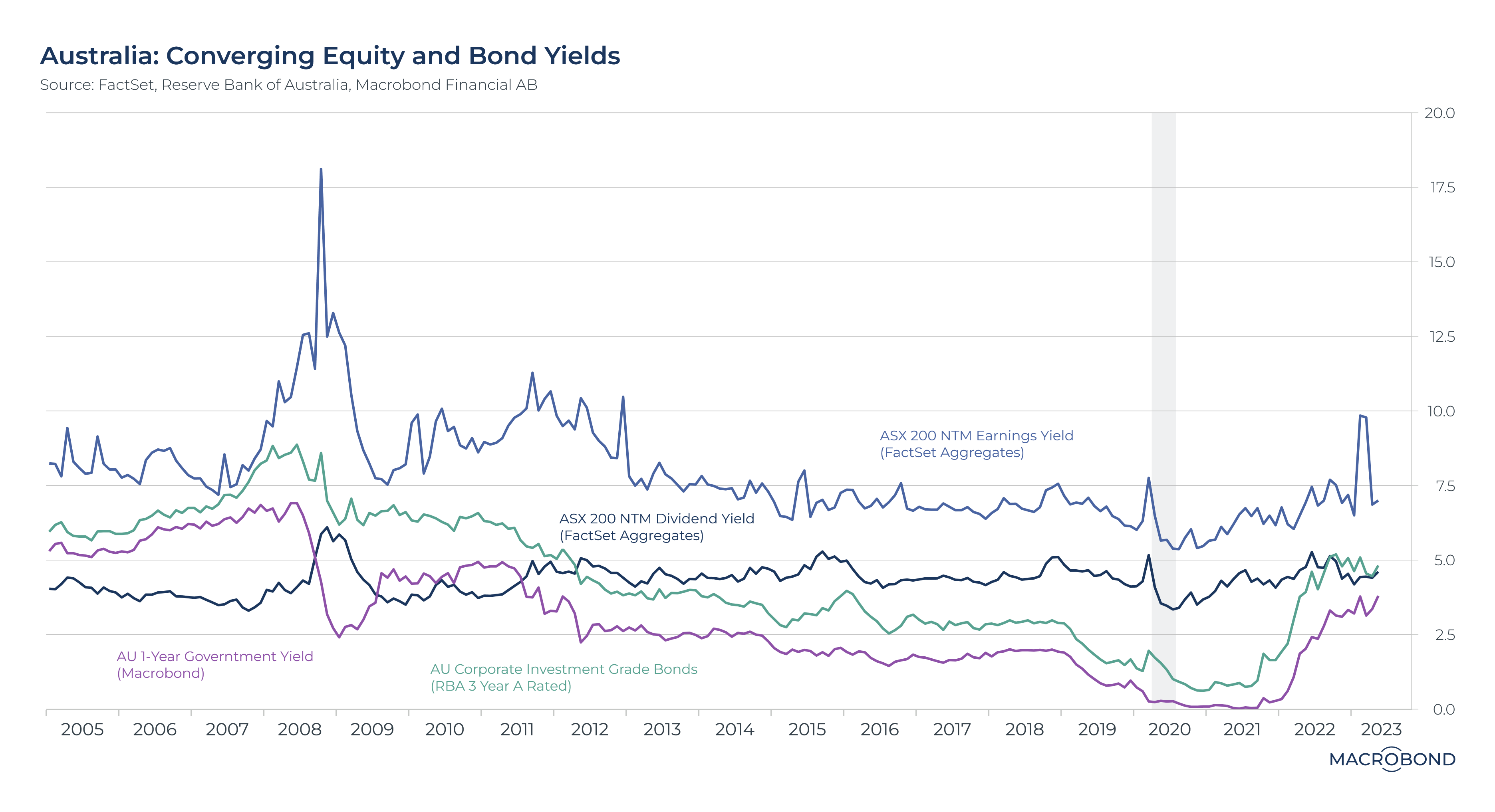
Given the US and Australian stock markets are very different beasts, Macrobond created two versions of this chart, with the following parameters:
- ASX 200 forward earnings yield
- ASX 200 dividend yield
- Australian investment-grade corporate bond yield
- Australian 1-year government bond yield

The Australian chart demonstrates that, while earnings yields continue to hover around the historical average of 7.5%, the figures for dividend, corporate bond, and short-duration bond yields are much closer together.
In fact, you can now get more by investing in the Australian corporate investment grade bond index (ie the highest quality corporate bonds) than in ASX 200 dividend yields.
Equally of interest, while we like to think of the huge rise in interest rates as a signal that income investing is back in vogue, the ASX 200 dividend yield has not risen above 5% sustainably since 2008.
Perhaps all those fixed-income people do know what they are talking about when they say bonds are back in vogue. If only these assets were more accessible to the average investor.
The cross-asset view
J.P. Morgan's Kerry Craig has long argued that bonds are back in vogue, after the credit sector's years in the wilderness. But he argues the move back into fixed income exposure comes at a time when investors should be (and are being) paid for holding some protection rather than paying to hold it.
"This means investors can better balance out the addition of equity risk which will fuel long-term portfolio growth," he adds.
Having said this, Craig believes equities remain attractive for the medium term.
"Clarity on the direction of inflation, rates and growth may provide opportunities for an increasing equity allocation, as valuations appear attractive by historical standards in many markets, even if they are higher now than when we started the year," he says.
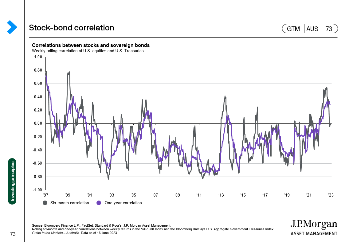
Beyond these two conventional asset classes, Craig argues that there is still a place for alternative and real assets because of how volatile inflation may remain over the next few years. Volatile inflation prints could put pressure on the stock-bond correlation in both the US and Australia. The stock-bond correlation is a tool designed to determine risk premia in financial markets. The conventional argument is that a fall in bond prices will eventually be followed by a fall in stocks.

"As inflation rates have come down, the stock-bond correlation for U.S. assets has fallen and we’d expect this to continue as has been the experience in the past," he argues.
"The results are similar for Australian data and the correlation between the ASX 200 and a broad Australian government bond index. However, while inflation in Australia did not reach the highs of the U.S., it has been slower to fall given the “relatively gradual” pace of rate hikes by the RBA compared to the Fed. The implication could be that it would take longer for the stock-bond correlation of Australian assets to revert to negative," he says.
In other words, investors may end up in a period where they are exposed to less risk and experience less volatility. But if Craig is right, the time it would take for this period to be reached will take a lot longer. And you can thank the Reserve Bank for that.
3 topics
1 contributor mentioned

