It’s difficult being different
It has been a disappointing year for the relative performance of the Allan Gray Australia Equity strategy. It is tempting to point to stock-specific reasons for this underperformance, but our largest detractor from performance Alumina (ASX: AWC) was mostly offset by our largest contributor (Newcrest Mining / Newmont (ASX: NEM)). Our underperformance this year is not because of the performance of our outliers. It is instead due to significant trending or momentum in areas of the market in which we are underrepresented.
We’ve been here before
We first wrote about being on the wrong side of momentum and trending share markets in our September 2015 Quarterly Commentary and then again in December 2021.
In the lead-up to late 2015, companies with defensive earnings characteristics were all the rage. Market participants bought these companies aggressively and sold cyclically-exposed companies to fund these acquisitions, which led to significant relative price dislocations. By late 2021, it was all about sexy disruptors and high-quality companies, with the boring old-world companies being used as the funding vehicles. Investing against these trends later proved very rewarding for investors. Today, size and liquidity appear to be major beneficiaries of the market’s trend, with large, liquid companies leading the field funded by the sale of smaller, less liquid companies.

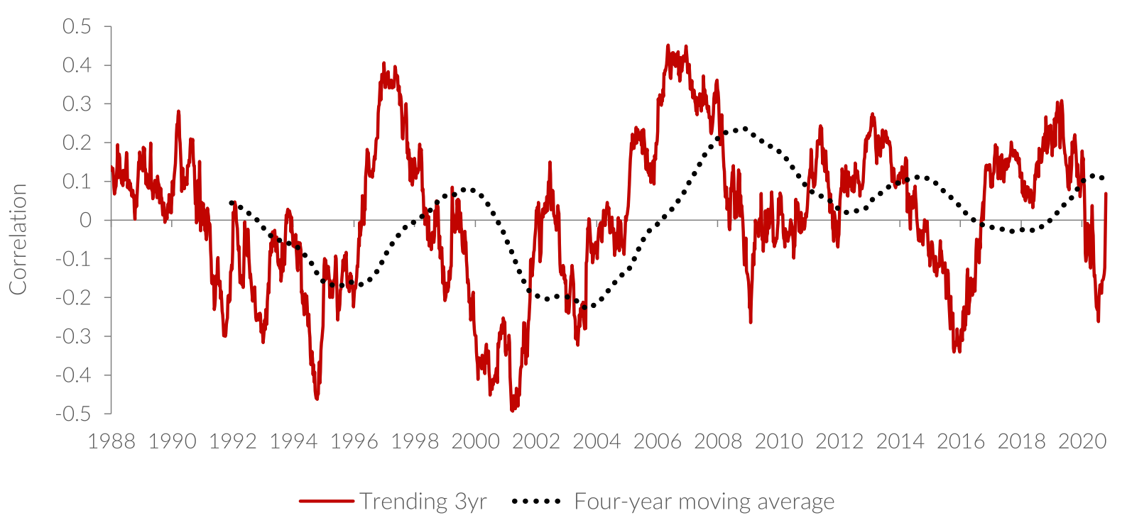
Graph 1 shows the degree to which shares have trended over time. It enables us to see how historical periods of extreme trending preceded the Dotcom bubble bursting, the onset of the Global Financial Crisis, and the extreme dislocations we saw in the aftermath of COVID-19 (e.g. the meme stock bubble).
All of these trends reversed. Today’s levels are not as high as these previous extremes, but they are much higher than normal.
Graph 1 | Share prices are trending – winners keep on winning

Source: Orbis, 20 November 2023
The graph plots the correlation between the total return of the winners over the past three years and the winners over the next three years. At each point on the graph, index constituents are ranked from the best performer to the worst performer in the FTSE All-World Australia Index over the prior three years. A similar rank is assigned to companies based on their actual returns in the next three years and the correlation of the ranks are determined. The higher the correlation, the greater the trending or momentum in the market.
In other words, a high correlation suggests that the winners of the past three years go on to be the winners of the next three years. The simple way to explain the graph is to say that when the line is high, the preceding three-year share price winners continue to be the next three-year share price winners. When the line is below zero, previous winners are recent losers.
Big has been beautiful
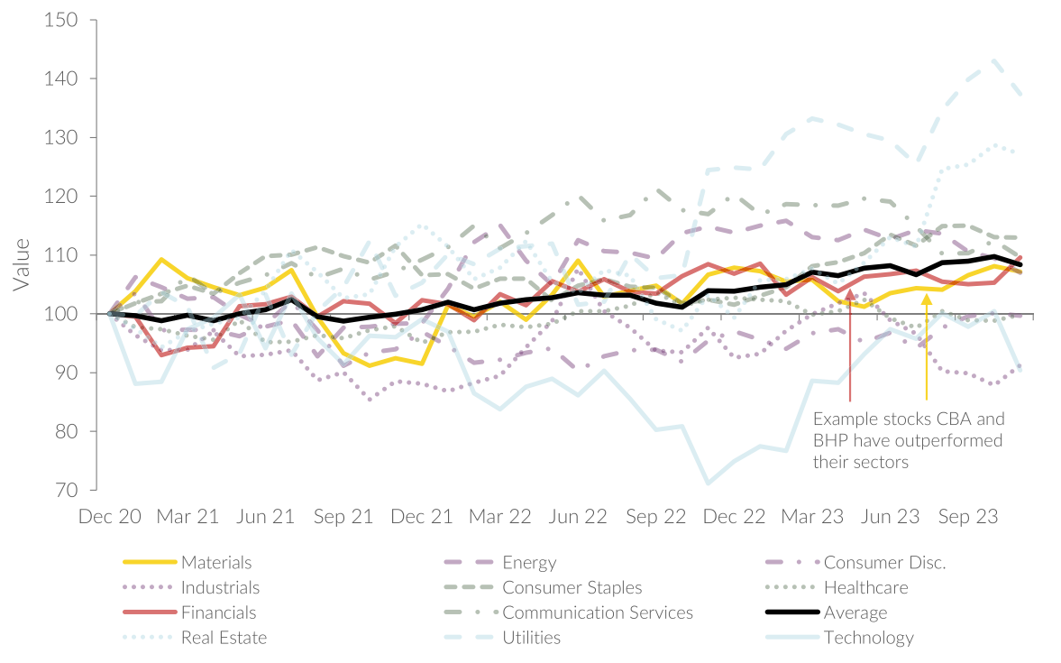
It is ‘size’ that has trended most strongly. In almost all sectors across the Australian market it is the largest company in that sector that has performed the best, as illustrated in Graph 2. It shows, for each sector, the price performance of the largest sector constituent relative to that sector as a whole. For example, the red line in the chart shows Commonwealth Bank of Australia’s (ASX: CBA) price performance relative to the Financials sector. Not only has CBA outperformed its sector by about 10%, it constitutes 30% of the sector itself. The same is true for BHP Billiton (ASX: BHP) (with a 7% outperformance and a whopping 45% sector weight), Woolworths (ASX: WOW) (13% outperformance and a huge 47% sector weight) and Goodman Group (ASX: GMG) (27% outperformance and 31% sector weight). Using a simple average of the 11 sectors, the largest stock has outperformed the overall sector by over 8% (weighed down heavily by Xero (ASX: XRO) in the Technology sector and Transurban (ASX: TCL) in the Industrials sector).
Graph 2 | Performance of the largest company in a sector relative to the sector itself

Source: Factset, three years to 30 November 2023
The extent of the outperformance is significantly more extreme than this 8% simple average might suggest. This is probably best illustrated by BHP and CBA. These are the two largest companies in the Equity strategy’s benchmark (11% and 8% respectively) and unsurprisingly therefore, the largest constituents in their respective sectors.
BHP has outperformed its materials sector by 7% over the past three years. Assuming a constant BHP sector weight (an unrealistic assumption, but not outrageous for this exercise) similar to its current 45%, means that the rest of the sector’s constituents (55% of the sector weight) must have underperformed BHP by the same amount that BHP outperformed the sector (the sector performs in line with itself). The rest of the materials sector constituents therefore fell 5.7% in aggregate (7% x 45% / 55%), so BHP has outperformed the rest of its sector by close to 13%. The same rough maths is true for CBA which has outperformed its sub-index by 10% over the past three years. At approximately 30% of its index, the rest of the constituents have returned -4%, underperforming CBA by 14%. It has been very costly to not own these two companies.
We have written in the past that we happen to be underweight large caps. Our portfolio has a significant skew away from these stocks, as Table 1 shows.
Table 1 | The Equity Fund is underweight large caps

Source: Allan Gray, 30 November 2023.
What does this mean for our portfolio?
This is not the first time we have been battered by strongly trending markets and as bottom-up investors we don’t try to forecast trends anyway. Even today, it is unclear what has given rise to this trend. Perhaps it is the higher liquidity that the largest companies offer relative to their smaller counterparts, something thematic or exchange-traded funds might value greatly. Or it may be the perception that, as we navigate potential economic storm clouds on the horizon, the largest companies will be the safest.
The good news though is that trends like this are not based on fundamentals and can’t last forever. At some stage, the pendulum will swing back to an equilibrium. To get to that equilibrium, the largest companies will have to underperform and, in the process, our performance should improve as price does matter, and will always matter, over the long term.
The above wire is an extract from Allan Gray Australia’s December 2023 Quarterly Commentary, which you can read in full here.
Want to learn more?
Contrarian investing is not for everyone, however, there can be rewards for the patient investor who embraces Allan Gray’s approach. Visit the Allan Gray Australia Equity Fund profiles to find out more.


8 stocks mentioned
2 funds mentioned
