Leading indicators, oil, geopolitics and sticky inflation
.png)
A potential green light for stalled economies
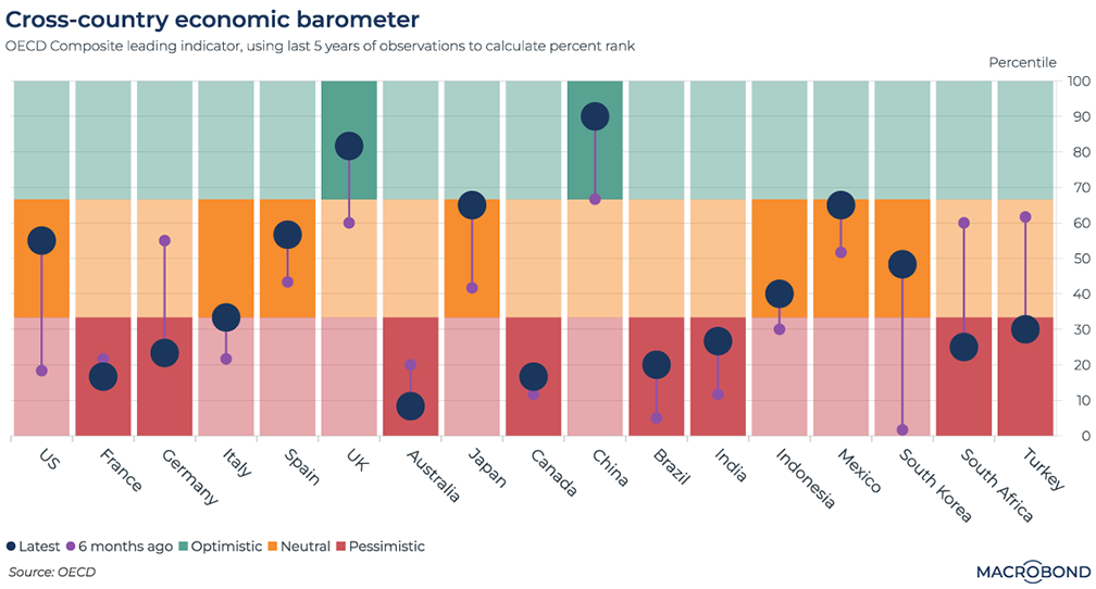
China was in the headlines in 2023 for an underwhelming rebound, and Britain’s travails post-Brexit are well-known. But according to the OECD, these two nations have improving economic momentum – relative to their own past five-year experience, that is.
This chart tracks the OECD’s Economic Composite Leading Indicator for 17 major economies. In the OECD’s words: it’s “designed to provide early signals of turning points in business cycles,” using future-sensitive economic data points that measure early-stage production and respond rapidly to changing circumstances.
Readings are divided into red, yellow and green based on their percentile over five years. We also added smaller dots to show the six-month trajectory. (We published a similar “traffic light” visualisation for the US in February.)
Worryingly for the world economy, a plurality of nations are in the red zone, suggesting their best recent days are behind them. Deterioration over six months is noted for Germany, Turkey and South Africa. But the indicator shows improvement for the US and Japan.
Exploring the spikes in global stock markets
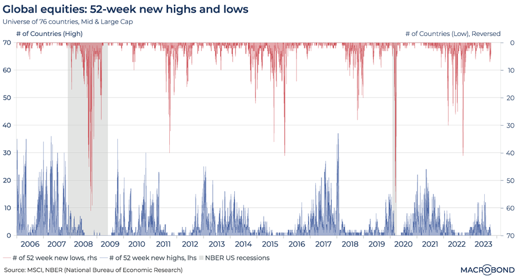
This chart has a global take on equities, examining mid- and large-cap stocks in 76 countries. Our analysis counts how many countries’ equity markets have reached a rolling 52-week high (in blue) or low (in red).
The resulting “stalagmite and stalactite” visualisation provides an insight into the current, more subdued equity dynamics when compared to the global financial crisis in 2007-09, as well as the panic that followed the outbreak of Covid-19. The two US recessions are highlighted in grey.
The red “stalactites” are spikier than their blue counterparts – suggesting that moments of pessimism are global, but optimism is more local.
Geopolitical events and oil prices
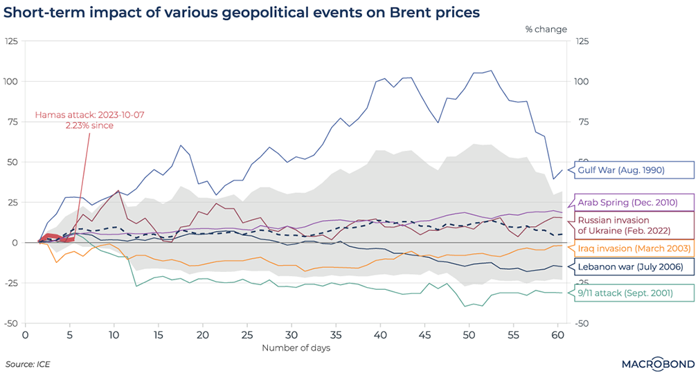
Oil prices jumped immediately after Hamas attacked Israel. As the war escalates, threatening to involve more players in the oil-rich Middle East and potentially complicating energy trade routes, our chart analyses the short-term effects of previous geopolitical events on Brent crude.
Saddam Hussein’s invasion of Kuwait in August 1990 had the most notable effect on oil markets. Less than two months later, prices had doubled.
9/11 saw a very short-term spike, but oil prices quickly began tumbling amid concerns that a recession driven by the attacks would reduce demand.
Will either pattern repeat itself this time? At the time of writing, this week’s oil-price spike was fading. Traders will be considering the interplay between a weaker global economy alongside the spectre of a wider conflict – as well as OPEC’s determination to cut production.
Curbed enthusiasm from the IMF
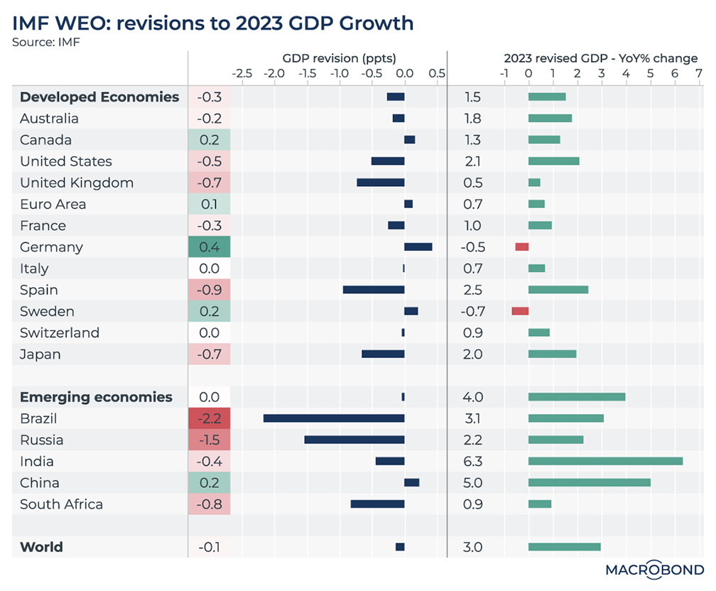
Tip: this chart can be applied to different countries using Macrobond’s change region functionality. It also requires a Data+ subscription.
We’ve written several times about the International Monetary Fund’s forecasts. Early this year, it boosted its 2023 outlook on optimism about China’s reopening. But in April, we noted that the IMF had a history of reducing its medium-term forecasts.
In an atmosphere of slowing global growth, the IMF updated its World Economic Outlook (WEO) again on Oct. 10. In the chart above, the right side displays the new GDP growth expectations for various nations in 2023. The left side measures the (mostly downward) revisions compared to the IMF’s previous outlook published in April.
India is forecast to post the strongest growth, at 6.3 percent. Germany and Sweden are notable: they’re among the few countries to receive upward revisions, but the IMF predicts a recession for both.
A fatter savings cushion Stateside
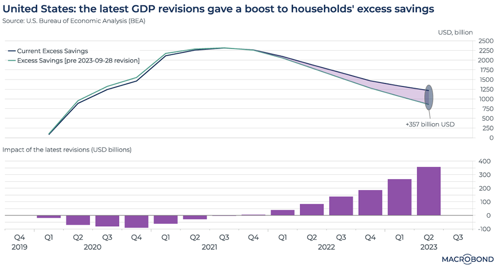
In August, we looked at the stock of excess savings US consumers had accumulated since the beginning of the pandemic. It appeared that this cushion was deflating quickly.
However, the picture has swiftly changed. When US gross domestic product figures were revised on Sept. 28, statistics on savings were revised as well. Households will have more flexibility to navigate a slowing economy and higher borrowing costs than some observers had expected.
As our chart shows, revisions increased the current stock of excess savings by 350 billion USD. (This was mainly due to significant upward adjustments made to the income component, which aggregates three variables: employee compensation, proprietors’ income, and rental income.)
US yield curves over the past five years
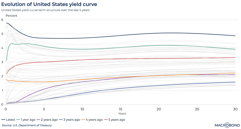
Tip: this chart can be applied to different countries using Macrobond’s change region functionality.
What a difference a few years, a pandemic and an inflation outbreak can make for the bond market.
This chart visualises the monthly evolution of the US yield curve since 2018, bolded and highlighted in different colours every 12 months.
Unsurprisingly, after a record rate-hiking cycle by the Fed, the current curve is at the top. Though the curve is inverted – indicating that longer-term rates are expected to be lower than their short-term counterparts – 30-year yields remain near 5 percent, indicating that the market doesn’t foresee a return to post-GFC inflation levels anytime soon.
At the bottom of our chart are highlighted curves from the worst pandemic years, 2020 and 2021 – before inflation had kicked in and policy makers around the world were vowing to keep rates low for some time.
The 2018 line, in red, might be considered the “old normal.” It’s notable that the 2019 curve, in orange, was inverted; traders were anticipating a non-pandemic-related recession in 2020.
Countries have been overshooting their inflation targets for years
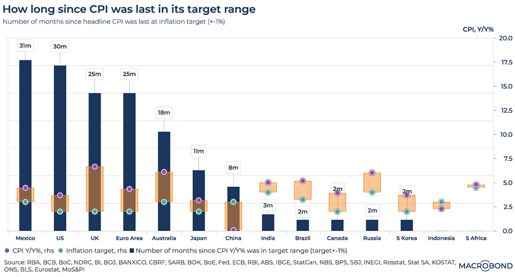
Central banks began declaring explicit, public inflation targets in the 1990s to boost their credibility. (Famously, the governor of the Bank of England is required to write a letter to the finance minister when inflation significantly overshoots.) In 2012, the Federal Reserve joined in under Ben Bernanke’s leadership, officially adopting a 2 percent target.
With inflation proving sticky around the world, these targets are being tested like never before.
The blue bars on our visualisation measure how long it has been since a country was within a percentage point of its central bank’s inflation target. Mexico and the US are closing in on three years. Only South Africa and Indonesia are less than a percentage point from their targets.
The orange/yellow bars, measurable on the Y axis, show the gap between the year-on-year consumer price index (CPI) increase and the inflation target. The UK has the widest gap.
China is notable for having missed its 3 percent target on the deflationary side for seven months.
Inflation is sticky for more than 80% of Britain’s CPI basket
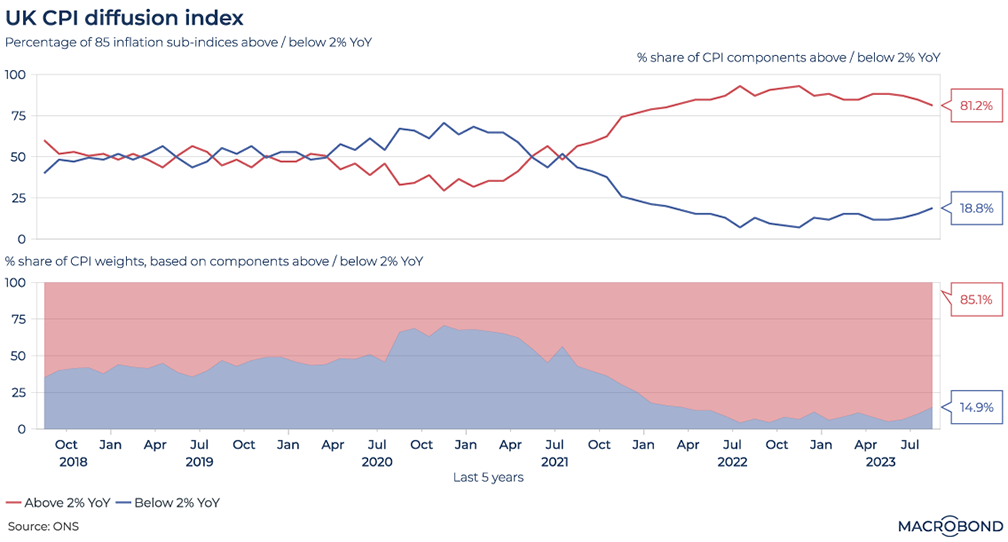
For a deeper dive into Britain’s inflation problem, we created a diffusion index for items in the CPI basket tracked by the Office for National Statistics. When overlap between categories is removed, we can identify 85 different sub-indices in this basket.
The upper pane of the chart compares the percentage of these 85 categories where prices are rising more than 2 percent year-on-year (in red) with the percentage where increases are below that threshold or negative (in green).
The lower pane takes the same data but adjusts categories for their weighting in the overall inflation basket.
The reversal since the deflationary days of the pandemic is stark: some 69 of the 85 sub-indices are in 2-percent-plus price-gain territory. When adjusted for weighting, the burden on the consumer by this metric is even worse. And worryingly for the Bank of England, the proportions have barely moved over the course of a year – in both panels.
5 topics
.png)
Macrobond delivers the world’s most extensive macroeconomic & financial data alongside the tools and technologies to quickly analyse, visualise and share insights – from a single integrated platform. Our application is a single source of truth for...
Expertise
.png)
Macrobond delivers the world’s most extensive macroeconomic & financial data alongside the tools and technologies to quickly analyse, visualise and share insights – from a single integrated platform. Our application is a single source of truth for...
.png)