No cut for you! RBA cut expectations pushed to 2025 (for the first time ever!)
Something very important happened for the first time ever today, and I bet I’m the only one who noticed!
Each day I take a screenshot of the ASX 30 Day Interbank Cash Rate Futures Implied Yield Curve available from the RBA Rate Tracker page on the ASX website. The blue bars reflect the prices of interest rate futures, and together they construct an “implied yield curve”. This is just a fancy way of saying “where the market thinks yields are going to be in the future”.
The future is unknown, of course, so there’s no guarantee the RBA is going to stick to the market’s perceived schedule, but I believe the RBA Implied Yield Curve is a fantastic way to help investors visualise how the market is thinking about interest rates. The best bit is, it’s freely available to everyone.
Each day, I keep an eye on which month the market thinks we’ll get our first interest rate cut. The RBA usually deals in 0.25% or ‘25 basis point’ moves. The official cash rate is currently at 4.35%, so this means that if the top of a blue bar is less than 4.10% the market has fully factored in the first rate cut.
Here’s the newsflash: For the first time ever, the market has priced out a rate cut in 2024!
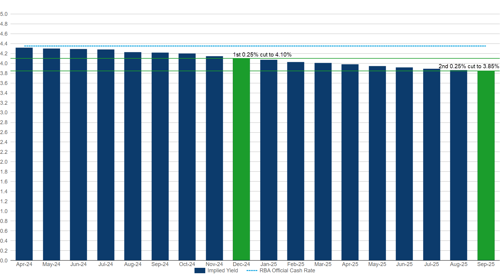
Above is the snapshot of the RBA Implied Yield Curve for Monday. I’ve coloured each rate cut in green. On Monday the market was expecting the first 25 basis point rate cut in December. Note also the timing of the second 25 basis point cut to 3.85%, it was expected in September 2025.
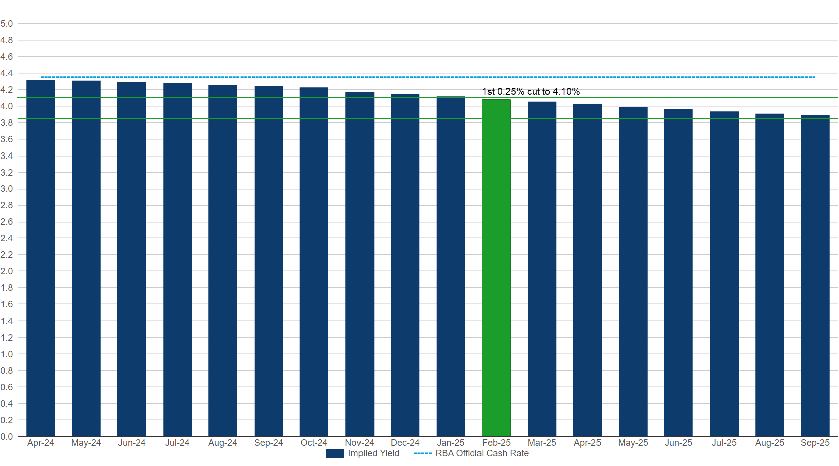
Fast forward to Tuesday’s RBA Implied Yield Curve and for the first time ever we can see that there’s only one green bar in the image – in February 2025! Worse still, the second cut isn’t even in the picture! Yikes!
I know what you’re thinking. I can see what this might have to do with my mortgage, but what’s it got to do with my portfolio? Well, it’s a big deal for your portfolio partly because it is such a big deal for your mortgage.
Stocks hate higher interest rates. Here’s why:
Higher rates equals less discretionary spending in the economy, that’s bad for company revenues
Higher rates increases borrowing costs for companies, plus companies use debt to invest to grow their profits, so higher rates also hampers earnings growth
Stock market analysts apply a discount rate to value stocks which is tied to the official cash rate. Higher discount rates lower the valuation that can be achieved for a company’s shares
So, higher interest rates are like a tax on how much investors can tolerate higher stock prices.
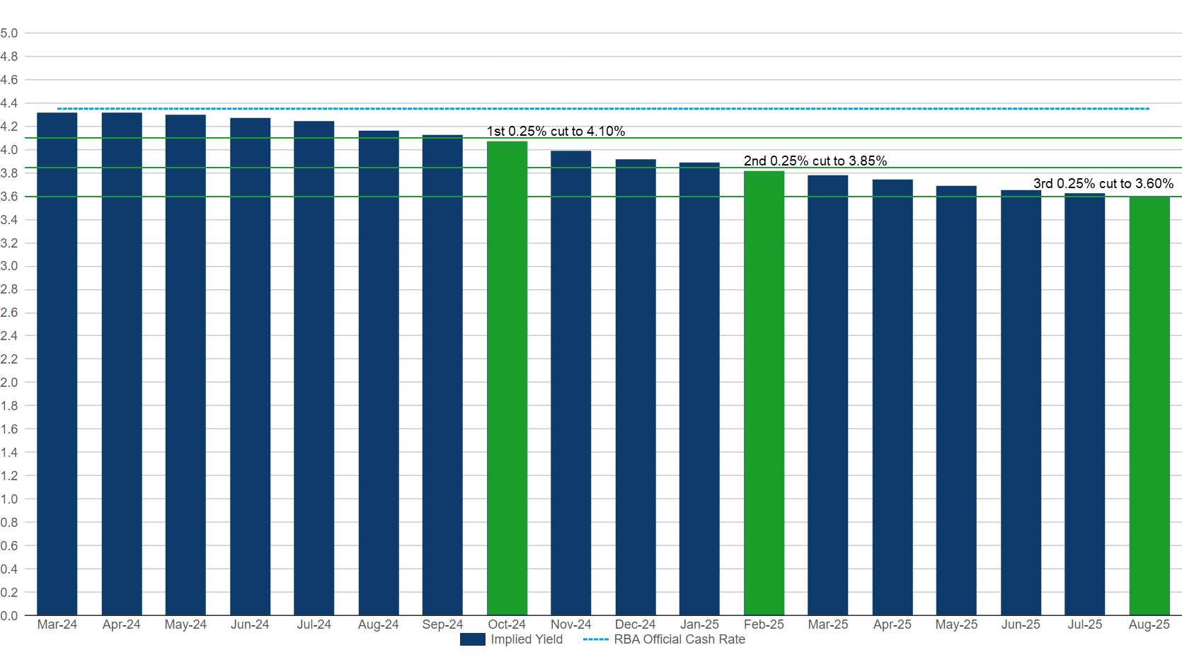
To better illustrate the link between the RBA Implied Yield Curve and stock prices on the ASX, consider the snapshot above from the day the S&P/ASX 200 peaked at 7910.5 on 28 March. Back then, the market was expecting three interest rate cuts by August 2025, with the first cut slated for October.
This means that in just three short weeks, market thinking about interest rates and therefore what’s fair value for Aussie stocks, has shifted dramatically. To further highlight how much market thinking about the timing of interest rate cuts has shifted, note that at the start of the year (curve not shown this time), the first three cuts were expected in June, October, and April 2024.
Why is this happening?
The short answer is inflation.
Nagging, sticky, just won’t go away, inflation. Around the end of last year, it looked like we were making great progress on inflation, particularly in the US where key global benchmark interest rates are set. Inevitably, US interest rates have a great deal to do with local interest rate expectations (sorry RBA!), and since the middle of March, these have been rising steadily.
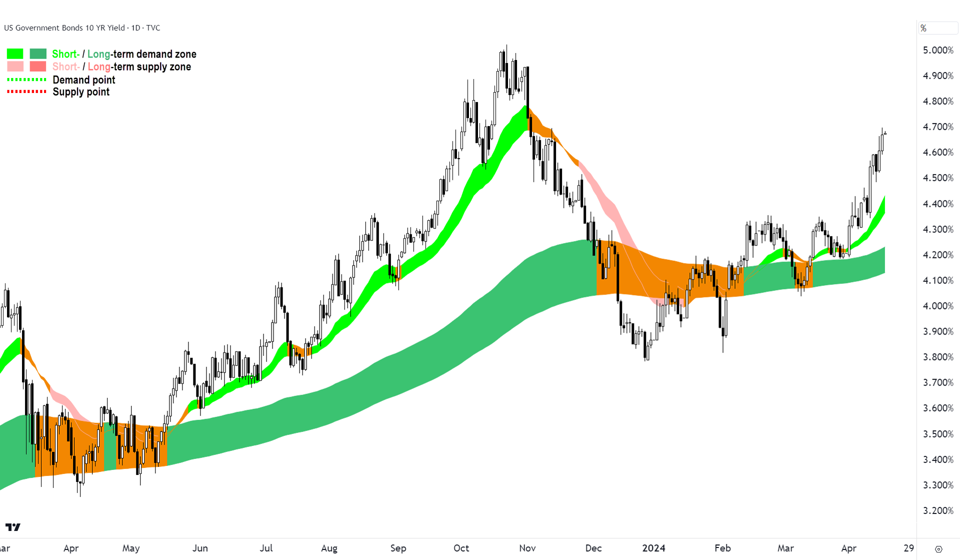
One of the key benchmark global interest rates is the US 10-year Treasury Bond Yield. The chart above shows the marked shift in its trajectory since the middle of March. Yields, and therefore market interest rates, are rising. Here’s why:
First pulse on 12 March = Worse than expected US February consumer price inflation (CPI) data
Second pulse 29 March = Worse than expected personal consumption expenditures (PCE) price index data, this is the Federal Reserve’s preferred measure of inflation.
Third pulse 10 April = Worse than expected US March consumer price inflation (CPI) data
Basically, the data on inflation in February and March shows inflation is hovering around 3.5% on an annual basis. Prior to this, it was steadily falling, and the market was hoping it would get to the Fed’s 2% target sooner rather than later. It now looks like the final leg of the disinflationary journey may take longer than originally expected, and this has pushed back expectations of the first rate cut.
What we’re seeing in stock markets now is a bit of a temper tantrum because investors are less likely to get what they really want: lower interest rates.
How bad could it get?
The good news is that inflation has come down, both in the US and locally, and the most likely next move in interest rates is down – it’s just a question of when. The aim of this article is to try to explain the market’s increasing uncertainty over the answer of this question: When?
Markets hate uncertainty, we’ve all heard that old chestnut before. But in practice, investors respond to greater uncertainty by increasing the discount rate they use to price stocks. Remember, a higher discount rate equals lower stock prices – it’s an inescapable fact of investing.
So, until we get some clarity from our central bankers as to their intentions, and or some inflation data which shows the next move out of the plateau commenced in the February and March inflation data is down, not up, we could be in for a rocky ride.
Yesterday, Federal Reserve Chairman Jerome Powell indicated the recent inflation data hasn’t given the Fed greater confidence inflation is tracking towards their 2% goal. If anything, he noted “it is likely to take longer than expected to achieve that confidence”.
He then went on to say, “Right now, given the strength of the labor market and progress on inflation so far, it’s appropriate to allow restrictive policy further time to work and let the data and the evolving outlook guide us”. Ouch.
These comments are the first from the Chairman to contradict statements he made less than a month ago when he said, “our policy rate is likely at its peak for this type of cycle, and that if the economy evolves broadly as expected, it will likely be appropriate to begin dialling back policy restraint at some point this year”.
The current drop in stock prices is a result of markets trying to adjust to a big shift in signalling in a very short space of time.
It's a little reminiscent of what occurred in November 2021. Prior to that time, Mr. Powell's messaging was that the ultra-low interest rates set in the wake of the COVID-19 pandemic would persist for the then foreseeable future.
On November 22, Mr. Powell was reappointed as Fed Chairman for another four-years. His rhetoric changed to signal inflation was a greater threat than previously thought, and that the Fed was prepared increase interest rates to combat it. Lift-off in the Fed’s latest hiking cycle commenced in March 2022.
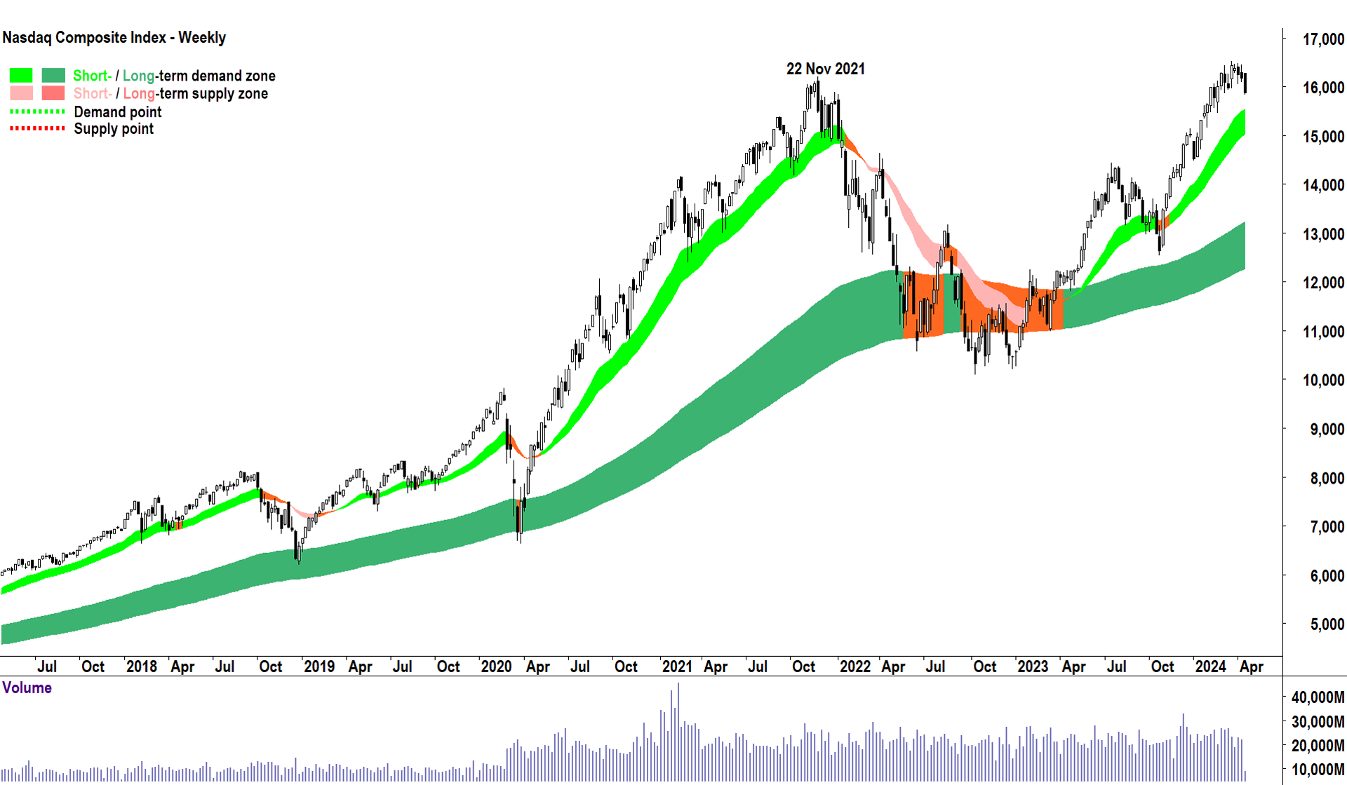
What’s the significance of 22 November 2021? It was the exact top of the 2020-2021 bull market. Stocks fell over 35% to the October 2022 low.
We’ve all heard the saying that history doesn’t necessarily repeat in markets, but it sure can rhyme. Well, looking at the similarities between November 2021 and today, let’s hope not!
This article first appeared on Market Index on Wednesday 17 April 2024.
5 topics

