Seven reasons the gold bull market will continue
Gold prices eased last week, with a broader pullback in commodity markets seeing the precious metal trade back below USD 2,000 per troy ounce (oz).
A widely anticipated rate hike by the Federal Reserve, and a strong rally in risk assets (S+P 500 +6%, NASDAQ +8% for the week) were additional headwinds for gold, with demand in key consumer markets also negatively impacted by a resurgence in COVID-19 cases.
Gold’s inability to hold onto the USD 2,000 oz level has seen some commentators suggest we may see a repeat of what happened back in 2011.
Back then, gold’s surge towards the USD 2,000 oz price level marked the end of a decade long bull run in the precious metal. The gold price would go onto fall by almost 45% in US dollar terms in the years that followed, bottoming out around USD 1,050 oz at the end of 2015.
While there could be more short-term downside for the precious metal, the outlook remains healthy, with several factors suggesting that rather than repeat the post-2011 experience, the bull market in gold will continue.
These factors include:
-
Gold was overbought in 2011
Gold hit USD 1,899 oz in early September 2011. At the time, it was trading a full 27%, and more than USD 400 oz above its 200-day moving average (DMA), which was still below USD 1,500 oz.
It had only been more overbought on two occasions in the preceding 10 years, a period that in total saw the price rise by almost 600%.
This time around, gold is trading just USD 123 oz (7%) above its 200DMA.
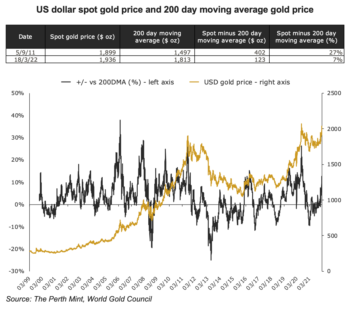
Gold was clearly overbought in 2011 and due for a meaningful correction, which it subsequently endured.
The market is in a far healthier position today.
-
Yield differentials
The nominal yield environment is somewhat similar today, as compared to August 2011, though real yields are lower, and now negative. This can be seen in the table below.
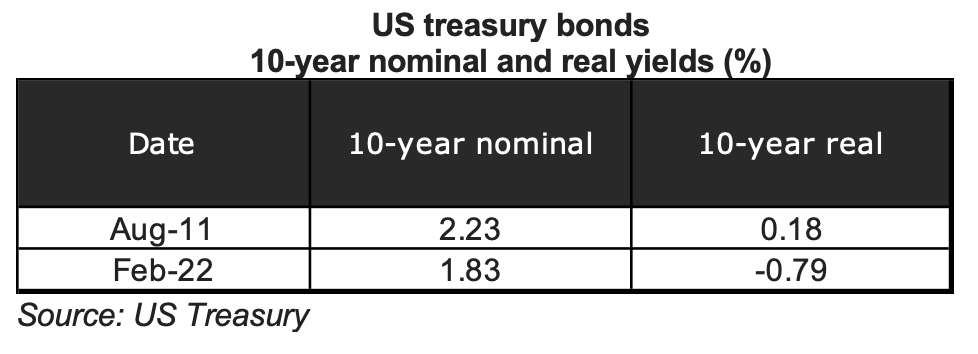
The bigger difference though is in the shape of the yield curve, and its evolution in recent times.
In 2011, the spread between the 10-year US treasury and the 2-year US treasury was 2.03%. In the year leading into August of that year, it had barely moved.
By the end of February of this year, this spread was just 0.39%, having declined by almost 1% in the past twelve months.
-
The best of times, the worst of times
One major difference between now and 2011 is the relative performance of gold versus the S&P 500. In the 10 years to Q3 2011, the precious metal substantially outperformed the equity market with gold rising by 455%, while the stock market was up just 9%.
In the 10 years that followed it was the complete opposite, with the S&P 500 up 280%, while gold was up just 7%.
The diverging fortunes of the two can be seen in the chart below which highlights the rolling 10-year performance of the S&P 500 versus gold. When the line is above zero, it means equities are outperforming, and vice-versa.
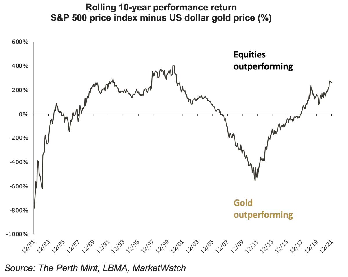
Relative to equities, gold was expensive in 2011. Today it looks cheap.
It should also be noted that equities are notably more expensive today than they were in late 2011 (see table below), with price to sales and price to earnings ratios rising by 168% and 83% respectively over this period.
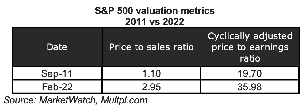
Put simply, equity returns are likely to be lower, while equity market volatility is likely to be higher in the years ahead, relative to the decade past.
-
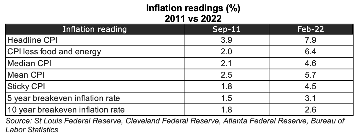
Inflation
While there was plenty of talk about inflation in 2011, in part fuelled by gold’s strong run that year, there was little in the way of meaningful inflationary pressure evident in markets.
It is significantly more problematic today, evidenced by much higher headline rates and other observable inflation readings.
Several factors are likely to exacerbate this inflation challenge going forward.
These include an enhanced focus on ESG concerns and net zero initiatives, the supply chain challenges posed by COVID, and the impetus toward onshoring and energy market fragilities, which have come to the fore since the onset of the Russia-Ukraine conflict.
None of these were major factors in 2011.
-
Sentiment
Every year, Gallup does a poll asking investors in the United States what they think the best long-term investment is. Typically, the investors are given five options to choose from: cash, gold, shares, real estate or bonds.
The chart below, which runs from 2011 to 2021, shows the evolution in the percentage of investors that chose gold (the gold line), and the percentage of investors that chose shares (black line).
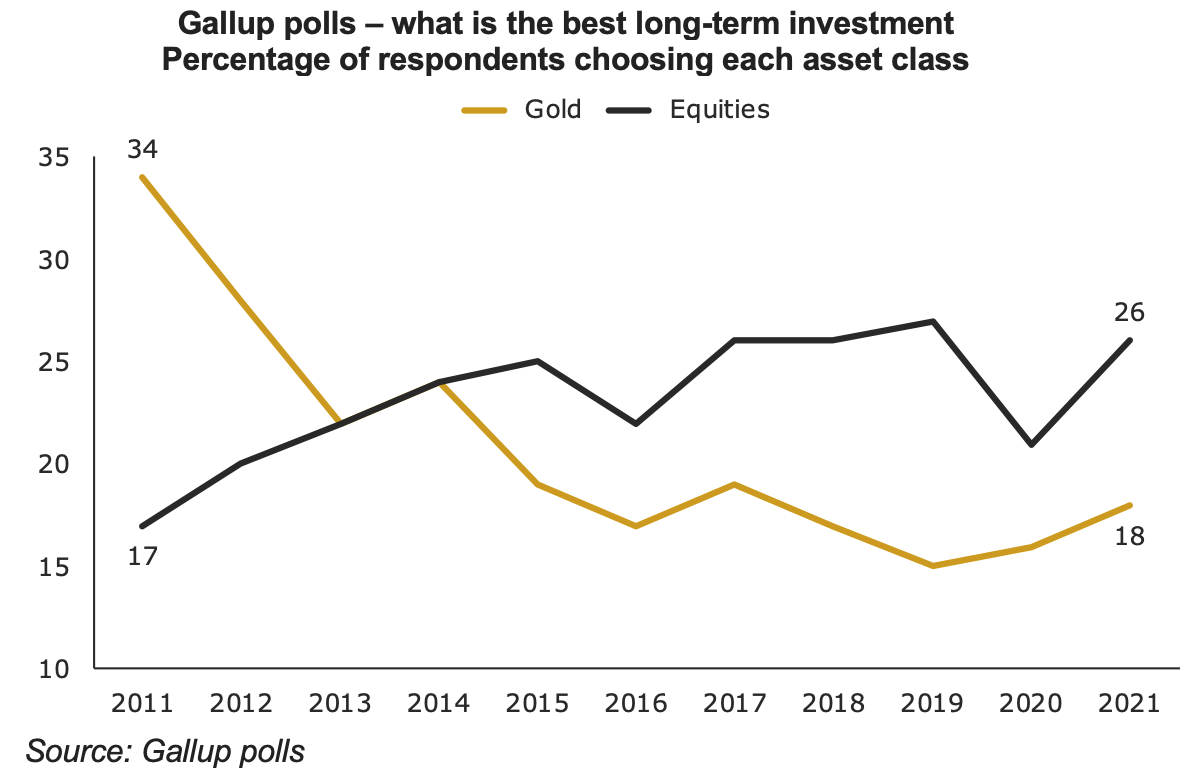
Back in 2011, when gold first approached USD 2,000 oz, it was the most popular choice of the five options, with 34% of investors stating it was the best long-term investment. Only 17% of people chose the share market, while only 19% chose real estate.
By last year, gold garnered just 18% of the votes, well below both stocks (26% of votes) and real estate (41% of votes).
-
ETF markets
Back in 2011, there was a surge of money flowing into gold ETFs, with total holdings rising by 8% in the 12 months ending in August of that year. In the 12 months to end February 2022, there were net outflows from gold ETFs, with total holdings falling by 1%.
As another way of visualising the exuberance towards gold in 2011, versus the far more subdued sentiment this time round, consider the following chart, from TopDown Charts.
It shows that back in 2011, gold ETFs in the US made up 8% of the total ETF market. GLD was at the time the biggest ETF in the world.
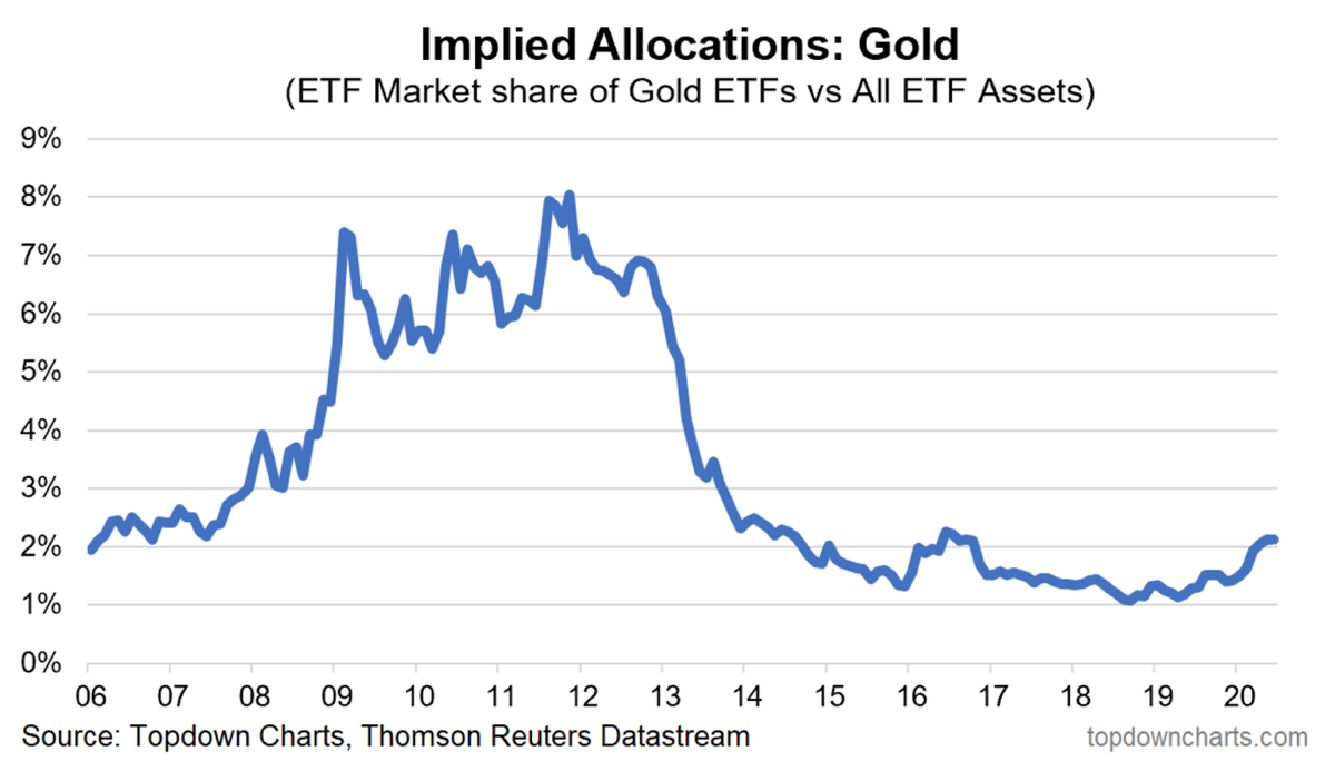
By June of 2020, gold ETFs made up just 2% of the total ETF market. Given movements in markets since (gold +8%, the S&P 500 +41% from end June 2020 to end February 22), gold’s ‘market share’ of total ETF assets would be even lower today.
-
Silver price suggests more upside
In April 2011, the gold to silver ratio (GSR) fell to just 32, meaning it took 32 ounces of silver to buy one ounce of gold. The GSR had been closer to 80 in late 2008, with gold prices rallying by 80% over this period.
Since then, silver suffered a decade of historic underperformance that culminated in the COVID crash, with the GSR rising to beyond 110. It has fallen in the two years since, but by the end of February this year the GSR was still sitting at 78.
That is almost the same level it was sitting at more than approximately 14 years ago, just before both gold and silver exploded to the upside.
Conclusion
Gold looks to be in a far healthier position relative to 2011.
Sentiment is far more subdued, while it is coming off a 10-year period of underperformance relative to risk assets, rather than the opposite.
Investor allocations are also more modest, while gold is not overbought today, whereas it was in 2011.
Finally, the yield environment, valuations in financial markets, and inflationary dynamics are all more supportive for the precious metal today, as is silver’s price, which remains cheap on a relative basis
Combined, these factors suggest gold’s bull market run could well continue.

3 topics
1 stock mentioned
.jpg)
.jpg)