TOL - 24th Sep, 2024
The Australian share market is at record highs. This indicator suggests it's not cheap...
The ASX 200 logged a series of record highs this week, but rising prices can reflect strong earnings. So, are Aussie shares expensive?
Everyone loves a bargain, right? This couldn’t be truer in the stock market. No investor wants to pay more than they should, and every investor, big and small, wants to find good value for their hard-earned dollar.
But what constitutes good value in the stock market? One of the most commonly used proxies for stock valuation is the Price-to-Earnings Ratio (PE Ratio). It divides a stock’s earnings into its price using this formula:

The PE Ratio formula is simple: The bigger a stock’s earnings compared to its current price, the lower its PE Ratio. For this reason investors typically seek out stocks with lower PE Ratios than higher PE Ratios. But there are some important rules of thumb when using the PE Ratio to compare stocks. Let’s go through each of them.
Consider a stock’s PE against its historical range
To get a better understanding of whether a stock’s PE Ratio is high or low right now, consider what the highest and lowest PE Ratio it achieved over the last five years. This sounds daunting, but it’s actually very easy using our Market Index stock Financials data. In the search bar at the top of each page, type the ASX code of a stock you’re interested in and then select the “Financials” tab from the menu just below the stock’s price.

Scroll down the financial data until you get to “Earnings (EPS) Adjusted)”. Our data typically goes back 10 years where available. Make note of the EPS data for the last five years – we’ll need this in the next step.
Now, you’ll need the other data point of the PE Ratio equation – the price. For this, go to the “Overview” tab and select the “5yr” option below the chart. By hovering over the chart, you can read off the last price of the stock each day over the last five years. I suggest you use the price at June 30 of each year in the PE Ratio calculation, to keep it consistent.

BHP’s 5-year PE Ratio calculations are displayed in the table below. We can see that it has traded in a PE Ratio range between 4.5 (FY22) and 18.2 (FY24). BHP’s current PE Ratio is 17.1, so it is very close to the top of its 5-year PE Ratio range.
.png)
This method provides a broad overview of what the market has been prepared to pay for BHP’s earnings over the past five years. There are no guarantees that this period will be representative of the next five years and you may wish to treat some years, for example, FY22, as aberrations.
Try to compare stocks within the same industry
It is important when considering a stock’s PE Ratio to compare it with other stocks in the same sector. The basic premise here is to compare apples with apples and oranges with oranges – or in the case of stocks: healthcare with healthcare and utilities with utilities!
Different sectors tend to have different average PE Ratios. Some sectors tend to have higher PE Ratios, reflecting typically higher earnings growth rates, while others tend to have lower PE Ratios, reflecting typically lower earnings growth rates but stable dividend returns.
Try to use forward-looking earnings data
We touched upon this in the historical range discussion – there’s no reason why a historical PE Ratio should be reflective of the future. One must consider current and future financial conditions for the stock to determine if they are similar to the historical sample – if they are – then historical data is more likely to be useful. Otherwise, it can be downright irrelevant, and therefore dangerous to use!
The “value trap”, or in this context, the PE Ratio trap refers to the mistaken belief that a low PE Ratio represents attractive value. The PE Ratio could be misleading if a low P (price) in the equation, using a historical E (earnings) that is much higher than can be achieved in the future, could result in a low PE Ratio that will not be sustained. If P remains the same, but E halves, because say the stock is in financial difficulty, then the PE Ratio in this example would turn out to be double that originally thought.

To avoid the PE Ratio trap, one should ideally use forward estimates of a stock’s earnings. These can be ascertained from some brokering and research houses. Otherwise, the average investor will have to do the hard work, researching a stock’s fundamentals to determine its future earnings.
What’s the PE Ratio of the Australian stock market? Is it cheap or expensive?
We can also use the PE Ratio to investigate value across an entire stock market, or more commonly, a benchmark stock index like the S&P/ASX 200. This is not typically something the average investor can do, because one would have to be able to determine the PE Ratio of every stock in the index. Still, the general concept is the same: Price of the index, divided by the combined earnings of the stocks in the index, equals the index PE Ratio.
To answer the question of whether the Australian stock market is expensive or not, we will use Macquarie’s Australian Market PER. The broker publishes this data each week for its clients in a dedicated research note (that we fortunately have access to!).
Before we get to Macquarie’s Australian Market PER, it’s worth mentioning historical PE Ratio norms for the Australian stock market. There are three general PE Ratio markers for the Australian stock market investors should be aware of. The data has been gathered over many decades (chart below) and can be summarised as:
- Market PE Ratios near 10 or below have typically been associated with major market lows and subsequent recoveries
- Market PE Ratios around 15 have typically been associated with a market that is considered “fairly valued”
- Market PE Ratios near or above 20 have typically been associated with major market tops and subsequent downturns

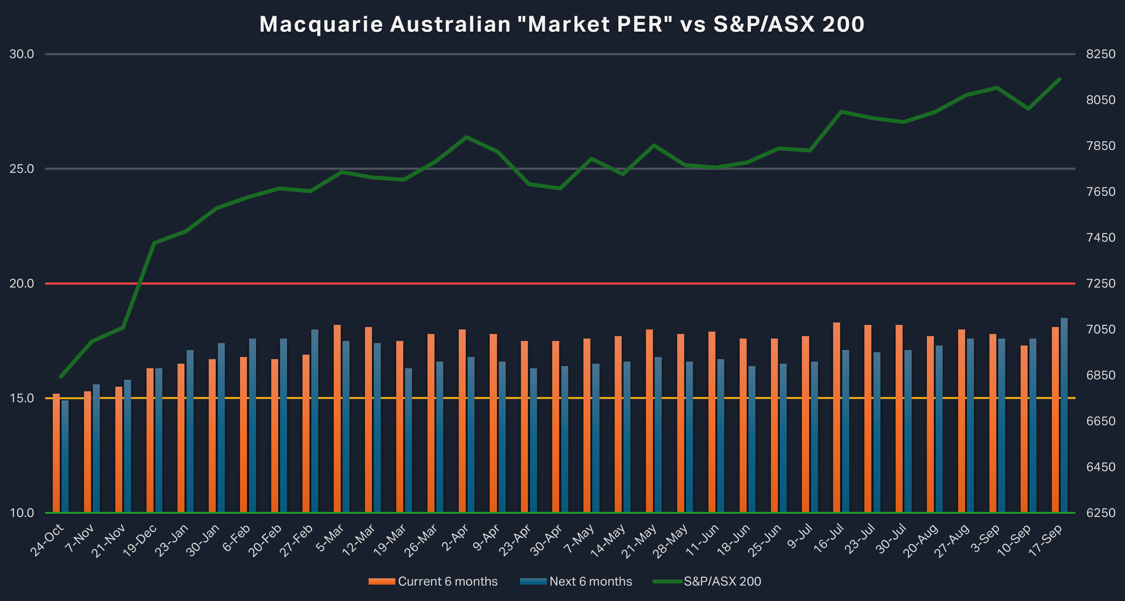
Back to Macquarie’s Australian Market PER. This week’s update shows that the Australian Market PER for the fiscal half ending 31 December 2024 has increased to 18.1x from last week’s 17.3x, it was 17.7x one month ago. Looking ahead to the fiscal half ending 30 June 2025, the Australian Market PER has increased to 18.5x compared to last week’s 17.6x, it was 17.3x one month ago.

Firstly, note we are using best practice here – we are using forward-looking PE Ratios, and we are also comparing to a historical range. Macquarie’s Australian Market PER suggests that Australian shares are not cheap, but they are closer to what has historically been considered “expensive” rather than to “fair value”.
Note here that Macquarie’s Australian Market PER is a dynamic concept. We know that price is always changing, but so too is the broker’s forecast for future earnings. It is possible that if Macquarie sees stronger earnings growth ahead, the Market PER could fall even if the ASX 200 remains at its current level.
Otherwise, for those who wish to get a bargain, you’ll have to wait until the P part of the equation adjusts. Waiting for a stock market crash is a risky business – you may miss out on the P rising – even if it is rising further into overvalued territory!
Note that every six months, Macquarie must change the half it refers to as the current half and the half it refers to as the next half. In the above chart, there was a change on 5 March when the June 2024/December 2024 halves took over from the December 2023/June 2024 halves as the relevant current half/next half combination. The last change was on 10 September where December 2024/June 2025 transitioned to the relevant current half/next half combination. For this reason, you may notice what appears to be an abrupt change in the Market PER data.
This article first appeared on Market Index on Friday 20 September 2024.
Never miss an update
Enjoy this wire? Hit the ‘like’ button to let us know.
Stay up to date with my current content by
following me below and you’ll be notified every time I post a wire
Carl has over 30-years investing experience and has helped investors navigate several bull and bear markets over this time. He is a well respected markets commentator who specialises in how the global macro impacts Australian and US equities. Carl has a passion for technical analysis and has taught his unique brand of price-action trend following to thousands of Aussie investors.
........
Investing is risky. Inevitably you will endure losses. If you can't cope with losing, don't invest.

5 topics
1 stock mentioned

Carl has over 30-years investing experience and has helped investors navigate several bull and bear markets over this time. He is a well respected markets commentator who specialises in how the global macro impacts Australian and US equities. Carl...
Carl has over 30-years investing experience and has helped investors navigate several bull and bear markets over this time. He is a well respected markets commentator who specialises in how the global macro impacts Australian and US equities. Carl...
Comments
Comments
Sign In or Join Free to comment