The real reason Aussie housing is expensive
Australian housing is expensive. Hardly a shocking statement. But if you ask a bunch of investors and economists why it’s expensive, you’re bound to get a wide range of answers. Most of them will refer to credit availability in some way. A few might mention a lack of supply, and demographics, and almost all of them will discuss interest rates.
But according to Chris Bedingfield, Principal and Portfolio Manager at Quay Global Investors, there’s a simple and absolutely critical reason that almost everyone overlooks.
Indeed, in more than a decade of closely following markets, I’ve never heard his view put forward.
It all boils down to the replacement cost – or the cost of building a new home. Sure, there’s a premium for being closer to the city or the beach, and various other niceties that come with expensive inner suburb houses. But it’s the cost of building a new property in Bankstown or Craigieburn that ultimately drives prices in the rest of the city in the long term.
As The Rules of Investing podcast returns after a break, Chris explains why it’s so expensive to build new housing in Australia, shares some of the best opportunities in real estate today, and tells us why he thinks many people are overestimating the impact of working from home.
Time stamps:
- 2:28 - The Centro "Sell" report
- 8:16 - What AREITs got wrong before the GFC and how they're different today
- 12:21 - The real reason Australian housing is so expensive
- 19:55 - Why the impacts of work from home might be over-stated
- 24:34 - What rising interest rates mean for property
- 29:21 - The boom in household savings and what it means for markets and economies
- 36:42 - Where Chris is finding attractive opportunities today
- 44:14 - Chris answers our three favourite questions.
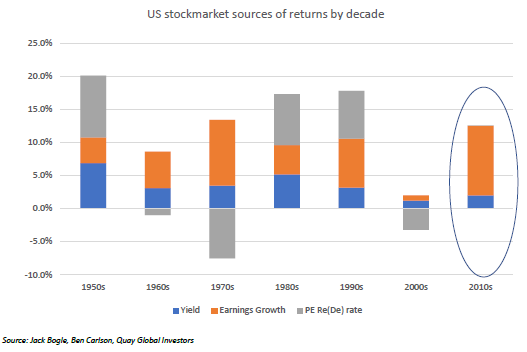
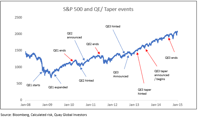
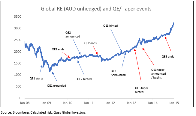
Accompanying charts - discussed between 24:34 and 29:21:

"The 2010’s were a very active decade for the US Fed with a significant expansion in Fed assets…. but zero impact on earnings multiples."

The chart above shows "the performance of the S&P500 coming out of the last crisis (GFC). The red arrows are 'hawkish' Fed statements, the blue arrows are 'dovish'"

This chart shows "the so-called interest rate sensitive global real estate index – again red arrows indicated ending of QE/rate rises etc." while the blue arrows show dovish statements or actions by the Fed.
Reading recommendation:
- The 7 deadly innocent frauds of economic policy, by Warren Mosler. Available for free (and legal) download here.
Investing in global listed real estate
Quay, a Bennelong Funds Management boutique, focuses on the preservation and creation of wealth through innovative strategies in real estate securities. For more insights on global property, visit Quay’s website.
1 contributor mentioned


