The value investor's guide to multi-asset investing
Valuations are an integral input for multi-asset investing. They tell us information about expected risk and opportunity both for individual asset classes and in relation to other assets — helping us prioritise allocations and manage portfolios.
As an asset allocator, your job is to navigate risk, return, and opportunity cost over typically longer-term timeframes but certainly through cycles and short-term gyrations. Extremes in absolute and relative valuations help with identifying and proactively managing risks, as well as prioritising opportunities through cycles and over the longer term.
It’s not necessarily about maximising returns, although that is an important objective, but being valuation-aware can help with what is arguably more important: protecting capital. Indeed, it takes a 100% return to get back to square from a 50% drawdown. So a risk signal from an extremely expensive valuation reading can be just as important as an opportunity signal from an extremely cheap valuation reading.
The principles are simple, but the practice is complicated by consensus thinking (especially in the presence of peer/benchmark risk) on the way up, and fear during downturns. There is always going to be a reason to not buy when things are cheap or not to reduce exposure when things are expensive, there is always an argument to go with the flow, and always a voice in your head talking you out of doing the right thing at the right time.
That’s why reliability, efficacy, and explainability (recall from the previous article on commodity valuations and indicator design) in valuation indicators across asset classes is critical. You need a solid quantitative and objective valuation signal that can help you keep your head when everyone else is losing theirs.
So it’s important to build the indicators (or at least obtain visibility on valuations from a reliable third party), understand the principles behind them and appreciate the wide range of investment insights that a solid suite of absolute and relative value indicators and skilled interpretation can yield.
Data and Application
The same principles of indicator design apply at a high level when it comes to building valuation indicators to help in the task of maximising return and managing risk in constructing multi-asset portfolios.
We want indicators that provide some kind of fundamental basis for gauging whether the asset is cheap or expensive (which should indicate troughs/peaks in that asset price), and the indicator needs to work —and work over time, and ideally be easily explainable (to explain to others, but also to yourself!).
We need to do this both in an absolute sense: i.e. is this individual asset cheap/expensive by itself? But also in the relative sense: i.e. is this asset cheap/expensive relative to another? There is also the mixed approach of valuation rankings i.e. a snapshot in time of what’s cheap, what’s expensive, and what’s in between.
But ultimately, it’s about supporting decision-making: determining which assets are at most risk, have the most opportunity, and prioritising allocations – and using valuations to also inform diversification efforts (e.g. 2022 taught us that expensive bonds could not be relied on as a dampener of risk, and instead they were a source of risk).
Relative Valuations
Let’s look first at relative valuations and then individual asset class valuations and rankings.
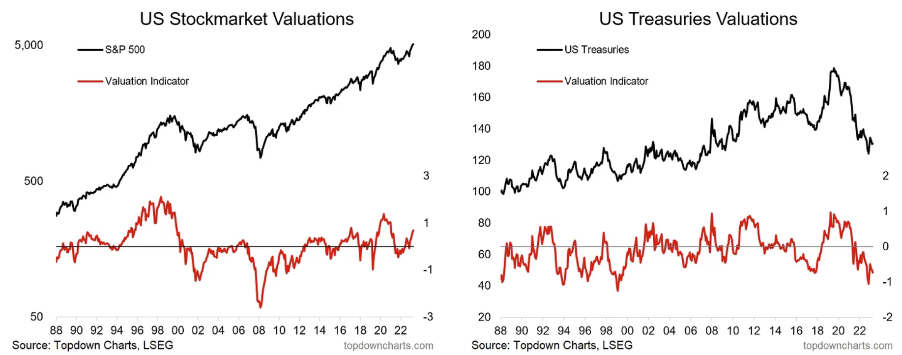
The charts below show my absolute valuation indicators for US equities, and US treasuries (from this post). Already we can glean some insights from this pair of charts — as of the latest reading (data to 31 March 2024) stocks are expensive, and bonds are cheap. That means our future/longer-term expectations would be for stocks to record lower returns, and bonds to turn in higher returns.
We can also see the individual peaks, troughs, and extremes in valuation – and in many respects, they mirror each other, given how stocks vs bonds tend to trade across the business and market cycles.
At the peak stocks are expensive and bonds are cheap, at the trough stocks are cheap and bonds are expensive – that makes intuitive sense (in boom times investors want risk-on/growth assets, not defensive assets, and in times of uncertainty and crisis, investors want defensive assets, not risk assets. We can use this understanding of cycles and observation of the data to help inform how we navigate cycles: when to shift allocations and go against the crowd (remember, valuations are just as much of a sentiment indicator as anything else).
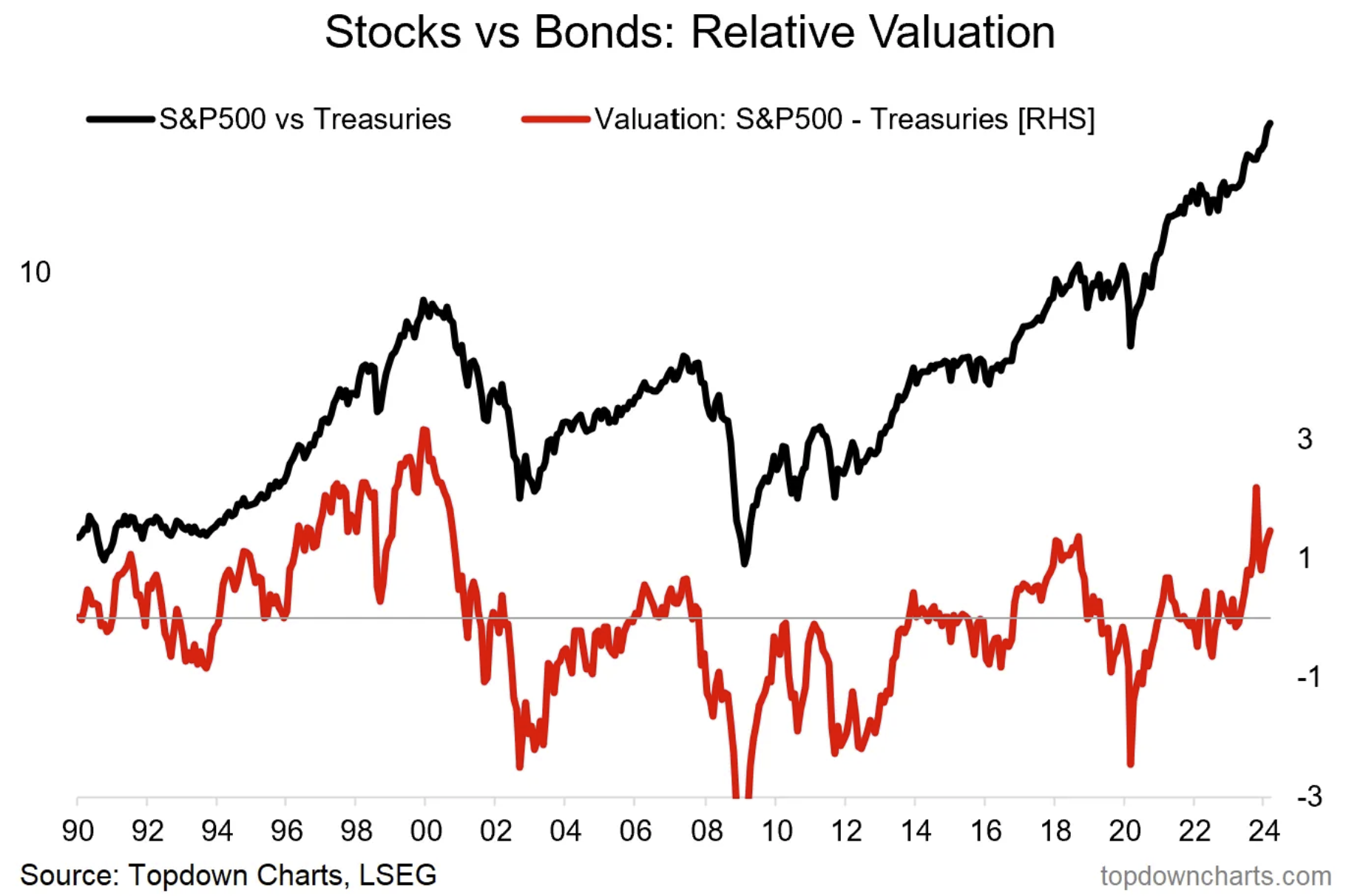
But armed with the above data and indicators, we can also produce a third/synthetic asset called stocks vs bonds (the stock/bond ratio). The relative performance line is the “price” of this third asset.
We can then simply take the spread of the stocks vs bonds valuation indicators above to generate a new valuation indicator for this “third asset”.
Echoing the understanding from the absolute valuations, we can see that the relative value indicator provides intuitive and useful signals at peaks and troughs of the stock/bond ratio.
Using this, an asset allocator can make decisions to take the portfolio defensive when forward-looking risk is high (i.e. when the relative value indicator is high and peaking) versus rebalancing into corrections/downturns and increasing risk asset exposure when forward-looking opportunity is high (i.e. when the relative value indicator plunges to an extreme low).
Just as with individual valuation indicators, there are exceptions to the rule, and it is often trickier in practice than in concept, but the job of navigating cycles and risk vs return is made easier by having vs not having a valuation compass. It can also be augmented by factoring in other information like macro/monetary data and tactical insights from sentiment and technicals.
But also, it’s important to note that stocks and bonds are not the only assets, and not only should we look across asset classes for opportunities, but also for prospective risks that may come “out of left field” (which may have had clues in the form of valuation extremes elsewhere…)
Multi-Asset Landscape
As noted once you have built valuation indicators for numerous asset classes, you can of course look at “third assets” and relative value indicators, but you can also use a simple ranking as a means of prioritizing research efforts, and quickly/easily spotting the extremes and lay of the multi-asset land.
The chart below is from our monthly Market Cycle Guidebook, and shows a snapshot in time (from 31 March 2024) of absolute valuation indicator levels across some of the major asset classes.
From this, we can immediately see what areas to look for opportunities (cheap) and what areas to monitor for risk (expensive). We can also from time to time see major themes (e.g. USD/US equities expensive vs EM/global assets cheap), and sentiment (e.g. government bonds cheap, risk assets expensive).

But that is just a snapshot in time and doesn’t reveal the insights that can be gained from studying the actual time series, where it can often pay to see the historical context and trend.
So in the next few charts, we will look at valuation indicators across these asset classes to provide a view of what’s possible and demonstrate some of the historical insights and current takeaways.
Equities
As previously outlined (in posts on global equities, different valuation types), the equity valuation indicators below are based on PE ratios. As you might guess, they largely move together for the most part, but there are clearly times when they disconnect and one market might show up significantly expensive vs its own history while others may simply be somewhat elevated or even neutral/cheap. A good example of this is the 2007 market peak, where the US and developed markets were not particularly expensive, but frontier and emerging markets were trading at a significant extreme.
This example goes to show the value of looking at valuation indicators across asset classes as you can end up detecting major risks and turning points by uncovering latent and emerging risks either from within the same type of asset class (equities) or from other assets (e.g. commodities, bonds, FX, real estate). It’s also worth highlighting that in the 2007 case, there were actually valuation extremes within US equities (e.g. small vs large, value vs growth).
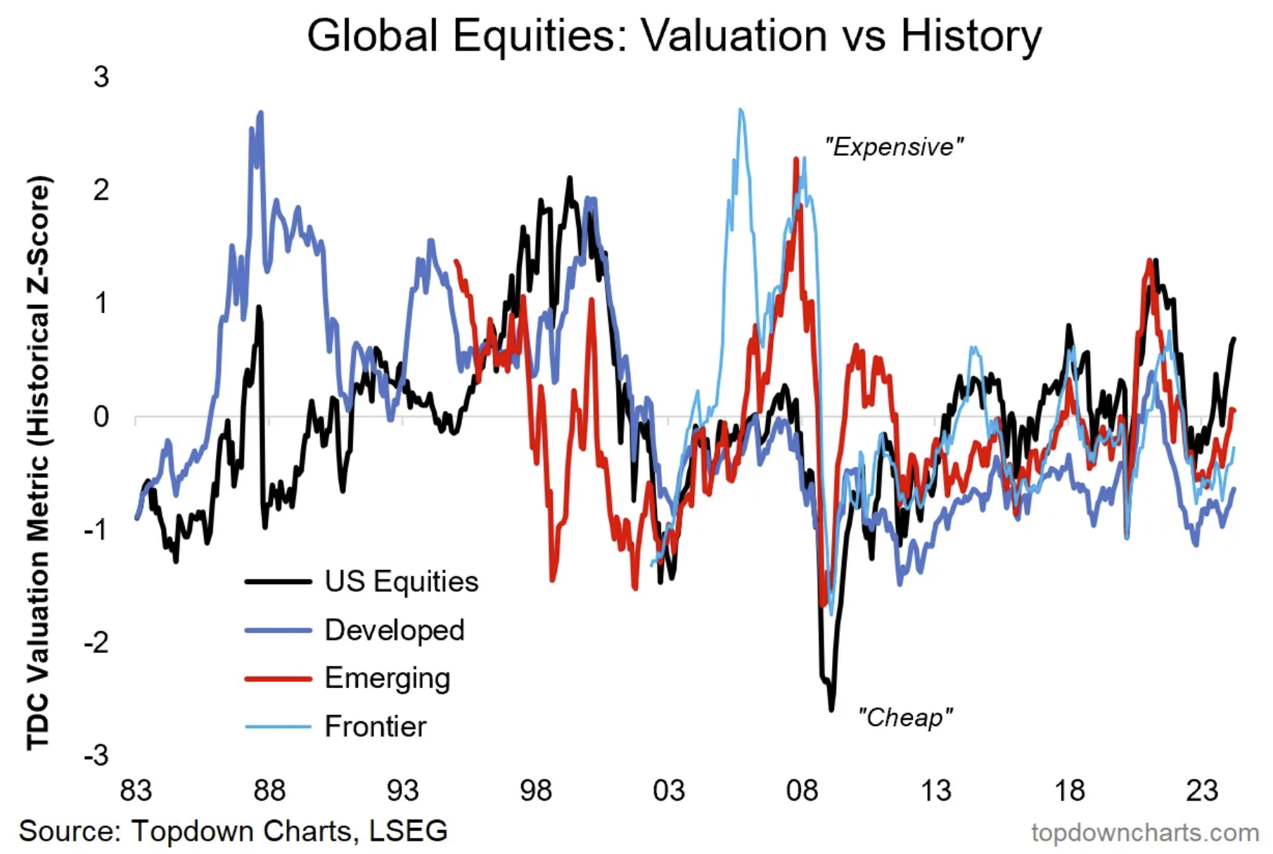
One drawback to this analysis is that because we are using z-scores we are gauging the expensiveness of each asset class by itself, about its own history. This is why emerging markets for example are showing up more expensive than developed markets most recently, despite trading on similar PE multiples. But again, even with that, using rankings can help prioritise research efforts (where to look first and in further detail + dimension).
Property
Real estate asset classes are also a good example of where detecting extremes (and peaks – i.e. the strongest signal is when a valuation indicator goes to an extreme and *then* rolls over) can yield important (macro)risk insights. The key example was again in the 2000s when the housing market and CRE went to extremely expensive levels and then peaked and rolled over, precipitating and contributing to the global financial crisis.
But importantly, they also indicated major opportunities on the other side of that episode, especially in REITs where extremely cheap valuations were briefly found (REIT prices subsequently doubled less than a year later, and tripled soon after — which goes to show how valuations can reveal major upside opportunities).
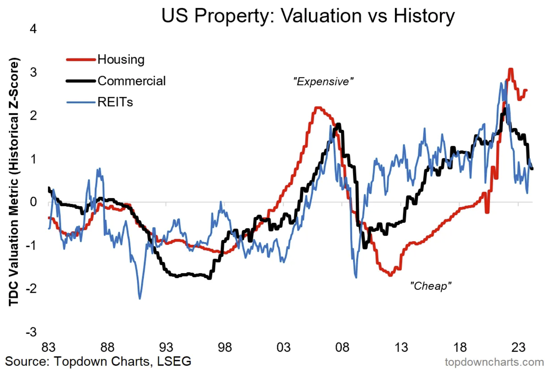
For reference, the housing indicator is based on house prices vs incomes and rents, the CRE indicator is based on real prices, and REITs use a composite of fundamental-based valuation multiples.
Non-treasuries Fixed Income
This one shows the inflation expectations (“breakevens”) component of TIPS (simply showing whether it is high/low vs history), high yield credit spreads (inverted, such that low credit spreads are expensive, and high credit spreads are cheap), and emerging market sovereign bonds (a composite of duration and sovereign credit).
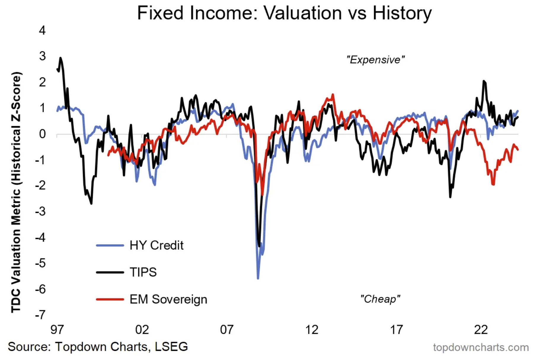
One interesting observation is how all three assets went extremely cheap in 2008/09 as panic selling hit just about anything and everything (one issue this highlight is that rebalancing and liquidity requirements contributed to self-reinforcing selling pressures across assets and raising cross-asset correlations). Another thing to watch for is disconnects e.g. TIPS breakevens sold off to a greater extent and showed up cheaper than credit in 2020 and (1998/99).
Commodities and Currencies
On currencies and commodities, we can also find some clues for major macro/asset allocation shifts e.g. the peak in the USD around 2000 occurred at a time when US stocks (and tech stocks in particular) were significantly outperforming (hence greater demand for USD) – and commodities/EM/hard assets were underperforming and significantly cheap.
Likewise, the trough in USD valuations and peak in EMFX in the early 2010s coincided with the peak in commodities and EM (when both were expensive) and the trough in US assets (and trough in US vs global relative value).
This highlights how you can gain confirming information by looking at valuations across asset classes and across time — this helps in building conviction, identifying risks and opportunities, and rotating allocations accordingly.

For reference, the FX value indicators are based on deviation from PPP and real effective exchange rate levels vs history, while the gold indicator uses M2 and inflation-adjusted gold prices and gold-driver value information, and the commodities indicator on real prices and trend/mean reversion.
Overall, as you can see, applying the concepts and principles to actual data it’s clear that valuations can be a very important source of information for asset allocators and active investors. Not only do they help identify risks and opportunities within asset classes, but also across asset classes through relative value, ranking, and cross-asset/macro risk detection.
The Best and Worst Setups
To sum up the data and application section, the table below presents the best and worst possible setups from an opportunity vs risk perspective across the key categories of valuation information in the multi-asset context.
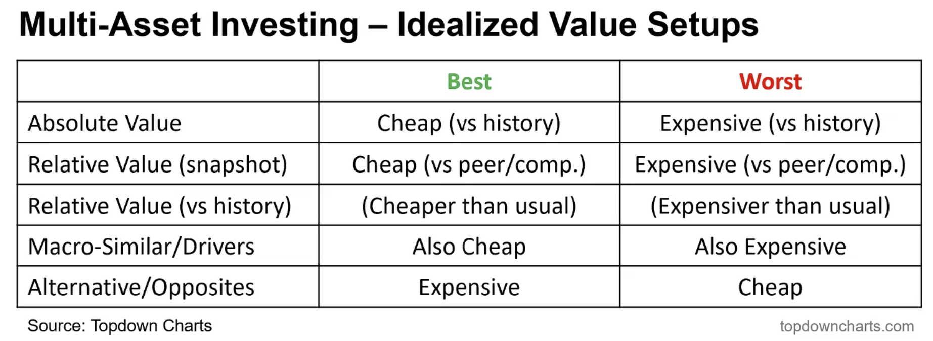
For example, the best upside opportunity in say emerging market equities would be when they show up cheap vs history, cheap vs peers (and cheaper than usual vs peers), and that EMFX/commodities (macro-similar) also show up as cheap, and the USD (opposite) shows up as expensive.
Meanwhile, the worst downside risk setup for say US equities would be when they show up expensive vs history, expensive vs peers (and more expensive than usual vs peers), USD and credit also expensive (macro-similar), and bonds cheap (alternative/opposite).
As you can see there are more dimensions to the valuation discussion than what typically gets presented. This table or something like it can be used as a helpful checklist (indeed, I advocate using checklists and ratings across factors to help frame and integrate various sources of information to aid in decision-making).
Perspectives
In this section, I turn to my mostly institutional investor following on LinkedIn to add some practitioner perspectives on the matter and as a prompt to consider some of the other practical issues in the application.
Importance of Valuations in Multi-Asset Investing
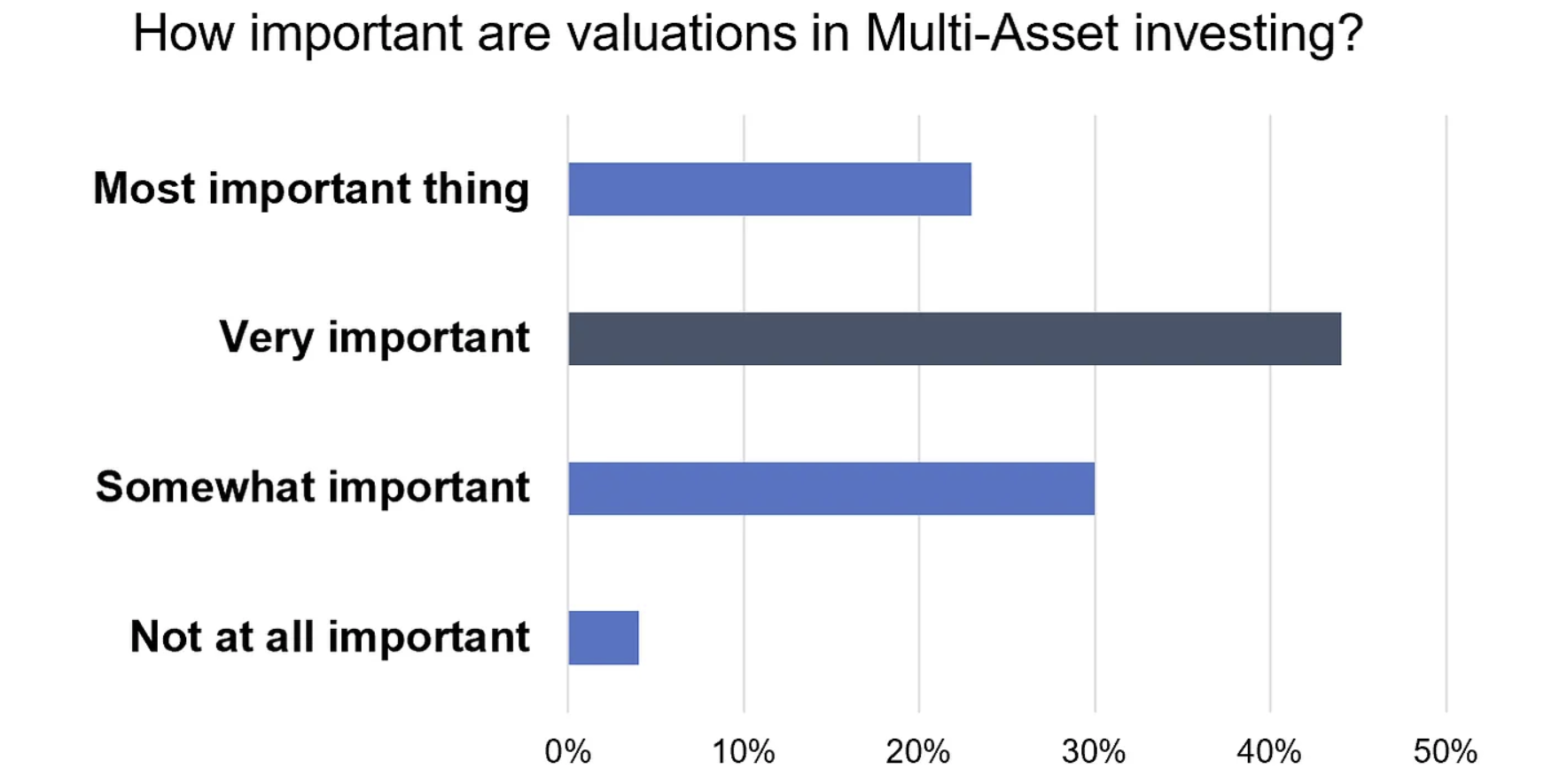
You can probably guess that the majority of practitioners find valuations valuable. A small but material cohort says it’s the most important thing (probably longer-term minded investors, who are less focused on short-term fluctuations and have the mandate and latitude to take more forward-thinking and at times deeply contrarian positions).
Yet, also a material amount says it’s only somewhat important. This perhaps is more from portfolio managers who have shorter-term performance measurement windows who are perhaps more benchmark aware, more peer aware, and maybe have less tolerance for short-term fluctuations and less latitude to take patient positions. Most likely they instead rely more on tactical factors to help with timing and avoiding short-term value traps (not to mention avoiding lagging peers, lagging the benchmark, and upsetting clients!)
Source: Callum Thomas (LinkedIn), Topdown Charts
Use of Valuations by Asset Allocators
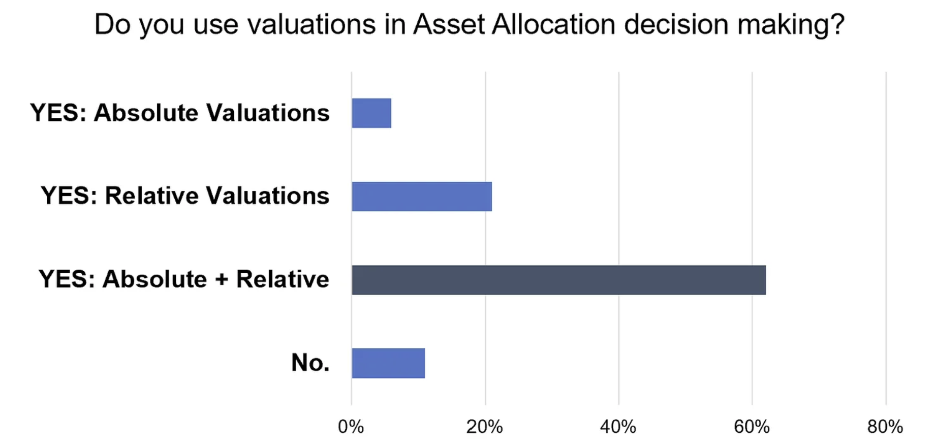
Again, this survey shows that the significant majority of asset allocators use valuations in decision-making, and as you would expect given what we discussed in this article, most use both absolute and relative valuations to help manage risk vs return and prioritize allocations.
I think it would probably be risky to rely only on absolute or relative value, rather than both but it would be even more risky and frankly foolish to not consider valuations at all (unless the investment process is more set-and-forget or more externally imposed, or perhaps pure trend-following).
As we saw in the data and application section, not having visibility on absolute and relative value information would have potentially meant missing out on major opportunities, getting blindsided by major risks, missing important correlation shifts, engaging in sub-optimal diversification, and ultimately poor outcomes for investors and clients. So I think unless there is a compelling reason (or substitute) to valuation information, it’s borderline irresponsible to not be valuation-aware.
Source: Callum Thomas (LinkedIn), Topdown Charts
Reflections
While there are some drawbacks and challenges to using valuations, for example getting the timing right, pulling the trigger when it’s time to act (vs internal and external pushback), and navigating other short-term complexities (such as benchmark/peer/client-related risks and pressures) — the value of valuations far outweigh any costs or limitations.
As noted above I think it would be foolish and irresponsible not to at least be aware of valuations as an active investor or custodian of other people’s money. Valuations help identify risks and opportunities, especially in a multi-asset context.
They also help detect possible shifts in asset class behaviour (correlations, volatility), emerging macro themes (as similar asset class valuations shift together), sentiment extremes (by looking at defensive vs risk asset valuations), and even opportunities in “third assets“ (aka synthetic assets such as the stock/bond ratio, or credit vs government bonds, emerging vs developed equities, value vs growth, and others).
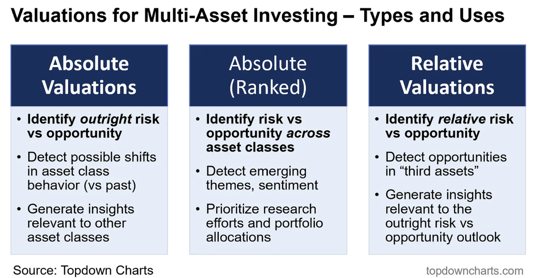
From a practical standpoint, they also help prioritise research efforts, reveal hidden risks, build conviction levels, and optimise portfolio allocations. So I highly recommend investors at all levels seek to understand and gain visibility on valuations, particularly in the multi-asset context.
5 topics

