TOL - 31st Mar, 2025
Watch these ASX copper stock charts carefully as the copper price soars!
The copper price is rising again, and the ASX hosts several world-class copper stocks. We investigate which of their charts looks the best.
On Friday we covered the fundamentals and technical analysis aspects of the current copper market, including views from major brokers Citi and Morgan Stanley – both who are modestly bullish on the copper price in the short term. We also investigated the key ASX copper stocks, focussing on the latest broker consensus views, as well as provided an overview of each company’s copper operations and its annual production. You can review the article here.
Today, we wrap our comprehensive look at the ASX copper sector with technical analysis of each of their charts. You may wish to review my ChartWatch Primer for an explanation of my trend following technical analysis method, as well as key definitions that will assist you in understanding any jargon I use.
I’ll divide the cohort of ASX copper stocks from Friday’s article into three groups based upon their current long term trends: Long term uptrend, Neutral long term trend, and Long term downtrend. As a trend follower, it is my rule that I can only buy stocks in uptrends, I must avoid stocks in neutral trends, and I can only short sell stocks in downtrends.
ASX COPPER STOCKS IN LONG TERM UPTRENDS 📈
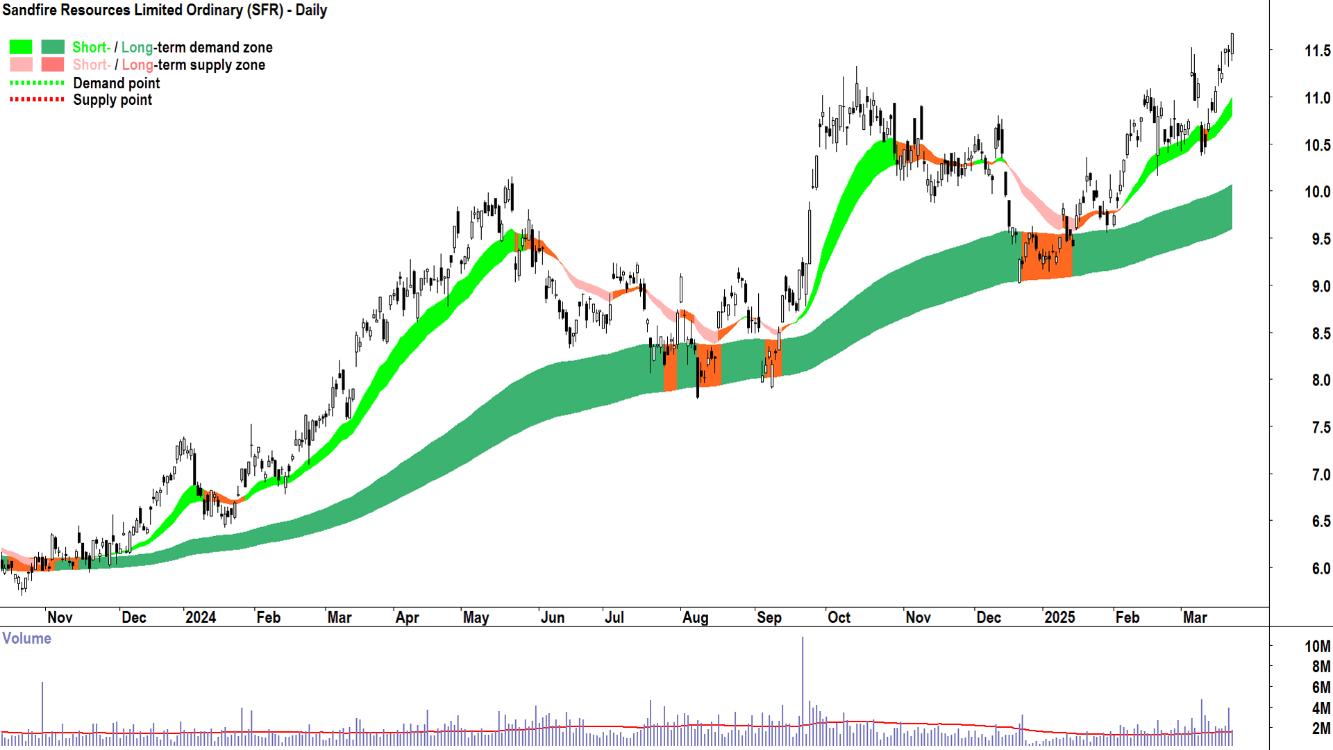
Sandfire Resources (ASX: SFR)
%20daily%20chart%2024%20March%202025.png)
SFR first appeared as a Feature Uptrend (highest conviction) in my daily ASX ChartWatch Scans based on the candle of 24 September ($9.80 candle close). It has been featured 6 times since, most recently in today’s update.
I note well established and strong short and long term uptrends, as indicated by the rising light green and dark green trend ribbons, both of which appear to be consistently acting as zones of dynamic demand (the price is bouncing out of them).
The price action is rising peaks and rising troughs, indicating an environment of supply removal and demand reinforcement respectively. I do note, however, the price action during the broader market’s correction starting 14 February, and through to 12 March, demonstrated some indecision. Still, considering the broader market’s weakness at the time, and the fact that this price action is consistent with dealing with the excess supply expected at the October 2023 major peak – I don’t consider it to be detrimental to the prevailing long term uptrend.
The candles are predominantly demand-side in nature (i.e. white-bodied and or those with downward pointing shadows), although, I again note some indecision through February and into mid-March. More recently, the candles are indicative of healthy short and long term demand-side control.
The key zone of demand is the short term uptrend ribbon, and below it, I would expect the 11 March trough low of $10.37 to also act as a point of demand. SFR’s short term uptrend is intact until its price closes below these levels.
There are no obvious points or zones of supply as SFR is trading at all-time highs.
In conclusion, there is nothing in the SFR chart that suggests to me that the prevailing short and long term uptrends cannot continue.
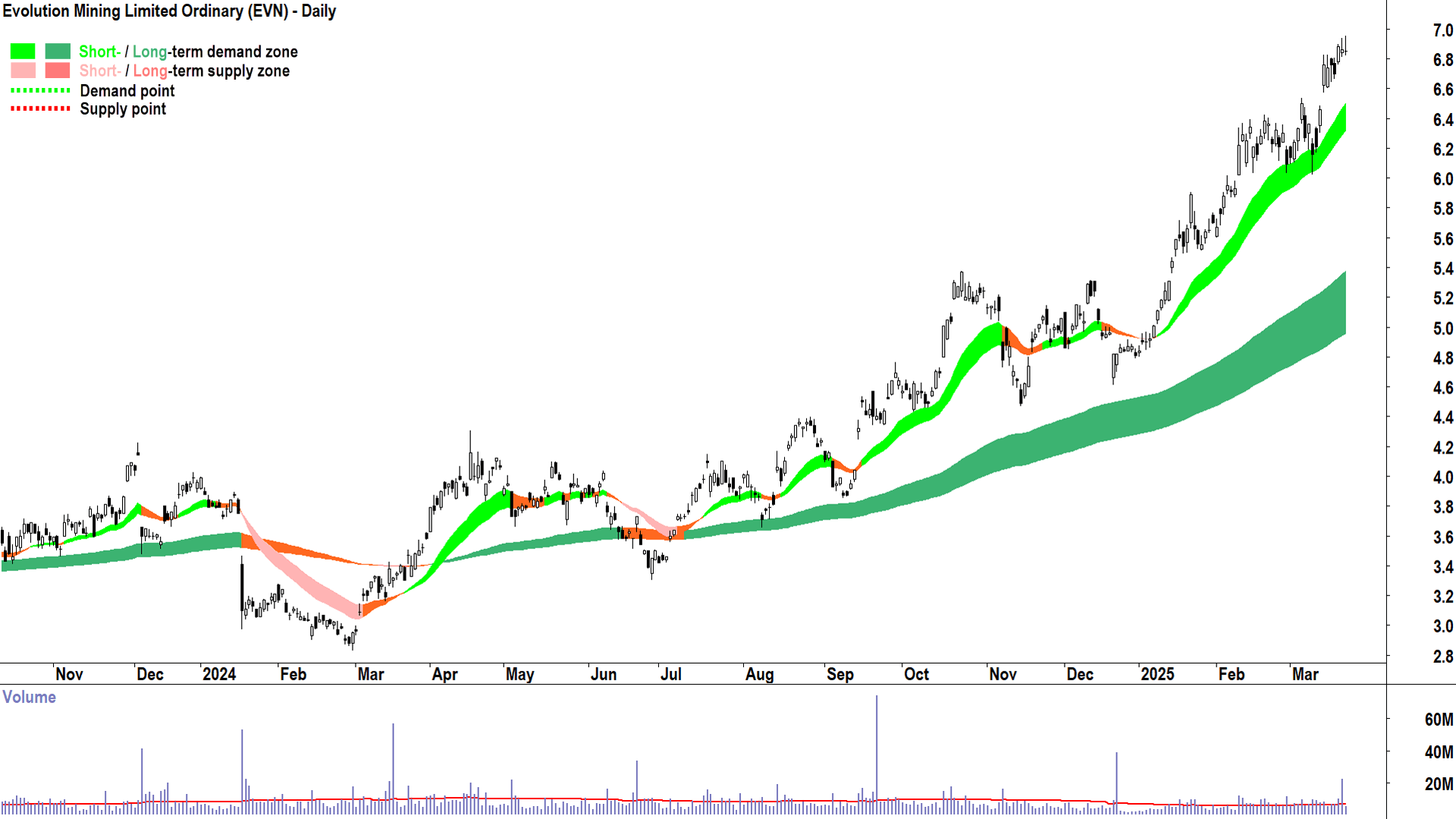
Evolution Mining (ASX: EVN)
%20daily%20chart%2024%20March%202025.png)
EVN first appeared as a Feature Uptrend in my daily ASX ChartWatch Scans based on the candle of 24 July ($4.10 candle close). It has been featured 18 times since, most recently on 20 March.
I note well established and strong short and long term uptrends, healthy demand-side price action (rising peaks and rising troughs with longer trough-to-peak segments compared to peak-to-trough segments), and predominantly demand-side candles.
Trends, price action, and candles are indicative of healthy short and long term demand-side control.
The key zone of demand is the short term uptrend ribbon, which coincides with the previous point of supply of the 6 March $6.54 peak. It is my observation that previous points of supply tend to act as points of demand in the future. EVN’s short term uptrend is intact until its price closes below these levels.
There are no obvious points or zones of supply as EVN is trading at all-time highs.
In conclusion, there is nothing in the EVN chart that suggests to me that the prevailing short and long term uptrends cannot continue.
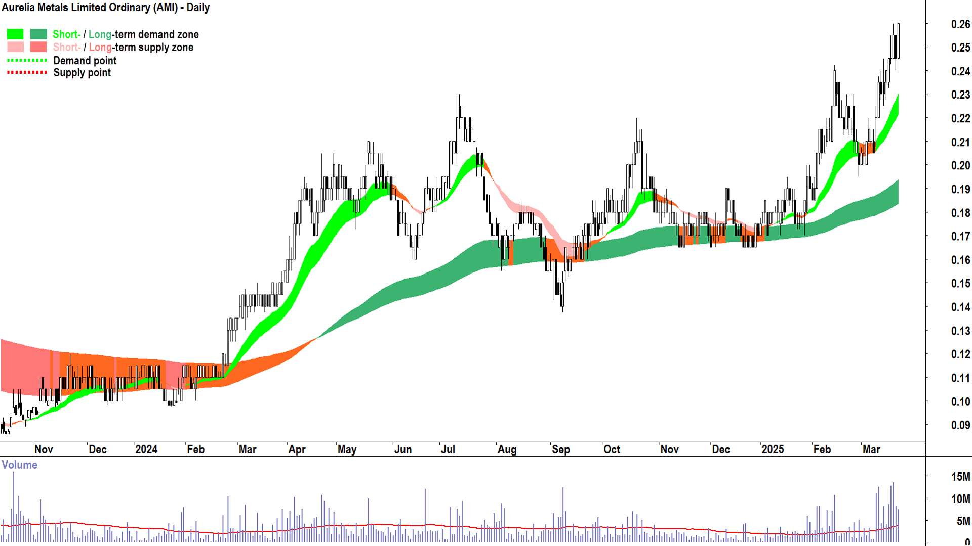
Aurelia Metals (ASX: AMI)
%20daily%20chart%2024%20March%202025.png)
AMI first appeared as a Feature Uptrend in my daily ASX ChartWatch Scans based on the candle of 6 February ($0.215 candle close). It has been featured 5 times since, most recently in today’s update.
I note well established and strong short and long term uptrends, healthy demand-side price action (rising peaks and rising troughs with longer trough-to-peak segments compared to peak-to-trough segments), and predominantly demand-side candles.
Trends, price action, and candles are indicative of healthy short and long term demand-side control.
The key zone of demand is the short term uptrend ribbon, but the previous point of supply of the 14 February $0.24 peak may also offer support to the price. AMI’s short term uptrend is intact until its price closes below the short term uptrend.
There are no obvious points or zones of supply from the daily chart as AMI is trading at near-3-year highs. There is, however, a potential point of supply at a major peak from August 2022 at $0.305 that may come into play down the track.
In conclusion, there is nothing in the AMI chart that suggests to me that the prevailing short and long term uptrends cannot continue.
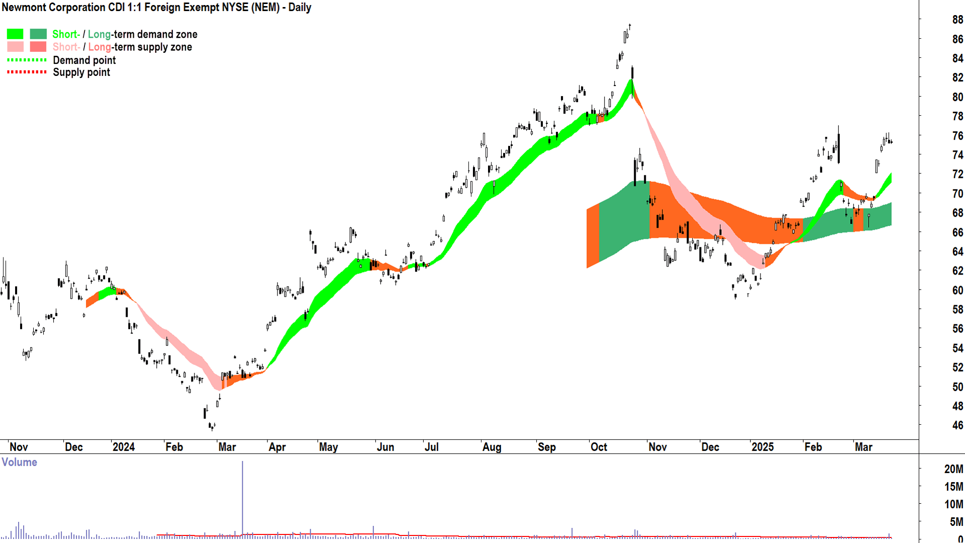
Newmont Corporation (ASX: NEM)
%20daily%20chart%2024%20March%202025.png)
NEM has not appeared as a Feature Uptrend in my daily ASX ChartWatch Scans since October 2024, but it did make the general uptrend list on 14 March ($73.43 candle close).
I note recently established short and long term uptrends, but mixed price action and candles until the most recent rally out of the long term uptrend ribbon.
These factors are consistent with recent demand-side control, but two recent up-side gaps (14 & 18 March) suggest the demand-side is highly motivated. As expected, supply is manifesting near the 21 February peak of $77 – slowing the recent rally.
Clearly, NEM’s technicals are less clear than those of SFR and EVN with respect to the degree of short and long term demand-side control being exhibited, but they are growing more indicative it is strengthening.
The key zone of demand is the short term uptrend ribbon, and beneath it, a previous point of supply of the 10 March peak at $70. NEM’s short term uptrend is intact until its price closes below these levels, and more broadly, its long uptrend is intact until its price closes below the long term uptrend ribbon.
If the NEM price can close above the $77 point of supply, the next major point of supply is the 23 October 2024 major peak of $87.57.
In conclusion, there is nothing major in the NEM chart that suggests to me that the prevailing short and long term uptrends cannot continue, however, a close above $77 would improve the upside potential significantly.
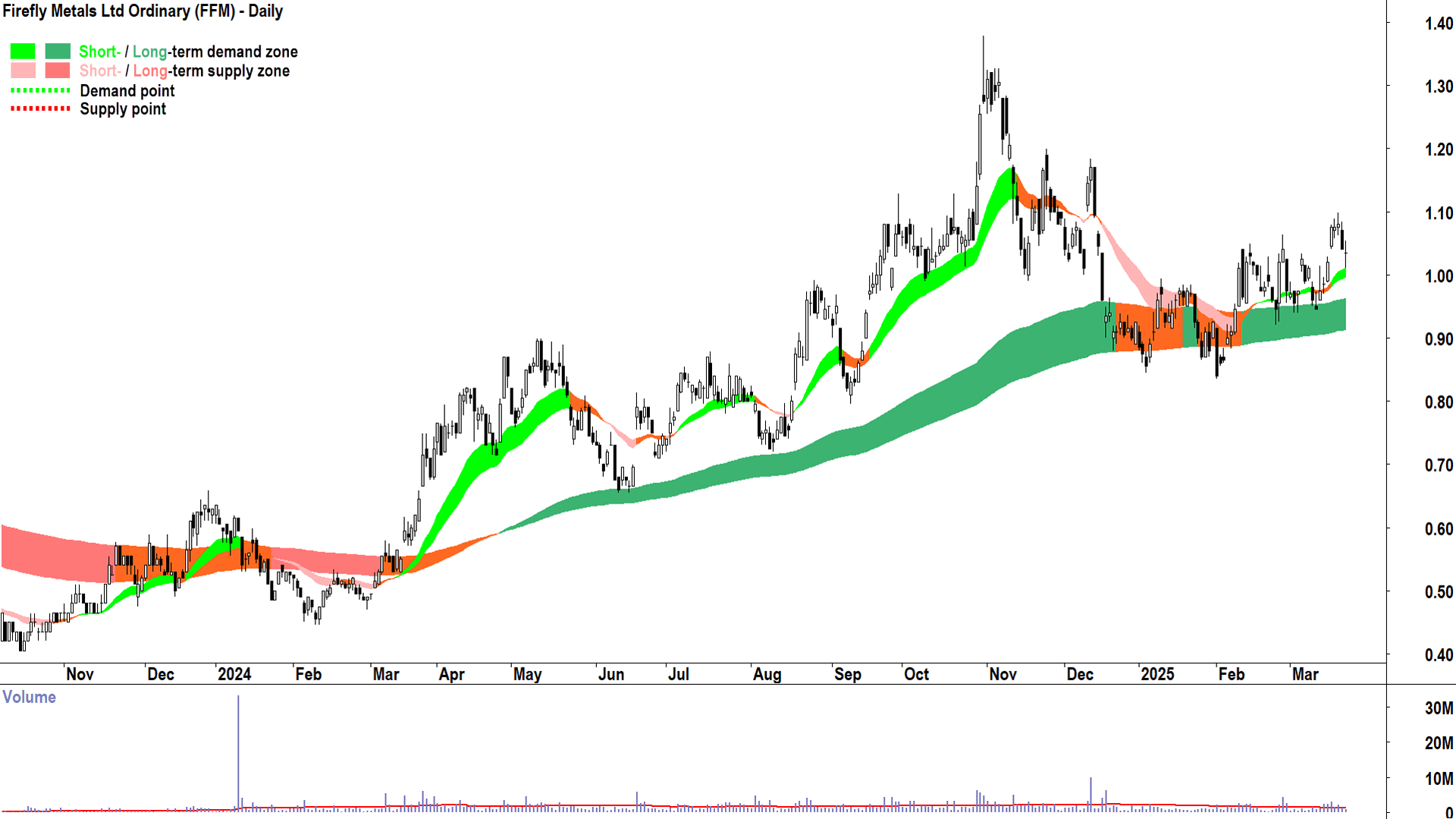
Firefly Metals (ASX: FFM)
%20daily%20chart%2024%20March%202025.png)
FFM has only just reappeared as a Feature Uptrend in my daily ASX ChartWatch Scans on 18 March ($1.075 candle close) – having been absent from it since October 2024.
I note recently established short and long term uptrends, but mixed price action and candles until the most recent rally out of the long term uptrend ribbon.
These factors are consistent with recent demand-side control, but the up-side gap and run on 18 March suggests the demand-side is growing increasingly motivated.
Clearly, FFM’s technicals are also less clear than those of SFR and EVN, and perhaps even than NEM with respect to the degree of short and long term demand-side control being exhibited. It is critical that strong demand-side candles and price action are maintained from here, or the risk is the price reverts to the choppy price action FFM has shown for much of this year.
The key zone of demand is the short term uptrend ribbon, and beneath it, several troughs logged in the long term uptrend ribbon through February and March. FFM’s short term uptrend is intact until its price closes below these levels, and more broadly, its long uptrend is intact until its price closes below the long term uptrend ribbon.
If the FFM price can close above the recent 20 March $1.10 point of supply, there are points of supply from November-December 2024 to contend with at $1.20 and $1.185. Beyond these, however, there are few points of supply to contend with until the October 31 major peak at $1.38.
In conclusion, indications of strong demand-side control are weaker here than in the previous charts, but they are improving. A close above $1.10 would improve the upside potential significantly.
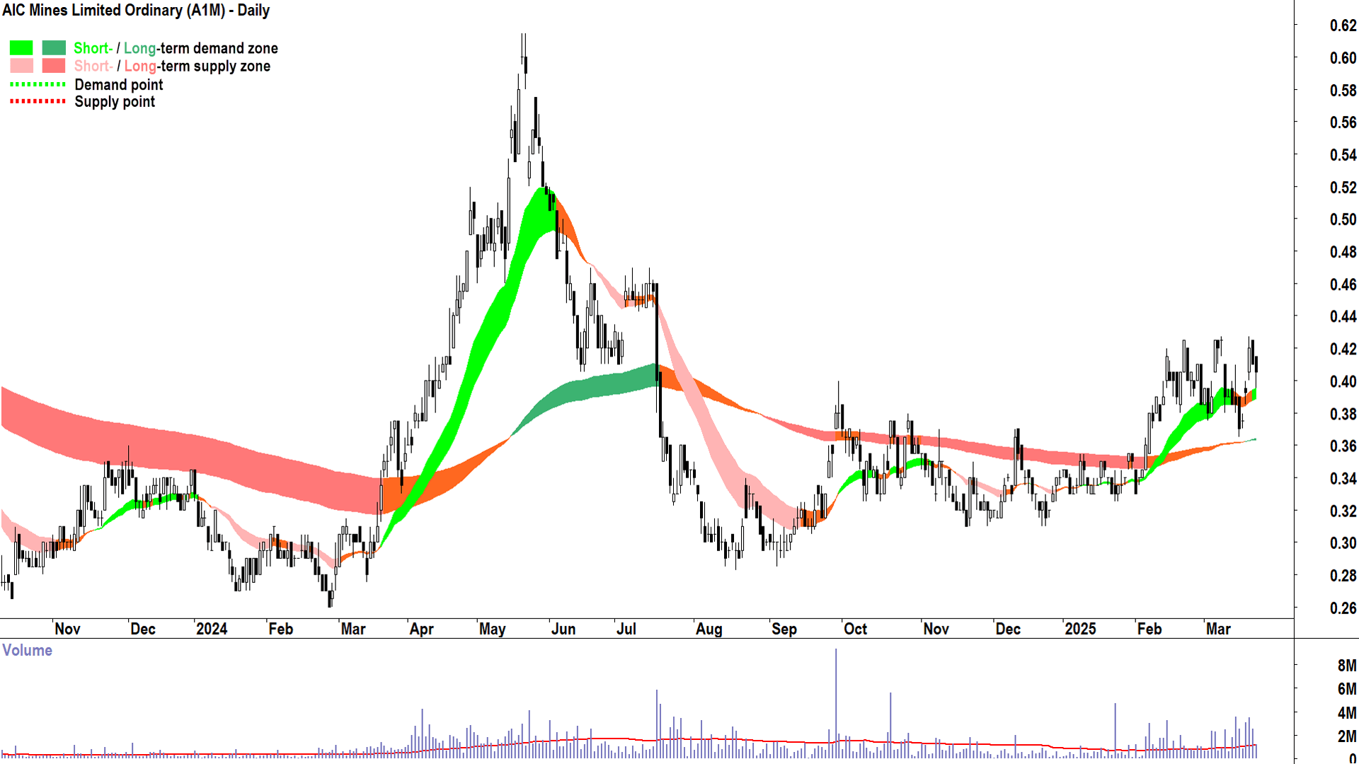
AIC Mines (ASX: A1M)
%20daily%20chart%2024%20March%202025.png)
A1M has only recently appeared as a Feature Uptrend in my daily ASX ChartWatch Scans on 14 February ($0.415 candle close).
I note a recently established short term uptrend and a very recently (20 March) long term uptrend. The price action is mixed, compressing within a trading range defined by $0.43 and the long term uptrend ribbon (presently $0.365). The candles were predominantly demand-side heading into the 14 February Feature Chart appearance, but have since grown increasingly mixed.
These factors are consistent with recent short term equilibrium, but I suspect, growing longer term demand-side control. Clearly, there is some excess supply lurking in the system around $0.43 – and it must be consumed before any next leg up in the new long term uptrend can occur.
The key zone of demand is the short term uptrend ribbon, and beneath it, the long term uptrend ribbon. FFM’s short term uptrend is intact until its price closes below the short term uptrend ribbon, and more broadly, its long uptrend is intact until its price closes below the long term uptrend ribbon.
If the FFM price can close above the $0.43 point of supply, there is a point of supply from July 2024 to contend with at $0.47. Beyond this, however, there are few points of supply to contend with until the May 21 major peak at $0.615.
In conclusion, clearly trends here are weaker than in the preceding charts, but they do appear to be improving. A close above $0.43 would improve the upside potential significantly.
ASX COPPER STOCKS IN NEUTRAL LONG TERM TRENDS ↔️
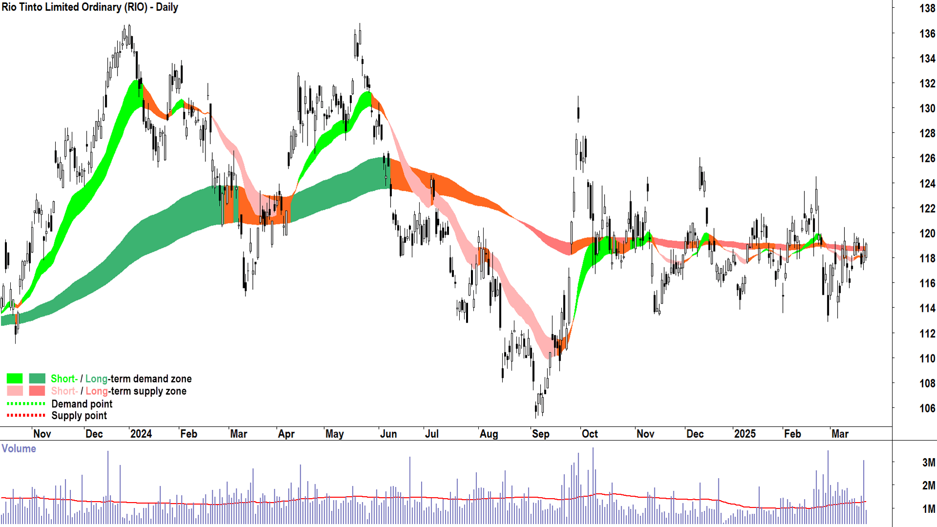
Rio Tinto (ASX: RIO)
%20daily%20chart%2024%20March%202025.png)
Now we move to the group of neutral long term trends and as you can see clearly from the above chart – they don’t come more neutral than RIO! I know it’s difficult to see, but if one zooms in, the trend ribbons are double amber which means caution is required for the trend follower!
The trend ribbons are a quick and simple way to summarise other price action aspects like peaks and troughs, and candles. If you wish to scan through hundreds of charts very quickly, you don’t want to be bogged down by too much detail. Using my trend ribbons alone, it would take me a fraction of a second to check RIO’s chart and call: Pass!
As a trend follower it must be a pass – because there are no clear signs that the demand-side is in control of RIO’s price, and more importantly – because the next set of double green trend ribbons may by just a down arrow tap on the keyboard away.
In conclusion, as a trend follower, I have no interest in this chart. I do note however, on closer inspection (as a learning exercise I encourage you to investigate), the price action since the March low is rising troughs, and the candles are generally demand-side – there is at least some persistent demand working into the system. For now, though, the supply side is motivated enough to cap the price.
A close above the 11 March peak of $120.45 would be interesting as it would signal the balance between demand and supply is shifting towards excess demand. A close above the 21 February peak of $124.54 would likely confirm at least a short term demand-side market. Alternatively, a close below the 28 February trough of $112.85 would likely confirm both a short term downtrend and a new long term downtrend.
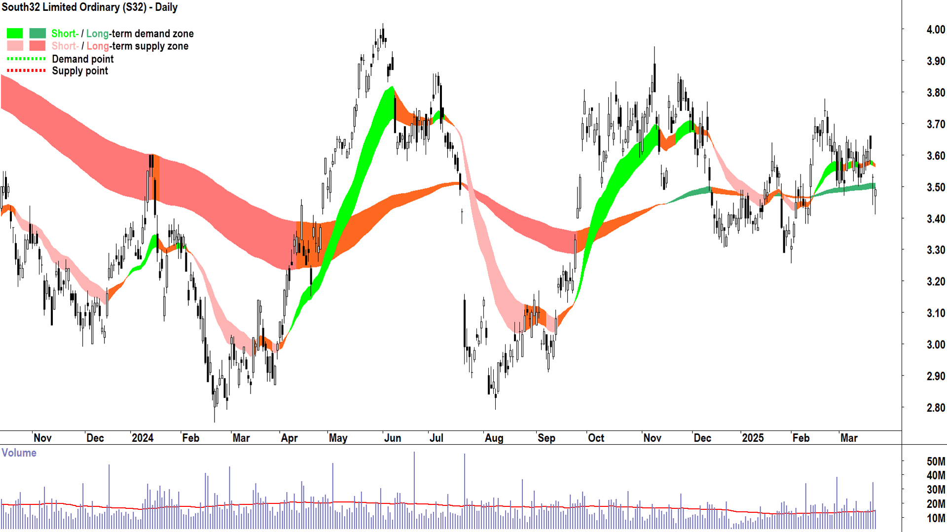
South32 (ASX: S32)
%20daily%20chart%2024%20March%202025.png)
S32’s long term trend is actually signalling uptrend, but as a rule, when the price closes below the long term uptrend ribbon, I default this to neutral. The short term trend is confirmed neutral.
The price action is mixed, with rising peaks but lower troughs, and the candles show no clear signs of either demand- or supply-side control.
So, again, it is a hard “pass” here. There is a much broader trading range at play, between the February low of $3.25 and the November 2024 high of $3.95, and beyond that, between the February 2024 low of $2.75 and the June 2024 high of $4.02. Trading ranges within trading ranges? Not one for the trend follower!
ASX COPPER STOCKS IN LONG TERM DOWNTRENDS 📉
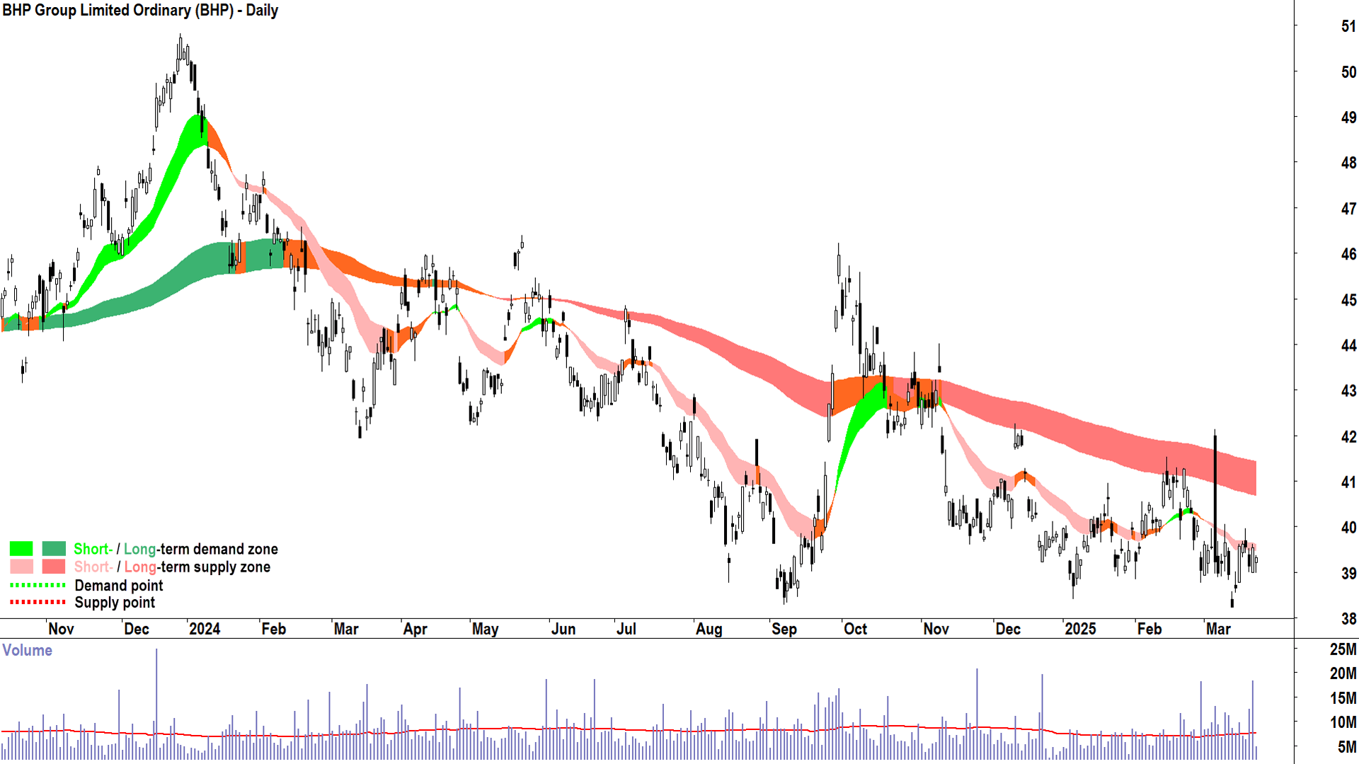
BHP Group (ASX: BHP)
%20daily%20chart%2024%20March%202025.png)
And now to the group of long term downtrends, where the technicals signal the supply-side is in control of the long term price.
It is clear from the trend ribbons above that the balance of demand and supply for BHP tipped towards equilibrium back in February 2024, and after several months of sideways consolidation, to excess supply in July 2024. There have been rallies, namely the September-October 2024 “China Stimulus” rally, but these have been met with persistent excess supply.
Selling into rallies is a common bear market trait. For the most part though, BHP has been able to hang onto the $38 handle (the September low was $38.28, the January low was $38.40, and the March low was $38.24).
Much like a bouncing ball across a tabletop peaks a little lower after each contact with the table (the table in this case is $38), at some point, the next bounce takes the ball off the table. Then, without the table’s support, the next drop is precipitous.
I am not a trend prognosticator, I am a trend follower, so I do not propose the table analogy is in store for BHP – merely that as a trend follower I have only two options available to me with such a chart: 1. Avoid; 2. Short.
On that last point, shorting, I note that BHP appeared several times as a Feature Downtrend in my daily ChartWatch ASX Scans in July and August with plenty of downside until the September rally when they would likely have been neutralised at worst. It then began to reappear in November, and as recently as 13 March.
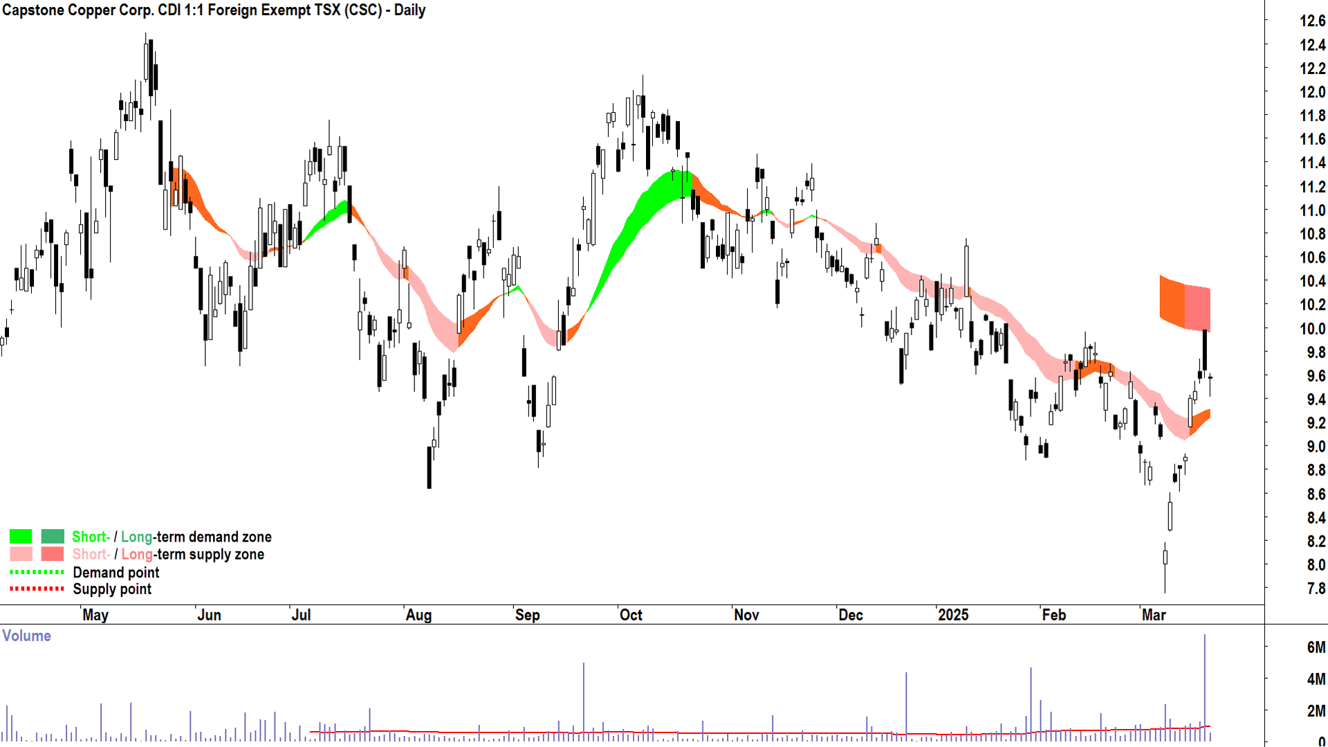
Capstone Copper Corp. (ASX: CSC)
%20daily%20chart%2024%20March%202025.png)
CSC first appeared as a Feature Downtrend in my daily ASX ChartWatch Scans based on the candle of 14 November 2024 ($10.20 candle close). It has been featured 3 times since, most recently on 22 January.
Shorts could have done very well at the 11 March blowoff low of $7.75, but with the price having rallied sharply back above the short term trend ribbon (neutral), are now neutralised. The long term trend is down, indicating there’s still a great deal of excess supply lurking in the system for CSC.
V-shaped rallies, like that from the March low, are in my opinion most likely to result in an enduring long term low. However, until I see the short term trend ribbon swing back to up, evidence of demand reinforcement and supply removal via rising troughs and rising peaks respectively, and the all-important close above the long term downtrend ribbon – this one is also a hard “Pass”.
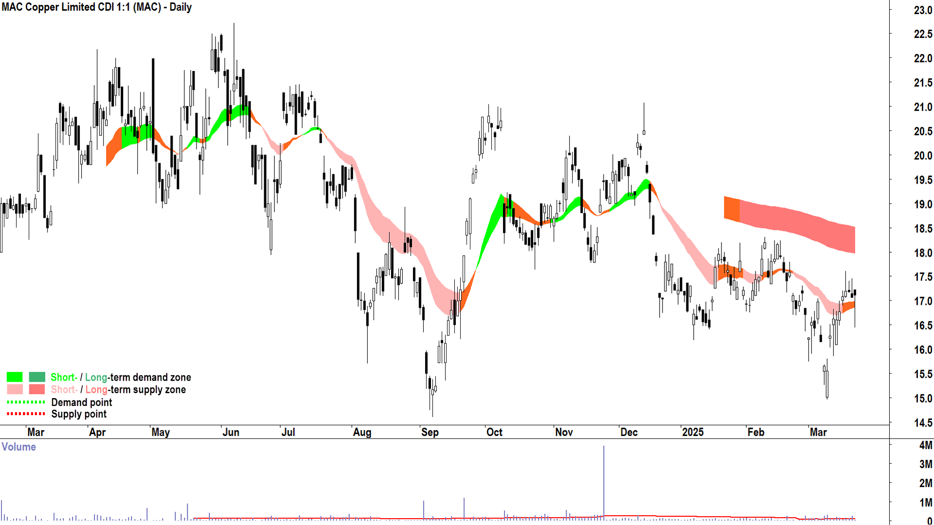
MAC Copper (ASX: MAC)
%20daily%20chart%2024%20March%202025.png)
MAC first appeared as a Feature Downtrend in my daily ASX ChartWatch Scans based on the candle of 6 January ($16.78 candle close) and 14 January ($16.54 candle close). It has been slim pickings for both longs and shorts since. With the now-neutral short term trend, solid enough demand-side candles since the March low, and a similar V-shaped bounce to CSC – my model suggests neutral at best here.
The checklist to get this MAC to a Feature Uptrend is long, and I suggest it may take many weeks to occur:
✅ Short term uptrend
✅ At least neutral long term uptrend
✅ Both trend ribbons are acting as zones of dynamic demand (i.e., the price action is bouncing out of the trend ribbons)
✅ Demand-side price action (i.e., rising peaks and rising troughs)
✅ A predominance of demand-side candles (i.e., white-bodies and or those with downward pointing shadows)
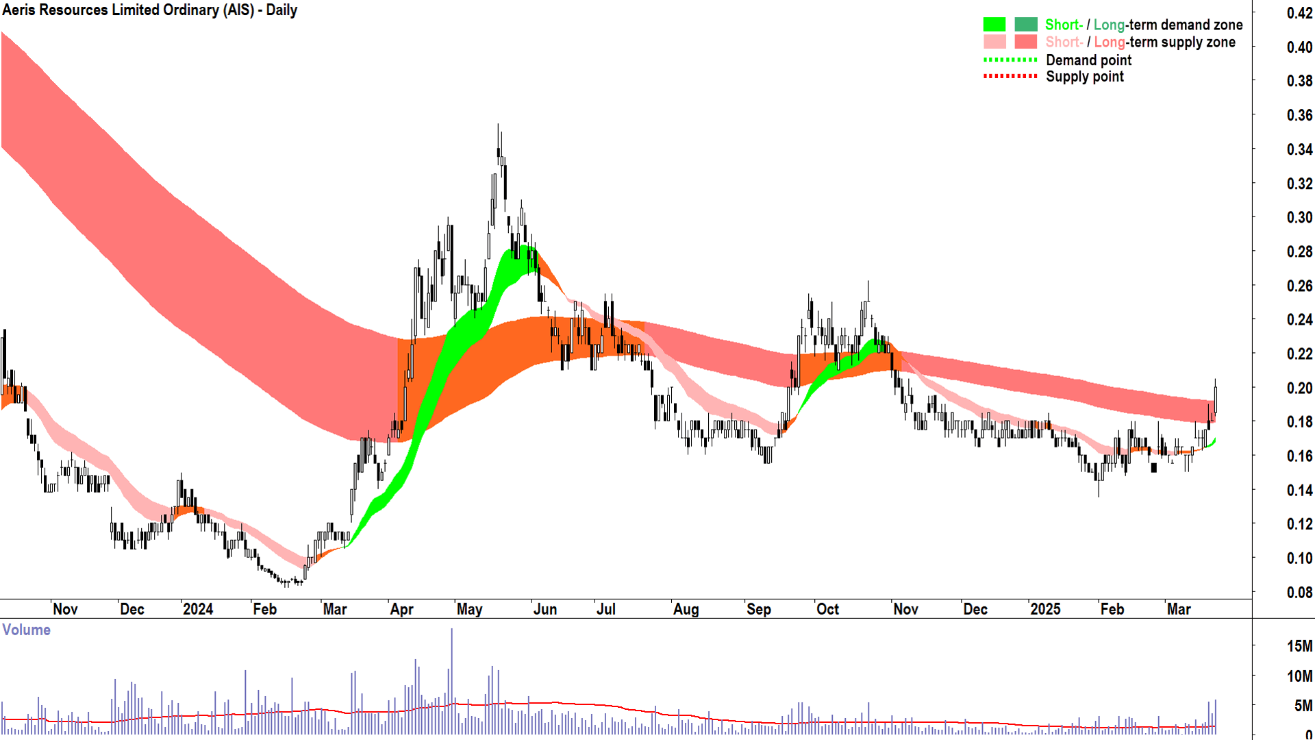
Aeris Resources (ASX: AIS)
%20daily%20chart%2024%20March%202025.png)
AIS has never appeared in ChartWatch ASX Scans as a Feature Uptrend or a Feature Downtrend – and it is clear from the above chart why. There has been a lack of a definitive trend since ChartWatch ASX Scans started at the end of May last year.
Yesterday’s blip back above the long term downtrend ribbons is interesting, however, but far from checking all of the boxes in the checklist above.
I use powerful scanning software programmed with my trend following methodology (the parameters of the checklist for longs and shorts and more) to parse every stock on the ASX each day after the market close. This is how my ChartWatch ASX Scans are created.
I guarantee, if AIS (or any other stock for that matter) meets my criteria for an uptrend, I will see it. Until then: Pass.
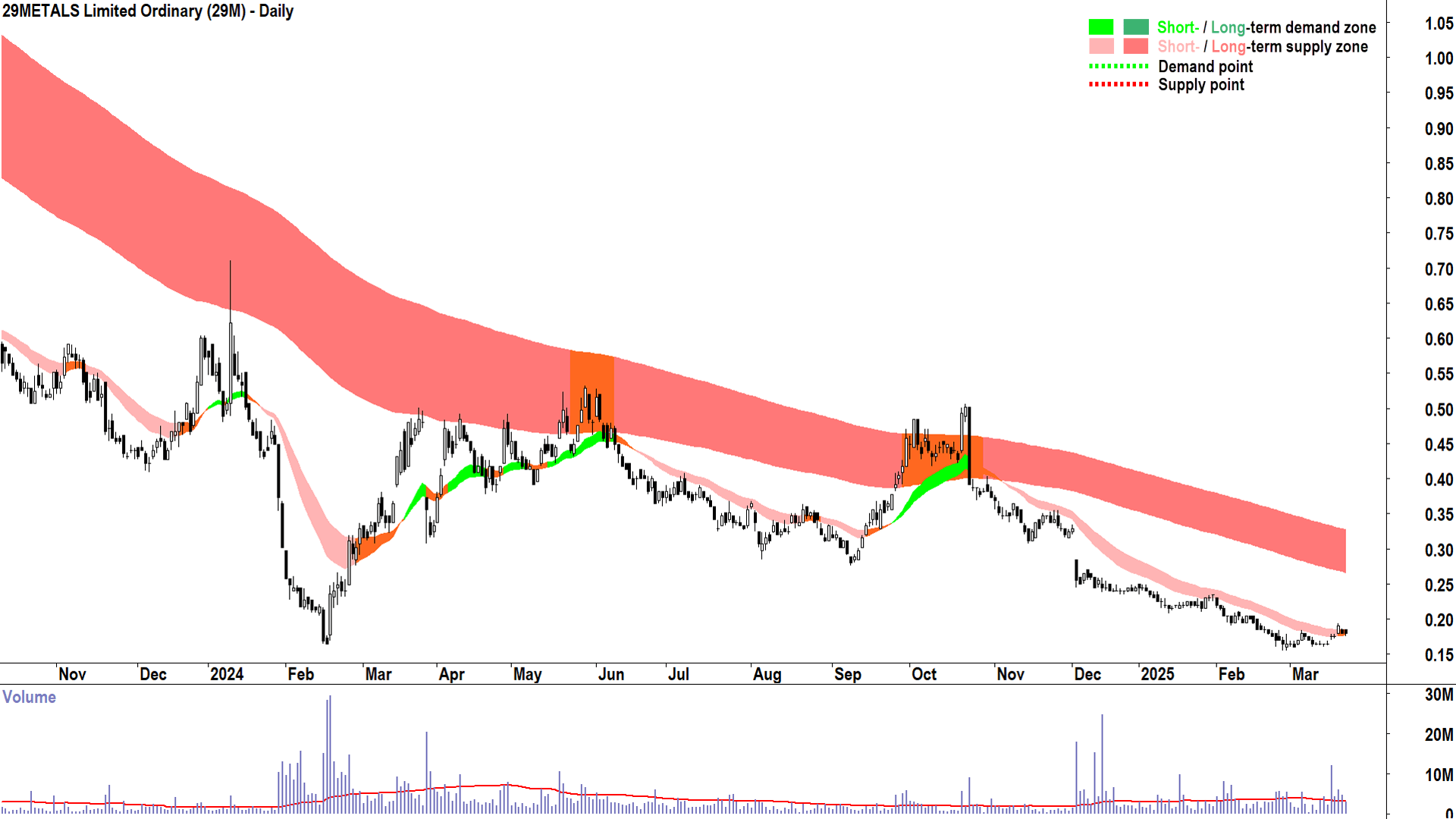
29Metals (ASX: 29M)
%20daily%20chart%2024%20March%202025.png)
Last, and arguably, least. The 29M chart is a picture of excess supply. This is how a chart looks when the supply-side is in total control of the price.
This chart demonstrates the power of a trend following methodology, of putting faith in the fact that both the demand-side (i.e., cash), and the supply-side (i.e., shares), have done their homework on the stock in question and are making rational decisions about their ownership of it.
The demand side is looking elsewhere – at other opportunities that indicate a superior risk-adjusted return. They are directing their cash away from 29M, creating a demand vacuum for its stock. Similarly, the supply-side is equally aware of those superior alternatives, and they are desperately trying to convert their shares to cash in order to pursue them.
For much of the above chart, the demand-supply environment has been in consensus: It is far better to own cash than it is to own 29M shares. Who are we to argue?
Yes, very recently, the short term trend has neutralised, and the price action has even returned to rising peaks and rising troughs – there is some indication that the demand-side is stepping up and the supply-side is stepping back. Regardless, it is far too early to say the trend has changed here: Pass.
CONCLUSION
Hopefully this has been a constructive sojourn through the demand-supply dynamics of the biggest players in the ASX copper sector. Always consider that my brand of analysis cares nothing about the fundamentals of each company, it is a purely technical model. It relies on the past to determine an action: Buy, Avoid, or Short.
It does not attempt to predict the future. A set of technicals that infers the action “Buy” does not predict the price will rise. If the price of the stock in question continues to rise, it is pure coincidence that the excess demand shown historically in its chart persisted into the future.
Similarly, if the technicals infer the action “Short”, this isn’t a prediction the price will fall. If the price of the stock in question continues to fall, it is pure coincidence that the excess supply shown historically in its chart persisted into the future.
The future is unknown, and not even the great Warren Buffett can predict it. So why worry about it?
I prefer to determine the trends, focus then on only the strongest indications of consensus and conviction in the market (i.e., either towards excess demand or excess supply), and to trade only in that direction. I believe this gives me the greatest probability of success.
The rest is up to the market – and there are no guarantees in the market! I understand that a trend may end the moment I get in – I accept this will occur from time to time. This is why I have the strictest “other part” of the investing puzzle – the determination of how much I risk. Ultimately, it is this determination, both at an individual trade and portfolio basis – that is far more important than what and when to buy or sell.
This article first appeared on Market Index on Tuesday 25 March.
Never miss an update
Enjoy this wire? Hit the ‘like’ button to let us know.
Stay up to date with my current content by
following me below and you’ll be notified every time I post a wire
Carl has over 30-years investing experience and has helped investors navigate several bull and bear markets over this time. He is a well respected markets commentator who specialises in how the global macro impacts Australian and US equities. Carl has a passion for technical analysis and has taught his unique brand of price-action trend following to thousands of Aussie investors.
........
Investing is risky. Inevitably you will endure losses. If you can't cope with losing, don't invest.

%20daily%20chart%2024%20March%202025.png)
%20daily%20chart%2024%20March%202025.png)
%20daily%20chart%2024%20March%202025.png)
%20daily%20chart%2024%20March%202025.png)
%20daily%20chart%2024%20March%202025.png)
%20daily%20chart%2024%20March%202025.png)
%20daily%20chart%2024%20March%202025.png)
%20daily%20chart%2024%20March%202025.png)
%20daily%20chart%2024%20March%202025.png)
%20daily%20chart%2024%20March%202025.png)
%20daily%20chart%2024%20March%202025.png)
%20daily%20chart%2024%20March%202025.png)
%20daily%20chart%2024%20March%202025.png)
5 topics
13 stocks mentioned

Carl has over 30-years investing experience and has helped investors navigate several bull and bear markets over this time. He is a well respected markets commentator who specialises in how the global macro impacts Australian and US equities. Carl...
Carl has over 30-years investing experience and has helped investors navigate several bull and bear markets over this time. He is a well respected markets commentator who specialises in how the global macro impacts Australian and US equities. Carl...
Comments
Comments
Sign In or Join Free to comment