Weekly S&P 500 #ChartStorm - 22 Jan 2017
Those that follow my personal account on Twitter (VIEW LINK) will be familiar with my weekly S&P 500 #ChartStorm in which I pick out 10 charts on the S&P 500 to tweet. Typically I'll pick a couple of themes and hammer them home with the charts, but sometimes it's just a selection of charts that will add to your perspective and help inform your own view - whether its bearish, bullish, or something else!
The purpose of this note is to add some extra context beyond the 140 characters of Twitter. It's worth noting that the aim of the #ChartStorm isn't necessarily to arrive at a certain view but to highlight charts and themes worth paying attention to.
So here's the another S&P 500 #ChartStorm write-up!
1. Weekly Price Chart: Quite a simple chart, but in my view a profound chart. I often like to put a simple chart that shows what the market is doing to add context, and the context this one provides or the profundity in it is how looking back over the past year you can see that much of the gains came from 3 distinct 3-4 week blocks (most will also point out how those blocks came after a dip or reset e.g. the election, Brexit, and the global panic at the start of the year). It goes to show how "boring" the market has been, often drifting sideways and doing nothing, and then bam! All at once. Those who go scared out of the market would have missed out.
Bottom line: Over the past year the market was either "on" or "off", and if you missed the "on" your returns would have been off!
[SPXCS220117-1.PNG]
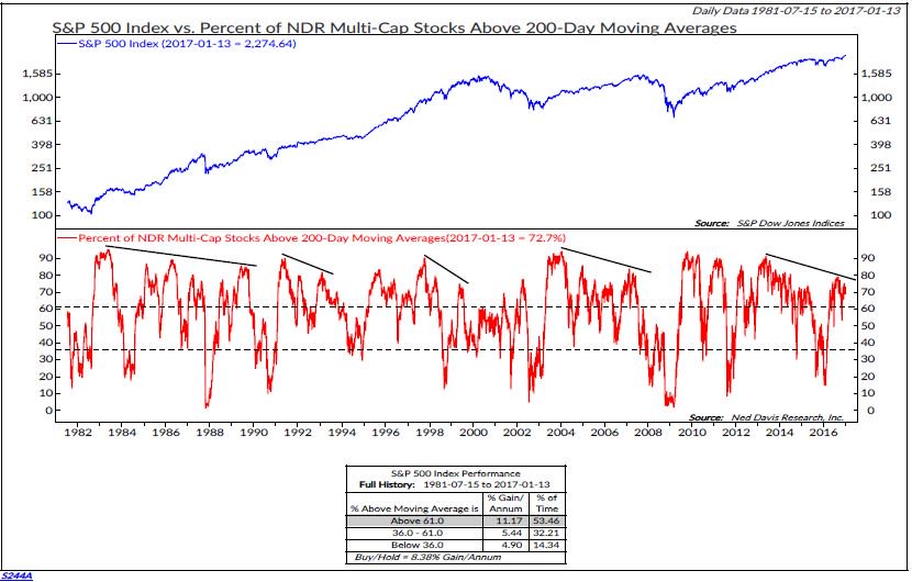
2. Bearish breadth divergence: As I highlighted in previous editions of the Weekly S&P500 ChartStorm there has been some bearish breadth divergence developing on the S&P500. This time it's NDR (VIEW LINK) showing it with a slightly different breadth measure, but the message is the same. In the past this type of pattern can be a bearish signal and a warning sign of a turning point in the market or at least a correction. Again it's something to keep in mind.
Bottom line: There remains bearish breadth divergence in the market, this could (eventually) resolve in the form of a correction or bear market.
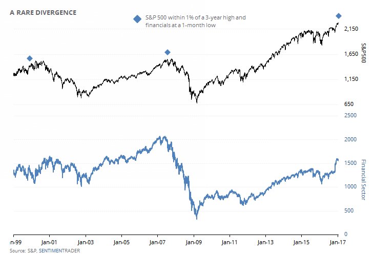
3. When the S&P500 is within 1% of a 3-year high and financials are at a 1-month low: This chart from the always interesting and insightful SentimenTrader (VIEW LINK) shows a very particular and almost dubious indicator. Some will immediately say, hang on - that smacks of data mining, what a specific and particular set of criteria! But if you think about it, what is the indicator trying to capture? It's basically saying when the market has gone up a lot (it must have to be near a 3-year high), but financials are starting to drop (financials are often a good leading indicator to what's going on in the economy and risk environment) that it's a potential warning sign. It seemed to work as a topping signal in 2000 and 2008, it could be just a coincidence, but something to think about - worth keeping an eye on those financials (as always).
Bottom line: Financials could be flagging big league risks for the S&P500.
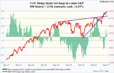
4. Futures positioning: This chart shows hedge fund net positioning in S&P500 futures overlayed against the underlying benchmark index itself. The main takeaway from this one is that positioning has increased, but it's not really at extremes just yet, usually I would say that this is therefore a positive momentum signal. The way I usually think about these sort of indicators is that through the range they have "momentum information" (i.e. go with the flow) and then at extremes they have "contrarian information" (go against the crowd). So until it hits an extreme I would take a marginally bullish signal from this chart.
Bottom line: Hedge fund futures positioning is not yet at an extreme so the small rise in net-longs carry bullish momentum information.
5. An alternative measure of volatility: My own chart from Topdown Charts (VIEW LINK) shows another view of volatility for the S&P500 i.e. a rolling 12 month count of daily price moves that exceeded + or - 1%. The indicator looks visually interesting and offers a couple of insights about market regimes. First, note how the indicator often spikes and peaks during a market bottom. Notice also how the indicator rolls over and goes lower during a "steady bull market". In both of those respects I would say it's currently signalling the start of a new, steady, bull market.
Bottom line: An alternative view of volatility seems to confirm the start of a new bull market.
[S&P500 volatility.PNG]
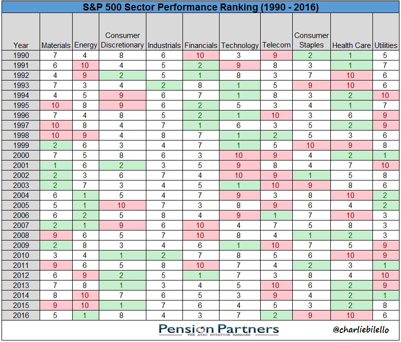
6. Sector performance ranking: This table shows the annual performance ranking of the main sectors of the S&P500. Probably the most interesting observation is that often the 9s and 10s become 1s or 2s in the following year. It's not always the case though! Sometimes it takes a couple of 9s and 10s before enough of a reset can happen to get a 1 or a 2 the next year. Last year it was Consumer Staples and Health Care that were the 9 and 10, but I'm not sure at all whether they will be a 1 and 2 this year with contenders such as financials and energy given the reflationary global macro backdrop. Furthermore, it's the sectors that will probably see the biggest impact of Trumpian economic policy, as there will probably be winners and losers.
Bottom line: History shows a big tendency for mean reversion in sector performance rankings.
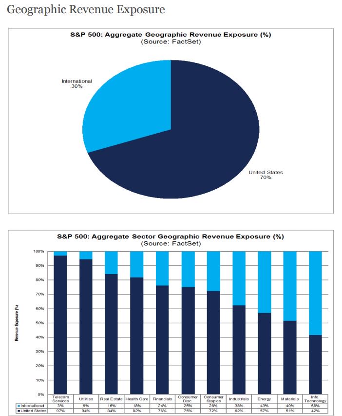
7. Foreign sourced revenues: This analysis from FactSet (VIEW LINK) shows a breakdown of where S&P500 companies get their revenue - about a third comes from non-US sources, which is material. The visual also has a chart showing the breakdown across sectors. America is first in this chart, but 30% is still big league. I would say if Trump follows through on plans to push for more America first and more protectionism and risk "trade-wars" it will be the ones with more US income that will benefit, and potentially those with more non-US income that could come under pressure. More importantly perhaps though is the US dollar implication - with a third of sales from offshore any material change in the dollar will certainly be felt.
Bottom line: In aggregate the S&P500 gets a third of its revenue from offshore which means investors need to pay attention to economic policy (particularly trade) and the US dollar.
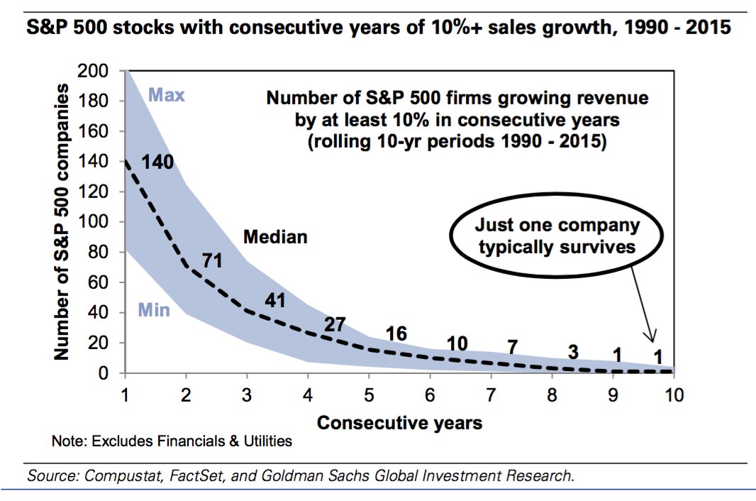
8. Consistent high revenue growth: Keeping on the theme of revenues, this chart (VIEW LINK) shows how rare it is for a company to see consistent high revenue growth (which I guess is one reason why growth companies often get bid up in price so much). To be fair the bar is pretty high in this chart i.e. rolling 10-year periods of 10%+ revenue growth. It's easy for a company to have high revenue growth when it's smaller, it's also easier for a company to have high revenue growth when conditions are booming for that industry e.g. commodity sectors that see distinct periods of boom and bust, but it's more difficult to consistently deliver high revenue growth for larger companies.
Bottom line: It's hard for an S&P500 company to consistently deliver very high sales growth.
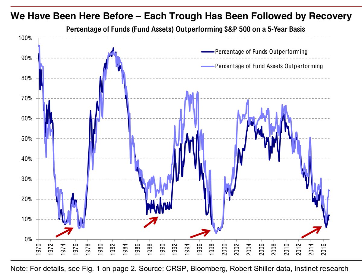
9. Active vs Passive: This chart (VIEW LINK) basically shows the war between active and passive investing - when the line goes high active is winning (in terms of performance) and when it goes low passive is "winning" in the sense that active management isn't delivering during those times. Indeed there appears to be a cycle for active vs passive investing and it looks like we're at a cyclical low for the performance of active management - so maybe active management is in for some better times ahead...
Bottom line: Active management seems to go through cycles of performance, and it looks like we're at the bottom of the cycle.
10. Eurozone vs the S&P500 - relative valuations: Speaking of active management, the below chart is perhaps a good argument for active management on regional allocation or active asset allocation more broadly. It shows relative valuations (VIEW LINK) for Europe (MSCI EMU - Eurozone) and the US (S&P500) at the cheapest level in years. While such mispricing can resolve in 2 ways (either one catches up or the other catches down) it does provide food for thought on thinking outside of the box and well maybe investors can still benefit by not putting America first!
Bottom line: Eurozone equities are the cheapest relative to US they've been for a long time - something to think about on regional equity allocation.
[eu vs us pe.PNG]
Follow us on LinkedIn (VIEW LINK)
So where does all this leave us?
This week there's probably 3 categories of interest:
1. Market outlook
As noted in previous editions there are very much mixed signals. Bearish divergence and the strange signal from sentimentrader point to potential topping of the market, while the alternative view of volatility suggests a new bull market, and futures positioning seems to show bullish momentum.
2. Sectors and revenues
On sectors and revenues we saw how sector performance rankings evolve through time, often with the worse becoming the best and the best becoming the worst. We also saw which sectors get their revenues from where. On the revenue front we learned how hard it is for big companies to maintain very high sales growth.
3. Active management
The chart showing outperformance statistics by active managers of the S&P500 seemed to display a clear cycle, which appears as though it could be at a cyclical low - thus this would be good for active management and the case for such. On active management the final chart makes a case or at least a reminder for active allocation not just across stocks or in and out of equities but across countries/regions, with the Eurozone trading on cheap valuations relative to the US.
Summary
Today's S&P500 #ChartStorm brought a few interesting insights into things like sectors and revenues and the prospects for active management. On the market outlook front it highlighted the mixed signals that still prevail. As noted in previous editions there is the risk of a short-term selloff or market correction, particularly as seasonality is often choppy at the start of the year, likewise expectations and confidence have been bid up high following the election and the prospects for business friendly policy. High expectations can be met, and confidence can feed on itself, and overall there is positive momentum in the domestic and global economy, but with several risks lurking around the corner it's easy to see some "dip buying" opportunities opening up at some point, so maybe it's worth going back and reviewing chart number 1 in today's report!
See also: Weekly S&P500 #ChartStorm - 15 Jan 2017 (VIEW LINK)
6 topics

