Weekly S&P 500 ChartStorm - 6 Nov 2016
The purpose of this note is to add some extra context beyond the 140 characters of Twitter. It's worth noting that the aim of the #ChartStorm isn't necessarily to arrive at a certain view but to highlight charts and themes worth paying attention to.
So here's the another S&P 500 #ChartStorm write-up
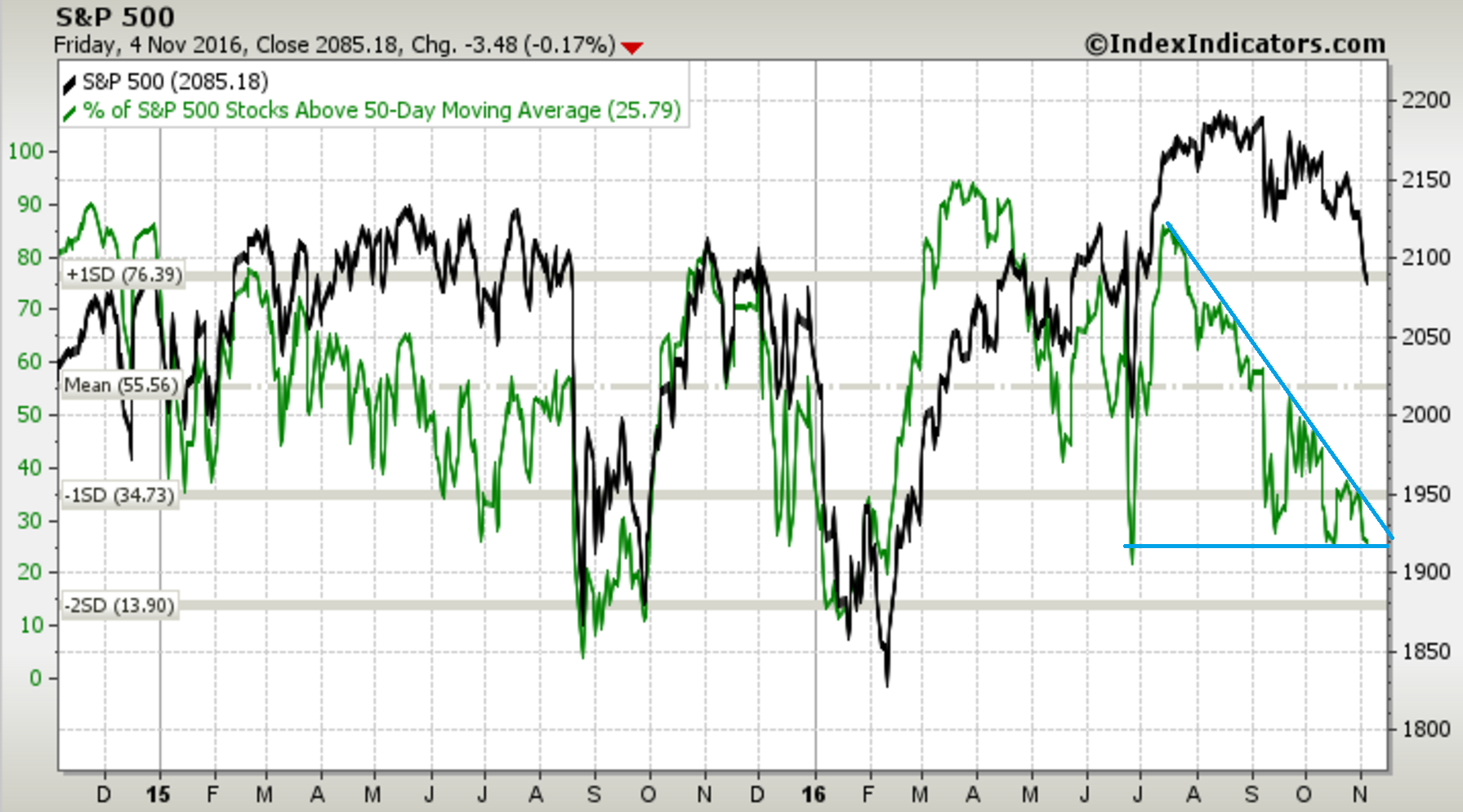
1. 50 day moving average breadth: At this point the level of the 50 day moving average breadth indicator is at levels usually consistent with oversold conditions. The main issue is the downtrend remains intact, and a breach of the line to the downside will be consistent with a deeper selloff. As mentioned previously, the moment that downtrend line is broken it will be game on for the S&P500.
Bottom line: 50dma breadth is around oversold levels, but that doesn't rule out further downside.
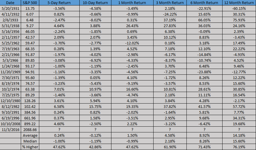
2. Losing streaks: As explained in more detail in the next table, the S&P500 has chalked up an 9-day losing streak, despite not really moving that much. It's relatively unusual, e.g. in that one year chart of consecutive up/down days the closest it gets is a couple of 5 day streaks, both of which happened to mark short term bottoms.
Bottom line: The S&P 500 chalked up an 9 day losing streak.
[conseqdays.PNG]
3. The day after a 9 day losing streak: The below table from the esteemed market analyst Ryan Detrick (VIEW LINK) shows what's happened historically when the market chalks up a 9-day losing streak. While there are exceptions, a broad characterization of it is that in the short term the average experience is mixed (some times it gets worse, sometimes it gets better), but further out the returns are mostly good. Personally I think this is probably a good characterization of the current streak, the near term could be "mixed" but will likely improve further out.
Bottom line: Following a 9 day losing streak market returns are mixed in the short term and generally better further out.
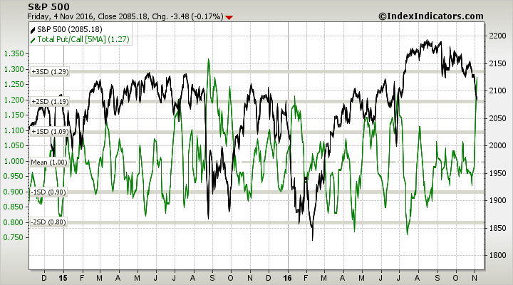
4. Put/call ratio: Using the total put/call ratio here (because it appears to give more reliable and logical signals than the alternative measures), and using a 5 day smoothing factor to bring out the signal from the noise, shows a market that looks oversold. The indicator spiked to the same levels in the August/Sep correction, the Jan/Feb correction, and the Brexit jitters. When you see these kinds of conditions the odds of a positive performance tend to be higher, all else equal.
Bottom line: The put call ratio is pointing to oversold conditions.
5. Fear and Greed: The CNN Money Fear & Greed Index (VIEW LINK) has plunged into extreme fear, which is a positive signal from a contrarian perspective. It shows a market in capitulation mode. The risk is that fear feeds upon itself and turns a minor selloff into a deeper correction, or that the fear is that of the justified kind! So while it represents negative momentum, this is another factor that is consistent with oversold conditions and raises the odds of positive performance.
Bottom line: The Fear and Greed Index dropped into extreme fear levels, which can be taken as a contrarian positive signal.
[fear and greed.PNG]
6. Tweet momentum: This measure is one of a set of indicators developed by Trade Followers (VIEW LINK) an outfit who track messages on twitter using algorithms to calculate the mood of the market. This chart shows the bullish/bearish twitter momentum for the S&P 500 index, and it shows the indicator falling to levels last seen at the depths of the Aug/Sep correction last year. Similar to the previous chart it shows the degree of negative momentum in the market, but it can also probably be taken as a contrarian signal.
Bottom line: Twitter momentum has turned down for the S&P500 which shows the negative momentum, but may be a positive contrarian signal.
[TF twit momo.PNG]
7. VIX futures curve indicator: This indicator is the ratio of the medium term VIX index (VXV) against the spot VIX index. Essentially it's an indicator of the slope of the VIX futures curve: lower on this method means the curve is in or closer to Backwardation, and higher means more Contango. In practical terms, when the VIX spikes higher than the VXV (i.e. the curve inverts more to backwardation) it's often a sign of a short term bottom - as you can see in the graph below. So again, similar to the previous charts, it's another piece of evidence that the market is becoming oversold and the odds for a rebound are rising.
Bottom line: The VIX futures curve indicator has fallen to the bullish signal zone.
[vix vxv chart.PNG]
8. SKEW and VVIX: These are what I consider to be measures of tail risk hedging (SKEW is a measure of activity/pricing of a black swan or long-tail event, and VVIX is basically the pricing of options on the VIX itself). When these indicators rise it basically represents the generally more sophisticated cohort of market participants taking out tail risk hedging - a good example is the elevation of both indicators in June in the lead up to the Brexit vote. That example is actually a pretty good analog to now as the US election is next week. It's clear that most market participants see Trump as the outlier and a negative for markets, but the announcement of the FBI investigation into Clinton also increases tail risks for the base case e.g. if she were elected and then indicted.
Bottom line: Measures of tail risk hedging have spiked in the lead up to the election.
[skew vvix.PNG]
9. Peso volatility vs the VIX: The S&P500 volatility index appears to be taken on a journey by its long lost cousin, the option implied volatility for the Mexican Peso. This is the clearest quantitative measure of how profoundly the election uncertainty is permeating through the market. The latest and largest spike in Peso volatility came on the back of the news of the reopening of the FBI investigation into Clinton and possible investigation of the Clinton Foundation. The other point is that the polling is very close, the the possibility of an outcome that is ultra close with lengthy contesting and litigation could see the final result delayed for a period of time, which would leave uncertainty levels elevated. Thus, as noted in the previous chart it shows how uncertain the political climate is in the US, and it could be some time before volatility reverts lower.
Bottom line: Implied volatility is spiking as the US political climate is a major source of uncertainty.
[peso vola.PNG]
10. S&P 500 Seasonality: While the S&P500 had been closely tracking its historical seasonal pattern for most of 2016, it has started to deviate significantly. It also deviated significantly in February at the height of the new year market panic that was brought on by a cacophony of factors e.g. China's currency, emerging markets, commodities, Korean nukes, etc. And again during the Brexit reaction. The Brexit deviation is a good analog - being a similar beast to the current event risk. After the event risk is cleared, assuming nothing else changes, the seasonal pattern will likely kick back in and the S&P 500 could rally significantly.
Bottom line: The S&P500 has begun deviating significantly from its seasonal pattern after closely tracking it for most of 2016.
[spx seasonal slip.PNG]
So where does all this leave us?
This week there's probably 3 key themes:
1. The 9-day streak
The rare 9-day losing streak of the S&P500 was highlighted, and it seems that in the short term the after effects are mixed, while the return experience generally improve further out i.e. at least 3 months, but more in the 6-12 months after space.
2. Oversold and and contrarian indicators
The 50 day moving average breadth, put/call ratio, fear and greed index, twitter momentum, tail risk hedging activity, and VIX futures curve have all moved to either oversold levels or zones consistent with contrarian bullish signals. So overall while this represents fear and and negative momentum - which can feed upon itself, collectively it raises the odds of positive future performance from the index.
3. Seasonal deviation
The S&P 500 has begun to significantly deviate from its seasonal pattern, but it could snap back in line rapidly if nothing else bad comes along and if the election goes smoothly.
Summary
This is the knife catching phase of the selloff, a number of indicators are lighting up oversold, but the negative momentum could take it further. The safe bet (albeit you might miss some of the move) would be to hold off buying the dip until confirmation comes. But the odds of positive performance from the index are improving as the oversold and contrarian bullish indicators light up, particularly in the context of positive seasonality. Either way, the week ahead is going to be very "interesting"!
Article originally appeared here: (VIEW LINK)
4 topics


