Weekly S&P500 ChartStorm - 1 May 2022
The Weekly S&P500 ChartStorm is a selection of 10 charts which I hand pick from around the web and post on Twitter. The purpose of this post is to add extra color and commentary around the charts.
The charts focus on the S&P500 (US equities); and the various forces and factors that influence the outlook - with the aim of bringing insight and perspective...
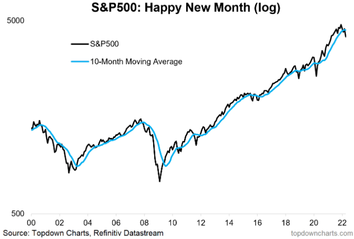
1. Happy(?) New Month! Another month, another update to the monthly chart, now tracking clean an clear below its 10-month moving average.

Never miss an update
Get the latest insights from me in your inbox when they’re published.
Advertisement
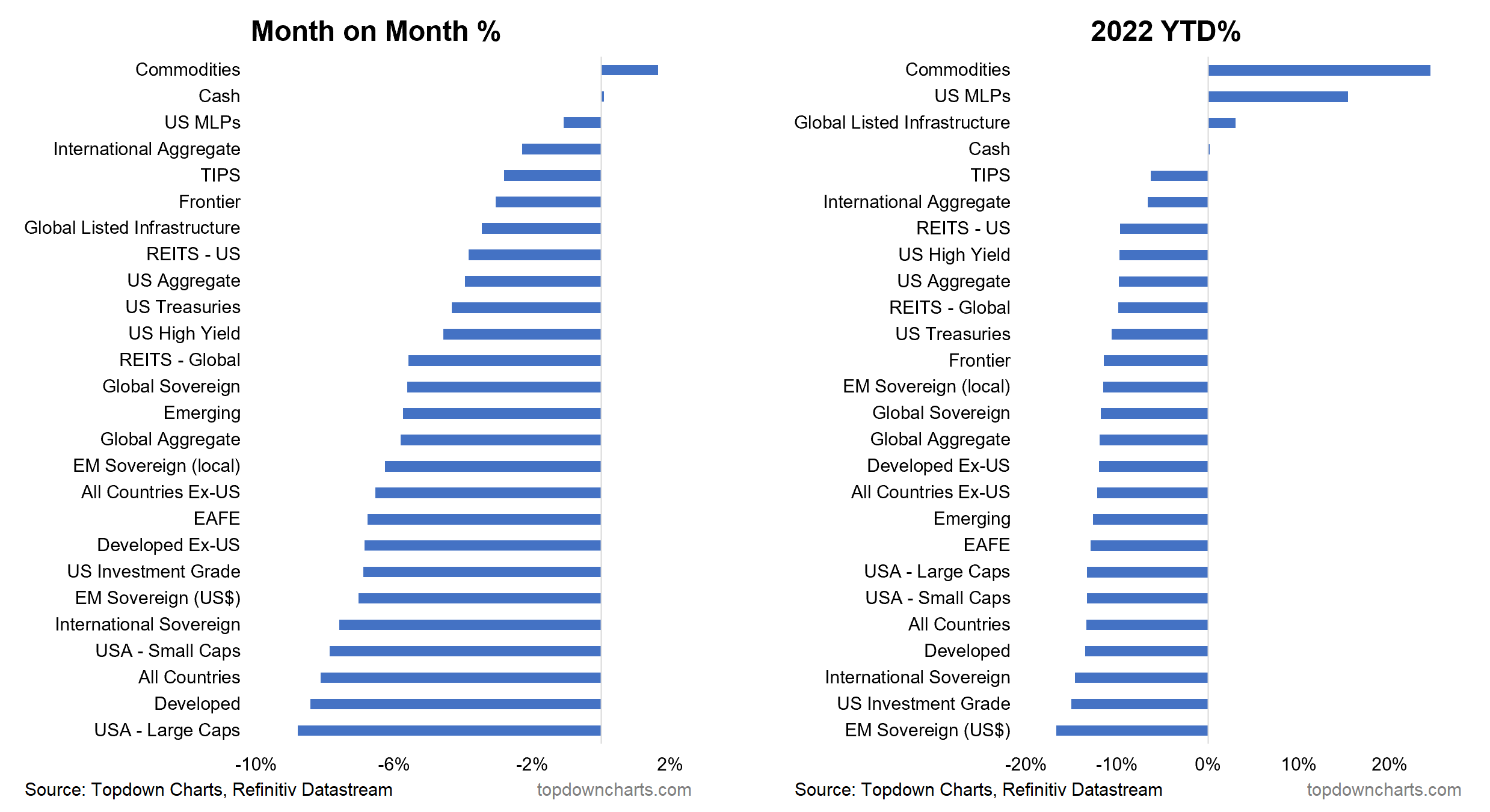
2. Monthly Asset Returns: US Large Cap equities were at the bottom of the table in April… basically everything except cash & commodities was in the crapper this month.
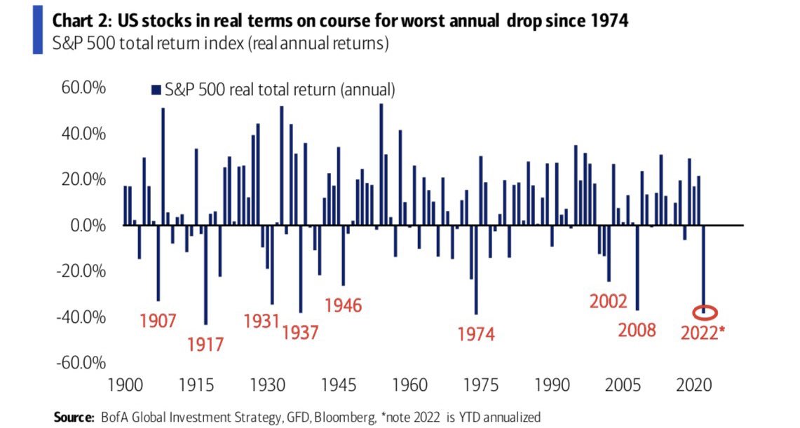
3. S&P500 Real Returns: CPI-Adjusted S&P500 on track for its worst performance since 1974 (and if you wanted a macro analog, the 70's have some similarities... e.g. surging inflation, geopolitical shocks, surging rates).
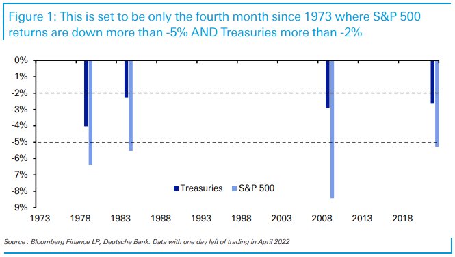
4. Rare Returns: As highlighted in chart 2, both stocks and bonds have had a rough and tough time this year. It was always going to be a hard ask for bonds to be a diversifier to stocks when both were extreme expensive -- all was needed was an inflation shock.
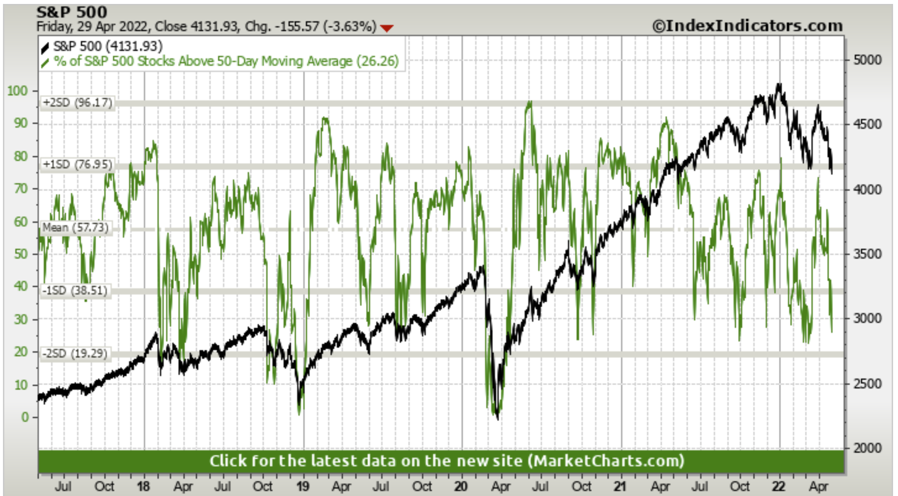
5. Bad Breadth Update: An update to that 50dma breadth chart from last week: starting to look a little more oversold this week... but I would probably still just call it strong bearish momentum as the index has also taken out a pretty key level.
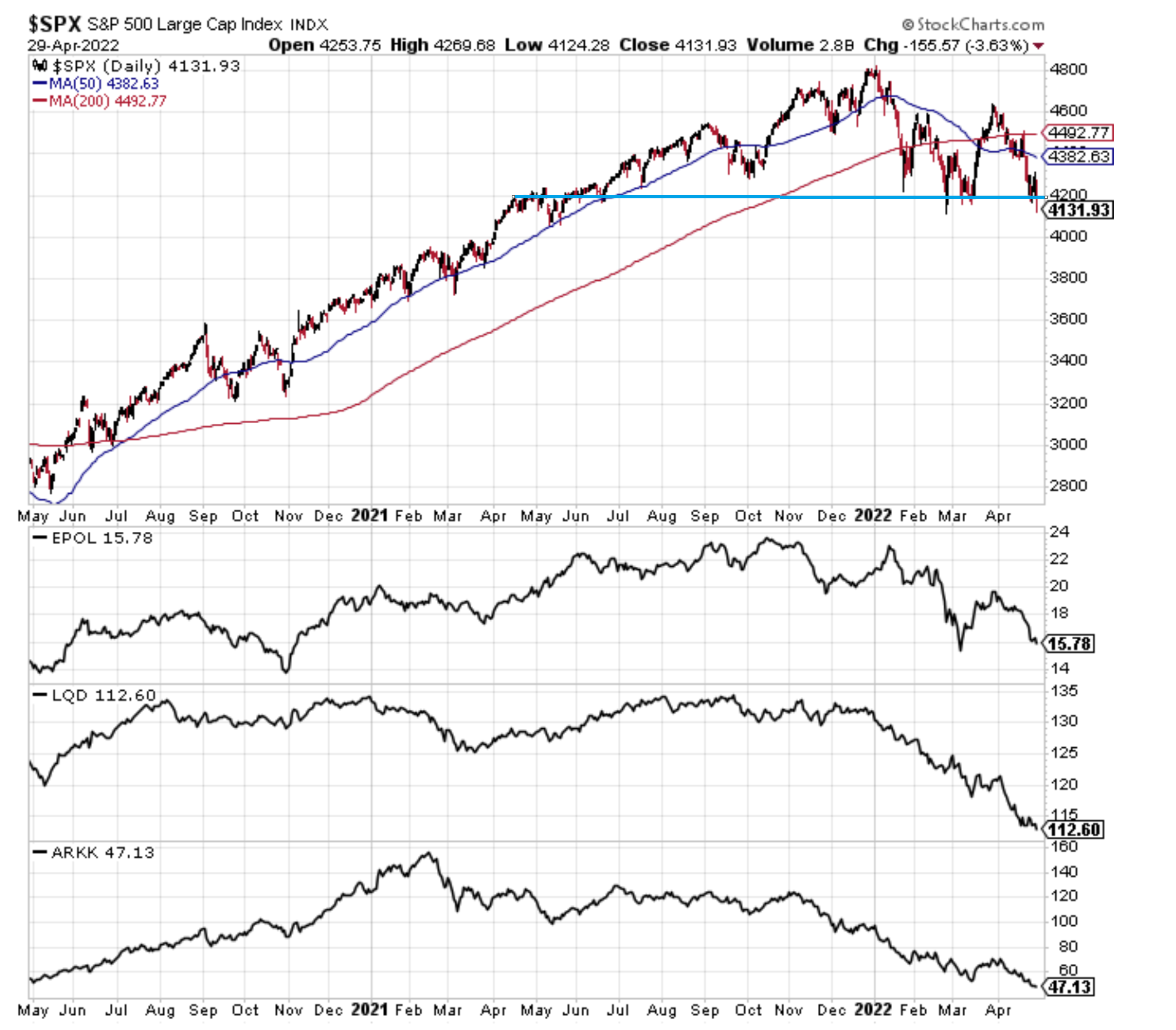
6. Correction-Drivers Update:
-EPOL [Poland ETF] (geopolitics proxy): worsening, high risk of spillovers.
-LQD [IG Credit ETF] (credit/rates): new lows as bond yields spike further + credit risk sentiment is starting to stumble too as the macro outlook dims.
-ARKK [New Tech Fund] (tech burst): new lows as tech reset plays through.
And the index has made an initial break down. Not good.
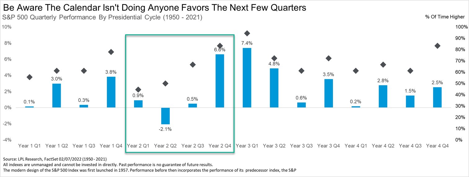
7. "SELL IN MAY" (especially May of Mid-Term years)
(of course: past performance - while informative and interesting context - is no guarantee of future results)
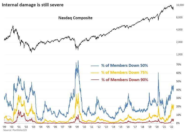
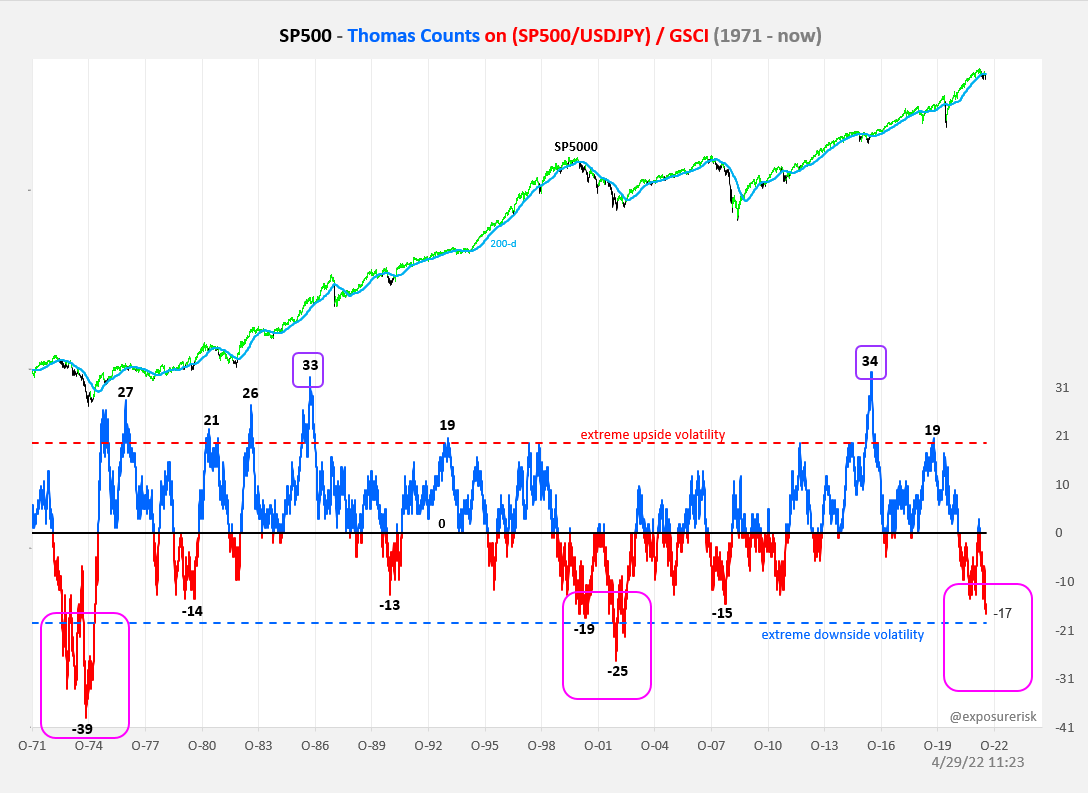
8. Let There be no Ambiguity: This is a bear market.
Under the surface the picture is clear as demonstrated in this excellent chart. We are only now starting to see the index roll over in earnest.
9. History Rhymes: Without even delving into the specifics of this chart the thing that is crystal clear is how many parallels there are NOW versus BOTH 2000 (tech boom/bust) AND 1970's (inflation/geopolitical shocks).
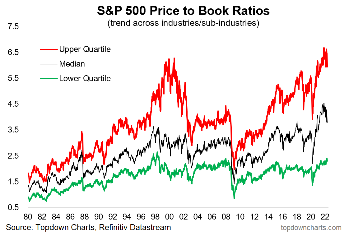
10. Valuations: I know not everyone likes the Price-to-Book ratio, and fewer still like comparing valuations across time, and people will offer plenty of explanations/reasons for why it’s so high...
But sh*t still expensive.
Thanks for reading!
Callum Thomas
Founder and Head of Research at Topdown Charts
Any feedback, questions and views are welcome in the comment section below.
Never miss an update
Enjoy this wire? Hit the ‘like’ button to let us know.
Stay up to date with my current content by
following me below and you’ll be notified every time I post a wire
Callum is Head of Research at Topdown Charts.
Topdown Charts is a chart-driven macro research house covering global Asset Allocation and Economics.
5 topics

Callum is Head of Research at Topdown Charts. Topdown Charts is a chart-driven macro research house covering global Asset Allocation and Economics.
Expertise
Callum is Head of Research at Topdown Charts. Topdown Charts is a chart-driven macro research house covering global Asset Allocation and Economics.
Expertise
Comments
Comments
Sign In or Join Free to comment
most popular
Equities
Investing for the biggest market shift since the GFC
Livewire Markets
Equities
Why ex-20 is the prime hunting ground for ASX returns
Livewire Markets