Weekly S&P500 ChartStorm - 10 July 2022
The charts focus on the S&P500 (US equities); and the various forces and factors that influence the outlook - with the aim of bringing insight and perspective...
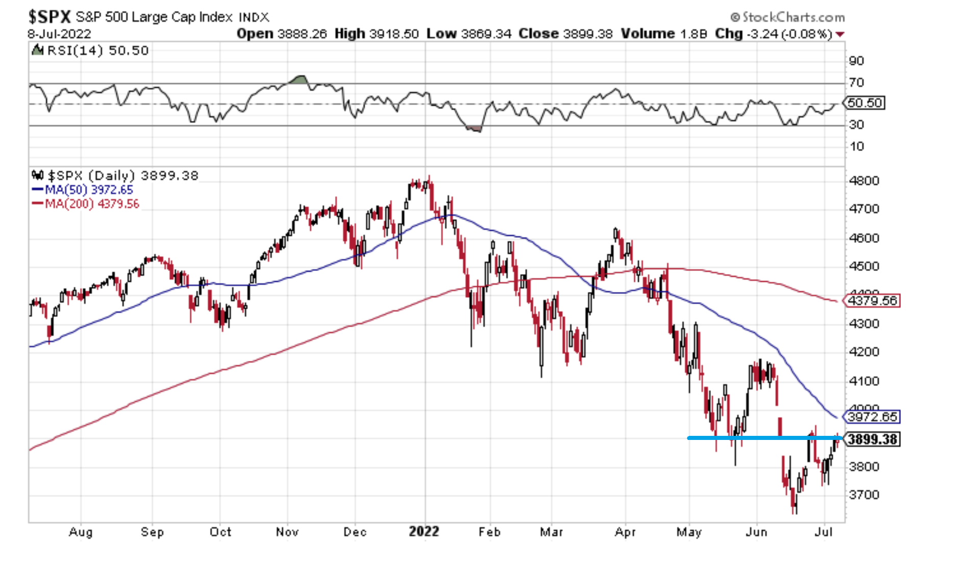
1. Technical Test: looking at nothing else but this chart, if the market can clear short-term overhead resistance (and the 50-day moving average) it probably has a decent go at putting in at least a multi-week base …and even making a move back above 4000 towards the next major line of resistance around 4200. But we are dealing with “if“ here, and I know this sounds a bit tautological (i.e. “if it goes up, it will go up”), but sometimes we need to just clarify some basic risk-levels to help frame things.
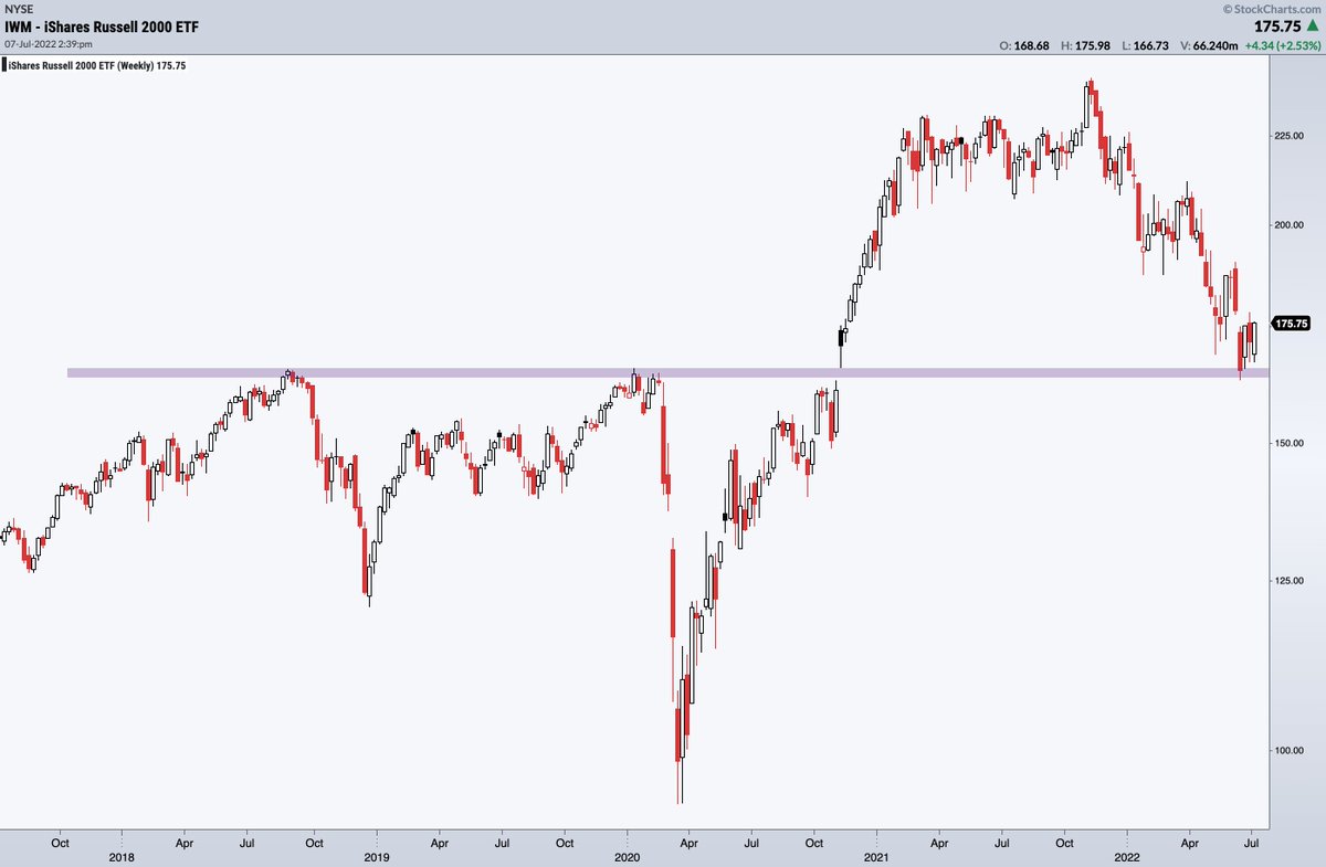
2. The Small Things: it's the small things in life that matter, and markets are no exception -- keep an eye on Small Caps at this critical junction...
Similar to the previous chart, but zoomed out a bit more and this time the focus is on support vs resistance, ultimately it’s the old question: "spring board or diving board?
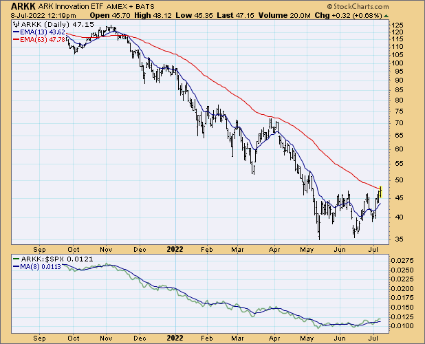
3. The arc of ARKK Continued: another technicals chart, because sometimes you just have to listen to what the market is saying...
An attempt is clearly being made here, and similar to the previous two charts the outcome will determine how things playout in H2. ARKK basically represents the new tech bubble burst, so some strength in this corner of the market would set a bullish tone.
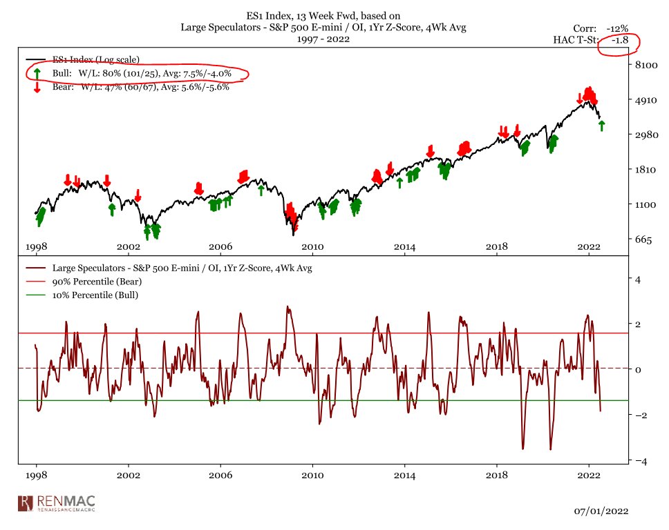
4. Positioning: large speculators running large shorts…
(if everyone is prepared for the worst, then it doesn’t take much to surprise)
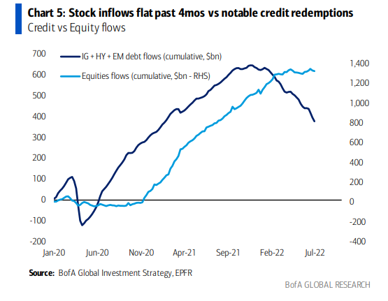
5. Fun with Flows: it looks like the stock market is a few steps behind the bond market... equity flows peaked about 6 months after bond flows did. Key implication or expectation implied is that equity flows are the next shoe to drop in this chart.
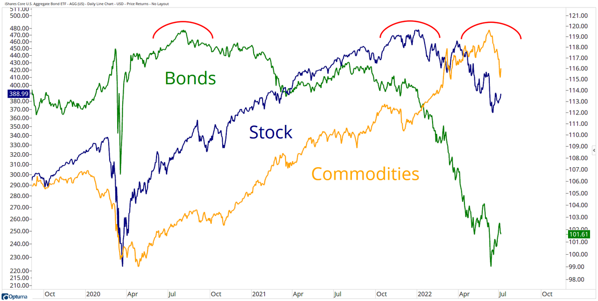
6. The Market Cycle: it's the old textbook market cycle map in progress: first bonds peak, then stocks peak, then commodities peak... at it's simplest, price just reflects the progression of the business cycle (and inflation/monetary policy).
edit: link to “the textbook market cycle map“
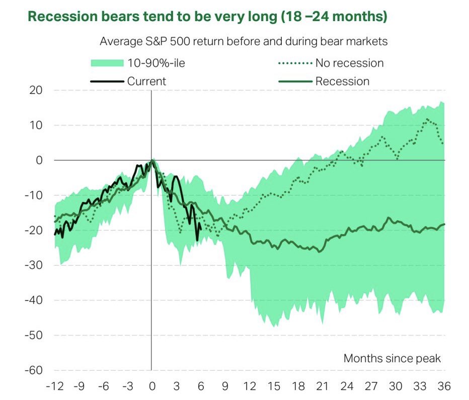
7. Bear Market Map: again, the market follows the business cycle, and so the playbook for markets comes down to the recession question.
But even then, by this chart -- the typical pattern seems to be that markets are basically a wash over the next few months either way.
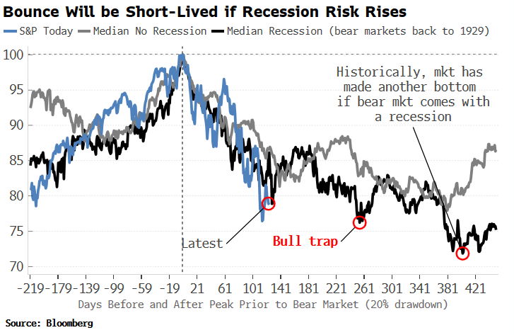
8. Daily Bear: similar to the previous chart, this time daily, same basic message... but a bit more finer detail of the trials and tribulations ahead (zooming out like the last chart is really helpful in setting perspective, but this chart highlights how messy it can be in the day-to-day).
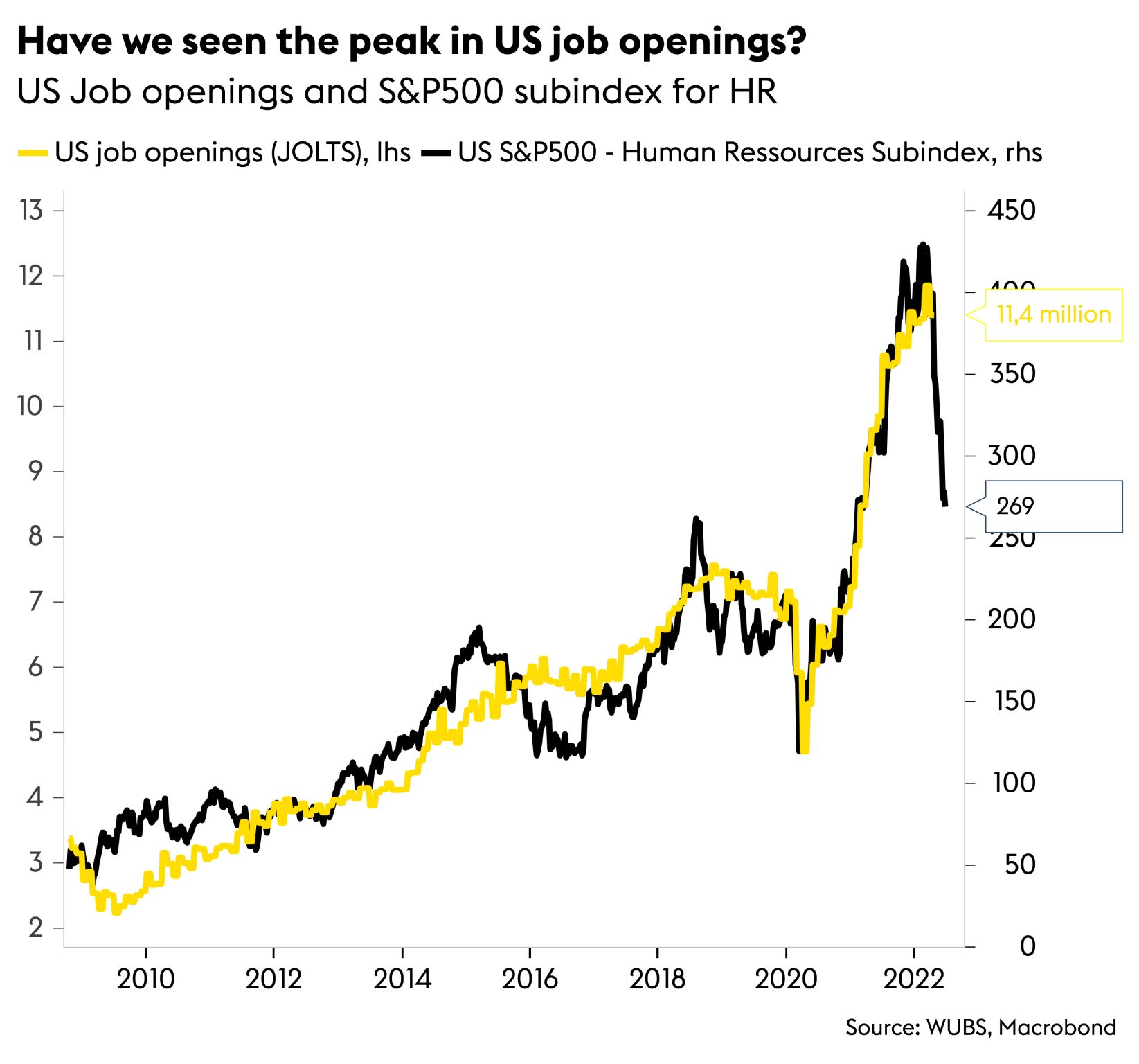
9. With a Jolt: market seems to be saying JOLTS about to jolt!
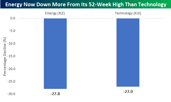
10. Energy vs Tech: these two things are not the same. But their drawdowns are!
Thanks for reading!
Callum Thomas, founder and head of research at Topdown Charts.
Any feedback, questions and views are welcome in the comment section below.
Never miss an insight
If you're not an existing Livewire subscriber you can sign up to get free access to investment ideas and strategies from Australia's leading investors.
And you can follow my profile to stay up to date with other wires as they're published – don't forget to give them a “like”.
4 topics

