Weekly S&P500 ChartStorm - 14 November 2021
The Weekly S&P500 ChartStorm is a selection of 10 charts that I hand pick from around the web and post on Twitter. The purpose of this blog post is to add some extra color and commentary around the charts.
The charts focus on the S&P500 (US equities); and the various forces and factors that influence the outlook - with the aim of bringing insight and perspective.
Hope you enjoy!
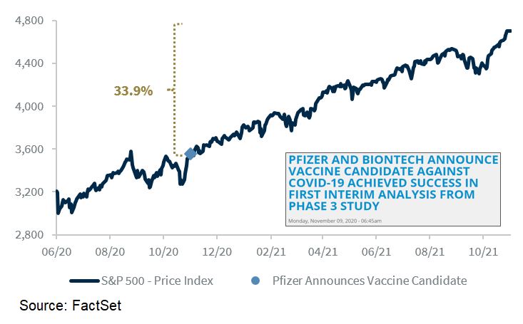
1. Vacciversary: Can you believe, an entire year has passed since the Pfizer vaccine announcement. Markets had a strong immediate reaction, and since then have chalked up some 34% in gains. Of course a bunch of other factors are also at play, and we also had delta along the way, but you have to think at some level if there were no vaccine that the ride in markets might have been a little rougher.
Source: @LarryAdamRJ
2. Investor Movement Index: The IMX moved down slightly in October - this continues the pattern of movement downwards from the peak in optimism of a few months ago. This is typically not a healthy sign for sentiment indicators i.e. reaching an extreme and then leveling off.
Source: TD Ameritrade
3. Investment Manager Index: On the other hand, the Markit IMI rebounded further in November with risk appetite surging to multi-month highs and expected returns reaching a new (albeit short history - newish survey) high.
Source: @IHSMarkitPMI
4. Euphoriameter: Even my own Euphoriameter composite sentiment indicator has ticked higher so far in November as valuations and bullish surveyed sentiment remain high and volatility lulls back towards complacency.
Source: @topdowncharts
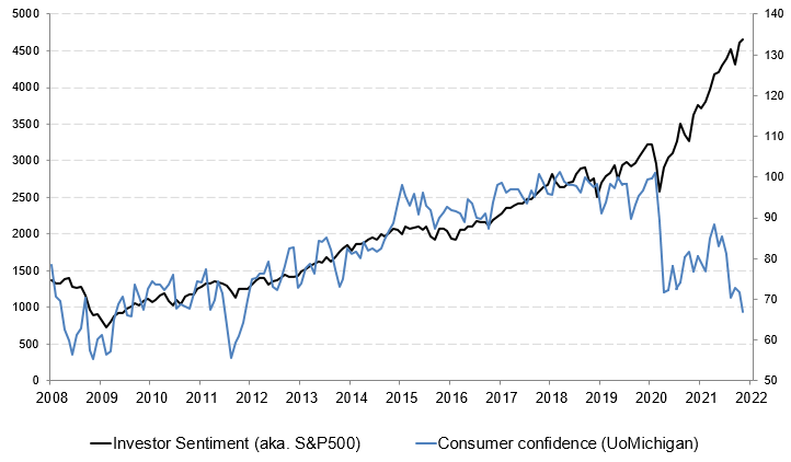
5. Investor Sentiment vs Consumer Sentiment: But not all sentiment indicators are at the highs: consumer sentiment has been decidedly less optimistic. I mentioned in a recent video that the UoM consumer sentiment indicator was perhaps overstating the extent of the decline, but the other 2 consumer confidence indicators I track for the USA have also started to drop off recently. This has left quite the divergence between consumer sentiment and investor sentiment.
A large part of this is probably down to the inflationary shock that is currently facing the global economy due to pandemic disruption to the global supply chain *and* unprecedented monetary + fiscal stimulus (remember: supply shortages/backlogs and the associated inflation surge don’t exist if there is no demand —> demand has been boosted by stimulus —> and stimulus helps stocks ——> gap explained).
Source: @takis2910
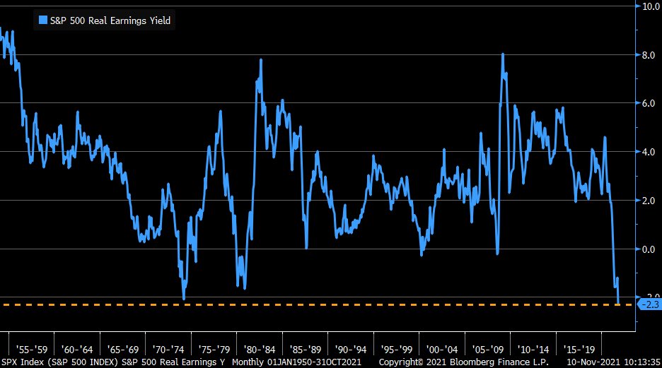
6. Real Earnings Yield: Another effect of the surge in inflation has been a plunge in the real earnings yield: again this can be squared up by noting that stimulus has been a key driver of the inflation shock and a key driver of the surge in asset prices —> surging asset prices (stock prices) leads to a lower nominal earnings yield (again: gap explained). So is this a problem? Perhaps, but one way or the other it will probably be transitory (if you can read between the lines a little there!!).
Source: @LizAnnSonders
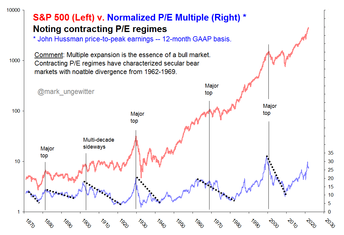
7. Valuations: Valuations rising = risks rising... but then again it's a bull market, so POLR is higher (for now).
n.b. “POLR” = path of least resistance: basic notion that in markets and life when a force is set in motion an object will not change its motion/trajectory unless another force acts on it... That means a bull market will carry on until something changes e.g. a crisis, monetary policy tightening, recession, regulations/politics, (or a combination of all of those!).
Source: @mark_ungewitter
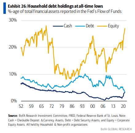
8. Household Financial Asset Allocations: We all know by now that equity allocations by households is at/near record highs. But one surprise: cash holdings have jumped and are apparently on par with debt (bonds etc) ...even as cash rates suck (and are even suckier when you consider the real interest rate). Probably an element of booking gains, stimulus payments, and precautionary savings. Recall though: the job of cash is preservation of capital (and optionality) vs generating returns, as such.
Source: @MikeZaccardi
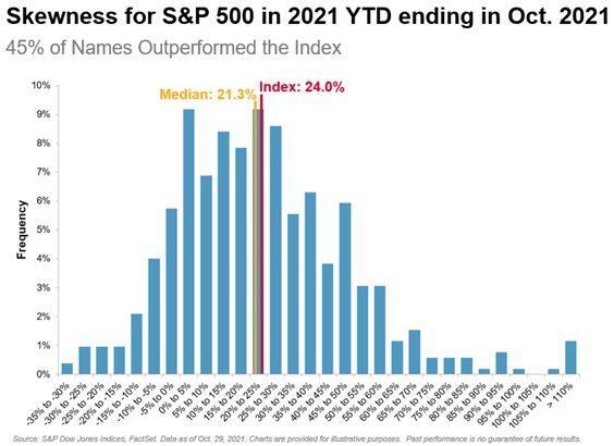
9. S&P500 Constituents Return Distribution: I thought this was interesting - especially the tails of the distribution - a lot of heavy lifting being done at the tails. But also that ”s” — tails (i.e. big dispersion between left and right tails).
Source: @spglobal via @bernardiniv68
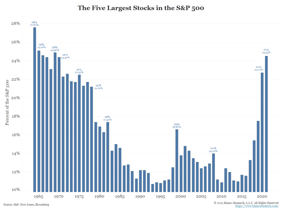
10. The Five Biggest Stocks: The bigness of the biggest stocks in the index is biggening more bigly. Serious though: the market is increasingly lop-sided, this means diversification may be diminishing as systematic risk will be increasingly driven by specific risk.
Source: @biancoresearch
Thanks for reading!
Feedback/questions/views welcome in the comment section below.
5 topics

