Weekly S&P500 ChartStorm - 31 July 2022
The charts focus on the S&P500 (US equities); and the various forces and factors that influence the outlook - with the aim of bringing insight and perspective...
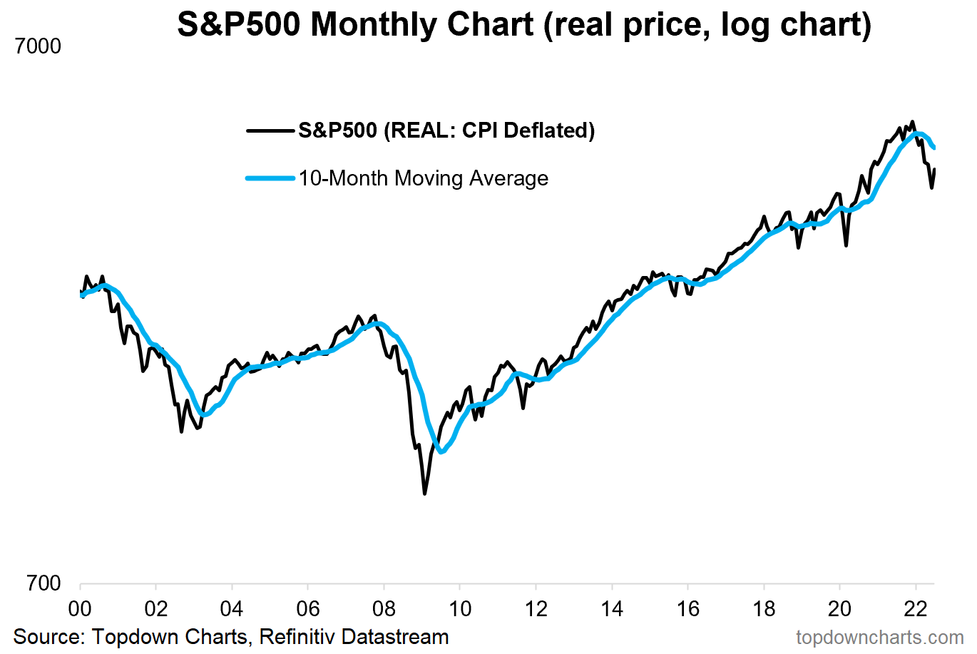
1. Happy New Month! S&P 500 up +9.11% in July.
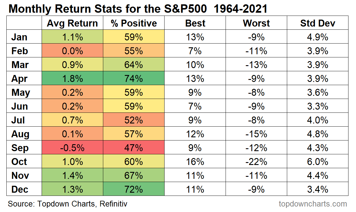
2. Monthly Seasonality Statistics Table: August is a mixed bag, can be very good or very bad (September is where it gets a bit messy though).
Source: @topdowncharts
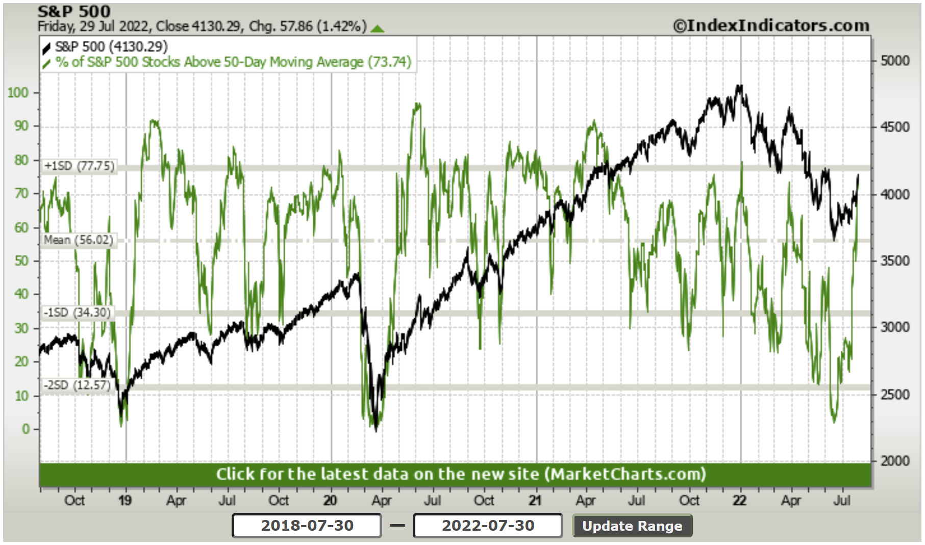
3. Big (Bear Market) Rally: Over 70% of stocks tracking above their 50-day moving average, and the index itself has cleared some pretty key levels...
That said, some would argue that 50-day moving average breadth now looks oversold, and there is heavy overhead resistance around that 4200 level.
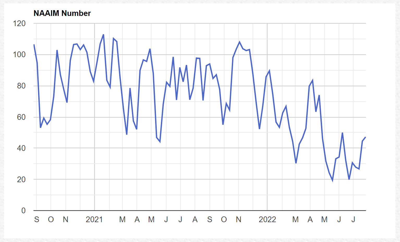
4. Exposure: As price breaks through initial resistance, NAAIM Exposure Index shows active managers tentatively upping exposure (albeit, clearly from the low end of the range and understandably light exposures in the scheme of things).
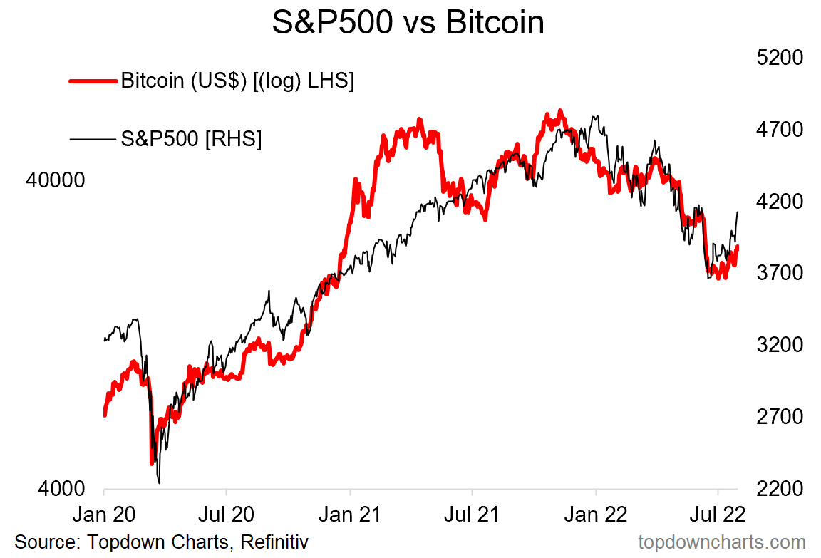
5. Fed Relief Euphoria: Consensus seems to think the Fed last week was dovish, maybe it is, and maybe we are close to a pause/pivot (me = do not think so — I covered this in a report to clients last week: the Fed needs to see inflation expectations re-anchor or at least pull back towards average at a minimum, and will ignore market volatility and economic wobbles until they are confident about containing inflation)
...but anyway one thing is clear --> investors are SO ready to jump on it the moment the Fed "comes to the rescue", as the chart below indicates IMO. Like Pavlov’s dogs, investors, especially newer ones, have had it ingrained in their heads that the bull market of 2020/21 is some how normal.
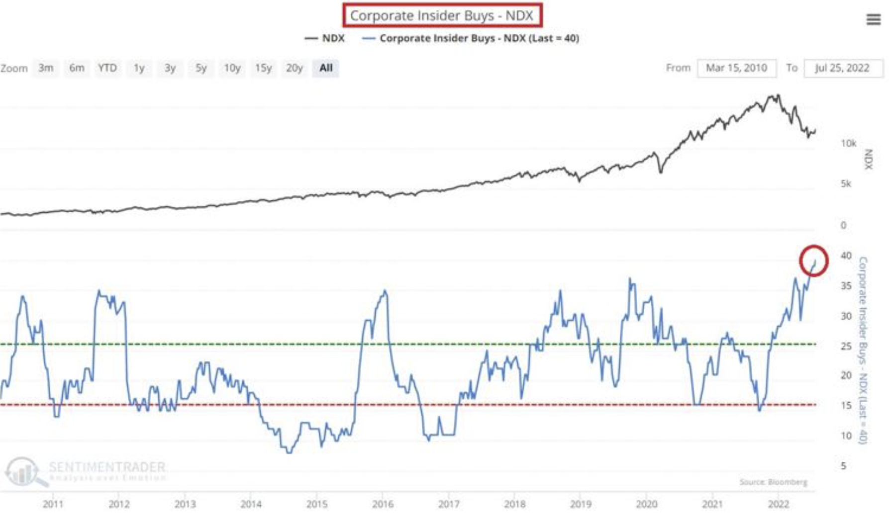
6. Insider Buying: Insiders busily scooping up bargains*
(*at least relative to the crazy valuations in 2021)
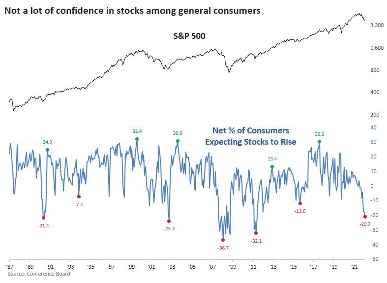
7. Consumers hate stocks
Looking at the chart, they got it right in 2009, but patchy otherwise, mostly a contrarian bullish signal. Does go to show though the steady transition in mood as the macro backdrop got worse and worse this year.
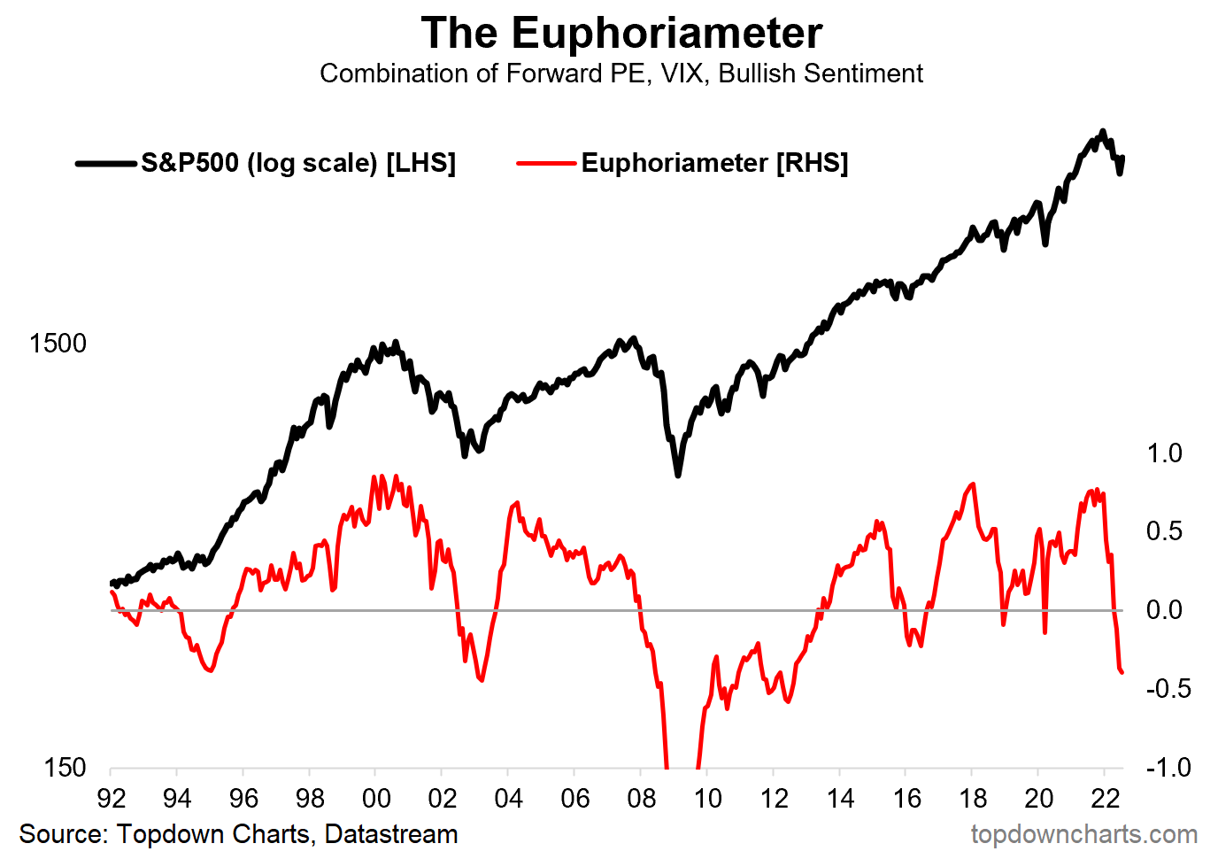
8. Boom to Gloom: The “Euphoriameter” shows a clear transition from Euphoria in 2021 and now Dysphoria in 2022...
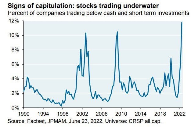
9. Cash Trading: In June there were a record 12% of companies trading below cash and short-term investments… (take note of where the previous climaxes in this indicator were)
Makes me wonder if some of that was switching to cash and short-duration investments given the bond chaos (vs rising cash rates).
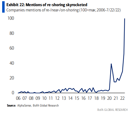
10. On-Shore For Sure
Bullish capex?
Thanks for reading!
Callum Thomas, founder and head of research at Topdown Charts.
Any feedback, questions, and views are welcome in the comment section below.
5 topics

