Weekly S&P500 ChartStorm - 6 March 2022
The Weekly S&P500 ChartStorm is a selection of 10 charts which I hand pick from around the web and post on Twitter. The purpose of this post is to add extra color and commentary around the charts.
The charts focus on the S&P500 (US equities); and the various forces and factors that influence the outlook - with the aim of bringing insight and perspective.
Hope you enjoy!
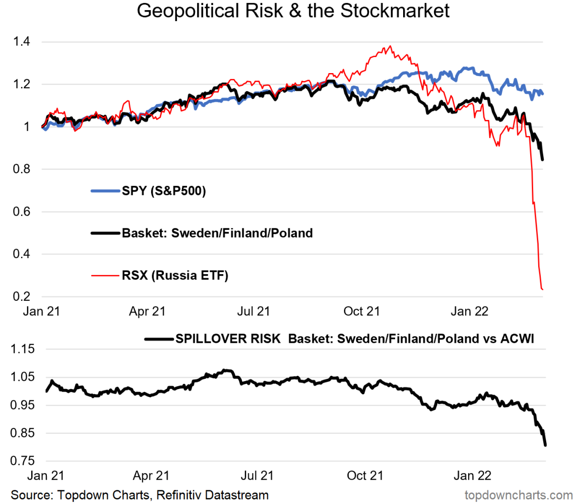
1. Spillover Risk: Tracking performance of equities close to the frontline, so to say. This is perhaps one of the most direct measures of investor perception of spillover risk. Definitely one to keep an eye on as the situation evolves.
n.b. spillover basket = US listed ETFs: EWD, EFNL, EPOL
Also n.b. RSX (and all other Ru ETFs) has been suspended/halted, and probably fair to say there is fundamental uncertainty to the viability of those funds (but I am no product expert, and this is *not* product advice!!).
Source: @topdowncharts
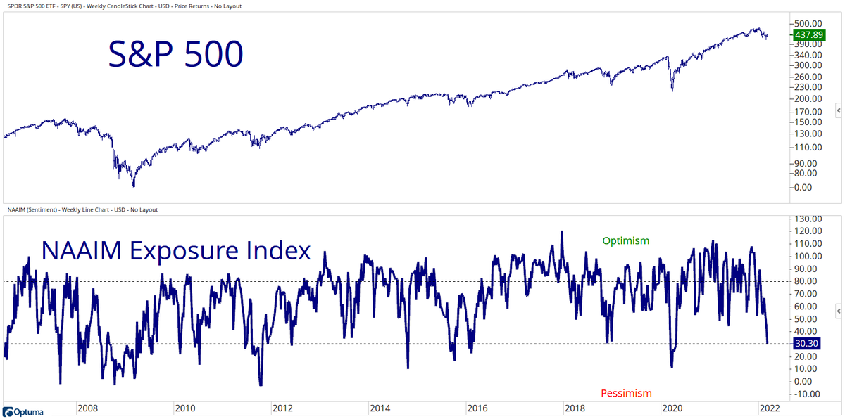
2. Sentiment continues to Sink: Here's another datapoint on the sentiment front — the National Association of Active Investment Managers exposure survey has dropped close to pandemic panic levels.
But again, with regards to sentiment, n.b. 2008. In other words, sentiment goes like this during a short-sharp (and then back to business) correction… but it can also go like this during the transition to bear market. I would say that with sentiment this repressed that the odds of a rebound is high, but also noting that bear markets are basically downtrends that do have plenty of short-lived rebounds and rallies.
Source: @granthawkridge
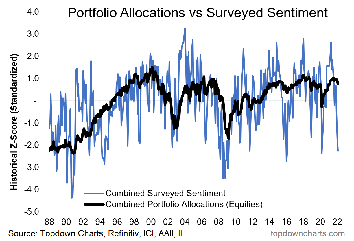
3. Surveyed Sentiment vs Portfolio Allocations: On the topic of investor sentiment, check out the chart below — *surveyed* sentiment (close to historical lows) vs *actual* portfolio allocations (close to historical highs). Investors might be saying they are extremely bearish, but their portfolios say they are still wildly bullish.
Source: @topdowncharts
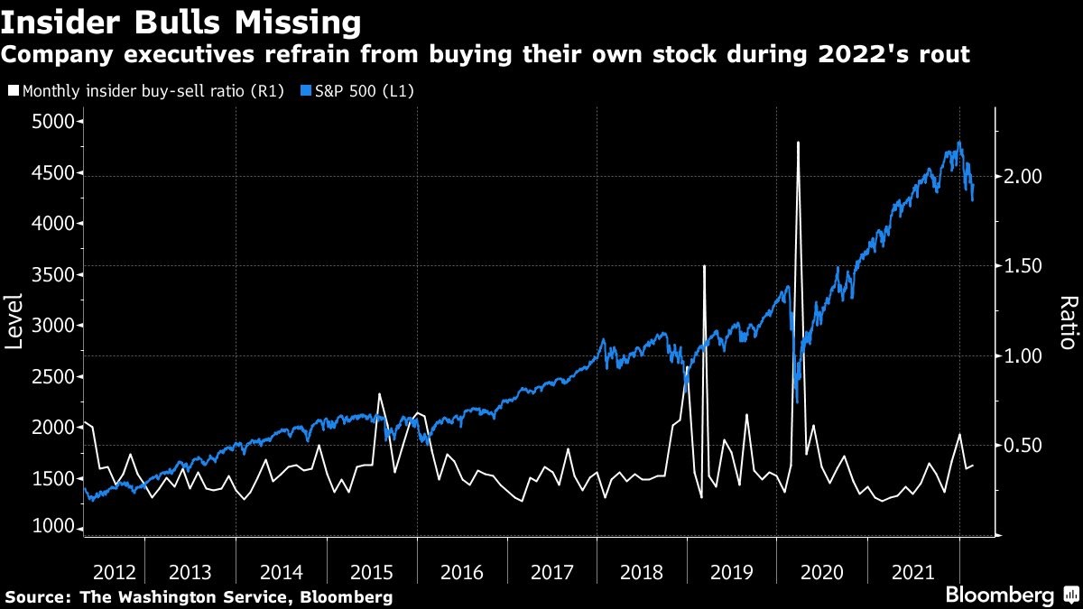
4. Insiders Out: No appetite by corporate insiders to "buy the dip" at this stage. Perhaps waiting for better prices... (and/or they see the pointy end of increasing inflationary pressures and rising bond yields).
Source: @DiMartinoBooth
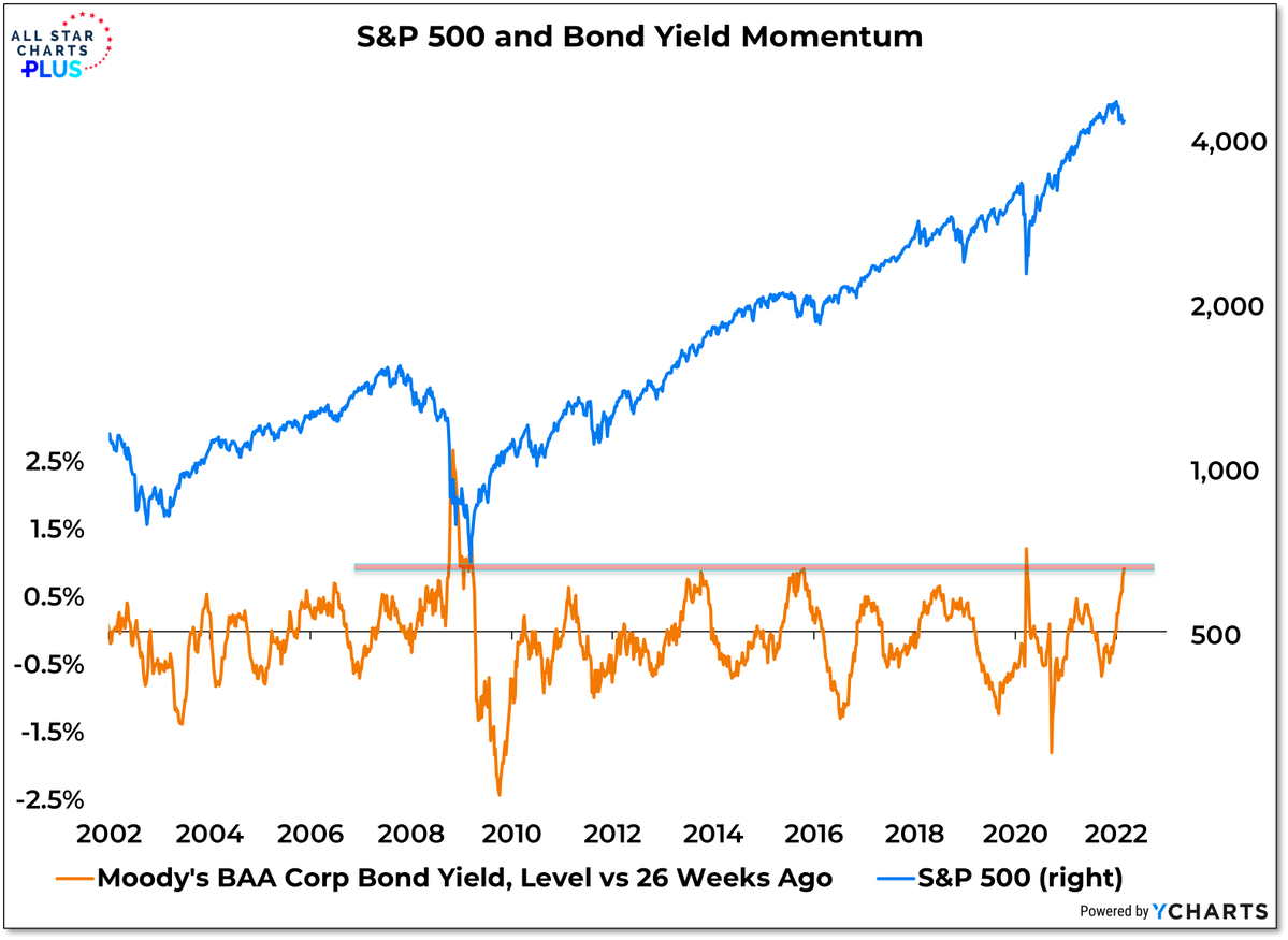
5. Corporate Bond Yield Momentum: When orange line going down/below zero = bullish. When orange line going up/above zero = bearish. Currently bearish. (logic would be that higher corp bond yields reflects weakening financial conditions as a result of rising interest rates and widening credit spreads).
Source: @WillieDelwiche
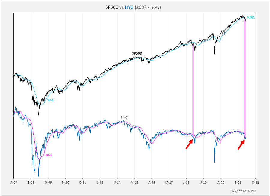
6. Junk Funk: Another angle on the Junk Funk...
(slowly at first, then all of a sudden)
Source: @exposurerisk
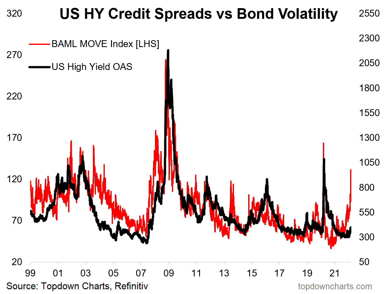
7. Slumbering Spreads: Following on, worth noting that “High Yield“ (aka junk bond) credit spreads haven’t even gotten that spready yet. Again, there is 2 ways we can look at this: a. there is another shoe to drop yet; or b. things aren’t actually that bad if credit spreads are still largely shrugging off the volatility. (albeit they could both be right, but in sequence…)
Source: @topdowncharts
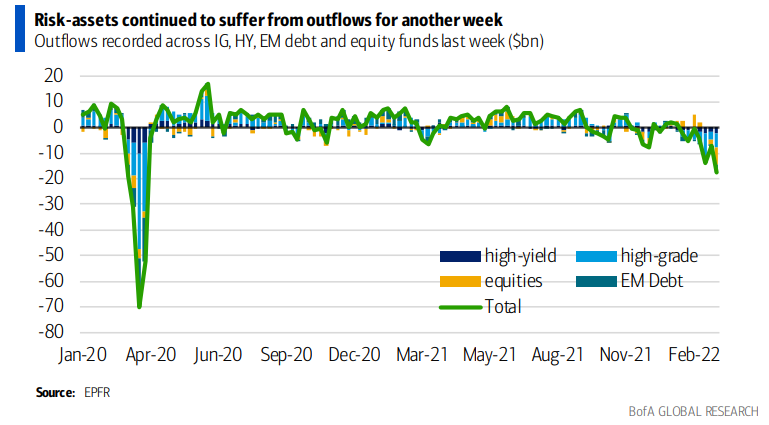
8. Risk Flows: If you are looking for further “shoes to drop”, I would say this is arguably one example: flows have clearly turned south as you would expect, but it still seems kind of light or perhaps underreaction vs what we saw in 2020 and vs the ostensibly shocking sentiment situation that seems to have set in...
Source: @MikeZaccardi
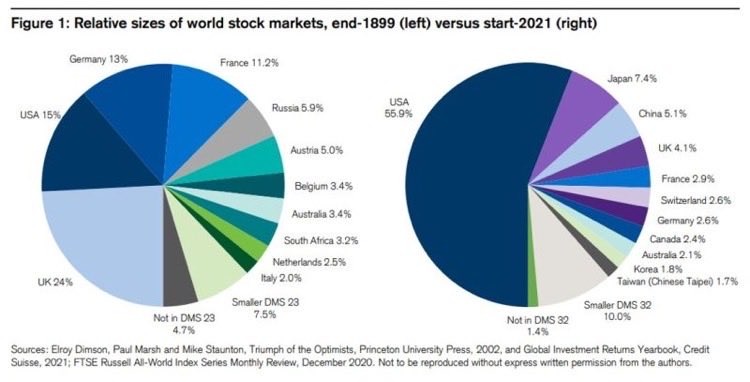
9. Monster Market: US stockmarket went from 15% of world in 1899 to 56% end 2021. Some think it's the only game in town, but it doesn't take much studying to realize there are many other and very different games out there too...
Source: @MacroAlf
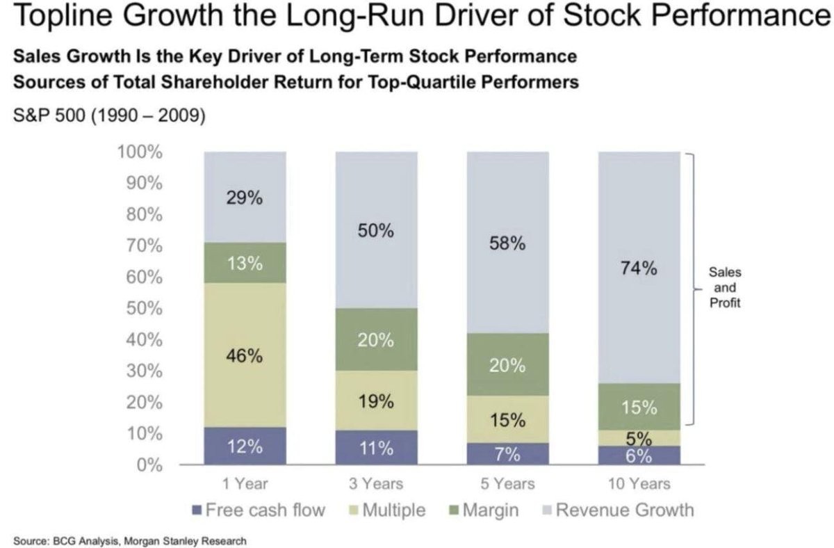
10. Sales = King. (albeit, that is an old chart, I would hazard a guess that margins and multiples might have taken greater weight in returns over the past decade)
Source: @MaverickBogdan
Thanks for reading!
Callum Thomas
Founder and Head of Research at Topdown Charts
Any feedback, questions and views are welcome in the comment section below.
5 topics

