Why are small-cap stocks under pressure?
While the Omicron variant may end up slowing the pace of recovery, our base case is unchanged. We are expecting one final rally in reflation sectors, pushing the share market higher into next year.
Leading indicators are strengthening as supply chains recover, inventories rebuild and western economies reopen. The strength of this recovery will of course depend on Omicron’s progress.
While vaccine efficacy may have diminished, booster shots will help, and severity appears manageable.
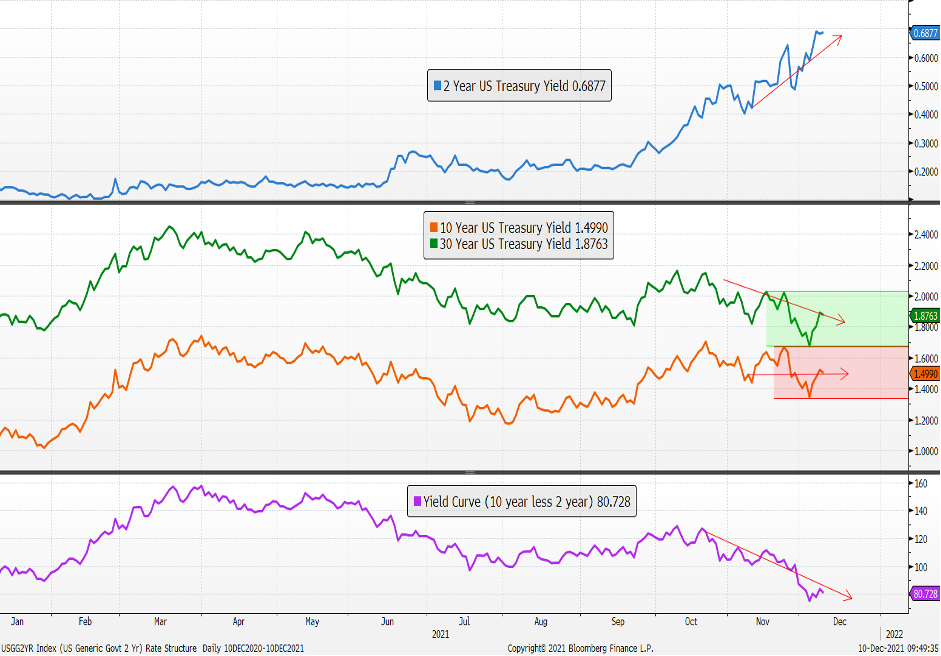
Bond and equity markets have quickly adjusted to this new scenario. In the figure below, yields on shorter dated bonds are pushing higher maintaining pressure on central banks to normalise policy, while longer dated bonds are consolidating reflecting a softer medium-term outlook.
A subtle but important shift is playing out in bond markets with implications for shares and leadership.
Interest rate structure and yield curve
Source: Bloomberg
The lower panel is the steepness of the interest rate structure or the ‘yield curve’. It has clearly flattened in recent weeks with the emergence of yet another COVID ‘variant of concern’. This ‘bear’ flattening is yet another sign of a maturing cycle.
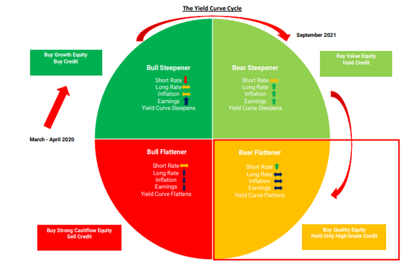
As we move toward the end of this business cycle, the yield curve will flatten as policy tightens before eventually inverting as we approach the next bear market. We are shifting into the yellow quadrant in figure 2 below where investors start to move out of more speculative, riskier assets into the larger, quality names.
Investment cycle and yield curve
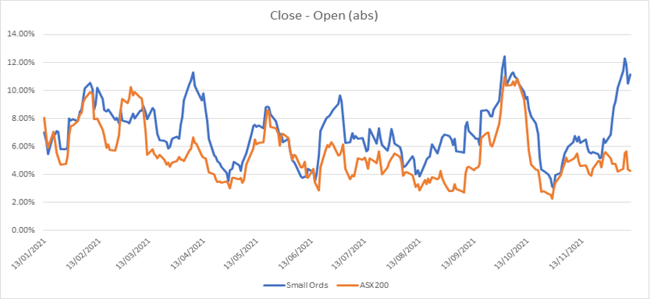
In recent days we have seen negative divergence in smaller companies versus the market leaders. We are seeing this in credit markets as well, with credit spreads turning higher as investors re-weight out of higher yielding bonds into investment grade securities.
ASX small-cap volume has changed materially
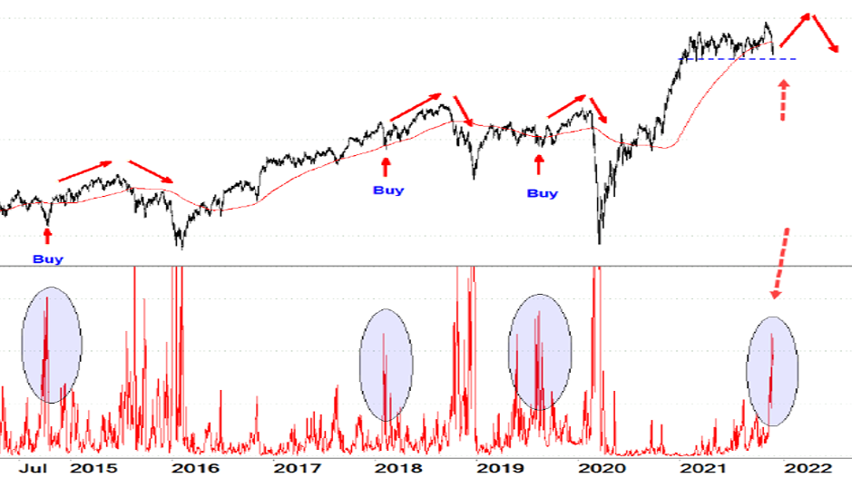
The small cap index in the US, the Russell 2000, broke out of its long trading range last month, which was bullish for sharemarkets, but has since fallen back again (figure 4 below). A false break like this with so many constituents making new 52-week lows (lower panel) is a bad sign for small companies and confirms this rotation into quality leadership is beginning.
A record number of new 12-month lows on the Russell 2000
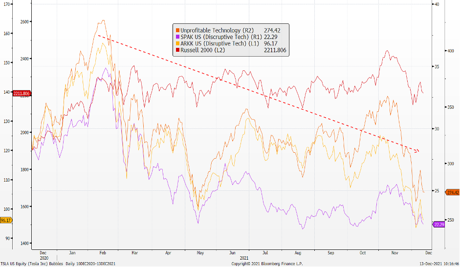
As the cycle matures, speculative bubbles in riskier segments of the market start to unwind, one by one. The highs may well be in for cryptocurrencies, TSLA, SPACs, and unprofitable technology, not to mention the racier, smaller companies (as in the figure below). Any rally from here is likely to be corrective only.
Bubbles are deflating one by one
Source: Bloomberg
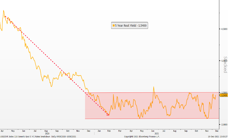
These bubbles are an outcome of emergency policy settings. If you look at real interest rates in the chart below (the nominal bond less break-even inflation) you can see how real rates collapsed with massive injection of liquidity from central banks. Shares and especially growth shares re-rated along with these very low real interest rates.
It is no coincidence that the low point for real rates in February of this year was also the high for the Russell 2000, as well as for the unprofitable and disruptive technology sectors (figure 5 above). Real rates have held in a range since then, as central banks continue with large scale asset purchases even as inflation tests 20-year highs sustaining the bubble.
Real rates plummeted in Q4 and are yet to recover as emergency settings continue
Source: Bloomberg
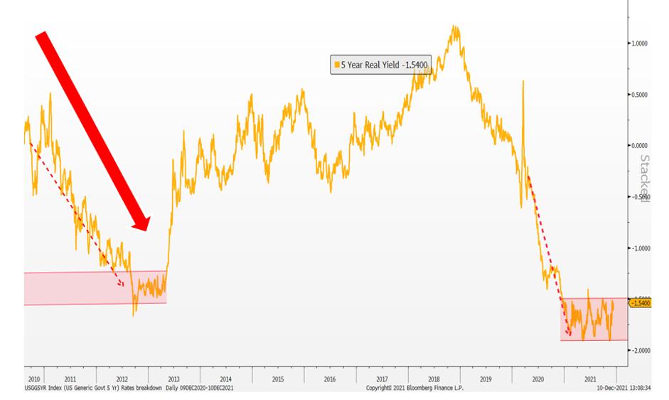
A useful analogue can be found in the 2013 ‘taper tantrum’ and the exit from QE1, as real rates jumped sharply higher (figure 7, below). You may be wondering why we haven’t seen the same break higher following the recent taper announcement. In 2013 we had deflation and austerity as we emerged from the European sovereign debt crisis, this time around we have inflation and profligacy keeping real rates lower for longer. As inflation pressures ease and fiscal stimulus unwinds (fiscal drag) real rates will inevitably move higher again as they did in 2013.
Real rates spiked with taper tantrum
We are seeing the same pattern play out in risk indicators where credit spreads and volatility have bottomed and are now moving higher (in figure 8 below).
Key risk indicators have now bottomed and are now turning higher
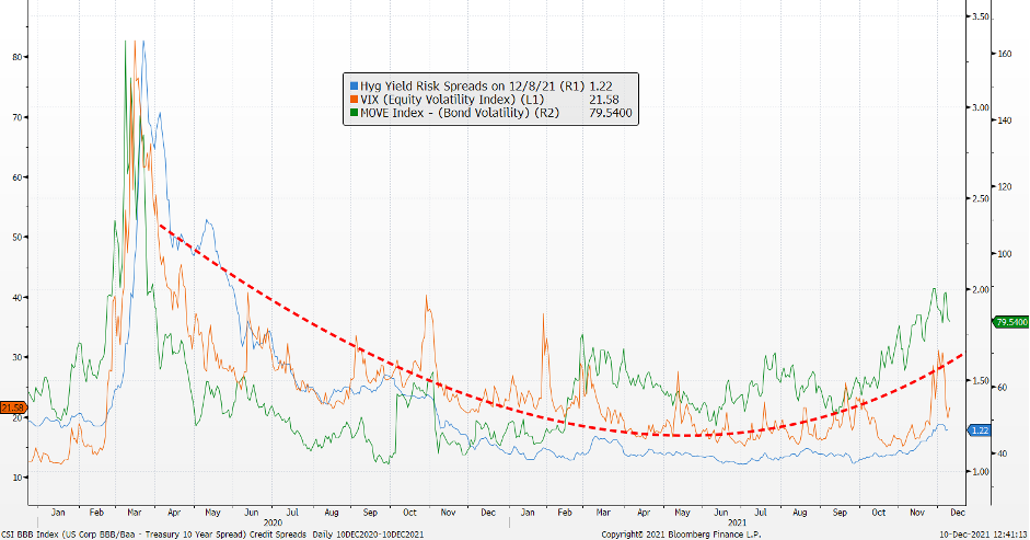
These are all signs of ‘distribution’ typical of market tops: deteriorating internals as participation falls and leadership narrows, along with ‘divergence’ as volatility and risk indicators are rising along with a rising market. The leadership narrows around the highest quality names before these stalwarts also fail and we find ourselves in a bear market.
This is a concern more for next year though. In the meantime, we should see one more decent rotation back in the key reflation sectors (value) as concerns around omicron pass.
Never miss an insight
Enjoy this wire? Hit the ‘like’ button to let us know. Stay up to date with my content by hitting the ‘follow’ button below and you’ll be notified every time I post a wire.
Not already a Livewire member? Sign up today to get free access to investment ideas and strategies from Australia’s leading investors.
5 topics

