Why is the price of iron ore falling?
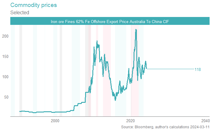
Iron ore is close to a correction (generally defined as any fall of ~20% from a near-term peak). That does mask the fact that iron ore is still well elevated against the pre-pandemic average price (closer to $80) and still well above many of the post-pandemic troughs.
In our view, iron ore is still fantastically profitable for Australia's majors, and, remains disconnected from cost-curve support. Whilst at first that sentence might read as "bullish" to some, we do not believe that it is, and see material downside to iron ore from here.

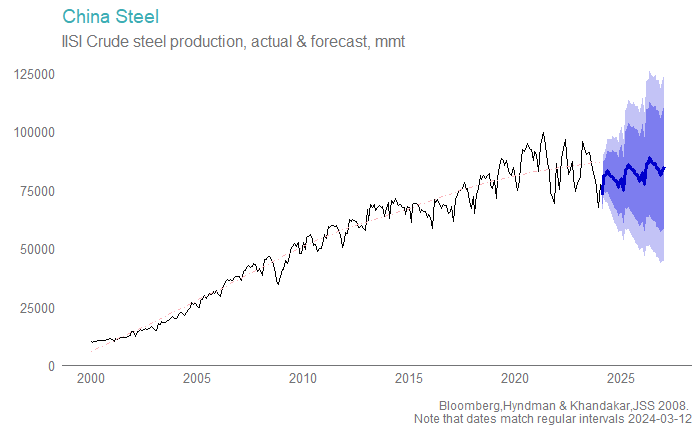
China's urbanisation story (people from the country moving to the city) and industrialisation journey (becoming a middle-income country and building out property, infrastructure and manufacturing capabilities to match) meant a tremendous amount of steel was required.
The urbanisation story has come largely to an end (urban migration is no longer as strong, there's more than enough housing, apartment blocks, office towers, high speed rail, you name it) and hence the steel production story is flatlining. You can eyeball it below; the growth rate has slowed (that little red line gradually bending), and "slowed" has given way to "stalled" over the past few years.

Some of that is COVID, which impacted the economy in stops and starts. Some of that is cyclical, with China's property woes being compounded by higher interest rates globally, rates that moderate global demand, in turn an engine for China's export-orientated model.
But mostly it is structural. China has more than enough (fixed asset) investment as a share of GDP, and not nearly enough consumption. Households need a larger share of income, to generate the next leg of "sustainable growth".
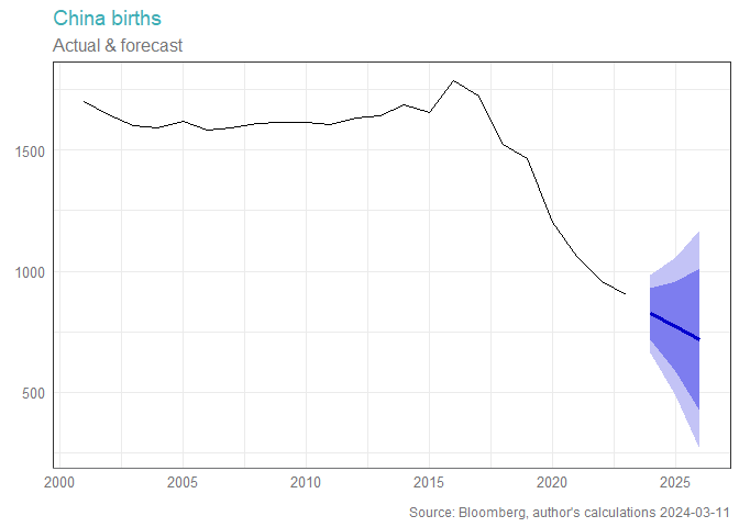
And that won't require iron ore, to the same degree as previously. Demographics is also destiny; when there are fewer people in the future (which the below graph guarantees, given the long run slow-moving nature of demographic data) there is a matching lesser need for housing and infrastructure.

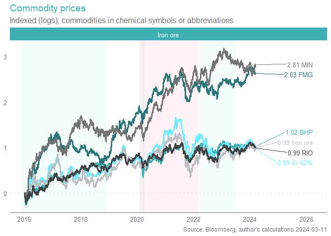
The price of iron explains the movements in the share price of big established majors like BHP and RIO over time. This makes sense; whilst BHP and RIO come across as "diversified miners" with exposures to nickel and potash and alumina, bauxite and copper, the reality is that iron ore makes up the vast majority of the profits. Nickel is a bust, at the moment, and some 40% of the alumina/aluminium cost curve is underwater at current pricing. Iron ore is the jewel in the crown.

There are some investors who are confident that the ROIC for BHP/RIO (which is very high) and the excellent cost curve positioning (which is very low) means that cycle dynamics for the price of iron ore don't really matter, for the longer term investor.
We don't share this view; even just eyeballing the above graph for a moment or two should suggest the cost curve support argument matters for solvency, and the dividend, and thus has a "level" implication for the above graph, but not really a "rate of change" implication, at least not in anything like the short or even medium run.
Now, we've been here before. Iron ore has had vicious sell-offs, many of which proved to be short-lived. The "big one" as it were, hasn't really come. Even that nasty sell-off back in 2021 was from above $200tn, which no-one really viewed as sustainable.
Will this prove the same? Well, no-one knows for sure, and certainly not me. But we can look at the fundamentals, and conclude that better opportunities lie elsewhere. We do have some BHP in our portfolios, but in aggregate are well underweight the metals and miners, and iron ore companies in particular, due to the above.
0
1 topic
2 stocks mentioned

