With the S&P500 down 18.5% this year, are stocks cheap on a valuation basis?
Markets are already meaningfully off from their highs at the start of this year.
Despite that, though, US monetary policy continues to tighten rapidly, with the chances of a 100bps rate hike at next week’s meeting growing over the course of this week. Macro indicators also continue to point to a rising likelihood of a recession in 2023: The yield curve remains inverted, leading economic indicators are contracting, whilst other macro indicators are also consistent with that message (i.e. the likelihood of a US/global recession in 2023).
Consensus earnings forecasts, in contrast, continue to anticipate rising EPS and margins in 2023 (despite those growing economic challenges).
All of that supports the expectation that the bear market is alive and well.
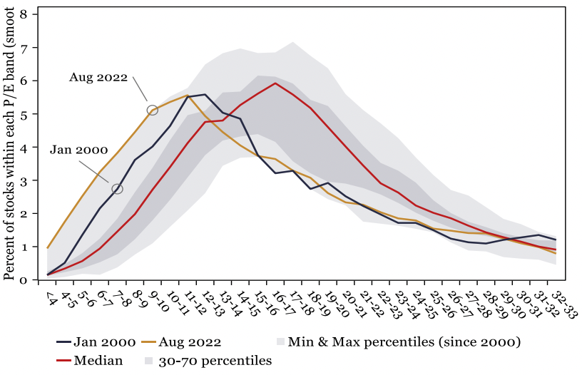
Fig 9: Distribution of individual underlying single stock PERs (US market)
Having bottomed in June 2022, however, the S&P500 rallied from oversold levels through to mid-August, aided by a strong Q2 earnings season (and resilient consensus earnings.
The key question for this (valuation) analysis, though, is: Does valuation
provide any insights into how far this bear market may have left to run? In
particular, with the S&P500 down 18.5% this year, are stocks cheap on
a valuation basis?
Key Rationale
There are multiple ways to assess the valuation factor in equity markets. In this analysis, we examine three categories of valuation measures to answer that question (i.e. are stocks cheap?).
Those three approaches are:
- An assessment of headline index PE ratios, median PE ratios, and the distribution curve of the underlying market’s PE ratios (all based on consensus forward earnings estimates);
- An assessment of the equity market through the lens of single stocks, with a focus on the disproportionate impact of the ‘Mega Cap’ stocks;
- Economy wide/‘broad-based’ measures of the market’s valuation.
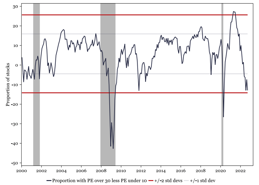
Fig 9i: Proportion of US stocks with a PE ratio over 30 less PE ratio under 10
The Analysis
Headline Valuation Metrics
At an aggregated index level, US equities still appear to be reasonably expensive. The S&P500 forward PE ratio is still firmly above its long term average (i.e. at 16.9x, see fig 9viii), while the NASDAQ index remains close to +1 standard deviation above its mean.
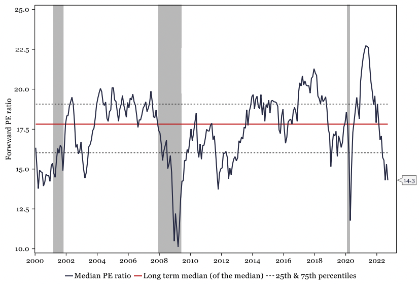
In contrast, other PE based metrics hold a different message and suggest that equities have become more attractive. The US median P/E ratio, for example, which measures the median forward P/E of the largest 2,500 US stocks, has continued to decline and is now at 14.3x (fig 9ii). That represents one of its lowest levels since the GFC.
Similarly, the distribution of the P/E ratios (of the single stocks that make
up the broad US equity market) has skewed notably to the left, relative to
history since 2000 (fig 9) – albeit, in both instances, there are parallels with
January 2000 in that respect.
Fig 9ii: US median PE ratio (with long term median)
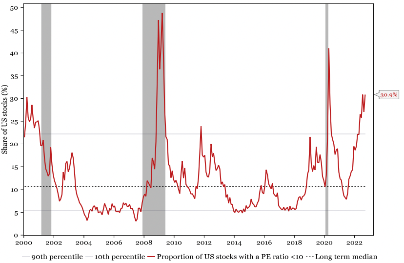
Digging into the detail, we observe that the proportion of stocks with a PE ratio below 10 is currently at historically high levels (over 30%, fig 9iii), similar to peaks seen in the pandemic, the GFC, and in 2000 (at the start of that bear market).
Conversely, the proportion of US stocks with a high PE ratio (i.e. above 30) has declined significantly from its April 2021 high (i.e. at 36.1%), and is now near its long-term median levels of 17.9% (September 2022 – fig 9xi). As such, our ‘overvalued less undervalued’ model (i.e. the proportion of stocks over 30 less under 10) is close to -2 std deviations (once again, at levels, usually only seen at bear market lows – fig 9i).
Understanding these divergent messages is critical for assessing the overarching message of the valuation models. How is the circle squared? Why is the median PE ratio low yet the headline PE notably above its long-term average?
The answer lies in the mega-cap stocks – which make up a significant proportion of the index market cap (see point 2).
Fig 9iii: Proportion of US stocks with a P/E ratio <10
‘Mega Caps’ are still expensive:
The availability of cheap money has
(arguably) made the S&P500 more top-heavy than ever, with the top 10
stocks amounting to over 30% of the total S&P500 market capitalisation.
Just as in the dot-com bubble in 2000, these mega cap stocks have notably
high valuations. Apple’s market cap, for example, is equal to that of the
bottom 183 S&P500 companies combined. Despite the recent challenges
that various tech stocks have faced, Apple is still trading at a forward ratio
of 24.6x, while its consensus earnings remain in positive territory, with
predicted growth of 8% in 2023 and 7% in 2024.
It's not just Apple that has rich valuations. Other stocks ranked in the top 10 by market cap include Microsoft (23.9x), Amazon (45.6x) and Tesla (55.9x). Hence, when thinking about the forward PE ratio of the S&P500, it’s important to factor in the bias caused by these mega cap stocks. Indeed, the current playbook of how the PE ratios are evolving looks similar to that of in the late 1990s to early 2000s (see fig 9iv).
The
forward PER for the top 10 stocks in March 2000 peaked at 42.5x, 78%
higher than the index PER. Eventually, as the excess unwound, the forward
PE ratio for the top 10 stocks converged to that of the index.
Fig 9iv: S&P500 forward PERs
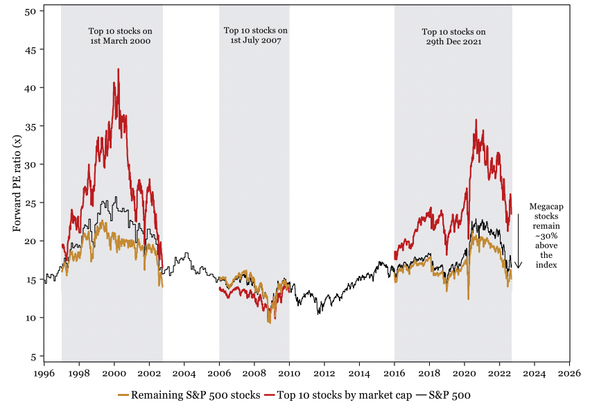
Similarly, from 2016 onwards, the forward PE ratio of the top 10 S&P500 stocks started to move above that of the rest of the market. By December 2021, it was at a peak of 35.9x (57% higher than the market’s PER).
Whilst those valuations have started to normalise in the past 12 months, they remain, extremely overvalued relative to the index (by approximately 30%). The key question, therefore, is whether that 2000s playbook is the one that the mega caps will follow?
If so, then significant mega-cap/tech weakness is likely in the coming months/quarters (i.e. as that overvaluation continues to unwind). In that respect, the price action and valuation of Facebook/Meta (which was also in the top 10 stocks at the market peak in Dec 2021) over the past 18 months have been interesting.
Meta’s forward PE ratio peaked at 27.7x in mid-2020 and remained reasonably high (at 21.8x) in Dec-2021. This year, though, the PER has fallen sharply, and is now trading at a significant discount to the tech sector (and, indeed, the index, fig 9ix).
Economy-wide, broad-based valuation measures suggest markets remain expensive.
While fund managers, analysts and tech enthusiasts often argue that the ‘tech mega caps’ are exceptional companies and, therefore, deserving of their high valuations, an assessment of the whole market’s valuation relative to the size of the economy (or against history), questions that assumption.
These (types of) charts show that the stock market (and other asset classes) are overvalued relative to the size of the economy (or similar metrics).
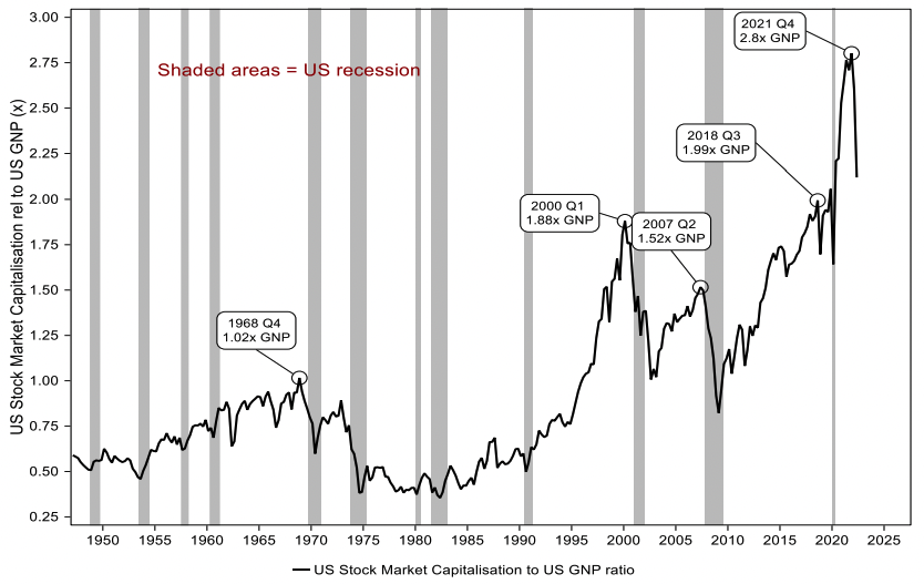
Indeed, Buffet’s favourite valuation indicator is, reputedly, the broad stock market’s market capitalisation relative to the size of the economy. The rationale is that GDP incorporates all of the earnings of the economy as a whole (and is therefore a comprehensive denominator9i), with the market capitalisation showing the valuation of the publicly listed corporate sector. As fig 9v shows, despite some recent softening, this measure suggests that the equity market (as a whole) remains notably overvalued relative to the country’s entire output.
Fig 9v: US stock market capitalisation relative to GNP
albeit it doesn’t include the overseas portion of the global economy, from which many US companies derive some of their earnings/sales
As Charles Kindleberger, a financial historian and student of financial bubbles described ‘all bubbles are inflated by cheap money, whilst those bubbles always burst when the cheap money is removed. In that respect, and given the Fed’s aggressive rate hiking cycle, the US stock market capitalisation to GNP ratio is clearly of concern (fig 9v). A revisit of the 2000 ratio highs (1.88x GNP, or the pre-pandemic peaks at 2.06x at end of 2019) seems plausible (& would be equivalent to a 22 - 27% fall from current levels).
A similar message is conveyed by the Shiller PE ratio (i.e. a ‘cyclically adjusted PE ratio’ fig 9x), which also correlates with US households’ allocation to equities as a share of their total financial assets.
Other signs of unwinding of the excess liquidity have also started to become visible, with the size of key asset classes decreasing by $7.2 trillion since April 2022 (Table 9i). Of that, US equities have shed $10.5 trillion of their market cap in the last 4 months. Unsurprisingly, another asset class that has seen a massive decrease in its market cap is ‘Cryptocurrencies’. Bitcoin, the largest crypto and which is widely regarded as another indicator of risk appetite/liquidity, is down 24% (from its highs).
Table 9i: Estimated size of key US9ii asset classes, and growth (2009-2021)
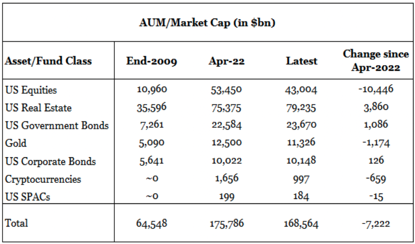
The above asset class estimations are US-centric, except for Gold and Crypto, which are global estimates.
To conclude, inflows into equities (and other asset classes) driven by the availability of cheap money, especially since March 2020, have pushed valuations to extremes.
While equity market weakness this year has begun to normalise those extreme valuations, at a headline level, equities still have a way to go before the pandemic effect will have been completely reversed.
In
particular, if that reversal is going to come to fruition, a significant portion of
that weakness will have to be centred around the current mega cap/tech stocks.
1 topic

