5 great charts on investing for income (or cash flow)
The low interest rates of recent times along with periodic turmoil in investment markets has provided us with a reminder of the importance of the income (cash) flow or yield an investment provides. It’s particularly important for those relying on investment income to fund their living expenses. As with all investment topics, investing for income can seem complicated and daunting once you move beyond bank deposits but in fact it’s really quite simple. So this note looks at five charts I find useful in understanding investing for income or yield.
Chart #1 - There are lots of alternatives to bank deposits
The yield an investment provides is basically its annual cash flow divided by the value of the investment.
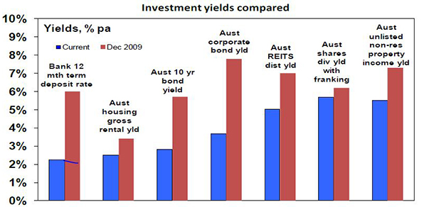
- For bank deposits, the yield is simply the interest rate, eg bank 1-year term deposit rates in Australia are about 2.25% and so this is the cash flow they will yield in the year ahead.
- For ten-year Australian Government bonds, annual cash payments on the bonds (coupons) relative to the current price of the bonds provides a yield of 2.8% right now.
- For corporate debt, it’s a margin above government bond yields and depends on the riskiness of the company but is currently averaging around 3.6% in Australia.
- For residential property, the yield is the annual value of rents as a percentage of the value of the property. On average in Australian capital cities it is about 3.9% for apartments and around 2.5% for houses. After allowing for costs, net rental yields are about 2 percentage points lower.
- For unlisted commercial property, yields are around 5.5%. For infrastructure investment it averages around 4.5%.
- For a basket of Australian shares represented by the ASX 200 index, annual dividend payments are running around 4.3% of the value of the shares. Once franking credits are allowed for, this pushes up to around 5.7%.
The next chart shows the yield available on a range of investments both now and in December 2009.
Source: Bloomberg, REIA, RBA, JLL, AMP Capital
Key message: first, there are plenty of alternatives to cash when it comes to yield or income. Second, the yields on these investments will move over time and since the aftermath of the Global Financial Crisis (GFC) the trend has been down.
Of course investors need to allow for risk. Bank deposits have close to zero risk but any move to higher-yielding investments does entail taking on risk. More on this later.
Chart #2 - The gap between yields on different assets relative to historic norms provides a guide to value
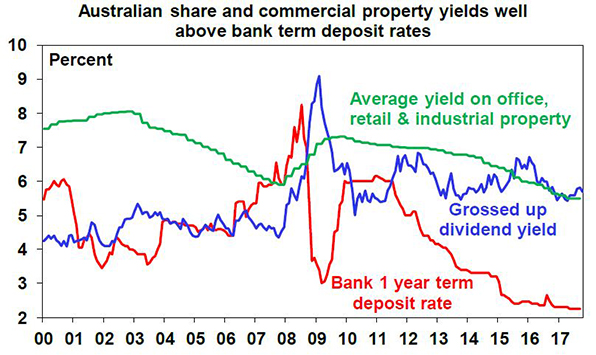
The next chart shows average yields on Australian shares and unlisted commercial property relative to the one-year term deposit rate since 2000. While yields have fallen, the gap between share and property yields and the bank deposit rate is extreme historically, with neither share or property yields plunging to the degree bank deposit rates have. In fact, the share yield is in its historic range. All things equal, this suggests commercial property and Australian shares continue to provide better value. The same would apply to unlisted infrastructure.
Source: JLL, Bloomberg, AMP Capital
Key message: comparing yields provides a guide to relative value and right now shares and unlisted commercial property remain very attractive relative to bank deposits.
Chart #3 - Shares can provide stronger growth in income with less volatility than bank deposits
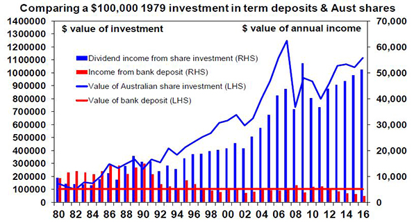
Investing in shares of course entails the risk of capital loss. But it can offer a higher and less volatile income flow over time. The next chart is a bit heavy but it compares initial $100,000 investments in Australian shares and one-year term deposits in December 1979 and the income they have provided over time (before franking credits are allowed for in the case of shares).
Source: RBA, Bloomberg, AMP Capital
The term deposit would still be worth $100,000 (red line) and last year would have paid roughly $2450 in interest (red bars). By contrast the $100,000 invested in shares would have grown to $1.12 million (blue line) by end 2016 and last year would have paid $51,323 in dividends before franking credits (blue bars). The point is that dividends tend to grow over time (because profits and hence an investment in shares tends to rise in value) and are relatively stable compared to income from bank deposits, which vary with interest rate settings. Over the period the worst decline in dividend income from shares was a 32% decline between 2009 and 2011, whereas the income from bank deposits plunged 68% between 1990 and 1994 and by 60% between 2011 and last year. Once franking credits are allowed for, the comparison would become even more favourable towards shares.
Key message: while shares come with the risk of capital loss, a well-diversified portfolio of Australian shares can provide stronger growth in income with less volatility in that income than bank term deposits. Investors focussed on income need to decide what is most important: stability in the value of their investment or a higher, more sustainable income flow. The key when investing in shares for income is to have a well-diversified portfolio. Or better still a well-diversified portfolio of shares paying high and sustainable dividend yields. Finding high dividend yields is easy but the key is to look for stocks that have a reliable track record of growing those dividends and that have dividends that are not threatened by things like excessive gearing.
Chart #4 - A bird in the hand is worth two in the bush
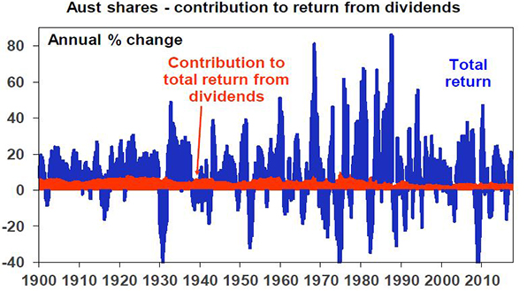
A high and sustainable starting point yield provides some security during volatile times. Since 1900, dividends (prior to allowing for franking credits) have provided just over half of the 11.8% average annual return from Australian shares and as can be seen in the next chart their contribution has been stable in contrast to the capital value of shares.
Source: Global Financial Data, Bloomberg, AMP Capital
Dividends are relatively smooth over time because most companies hate having to cut them as they know it annoys shareholders so they prefer to keep them sustainable.
Key message: a high and sustainable income yield for an investment provides some security during volatile times. It’s a bit like a down payment on future returns.
Chart #5 - Yield provides a guide to future returns
The yield an investment provides forms the building block for its total return, which is essentially determined by the following.
Total return = yield + capital growth
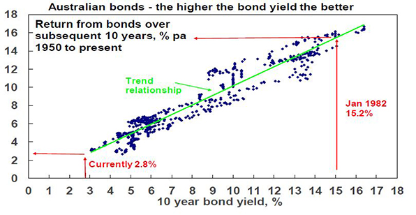
As a general principle, the higher the yield an investor invests at, the higher the return their investment will likely provide. This is self-evident in the case of bank deposits because the yield is the return (assuming the bank does not default on its deposits – which is very unlikely in Australia given Government protections). It can be seen in relation to bonds in the next chart, which shows a scatter plot of Australian ten-year bond yields since 1950 (along the horizontal axis) against subsequent ten-year bond returns based on the Composite All Maturities Bond Index (vertical axis). Over short term periods, bond prices can move up and down and so influence short-term returns, but over the medium term the main driver of the return a bond investor will get is what bond yields were when they invested. If the yield on a ten-year bond is 5%, then if you hold the bond to maturity your return will be 5%. Of course a portfolio of bonds will reflect a range of maturities and so the relationship is not perfect, but it can be seen in the next chart that the higher the starting point bond yield, the higher the subsequent return.
Source: Global Financial Data, Bloomberg, AMP Capital
Put simply when bond yields are high they drive high bond returns over the medium term and vice versa. For example, when Australian ten-year bond yields in January 1982 were 15.2% it’s not surprising that returns from bonds over the subsequent ten years were 15.4% per annum. Similarly, when bond yields were just 3.1% in January 1950, it’s no surprise that returns from bonds over the next ten years were 3.1%. At 2.8% now, we are off the bottom of the chart meaning record low bond returns for the next decade.
Similar albeit less perfect relationships exist for other asset classes – the higher the yield, the higher the subsequent return.
Of course there are some risks investors must watch out for. At the individual share level, a very high dividend yield may be a sign of a “value trap” – where current profits and dividends may be fine but there is an impending threat to the company and so the share price is low. Second, high distributions may also be unsustainable if they are being paid for out of debt and reflect excessive gearing or high risk investments (eg, sub-prime mortgages prior to the GFC). Just remember that there is no free lunch.
Key message: while returns have been solid lately, low investment yields do warn of lower returns ahead – most notably from government bonds.
For further insights from AMP Capital, please visit our website
2 topics

