A recession dashboard, Fed peaks and Asian commercial property
.png)
This edition of Charts of the Week considers our position at the likely peak of the rate cycle and looks through history to consider patterns for equities. We also examine how the “growth” investing style defeated most others in 2023. As Chair Powell aims for a soft landing, we created a recession dashboard examining 10 indicators, and visualised payment-card trends to get a sense of consumer confidence. In Asia, we charted a “clock” for the real-estate cycle and China’s population decline.
The intricate dance between rate moves and equities
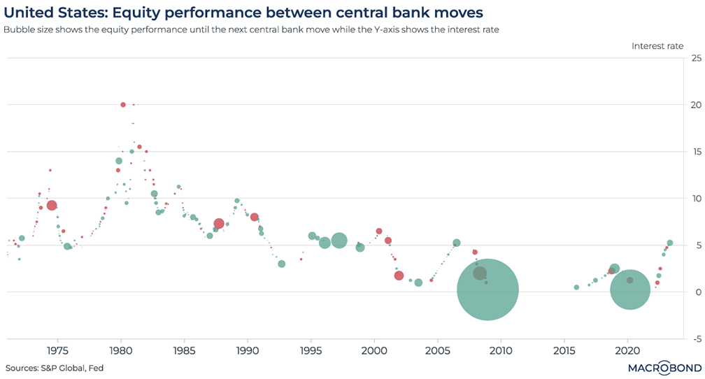
This chart can be applied to different countries using Macrobond’s change region functionality.
Lower interest rates are broadly perceived as good for stocks: stimulus for the economy and an implication that inflation is under control should be good for corporate earnings. But the relationship is intricate.
This chart expresses the relationship between Federal Reserve hikes and cuts since 1970 and the S&P 500 performance that preceded every move by the central bank – as expressed by the bubble size and colour.
The pre- and post-2000 environments look strikingly different. Not only were rates much higher, but there were fewer outsized market moves. The preponderance of green in the 1980s and 1990s reflects long bull markets, interrupted by the large red bubble of the 1987 crash.
Post-2000, what’s most visible is the gap – seven years that rates spent at zero between 2008 and 2015 – and two large green bubbles. Very sharp gains preceded the Fed’s moves to slash rates to nothing during the GFC and the pandemic, suggesting the market was pricing in the Fed’s hyper-stimulative response to crisis.
A recession dashboard to fact-check prospects for a soft landing
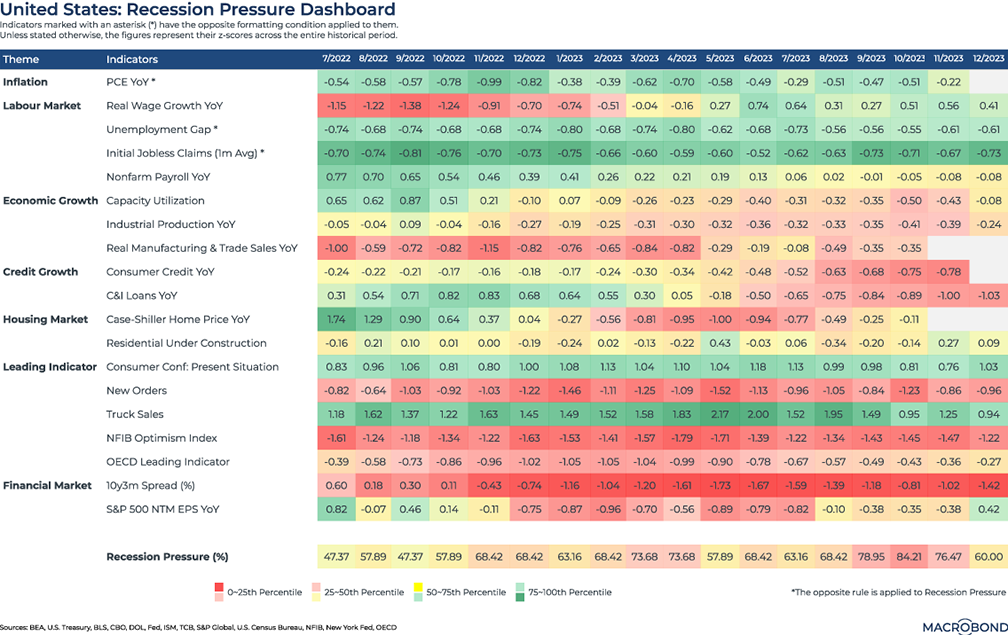
“It won’t be a recession; it will just feel like one,” the Wall Street Journal wrote this month. But downside risks shouldn’t be overlooked.
We created a dashboard that tracks 19 variables and then compiles our own “recession pressure” gauge. It assesses macroeconomic indicators from labour to house prices and adds important signals from the financial markets, such as the yield-curve slope and S&P 500 forward earnings-per-share growth. Finally, we “heat-mapped” all figures by tracking their Z-scores, or standard deviations, to create percentile ranges based on decades of historic data.
There was generally more red on our dashboard in 2023 than there was in 2022. But it’s notable that some leading economic and financial indicators seem to have bottomed out, bolstering the case that Jay Powell is pulling off a soft landing.
The NFIB small-business lobby’s optimism index and the OECD leading indicator are starting to recover, while new orders PMI held steady in 2023.
Equity investors’ dash for growth
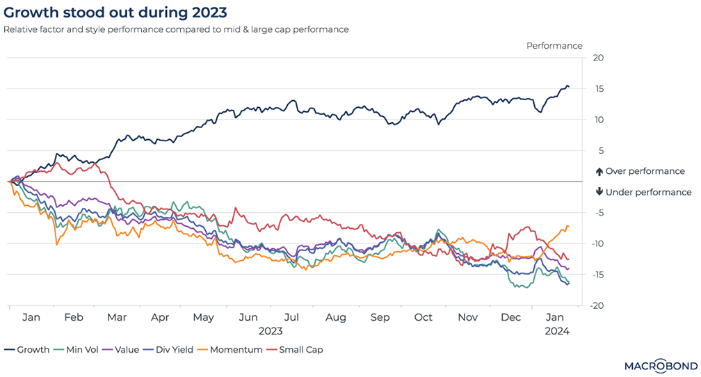
The stock market’s gains have been narrow – a theme we have revisited several times. The biggest gains have been concentrated in a small number of tech stocks.
This chart takes another look at this theme by breaking down 2023 market performance between investment styles, as defined by MSCI. The “growth stocks” strategy – defined as equities whose earnings are expected to grow more rapidly than the rest of the market – was the clear outperformer.
(Indeed, MSCI’s breakdown of the biggest components in its World Growth Index reveals some familiar names: Apple, Microsoft, Amazon and Nvidia.)
Momentum, dividend-yield, minimum-volatility and value strategies all underperformed our benchmark (the MSCI mid- and large-cap index).
A “clock” for Asia’s real-estate cycle
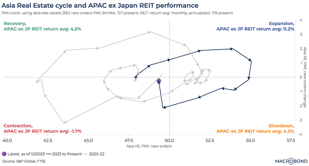
This chart was inspired by a suggestion from one of our readers in Singapore. If you have a theme that you think we should cover, we would like to hear from you at chartoftheweek@macrobond.com.
Commercial real estate’s headwinds are well known: the rise of remote work was followed by the highest interest rates in decades, constraining spreads between real estate yields (REIT dividend yields or commercial real estate cap rates) and bond yields. However, everything goes in cycles. CBRE recently said it expects CRE investment activity in Asia should recover by mid-2024, led by Singapore.
To explore this cycle, we created a “clock” tracking the new orders purchasing managers index (PMI) – the gauge of executives’ sentiment – for the real-estate industry in Asia. PMI of 50 equals neutral sentiment.
We tracked both the PMI reading for each moment in time and its rate of change, placing each month in a quadrant. “Slowdown,” for instance, reflects a positive (50-plus) sentiment reading that has come down from a month earlier. “Recovery” is negative (less than 50) sentiment that has improved from the previous month, and so on.
For each quadrant – recovery, expansion, slowdown and contraction – we then posted the average performance by S&P’s Asia-Pacific Ex-Japan REIT. Unsurprisingly, “expansion” was correlated with the best returns. The gray line follows the deep pessimism through the worst of 2020, followed by a weak expansion in 2021 and more pessimism in 2022. Switching to dark blue, the 2023 cycle was in more positive territory.
Equities shrug off Fed hiking cycles
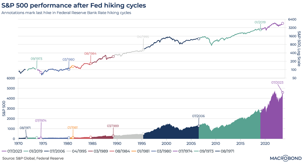
This chart looks at the S&P 500’s price return over the last 11 Federal Reserve tightening cycles. We’ve identified the days that the central bank made its final hike, allowing us to slice 50 years of market history into different regimes.
While the lower pane presents this performance in a “normal” index manner on the Y axis, the upper pane displays the S&P 500 on a logarithmic scale. That’s useful for a better sense of long-term performance, given how lower early absolute values in the bottom pane compress the visualisation.
Over the last 10 hiking cycles (excluding the current cycle, assuming Jay Powell’s July rate increase was indeed the last), the S&P 500 has posted an advance within 12 months of the final hike. (The GFC took more than a year to really kick in after the final hike of 2006.)
China's declining population
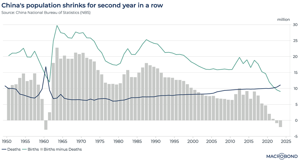
The Chinese National Bureau of Statistics recently released annual demographic figures, showing that the nation’s population shrunk for a second straight year. Before 2022, that hadn’t happened since the 1960s.
The global decline in birth rates is a potential headwind for many economies and social-security systems, and China is seeing a particularly dramatic change. In 2016, there were nearly 19 million births; in 2023, that number dropped to just 9 million.
Watching payment-card use to gauge US consumer confidence
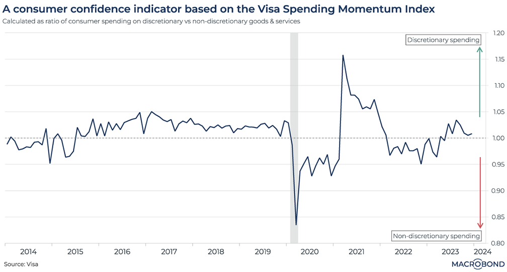
Visa, the payment-card giant, provides us with a Spending Momentum Index. This breaks down spending on necessities versus “discretionary spending,” i.e. non-essential expenses like restaurants, entertainment and subscriptions.
If the ratio of discretionary to non-discretionary spending is above 1, it indicates that Americans are relatively confident about their economic situation. When the ratio falls below 1, consumers are cutting back, using their cards for basic needs, i.e. “non-discretionary” goods and services.
The effect of Covid-19 in our chart is obvious: spending on perceived luxuries ground to a halt in 2020. Pent-up pandemic demand for discretionary items was released in a surge during 2021.
As we assess prospects for a soft landing, the ratio is shrinking towards 1 again, suggesting that consumers are tightening their belts.
4 topics
.png)
Macrobond delivers the world’s most extensive macroeconomic & financial data alongside the tools and technologies to quickly analyse, visualise and share insights – from a single integrated platform. Our application is a single source of truth for...
Expertise
.png)
Macrobond delivers the world’s most extensive macroeconomic & financial data alongside the tools and technologies to quickly analyse, visualise and share insights – from a single integrated platform. Our application is a single source of truth for...
.png)