Chart of the Week - Energy rotation
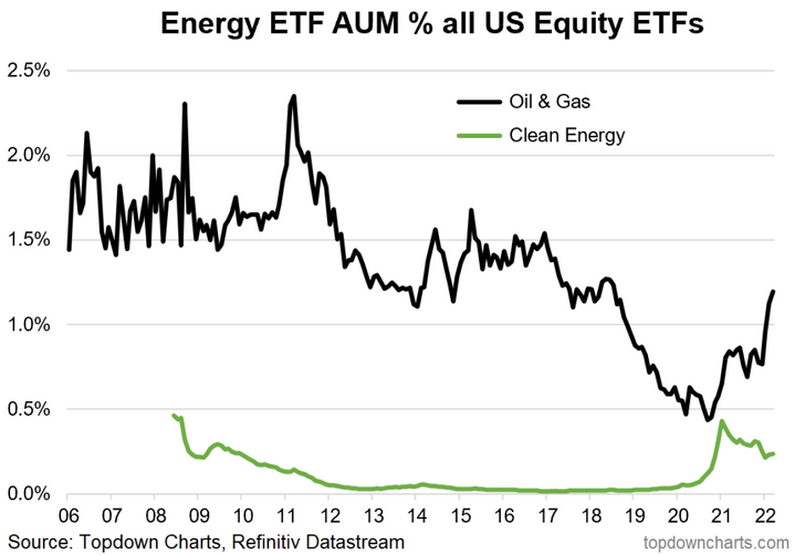
Investor allocations — Clean energy versus fossil fuels: This intriguing chart shows the ETF market share, aka “implied portfolio allocations” to Oil & Gas sector ETFs and the same for Clean Energy ETFs.
What is perhaps most interesting about this chart is how they almost crossed over at the exact peak in relative performance of clean energy stocks vs fossil fuel producers. Since then, there has been a major rotation out of clean energy and back into fossil fuel producers.
I strongly suspect that the next steps in the path of relative (and absolute) performance of clean energy vs fossil fuels will be signaled in this chart. And on that note it’s worth highlighting the notion that while fossil fuel producers are the clear short-term winner of higher energy prices, it’s most likely going to be clean/alt energy that wins longer-term out of this oil-shock as a result of substitution effects and greater commercial incentives to bring clean/alt energy solutions to market.
Aside from that, it seems likely that ESG/impact investing is here to stay given that it’s about shifts in preferences rather than return chasing as such (albeit questions will be raised about relative performance of fossils vs renewables). The key point is that will mean we likely see ongoing structural fund-flows tailwinds for clean energy.
Further, if you really extend the timeframe, at some point a hard limit will be reached for fossil fuels, and at that point some form of clean (or other alternative) energy will be needed to pickup the slack. Between now and then what is required is a massive undertaking of investment, and if anything the geopolitics of energy should sharpen the focus in this space. So this will indeed be an interesting chart to watch in the coming years and decades ahead.

Key point: We’ve seen a big rotation out of clean energy and into oil & gas ETFs.
Never miss an insight
If you're not an existing Livewire subscriber you can sign up to get free access to investment ideas and strategies from Australia's leading investors.
And you can follow my profile to stay up to date with other wires as they're published – don't forget to give them a “like”.
4 topics

