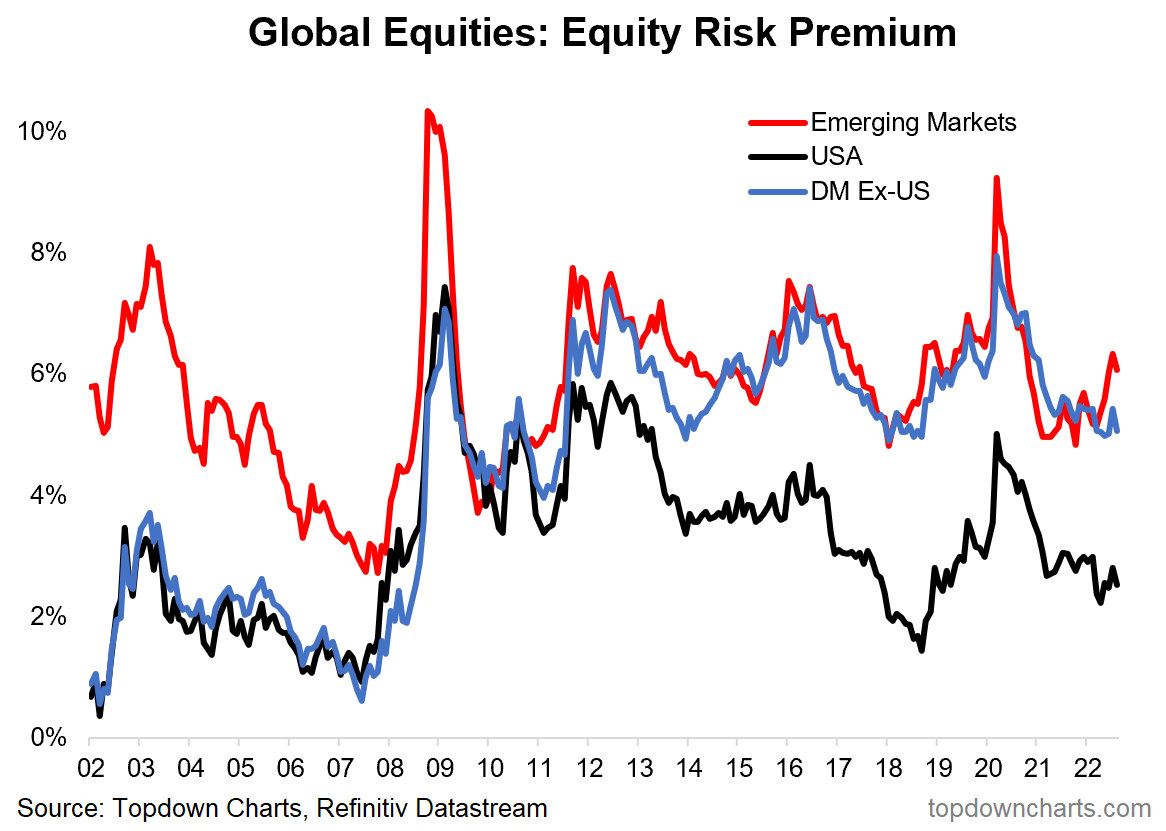
Chart of the Week - Global equity risk premium
ERP Valuation Indicator: This is an important chart for global equities. Despite some reduction in valuations (e.g. PE Ratios have fallen), the issue is that bond yields have gone up as well, so the equity risk premium has not really improved.
For instance, compare and contrast the current levels of the ERP [Equity Risk Premium] vs that seen during the peak of the pandemic panic or the 2008 financial crisis. Current levels are simply not compelling, certainly not compared to those episodes.
The ERP works well as a key input for asset allocation e.g. by giving buy signals when it spikes (n.b. higher = better) because it reflects outright valuations, but also valuations relative to the risk free alternative (i.e. bonds) — and indirectly also reflects sentiment and monetary conditions with regards to changes in bond yields.
Simply put, the higher the ERP, the better compensation you are getting for being in risky assets vs “safe“ assets. So clearly, a lower ERP means less compensation for risk, and hence a riskier setup, all else equal.
The key takeaway is that the current level of the ERP is not particularly attractive for US equities. Even the rest of the world, while boasting a higher ERP vs the USA, still hasn’t moved up to previous major buying opportunity levels at this point. Hence again, we see another indicator saying “not yet“ for global equities.

Key point: Global ERPs have not improved much since the onset of bear market.
NOTE: this post first appeared on our NEW Substack: (VIEW LINK)
Best regards,
Callum Thomas
Head of Research and Founder of Topdown Charts
4 topics

