Chart of the Week - Green Boom & Bust
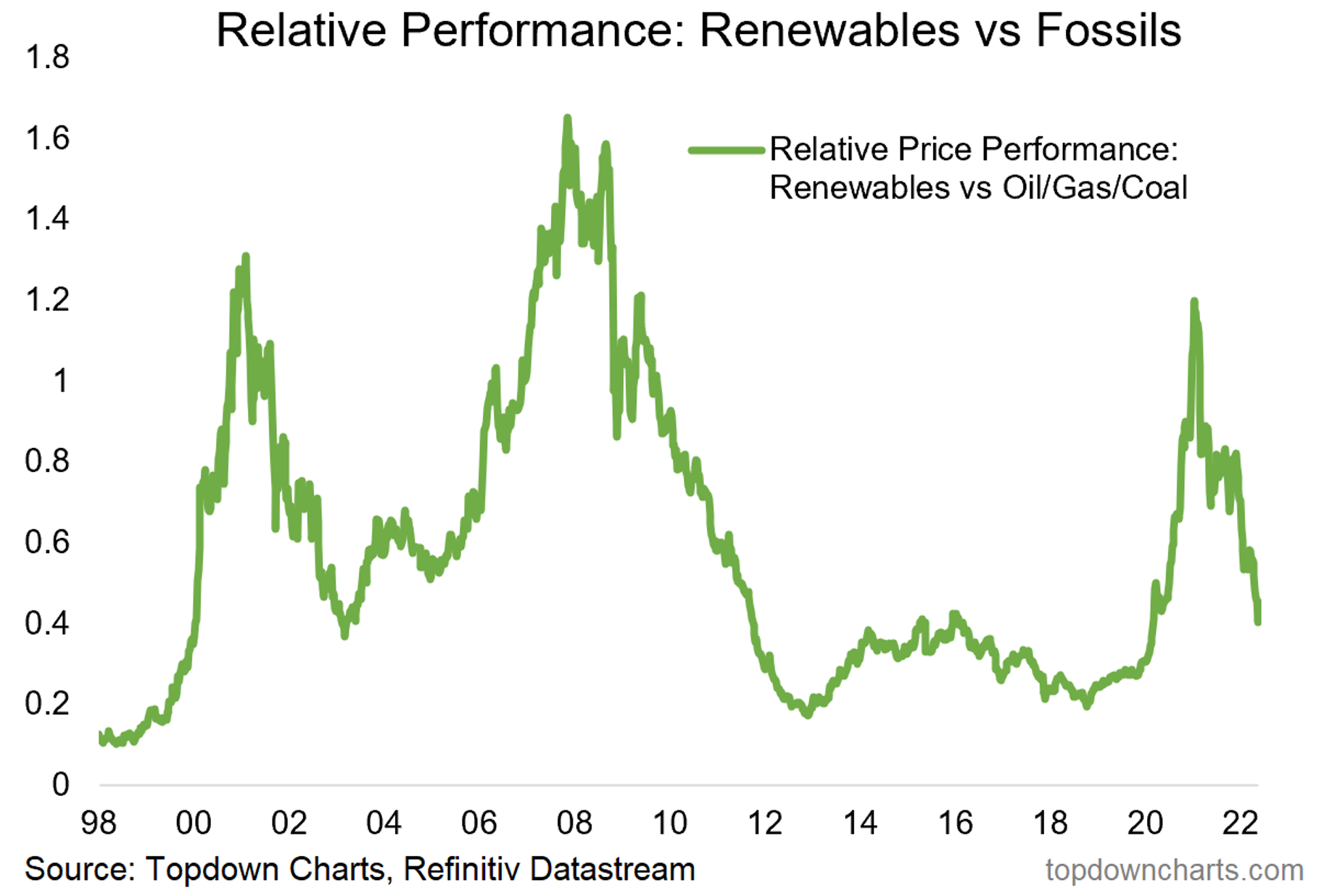
Renewables vs Fossils: The relative performance of clean energy vs fossil fuel stocks has featured some wild boom/bust cycles over the past two decades. The current stage of the cycle is well and truly in the bust stage following a major boom phase.
The magnitude of changes in relative performance is stark. The relative performance line gained +500% from the 2018 lows to the 2021 peak, and has since dropped almost -70% from that point (that compares to -72% from the 2001 peak and -90% from the 2008 peak). Big moves, and a lot of alpha if you were on the right side of those seismic shifts!
Going forward, there will likely be some upside for renewables spurred on by substitution effects should fossil fuel prices remain elevated. Both crude oil and natural gas appear to be in the process of establishing a higher base: if prices do find a new higher range, demand for alternatives likely increases with clean/alternative energy being a benefactor as commercial viability improves. There is likely also something to be said about energy security.
I think it’s also fair to say that it looks like green/climate/ESG investing is here to stay, and we should expect such investor preferences to skew flows and financing towards clean energy (despite a significant recent rotation back into fossil fuels).
But aside from that, the other key point to note is that the previous significant valuation premium that renewables traded on vs oil/gas/coal (+140% P/B ratio premium at the peak) has now dropped back to actually a very slight discount.
So I am watching this great unwinding with great interest for emerging opportunities in the coming months/years.

Key point: Global “Renewables vs Fossils” equities have gone from boom to bust.
NOTE: this post first appeared on our NEW Substack
Best regards,
Callum Thomas
Head of Research and Founder of Topdown Charts
Follow us on:
5 topics

