Charts of the Week - The Fed balance sheet grows, AT1s turn risky, and the outlook for real estate
.png)
This week’s charts address the repercussions of banking crises on both sides of the Atlantic: the Fed expanded its balance sheet on an emergency basis, while AT1 yields jumped higher after the Credit Suisse rescue wiped out CoCo bondholders. We also created a dashboard to measure national banking risks, and show how equity and bond-market volatility are unusually disconnected. We examine several emerging markets: South Africa’s power crisis, Vietnam’s wider currency-trading range, and Latin America’s economic stagnation. And finally, we examine real estate performance during tightening cycles and invite you to watch our webinar with experts on the sector.
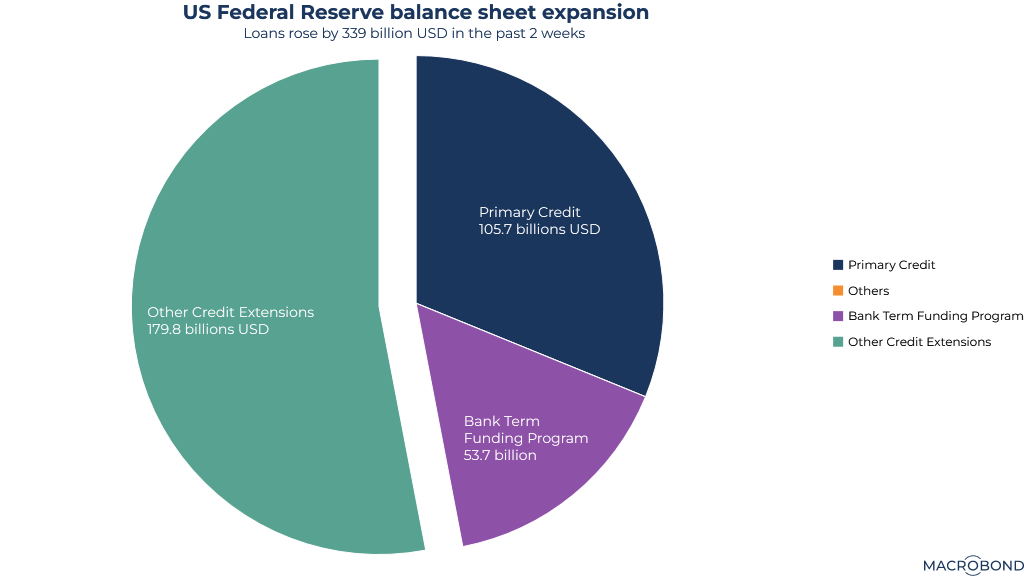
Slicing up the emergency balance sheet expansion at the Fed
The Silicon Valley Bank crisis prompted a sharp reversal of the Federal Reserve’s effort to shrink its balance sheet. The Fed had been letting securities mature for months, gradually reducing the stockpile of bonds accumulated during waves of quantitative easing.
In just two weeks, the balance sheet expanded by more than USD 399 billion. This pie chart breaks down that increase and its two main components: the bailout of depositors and last-resort lending.
About USD 181 billion was loaned to the Federal Deposit Insurance Corporation, classified under "Other Credit Extensions." Traditionally, the FDIC borrows from the Treasury; however, the Fed stepped in amid the current political standoff over the debt ceiling.
Primary Credit jumped by USD 105 billion due to lending through the "discount window," normally a last-resort funding source. This topped the weekly peak in 2008, reflecting the stress on banks’ funding as higher rates pressure their fixed-income assets.
The Bank Term Funding Program grabbed the headlines; this limited-time, emergency facility provides liquidity to banks. It’s been a relatively small slice of the pie so far, accounting for about USD 53 billion.
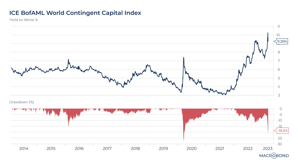
Credit Suisse CoCo wipeout sends AT1 yields soaring
The emergency takeover of Credit Suisse by its domestic rival UBS sent shockwaves through a particular securities market: Additional Tier 1 bonds, known as AT1 or CoCos (contingent convertible bonds).
AT1 securities were created in Europe after the 2008 financial crisis to bolster banks’ capital and shift risk away from taxpayers.
Controversially, Swiss regulators ordered that Credit Suisse’s AT1 holders be wiped out as part of the rescue, in contrast to equity holders (like the Saudi National Bank) that received small payouts from UBS as part of the deal.
Our chart shows the impact on the USD 250 billion CoCo market. Yields have soared, tripling from their lows, as these instruments are now perceived as much riskier. The second panel shows that the ICE BofAML benchmark has slumped about 20 percent from its pandemic peak.
Some of the Credit Suisse AT1 holders are considering legal action; meanwhile, EU regulators have attempted to calm the market, saying that equity holders should be first to absorb losses before AT1s are written down.
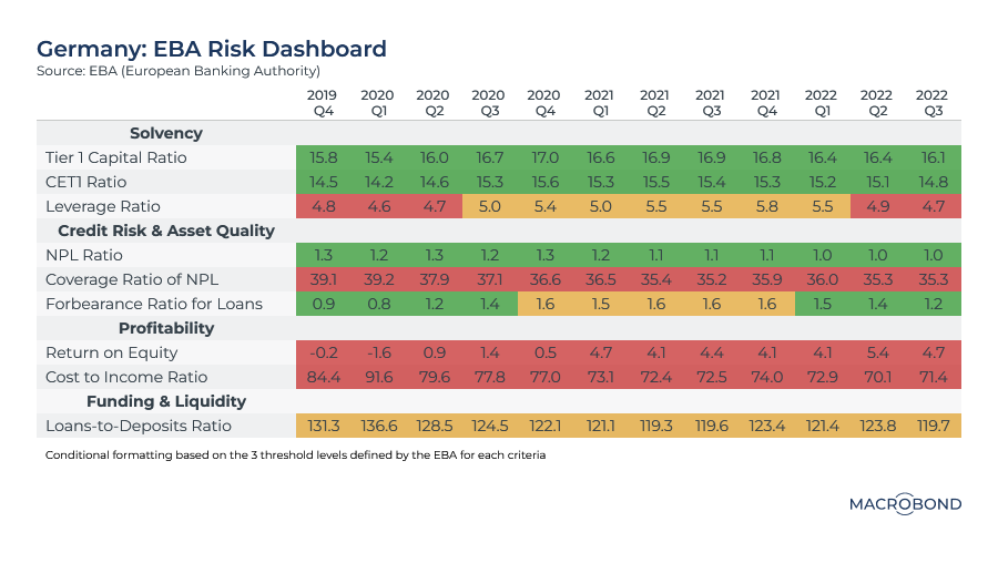
Visualising a risk dashboard for banking turmoil
With the banking industry unsettled on both sides of the Atlantic, we have created a visualisation of the European Banking Authority’s risk dashboard that can be toggled between different countries.
Each quarter, the EBA publishes a broad range of risk indicators for the banking system. These include capital strength metrics (like CET1 ratios), measures of non-performing loans, and profitability.
Our table includes data up to the third quarter of last year, so it will be some time before it reflects this quarter’s turmoil. It uses the EBA’s own green-yellow-red “traffic light” thresholds for good, intermediate and bad readings.
In the case of Germany, the picture was mixed two quarters ago. Profitability metrics and liquidity capabilities were poor, but banks had strong solvency ratios and asset quality.
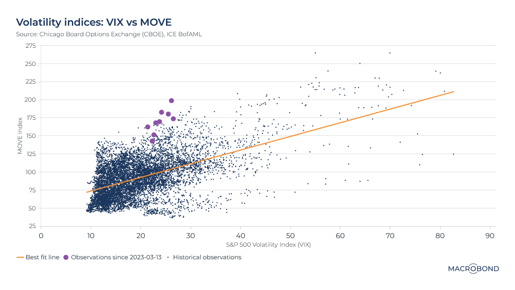
Comparing volatility in the equity and rates markets
This chart compares volatility in equity markets – the VIX index – with volatility in the bond market – the MOVE index. Unsurprisingly, the historic relationship between the two is positive: when volatility surges in one asset class, it tends to spread in the other.
In recent weeks, between the Credit Suisse AT1 wipeout and bets on a Fed “pivot” to dovish monetary policy, market turmoil has been focused on the fixed-income space. Our chart reflects this.
The purple dots reflect the most recent readings of the two volatility indices. MOVE is high; the VIX is not particularly elevated. The historic relationship between stock and bond volatility suggests that the VIX might “normally” be as much as double its current level.
The South African energy crisis keeps getting worse
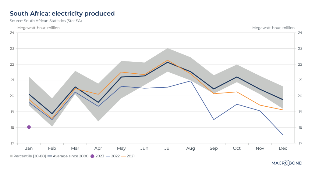
South Africa gets 90 percent of its electricity from Eskom, a state-owned utility that has produced steadily less power as it lurches between corruption scandals. As the nation’s population grows, the utility and its old, poorly maintained plants can’t keep up with demand.
The situation is so critical that Eskom resorts to intentional outages, known as “load-shedding,” to prevent a collapse of the national grid.
This visualisation shows how the situation has worsened in recent years. We chart the historic average yearly trajectory of power generation since 2000 against the shrinking production seen in 2021 and 2022. As 2023 rolls on, the January figure was far worse than it was for the two previous years – 2 million MWh below the historic average.
Eskom’s troubles are weighing on economic growth; the nation’s central bank estimates that the energy crisis will cut 2 percentage points from GDP growth this year. Power cuts hurt daily life in a myriad of ways; water shortages result as pumping stations are cut off from energy, while businesses are forced to close.
A decade of doldrums in Latin America
The 1980s are typically dubbed Latin America’s “lost decade.” Many nations were unable to service their foreign debt, while the prices of the exported commodities that were key to many of the continent’s economies were depressed in a hangover from the 1970s boom.
Interestingly, the past 10 years show an even worse growth trend for the region – whose economic expansion was slower than almost any other part of the world.
Weak investment and productivity are factors, as was the pandemic; a region with less than 10 percent of the world’s population suffered more than a quarter of all recorded Covid-19 deaths. And commodity prices have only recently recovered their mid-2000s liveliness.
The International Monetary Fund’s forecasts for the rest of the decade suggest an only somewhat improved trend.

How the Vietnamese currency band widened over the years
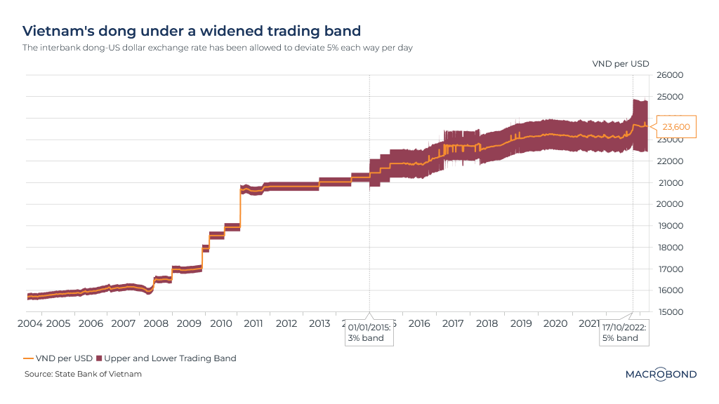
Vietnam manages its currency, the dong, by allowing it to trade in a range against the US dollar. As our chart shows, that range has widened over the past two decades as policy makers tolerate greater volatility.
The dong was under pressure in 2022 as the dollar strengthened, driven by the aggressive Federal Reserve tightening that depressed most emerging-market currencies.
In October, Vietnam widened its trading band to lessen the pressure on its foreign-exchange reserves.
The dong-dollar exchange rate is now allowed to rise or fall as much as 5 percent per day, compared with 3 percent previously. The currency’s increased flexibility is important; the central bank unexpectedly cut the rate at which it lends to banks earlier this month, underscoring the need to support the economy.
Real estate and tightening cycles
Higher interest rates are already starting to deflate some of the world’s frothier real-estate markets. Residential mortgage borrowers are seeing payments increase and affordability decrease; developers are finding it harder to secure financing.
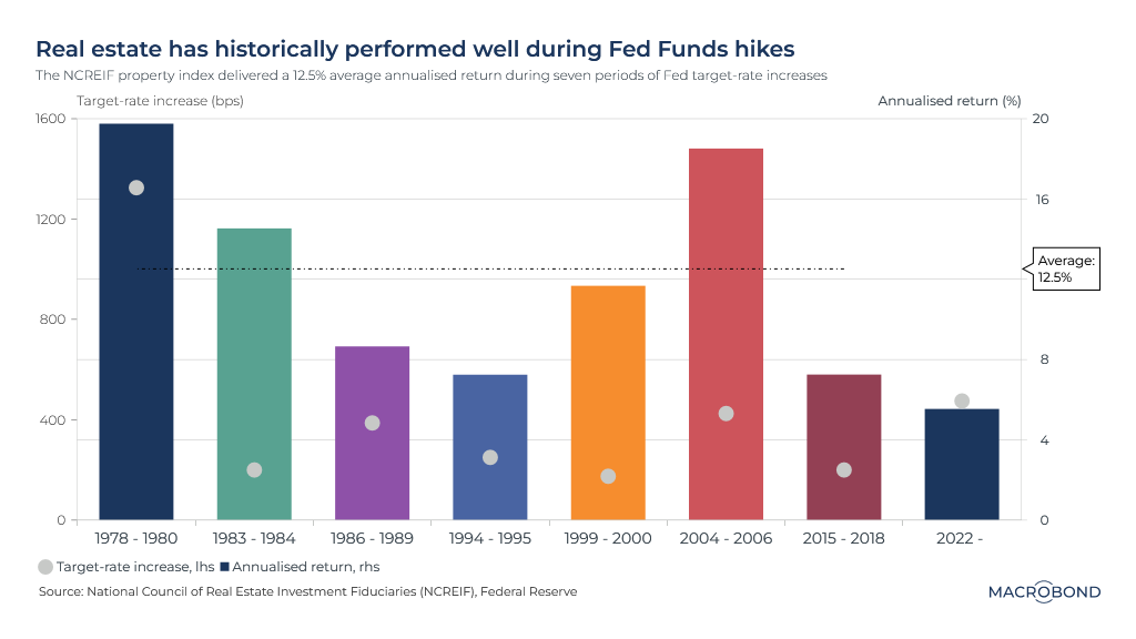
But history suggests that a Fed tightening cycle can be a good time to own US real estate. The Fed is usually tightening to control inflation, and real estate is a classic inflation hedge.
This was certainly the case in the late 1970s, as shown by our chart tracking the extent of rate hikes (the dots) and returns for all categories of real estate (the bars) during recent tightening cycles. As the key Fed rate was hiked more than 1200 basis points, property returned 20 percent a year.
In the much less inflationary 2004-06 rate-hike cycle, property again returned almost 20 percent.
4 topics
.png)
Macrobond delivers the world’s most extensive macroeconomic & financial data alongside the tools and technologies to quickly analyse, visualise and share insights – from a single integrated platform. Our application is a single source of truth for...
Expertise
.png)
Macrobond delivers the world’s most extensive macroeconomic & financial data alongside the tools and technologies to quickly analyse, visualise and share insights – from a single integrated platform. Our application is a single source of truth for...
.png)