Early hikers, NFP revisions and aggressive asset allocation
.png)
This week’s charts begin with a visualisation of “early hikers” – central banks, mostly in emerging markets, that moved most quickly when the current episode of inflation began. We revisit this month’s non-farm payrolls number, which was released alongside revisions of past NFP figures that suggest the US labour market is weakening. We created two charts that might be relevant to your investment portfolio: one shows the probability of making money in the S&P 500 over time, while the other models an aggressive asset-allocation strategy. We conclude with two visualisations on China, tracking a decline in foreign direct investment but a rebound in raw materials prices paid by manufacturers – and PPI.
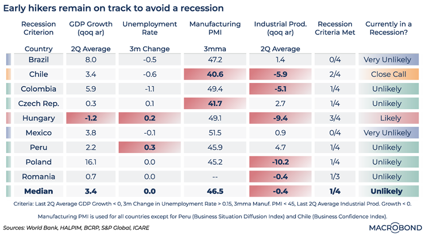
The world’s “early hiker” central banks mostly dodged a recession
.png)
When inflation alarm bells started sounding in 2021, some countries – mostly emerging markets – acted more quickly than others. Some hiked rates a year earlier than their developed-market peers did.
This heatmap examines nine of these countries, gauging how they have fared since becoming “early hikers” and whether they have avoided recession.
We chose several criteria: 1) whether the average quarter-on-quarter annualised GDP growth for the past two quarters is below zero; 2) whether unemployment grew by more than 0.15 percentage point over three months; 3) whether the three-month moving average of manufacturing PMI is below 45; and 4) whether average quarter-on-quarter annualised industrial-production growth is below zero for the past two quarters. Wherever these criteria are met, the values have a red background shading.
Most of these economies appear to have been robust enough to absorb the tightening by inflation-hawk central bankers. Only Hungary faces a likely recession.
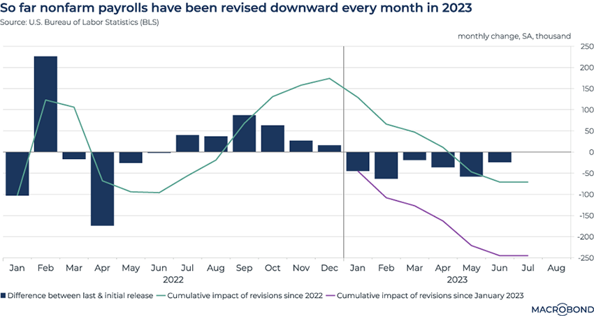
Repeated nonfarm payroll revisions show a weakening trend
.png)
This chart requires a Data+ subscription.
US employment numbers for July showed nonfarm payrolls grew by 187,000. That was slightly less than market expectations, but still in line with a soft-landing scenario. (Two of our users generated forecasts in line with this data release: read about how they did it here and here.)
However, equally newsworthy were the revisions to the May and June NFP figures: they were both reduced. Indeed, NFP is revised at least twice by the Bureau of Labor Statistics, so expect the July number to change as well (and for June to be revised again).
In this chart, we track two years of revisions, calculating the difference between the initial numbers released and the latest estimate. So far, every payroll number published in 2023 has been revised downwards. The cumulative revisions since the beginning of the year represent a loss of 245,000 jobs.
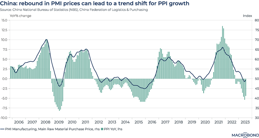
Signs of a producer price inflation rebound in China
.png)
This chart tracks raw materials purchase prices for the manufacturers’ Purchasing Managers Index (PMI) for China. It also shows the historic correlation with producer price inflation (PPI)– which measures the average change in the price of goods and services sold by producers and manufacturers in the wholesale market. (PPI is often a leading indicator for consumer price inflation.)
As PMI prices leave negative territory and climb toward the neutral line of 50, PPI’s year-on-year deceleration is also easing. Given China’s role in the global economy, inflation hawks will be watching.
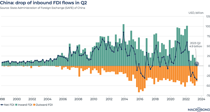
Foreign direct investment in China declines
.png)
China also published its second-quarter balance-of-payments figures this month.
Direct investment liabilities, a proxy for inward foreign direct investment, fell to USD 4.9 billion, a historic low.
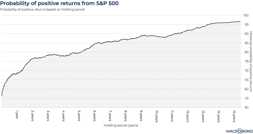
The S&P 500’s probability curve for positive returns
.png)
Tip: this chart allows for change region functionality. Watch our change region video and learn more.
This chart crunches historical data to examine the chances of making money from the S&P 500, depending on how many years you’ve been invested.
There’s a steep curve at the beginning. If you’ve been invested for a week, your chance of a positive return is 56 percent. If you’ve been invested for a year, it’s 68 percent. And over two years, your probability of making money rises to 78 percent.
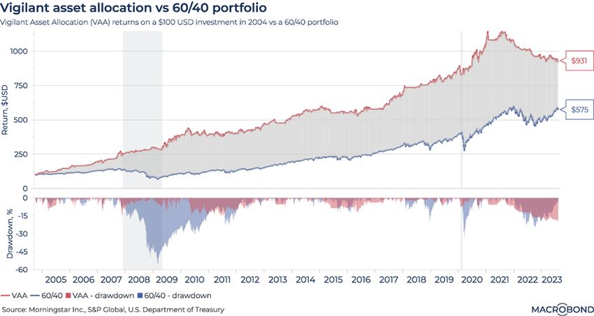
Allocating assets with vigilance (and momentum)
.png)
This chart requires the Morningstar add-on.
Vigilant Asset Allocation (VAA) is an aggressive strategy designed to take advantage of changing trends. It’s a “momentum” play: you invest in asset classes that have recently performed well, based on the long-observed tendency for such assets to keep rising. (Academics attribute this phenomenon to human behavioural biases, such as herding.)
For the purposes of this chart, we created a VAA strategy that calculates a momentum score for seven different “offensive” and “defensive” ETFs.* It then allocates the entire portfolio to the winner every month.
We then compared VAA to returns for a traditional 60-percent-stocks, 40-percent-bonds allocation. Since 2005, VAA has generally outperformed overall, as the top pane shows. The second pane tracks drawdowns, i.e. the decline from the last record high. VAA generally also posted smaller drawdowns, especially during the global financial crisis, suggesting that higher returns came with lower risk.
Interestingly, this is not the case since 2021; VAA has underperformed.
*Offensive ETFs: US large-cap equities (SPY), international equities (EFA), emerging market equities (EEM), and US government & corporate bonds (AGG); Defensive ETFS: Investment-grade US corporate bonds (LQD), medium-term US government bonds (IEF), and short-term US government bonds (SHY).
5 topics
.png)
Macrobond delivers the world’s most extensive macroeconomic & financial data alongside the tools and technologies to quickly analyse, visualise and share insights – from a single integrated platform. Our application is a single source of truth for...
Expertise
.png)
Macrobond delivers the world’s most extensive macroeconomic & financial data alongside the tools and technologies to quickly analyse, visualise and share insights – from a single integrated platform. Our application is a single source of truth for...
.png)