Five charts that tell the bull market story
The US stock market is on its longest bull-run in history. It began on 9 March 2009 and, so far, has lasted nine years, five months and 13 days. As of today, it beats the great equities performance of the 1990s.
A bull market is broadly defined as one that rises over time without falling more than 20% from its peak during the period. Plenty of traders working in the markets today will only ever have known rising share prices.
Since March 2009, the S&P 500, the primary US stock market index, has risen by 323%, a gain few could have envisaged after the index plunged 57% from its peak in October 2007 during the global financial crisis.
On a total return basis, which includes dividends paid by companies, the index has returned 415%.
Gains have been made in spite of a difficult economic and political backdrop over the past decade. More recently, the prospect of trade wars, a surging US dollar, rising interest rates and the withdrawal of stimulus by central banks has failed so far to derail the bull.
From its closing low of 676.53 on 9 March 2009 the S&P 500 has risen to 2,862.96 points. It works out to an average rise of 16% a year.
But while the current bull market is the longest in history, bigger gains were made during the 1990s. From a closing low of 295.46 on 11 October 1990, the S&P 500 rose 417% to peak at 1,527.46 on 24 March 2000, or 546% on a total return basis.
The longest S&P 500 bull markets: 1990s vs the 2010s
Stock market level
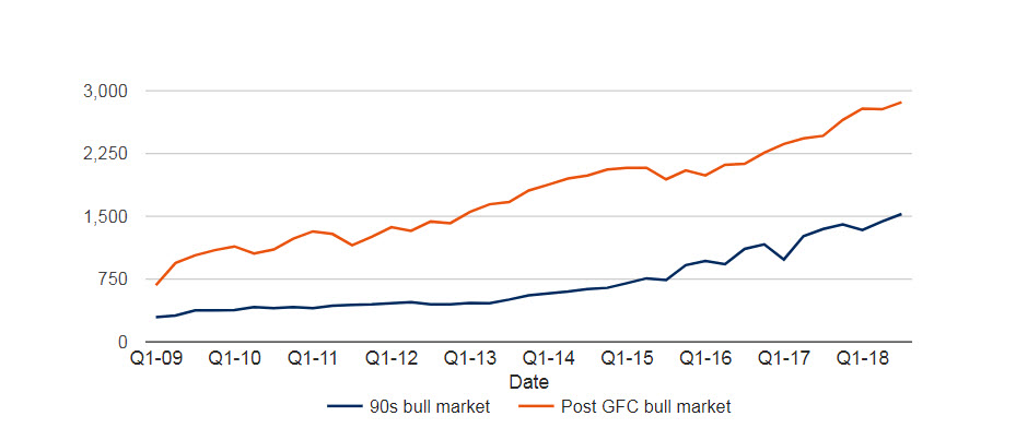
For information purposes only. Please remember that past performance is not a guide to future performance and may not be repeated. Source: Schroders and Thomson Reuters Datastream. Data for S&P 500 correct as at 20 August 2018.
What defines a bull market?
A bull market is broadly defined as one that rises over time without falling more than 20% from its peak during the period.
The current bull market for the S&P 500 peaked on 26 Jan 2018 at 2,872.87, although it registered a higher intra-day level yesterday at 2,873.23. The furthest the index has fallen since then is 10% to 2,581 on 8 February 2018. The bull market has lasted for 3,453 days.
There are caveats to add. The 20% fall in 1990 was actually a 19.92% but rounding up has led to a consensus that a new bull market began then.
You should also note that the definitions are based on closing prices. An intra-day fall in 2011, which took the market down more than 20% from its high, would have broken the current bull market, making it only seven years long.
The five biggest bull markets over the last 50 years
Putting the caveats aside, it is possible to identify the major bull markets of the past five decades.
Since 1970, the S&P 500 has seen seven bull markets, five of which resulted in a market rise of more than 100%.
1. The 1970s economic recovery
Despite perceptions of economic turmoil in the 1970s, assets rose rapidly in certain periods. A rally started in 1974. It came after a recession that followed the post-Second World War expansion and lasted just over six years during which time the S&P 500 rose by 122%. The decade also saw high inflation, which would have eroded asset price gains.
2. The Reagan-era presidency bull market
This was the joint shortest of the five bull-runs where the S&P500 rose in excess of 100%. However, on an annual basis it was the best performing bull market, with the S&P rising 26% annually. It was powered by huge tax cuts, massive job creation and record wealth creation and lasted between August 1982 and August 1987.
3. The great expansion of the 1990s
This bull market coincided with good economic times; robust job growth in the US and a tax relief act made certain stocks attractive. Technology companies boomed as the internet took off and culminated in a powerful bull market that went to extremes before collapsing in early 2000. This bull-run began on 11 October 1990 and lasted just under nine-and-a-half years. The total index rise was 417%.
4. Pre-global financial crisis bull market
Beginning in the aftermath of the dotcom bubble and September 11 attacks, this bull market lasted between October 2002 and October 2007. It was fuelled by low interest rates and easy access to credit which was largely invested in the housing market. It ended when property prices began to collapse due to the subprime mortgage crisis.
5. Post-global financial crisis bull market
The current bull market is the longest on record. It began in March 2009 and has been fuelled by record-low interest rates and the easy monetary policies adopted by central banks which has made it cheap to borrow money. It has been extended by President Trump’s tax cuts, which reduced taxes paid by US corporations.
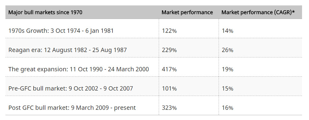
*CAGR: Compound annual growth rate. The compound annual growth rate (CAGR) is the mean annual growth rate of an investment over a specified period of time longer than one year.
For information purposes only. Please remember that past performance is not a guide to future performance and may not be repeated.
Source: Schroders and Thomson Reuters Datastream. Data for S&P 500 correct as at 20 August 2018.
It’s not just US stocks that have risen
While US shares have enjoyed the biggest gains over the last nine-and-a-half years, the rally in stocks has been global. German stocks have returned nearly 250% over the same period and UK stocks have made just over 200%, according to MSCI indices. Chinese and Japanese stock markets have registered returns of nearly 200%.
Quantitative easing (QE), which is effectively central banks pumping money directly into the financial system by way of asset purchases (mainly bonds), has driven down the cost of financing. It has kept lenders lending and corporations spending. It has inflated the prices of many assets, from stock markets to houses to classic cars.
Stock market returns since 9 March 2009
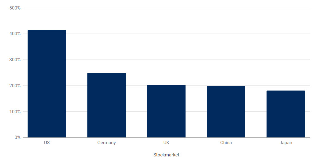
For information purposes only. Please remember that past performance is not a guide to future performance and may not be repeated. Source: Schroders and Thomson Reuters Datastream. Data for S&P 500 correct as at 21 August 2018.
Which sectors have gained the most?
Just as with the bull market of the 1990s technology stocks have led the gains. Facebook, Amazon, Netflix and Google, known as the FANGs, have been popular with investors. As the chart below illustrates, $1,000 invested in the technology sector in March 2009 would now be worth $6,326, not adjusted for inflation.
The worst performing sector was the basic resources, which includes the likes of oil producers and miners. The sector was deserted by the majority of investors during the height of the recession as demand for raw materials slumped along with global growth. An investment of $1,000 in March 2009 would now be worth $1,907.
What $1,000 would be worth now if you invested in March 2009
Best performing sectors globally: March 2009 – August 2018
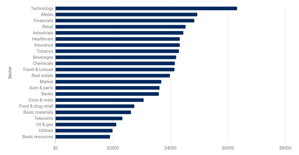
For information purposes only. Please remember that past performance is not a guide to future performance and may not be repeated. Source: Schroders and Thomson Reuters Datastream. Data for MSCI indices in local currency on a total return basis, which includes dividends, and not adjusted for inflation. Data correct as at 20 August 2018.
What’s happened to valuations?
If share prices rise more rapidly than the profits of those companies then valuations inevitably change.
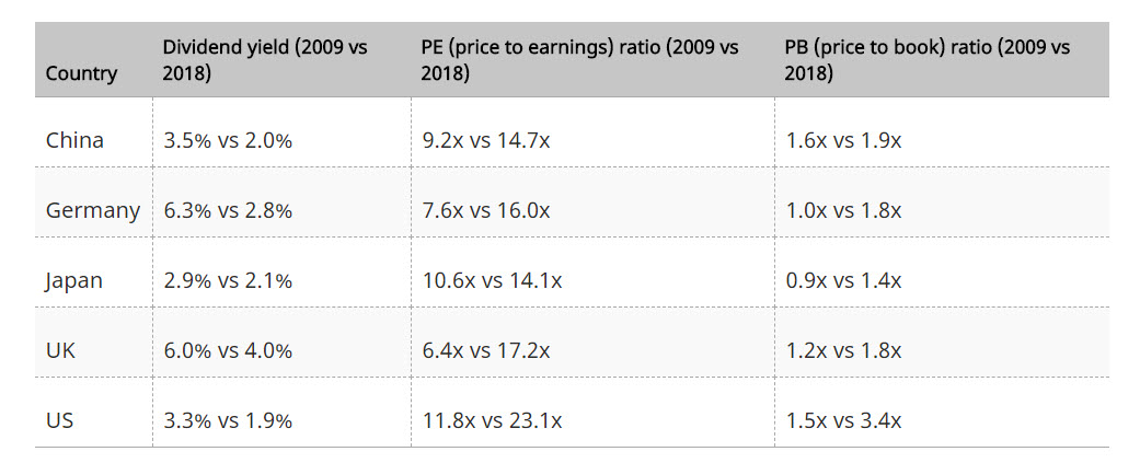
The table below offers a snapshot of this. Higher dividend income can suggest better value, with shares producing more income. The other measures, the price-to-earnings (PE) ratio and the price-to-book (PB) ratio, compare share prices with profits or with the “book value” – the estimated residual valuation of a company’s assets and parts. With both, a lower ratio suggests better value.
In 2009, investors in the US stock market received a decent income yield of 3.3%. Today, they could expect just 1.9%.
Conversely, the P/E ratio has gone from around 12 up to 23, while the P/B ratio has more than doubled. A swing to higher valuations is expected as the market rises. For investors, the crucial task is working out whether those valuations remain attractive today.
Source: Schroders and Thomson Reuters Datastream. Data for MSCI indices correct as at 20 August 2018.
Further insights
You can access more analysis from the team at Schroders here
3 topics

