Funds flow into China, central banking and the US energy mix
.png)
This edition of Charts of the Week takes a global look at central banking, examining how key policy rates intertwine with inflation levels in different countries. There is good and bad news in China: funds are flowing into the equity market, but the end of the property slump is nowhere in sight. We also examine US energy production, international corruption perceptions, and S&P 500 performance after past rate cuts.
Hawkish and dovish central banks – and the one-size-fits-all ECB dilemma
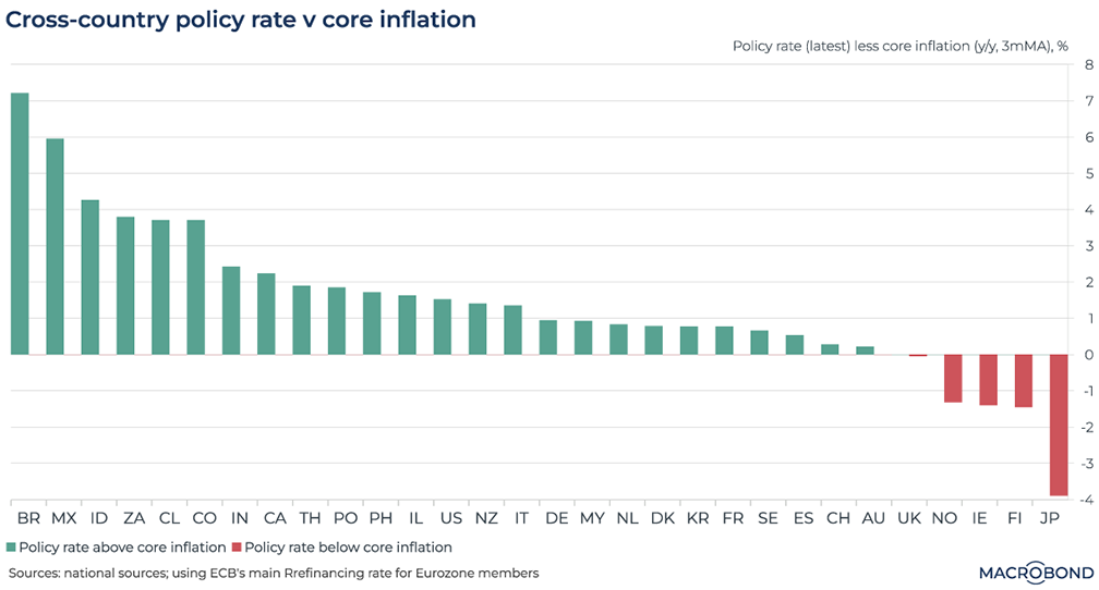
Rate cuts are priced in around the world this year. However, there has been some recent pushback on those expectations: Jerome Powell suggested Fed watchers shouldn’t expect a cut in March.
This chart assesses the relative hawkishness of various central banks by taking their key interest rate and subtracting core inflation to get a sense of their “real” policy stance. In the case of the UK and Australia, inflation and the policy rate match: a true neutral stance.
The presence of Latin American countries on the left-hand side is notable. Last year, we named Brazil and Mexico as “early hikers:” their central banks have had more history of steeply raising rates to fight inflation in recent decades than their developed-market peers.
However, green bars don’t just reflect tough policy: they can be a consequence of speedily cooling inflation, as seems to be the case for Canada and India.
Unsurprisingly, Japan is at the right-hand side of the chart: still running a negative interest-rate policy even as price increases pick up, as the central bank awaits a “virtuous” wage-price spiral.
Ireland and Finland are also notable due to their elevated inflation, showing the challenges of the European Central Bank’s one-size-fits-all monetary policy for 20 countries.
Emerging market fund flows rediscover China
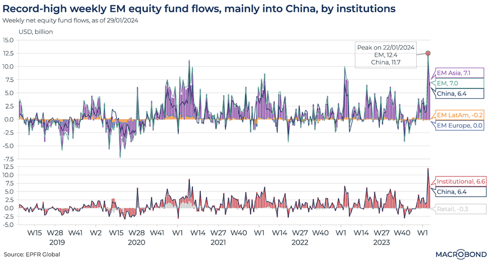
This chart requires a subscription to the EPFR Fund Flow add-on database.
Stock markets in mainland China and Hong Kong have been slumping to multi-year lows.
However, equity fund flows into China have spiked higher lately, with asset managers perhaps lured by cheap valuations.
Data from EPFR is showing that weekly fund flows into emerging-market equities have picked up. As the spike in our chart shows, they reached a multi-year high of USD 12.5 billion in the week through Jan. 24. The inflows fell off somewhat last week, but are still high when compared to the last two years.
As the top pane of our chart shows, this can be broken down to show how that entire gain is headed to Asian equities – especially China.
The second panel shows how institutional investors account for all of that influx: retail investors are, in fact, pulling their money.
China’s property woes continue
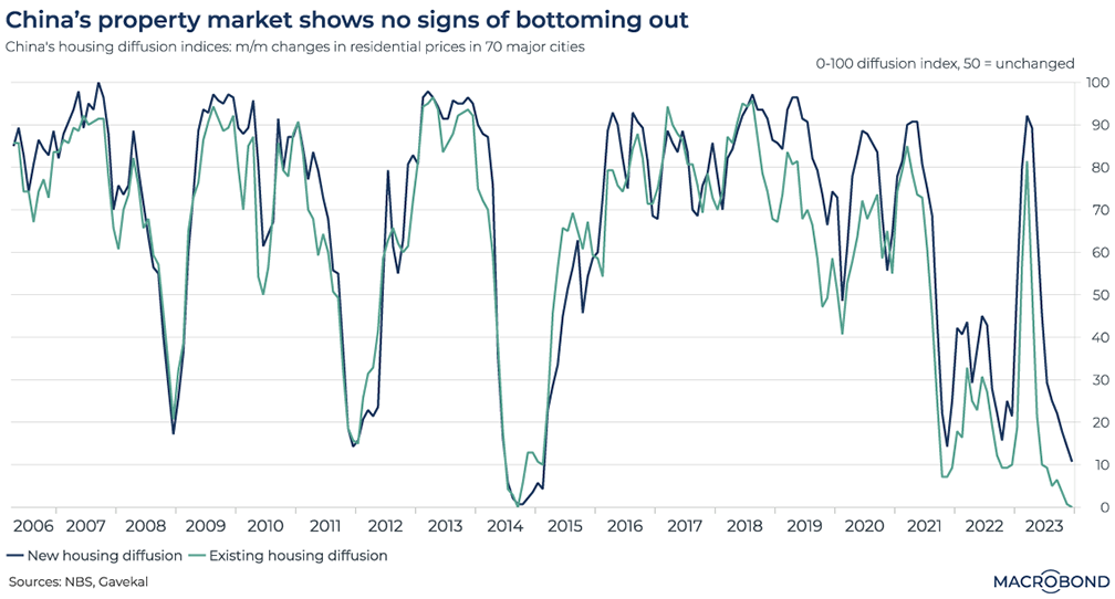
The difficulties in China’s property market continue. The most recent development is the liquidation order from a Hong Kong court received by former mega-developer Evergrande. China is unveiling support measures as a result.
This chart visualizes Chinese housing diffusion indices we created for new and existing homes, incorporating month-on-month changes in primary and secondary residential prices for 70 major cities. A reading of 50 indicates prices were unchanged.
The index for existing homes just touched zero for the first time since 2014; the new housing measure is not far behind.
When the rate drops, stocks can have a delayed reaction
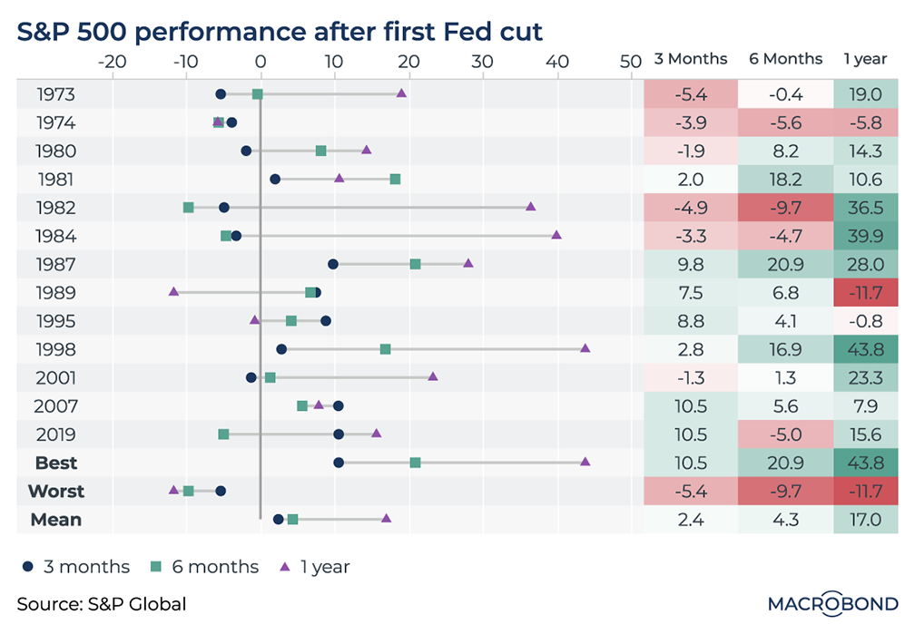
This chart can be applied to different countries using Macrobond’s change region functionality.
As Mr. Powell indicates he won’t hurry towards a policy pivot, this “mixing board” chart analyzes history for a sense of what might await US stock investors when they finally get a rate cut.
It measures the response by the S&P 500 three, six and 12 months after the first rate cut in various cycles. Interestingly, the initial response is often not that positive; this was especially the case in the high-inflation 1970s and early 1980s.
After six months, most cycles saw improved performance. And after a year, the gains were usually quite strong: only the post-1989 and post-1974 cycles saw truly weak markets.
Nations fight corruption perceptions while others backslide
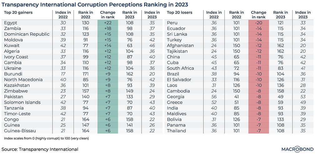
Transparency International recently released its Corruption Perceptions Index for 2023. It examines perceived levels of public-sector malfeasance for more than 180 countries, scoring them on a scale of 0 (highly corrupt) to 100 (very clean).
Our dashboard identifies two lists of 20 countries: those that made the greatest progress fighting corruption, and those perceived to be backsliding the most.
By absolute corruption score, Egypt and Zambia remain in the bottom half of the world’s nations. But the two countries made the most relative progress, advancing by 22 and 18 places respectively. (Egypt has made up ground that it lost last year. Zambia, meanwhile, saw the arrest of a former president’s son on corruption charges in 2023, as well as an incident that prompted the resignation of its foreign minister.)
In Europe, Moldova and North Macedonia made notable progress in relative and absolute terms.
Two neighboring South American countries topped the table of relative backsliders. As we wrote last month, business confidence in Peru has rarely been more pessimistic, with corruption scandals shaking different governments for years. Ecuador, meanwhile, is embroiled in a battle with narco-terrorism.
The US pivot to gas (and, slowly, renewables)
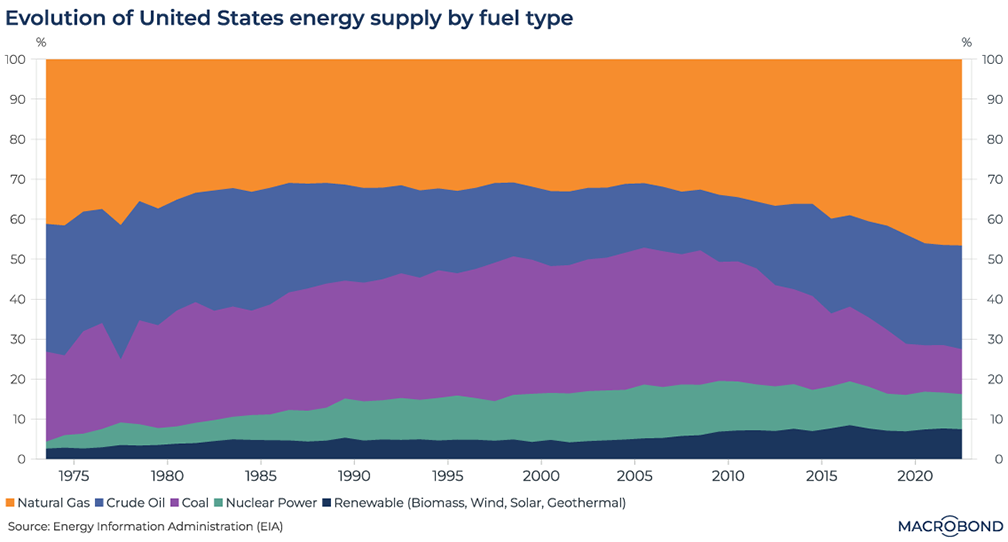
This chart uses data from the Energy Information Administration to break down all of the energy produced in America, whether it’s consumed domestically or exported.
Our visualisation shows how the shale revolution transformed the US energy mix. From 2005, natural-gas production rose for 10 straight years, making the US the world’s biggest producer. (And in the wake of the Russia-Ukraine war, US gas producers now have a lucrative European market for liquefied exports.)
Shale drilling also made the US the world’s largest oil producer. Since the “peak oil” worries in the mid-2000s, crude has regained the share of US energy production that it had in the early 1980s.
The other key trend is climate-friendly: the decline of coal. In 2008, it represented 33% of American energy production. By last year, that figure had shrunk to 11%. Net Zero campaigners might also appreciate the steadily rising share of renewables, which is approaching 10%.
Despite the renewed, climate-driven wave of enthusiasm for nuclear power, its proportion of the national energy mix has shrunk somewhat since the 2000s.
.png)
Macrobond delivers the world’s most extensive macroeconomic & financial data alongside the tools and technologies to quickly analyse, visualise and share insights – from a single integrated platform. Our application is a single source of truth for...
Expertise
.png)
Macrobond delivers the world’s most extensive macroeconomic & financial data alongside the tools and technologies to quickly analyse, visualise and share insights – from a single integrated platform. Our application is a single source of truth for...
.png)