German trade, inflation measures, SWIFT and the yuan
.png)
This week’s charts begin with a dashboard that helps us dissect Germany’s stagnant exports. For the US, we look at the “instantaneous” measure of price increases and consider Fed rate levels when inflation was this high in decades past. In the fixed-income markets, we show how unlikely bonds are to outperform equities over the long run, and consider how forecasters used to be wrong-footed by lower bond yields; that trend has gone into reverse. And when it comes to currencies, the dollar is back on a winning streak. Finally, we turn to China, where the yuan is weakening against the dollar amid rate differentials, and conclude with the mysterious shrinkage of the euro’s role in the SWIFT international payments system.
A deep dive into German trade
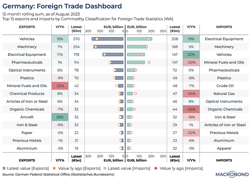
We’ve written several times about Germany’s economic malaise. This visualisation takes a deeper look at Europe’s dominant exporter to show how various industries are performing.
Sifting through almost 100 market segments, our 12-month rolling analysis selects the top 15 exported and imported types of goods.
Unsurprisingly, the top export category for the home of Mercedes and BMW is vehicles. This sector is doing OK, with exports by value rising 19 percent year on year. But several other categories in the top 15 are stagnant at best.
On the other side of the trade balance, falling imports of oil and gas (presumably from Russia) can clearly be seen.
Weighting the most recent CPI prints to create “instantaneous inflation"
Tip: this chart can be applied to different countries using Macrobond’s change region functionality.
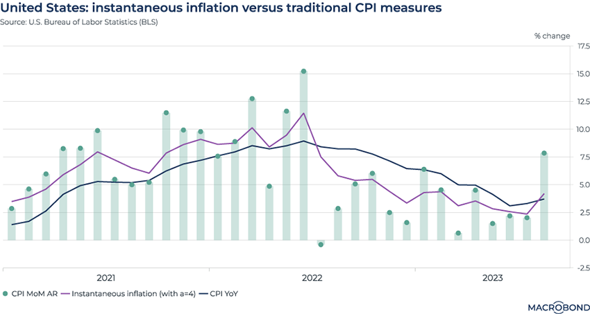
This chart is inspired by a recent academic paper that discussed the concept of “instantaneous inflation.” Annualised monthly inflation rates are weighted to give more recent readings greater importance; this is then used to calculate a 12-month inflation rate.
Macrobond created an instantaneous inflation model* – charted in purple – and compared it to traditional measures of the consumer price index: year-on-year (in blue) and annualised month-on month (in bars).
Giving more importance to recent prints in this way is a method of capturing rapid price shifts. Until mid-2022, instantaneous inflation was above conventional CPI as prices increased more and more quickly each month. From the second half of 2022, the trend changes: prices increase more slowly, so the instantaneous inflation line falls below year-on-year CPI.
The latest data point shows the Fed’s dilemma: a 7.8 percent month-on-month CPI gain is pushing instantaneous inflation above annual CPI again. (The next CPI print is coming on Oct. 12.)
*We replicated the instantaneous inflation measure using a convex kernel. Macrobond users can click through to the chart and adjust this formula by changing the second variable from 4 to 1 if their preference goes for a linear kernel.
Where the Fed historically had rates the last time inflation was this high
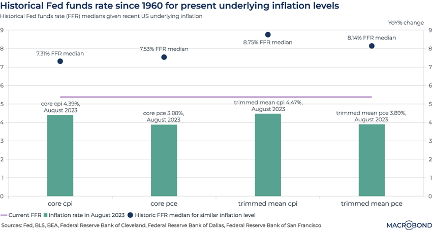
What was the “usual” Fed funds rate in past decades when US inflation was this high? This chart aims to compare the historic median to the present day – perhaps suggesting why more people are predicting “higher for longer.”
We selected four measures of underlying inflation: the core consumer price index (CPI) and core personal consumption expenditures (PCE), which both exclude food and energy; and the “trimmed mean” CPI and PCE, which exclude components with extreme price movements.
For August, these measures of inflation ranged between 3.9 percent and 4.5 percent year-on-year. We then calculated a Fed funds rate (FFR) median for every month since 1960 that these four measures were in a 50-basis point bucket that includes the August 2023 reading. (I.e. months when the two CPI measures were between 4 percent and 4.5 percent, and between 3.5 percent and 4 percent for PCE.)
In all cases, the Fed’s median key interest rate was above 7 percent, compared with the current range between 5.25 percent and 5.5 percent. For trimmed-mean CPI, the Fed’s median rate was almost 9 percent when inflation was as elevated as it is today.
(Futures markets still don’t believe Jerome Powell will match such Volcker-era tightening; a peak around 5.5 percent and cuts in the second half of 2024 are priced in.)
Bond forecasters are getting it wrong in a new way
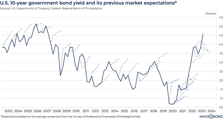
The Survey of Professional Forecasters, conducted by the Philadelphia Fed, is one of the longest-running forecasting exercises in US macroeconomics. Given this history, which stretches back to 1968, we can visualise many years of expectations versus reality.
As our chart shows, from about 2003 through the onset of the pandemic, America’s top economists frequently predicted that bond yields would rise (the dotted lines), only to see yields fall before a smaller-than-expected increase (or falling some more). Put another way, there was a long-running tendency for observers to declare premature obituaries for the 35-year bond bull market.
After the worst of the pandemic, the bond bear market finally kicked in, but rising yields surpassed forecasters’ expectations. The most recent year shows how forecasters have turned bullish, i.e. calling for yields to start falling; for now, the market is again defying their expectations.
King Dollar is back
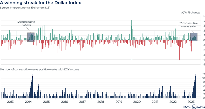
We wrote frequently about “King Dollar” in 2022. The greenback was strengthening against almost all currencies during the Fed’s historic tightening cycle.
After those gains unwound somewhat in early 2023, the strong dollar is back as the “higher for longer” view of US rates takes hold, the economy surprises with its resilience and prospects for a pivot to looser policy recede into the future.
This chart tracks the Dollar Index (DXY), which tracks the greenback against a basket major US trading partners’ currencies. In 2022, the dollar broadly experienced more volatility than it did in 2023, as seen by the sharper weekly gains (in green) and losses (in red) in the first panel.
But the second panel highlights how, measured by a “winning streak” metric, the current surge is even more impressive. DXY is about to appreciate for a 12th consecutive week; the last time that happened was in 2014.
US-China bond-yield spreads and the dollar-yuan exchange rate
Tip: this chart can be applied to different countries using Macrobond’s change region functionality.
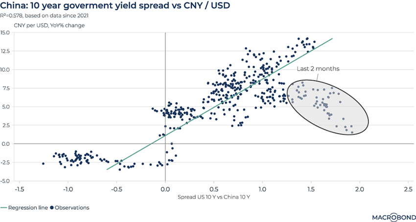
As US and Chinese rates diverge, the yuan is declining. The renminbi reached 7.34 per dollar last month, the lowest since 2007.
This chart plots daily observations of the year-on-year change in CNY/USD and the spread between 10-year Chinese and American government bonds.
The last two months of observations are highlighted in the oval (steady year-on-year depreciation and wide spreads). These readings coincide with the growing acceptance of the “higher for longer” US interest-rate narrative as prospects for a Fed “pivot” recede into late 2024. By contrast, China has been cutting key lending rates to support the economy.
Long-term, bonds almost never outperform equities
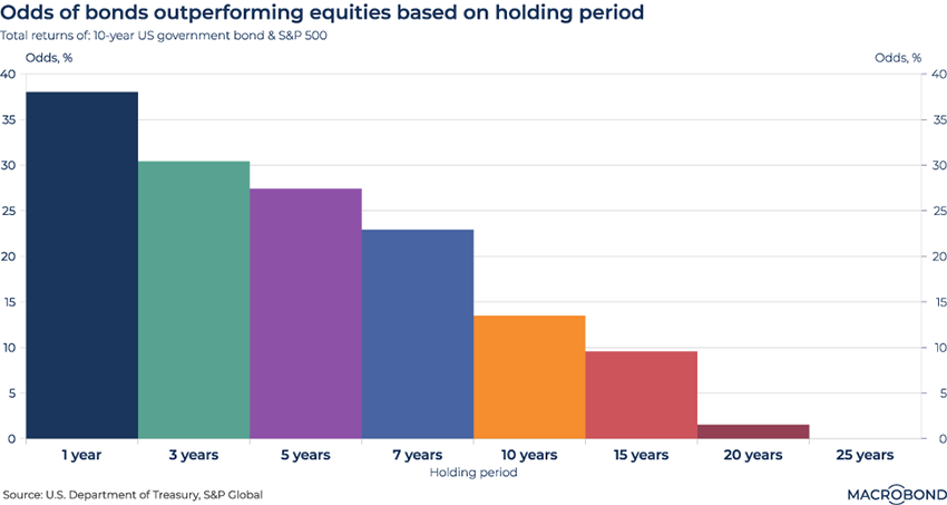
One of the clichés about investing is that equities generally outperform bonds over time. This maxim is backed up by our visualisation.
The relative analysis is based on the S&P 500 and 10-year US government debt, evaluating historic performance going back to 1871. Bonds and stocks are examined on a total return basis, i.e. including interest, dividends and distributions as well as capital gains.
Even on a one-year basis, there’s only about a one-in-three chance that bonds will outperform stocks.
Euro users’ SWIFT departure
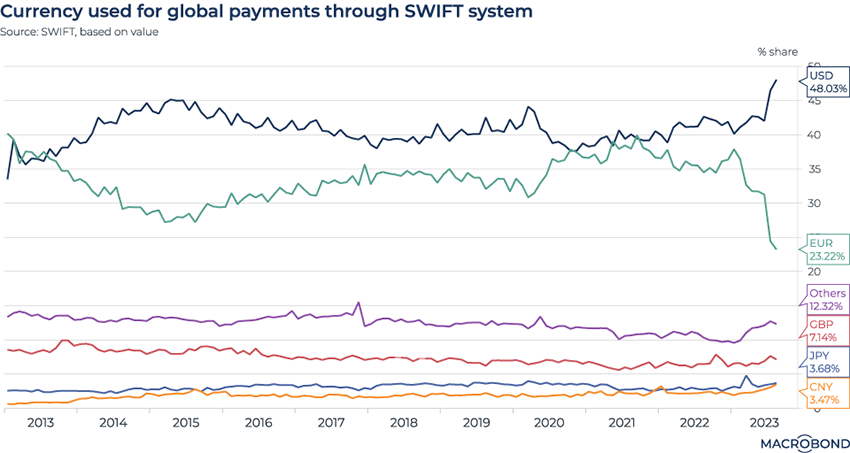
This chart tracks currencies used for transactions on SWIFT (the Society for Worldwide Interbank Financial Telecommunication). This Brussels-based network handles global interbank payments.
It revisits a visualisation we used in a blog earlier this year on the potential for global “de-dollarisation.”
But not only is SWIFT becoming ever more “dollarised;” proportionally, the euro’s share is plunging more than that of the greenback is rising.
Two years ago, both currencies had about 40 percent of global payments. Now, the dollar now accounts for more than 48 percent of SWIFT transactions by value, while the euro’s use has almost halved, sliding to 23 percent. Both figures are 10-year records.
It’s not clear why these trends have gathered pace in recent months. (Slumping German exports, combined with the re-emergence of King Dollar inflating the value of transactions in the US currency, perhaps?)
The dollar isn’t shoving everyone else aside: BRICS nations may be having some success in their efforts to increase trade using their currencies. The share of Chinese yuan and “others” on SWIFT is creeping higher.
4 topics
.png)
Macrobond delivers the world’s most extensive macroeconomic & financial data alongside the tools and technologies to quickly analyse, visualise and share insights – from a single integrated platform. Our application is a single source of truth for...
Expertise
.png)
Macrobond delivers the world’s most extensive macroeconomic & financial data alongside the tools and technologies to quickly analyse, visualise and share insights – from a single integrated platform. Our application is a single source of truth for...
.png)