How high can the US stock market go? Which index measures its performance best?
No doubt you would have heard the headlines about how well the US stock market is performing. In particular, the financial media seems very interested in the possibility that much of the recent strong performance is attributable to just a few mega-cap tech stocks which have come to be known as the “Magnificent Seven”.
Most stock indices, including our own benchmark S&P/ASX 200 index, are typically capitalisation weighted. This means the performance of the index is calculated based on the weighted performance of its constituents. Basically, the bigger a stock you are, the more impact you have on the index.
Why shouldn’t BHP’s performance have more impact than a tiny mining stock? The major issue here is that the index may not properly reflect the performance of the broader stock market. If the biggest stocks are doing well (possibly because they’re the biggest), what’s everyone else in the market really doing?
Many argue that the influence of the Magnificent Seven, being Nvidia (NVDA), Tesla (TSLA), Meta Platforms (META), Apple (AAPL), Amazon.com (AMZN), Microsoft (MSFT), and Alphabet (GOOG) is obscuring the real performance of the US stock market. These seven stocks make up roughly 30% of the US stock market by capitalisation.
Even more influential, these stocks have risen nearly 130% over the past 12 months on average, and according to research house Morningstar, “(excluding Apple and Tesla) were responsible for a staggering 98% of the index’s gains in January.” Has the Magnificent Seven effectively become the US stock market? Is there a better way to measure the true performance of US stocks?
Let’s investigate the key attributes of the major US stock indices to try to answer these questions!
Dow Jones Industrial Average (DJIA)
What is the Dow Jones Industrial Average (DJIA)? Often referred to just as “the Dow'', it’s possibly the best-known US stock index. It’s certainly been around the longest, established in 1896 by The Wall Street Journal co-founder Charles Dow, after which the index is named.
Many, (including myself!) consider the Dow to be a poor representation of the US stock market. The main complaint is that it's far too narrow. By only looking at what are generally the 30 biggest blue chips, the Dow hardly represents what’s going on in the heart of corporate America!
It is less influenced by the Magnificent Seven, containing only two of the cohort (Apple and Microsoft), so that helps dispel the “just seven stocks are dominating the market argument”. The reality is, given its shortcomings, financial professionals typically pay little attention to this index. For this reason, I suggest you focus less on the Dow, and more on some of the broader-based stock indices discussed below.
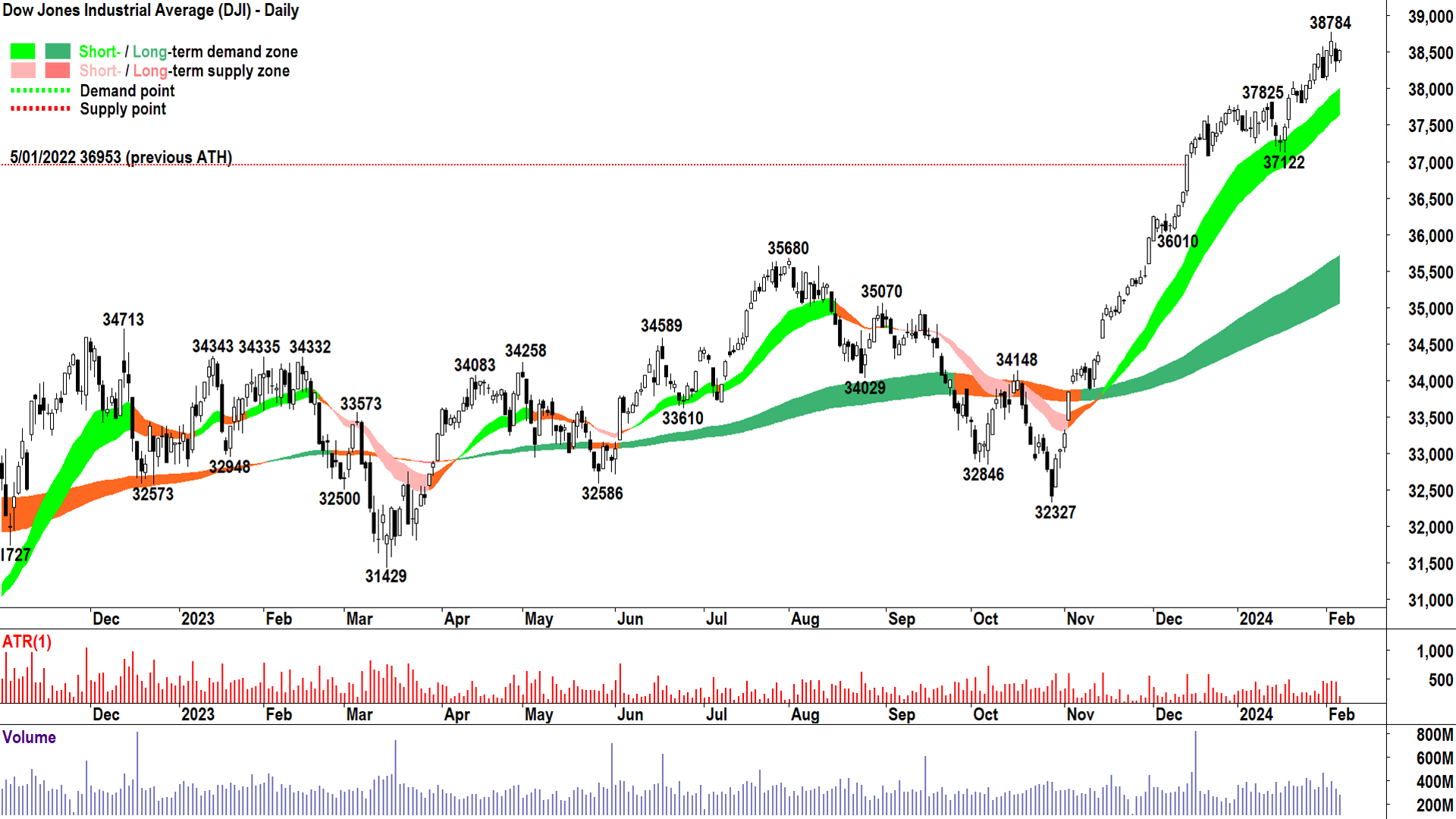
The Dow chart implies US blue chips are doing well, logging an 18.8% gain since the October low. This is a chart which is clearly exhibiting the signs of strong excess demand in trends, price action, and candles. Perhaps the short term trend is moderating slightly, but that’s to be expected given the breakneck rally through November and December. I can’t see any classic indications of a major market top in the Dow just yet.
S&P 500
What is the S&P 500? As the name suggests, the S&P 500 contains the 500 largest US stocks. It’s also a market capitalisation weighted index, and so its performance is prone to being dominated by its largest stocks. All seven Magnificent Seven stocks are constituents of the S&P 500, and they have been instrumental in defining its performance over the past few years.
The S&P 500 is widely considered the benchmark US stock index, and for this reason it can’t be ignored. However, as we’ll soon see, there are potentially better/fairer representations of what’s really going on with US stocks and in the US economy.
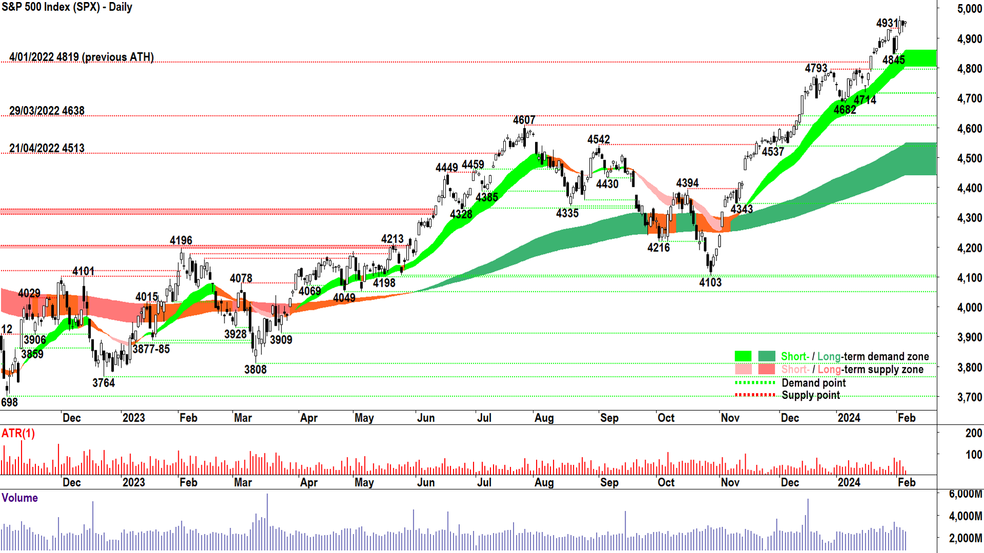
If we use the October low as a consistent starting point for recent index performance, the S&P 500 has risen 20.3%. This is most likely due to the fact the S&P 500 contains each of the Magnificent Seven stocks. Both the Dow and the S&P 500 have eclipsed their post-COVID major peaks and are trading near record highs.
In terms of its technicals, the S&P 500 is also a picture of excess demand with excellent trends, price action, and candles. There’s nothing in the indicators I monitor which suggests a major market top is imminent, and whilst the price continues to trade above the short term trend ribbon (the light green zone), I suggest the path of least resistance is up.
Nasdaq Composite
What is the Nasdaq Composite Index? Often referred to as just “the Nasdaq”, this index sits alongside the Dow and the S&P 500 in terms of the most visible and most widely quoted indexes in the financial media. It is an important barometer of the US stock market because of its massive breadth, containing over 3,000 US stocksranging from the mega-cap Magnificent Seven, down to mid-and-small cap listings. The Nasdaq is best known for its predominance of technology-focused companies.
As many of the companies in the Nasdaq are pre-earnings and in the early phase of their development, they tend to be more sensitive to changes in economic growth. This makes the Nasdaq potentially the best gauge of the health of the US economy, but it also makes it potentially more volatilethan the other major US stock indices.
I’ll admit, due to its excellent breadth and sensitivity to US economic growth, the Nasdaq is my favourite US stock index, and it’s the one I watch the most. The only drawback with the Nasdaq is like the Dow and S&P 500 is that it’s a market-capitalisation weighted index, and therefore it too is prone to performance concentration.
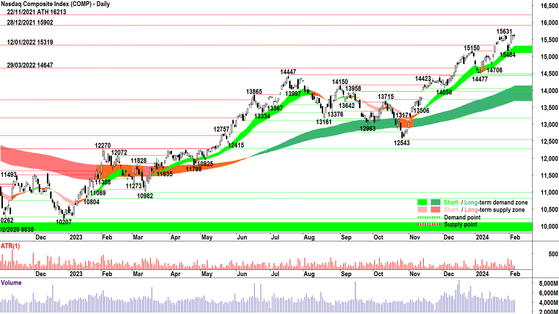
The Nasdaq is up an impressive 24.5% from the October low, better than any of the indexes covered in this article. This likely again reflects the impact of the Magnificent Seven, but also the Nasdaq’s sensitivity to the major theme currently driving markets: interest rates. The high growth, early-stage companies typical of the Nasdaq, are the most sensitive interest rate movements, and have benefited from speculation since late-October that lower rates are on the way.
It's interesting to note that despite its strong performance since the October low, unlike the Dow and the S&P 500, the Nasdaq is yet to make a new all-time high. It’s not far off though, the post-COVID major peak of 16,213 is only 4% or so away (there’s a minor peak at 15,902 to get through first).
New all-time high or not, the Nasdaq’s technicals are exemplary. Again, there’s absolutely nothing in these technicals to suggest a record high isn’t in the offing, with strong trends, excellent price action, and predominantly demand-side candles. I place great importance on the price remaining above the short term uptrend ribbon, and whilst it does so, the demand-side remains very much in control.
S&P 500 Equal Weight Index
What is the S&P 500 Equal Weight Index? It’s an important twist on the S&P 500. It effectively democratises the S&P 500 by giving each of its constituents an equal weighting within the index. The performance of every stock in the S&P 500 Equal Weight Index, from the US$3T Microsoft to the US$6B Zions Bancorp (the index’s smallest constituent!), impacts the price of the index on the same basis.
Certainly, the S&P 500 Equal Weight Index dispenses with the all-too-common complaint lately that the Magnificent Seven are dominating the key US benchmark indices. Dispensing with market weightings ensures we’re getting a much better insight into how all 500 constituents are performing compared to the regular S&P 500.
But, despite its major advantage over the S&P 500, the S&P 500 Equal Weight Index retains the original’s index’s flaws. It’s still not as broad as the Nasdaq’s 3,000-plus stocks, and given it only contains big blue-chip stocks, which are generally less impacted by subtle shifts in the strength of the US economy, it’s potentially a less impactful barometer of the underlying health of the US economy.
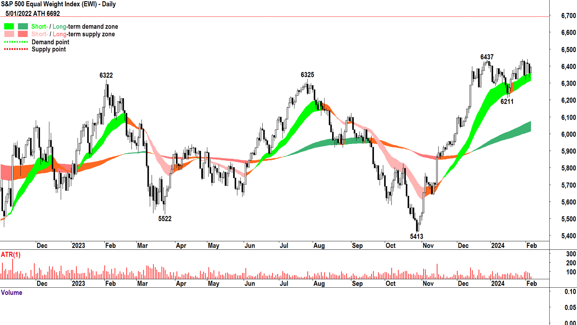
The S&P 500 Equal Weight Index is up 17.9% from its October low, modestly worse than the 20.3% gain for the S&P 500. It’s also considerably below its post-COVID major peak of 6,692. It’s pretty clear that the average S&P 500 stock is not doing quite as well as the regular S&P 500 index suggests.
Still, there’s a decent gain here, and some solid technicals – albeit nowhere near as strong as those exhibited by the S&P 500. There’s clearly some supply nagging around the 6,437 level, with the short term trend flattening, price action compressing, and more frequent black candles demonstrating less convincing demand-side control.
A close below 6,211 would be concerning, I suggest the supply-side controls the market below there. On the other hand, a close above 6,437 would confirm the demand-side has regained control of the price and sets the S&P 500 Equal Weight Index up for a shot at the 6,692 all-time high.
Russell 2000
What is the Russell 2000? The Russell 2000 possesses some of the best attributes a stock market index can have: breadth, diversification, and sensitivity to a country’s economy. As the name suggests, it contains 2,000 US stocks, but where the Russell 2000 differs from its other major counterparts in this list, is its constituents are exclusively smaller capitalisation stocks.
As suggested before, smaller stocks generally do it tougher during an economic downturn than their big-cap counterparts, and therefore small stocks can be considered the canary in the mineshaftwith respect to US economic growth. If the Russell 2000 is struggling, so too is the broader US economy. Similarly, it’s a very good sign for US economic health when the Russell 2000 is booming.
Whilst the Russell 2000 is also a market capitalisation index, due to its selection criteria for index inclusion, there is a far smaller range of market capitalisation weights across its constituents. For example, the S&P 500’s largest constituent (Microsoft) has an index weighing of 7.3%, whereas the Russell 2000’s largest constituent (Super Micro Computer) has a weighting of just 0.5%.
The Russell 2000 has the works when it comes to getting what you want in a US index. It has breadth, diversification, sensitivity to its country’s economy, and a fairly democratic weighting structure which reduces the possibility of its performance being skewed by a handful of stocks. This makes the Russell 2000 an essential part of any US stocks analysis regime. Personally, I never check on the US stock market without also checking the Russell 2000!

The Russell 2000 is up 19.3% from its October low, a commendable performance relative to its peers. As for its post-COVID major peak, I couldn’t fit it on the chartwhilst maintaining a reasonable scale! It’s a whopping 26% higher than the current price, and a strong indication that small-cap stocks haven’t bounced back anywhere near as well from the bear market lows as their large-cap counterparts.
It's worth noting the most recent bear market was triggered by the most aggressive rate hiking campaign by the Federal Reserve ever. So, this suggests the heart of corporate America is struggling in this higher interest rate environment.
The Russell 2000 also has the worst set of technicals among the cohort we’re investigating today. This is disturbing given its canary in the mine shaft moniker! The short term trend is neutral, but is at threat of turning down. The price action is lower major peaks (2,072 and 2,012), and numerous black candles indicate there’s plenty of motivated supply lurking in the system.
A close below 1,898 would be very concerning, as it would confirm a move back to a supply-side market in the medium term and threaten the long term uptrend. I suggest the Russell 2000 must close above 2,012 soon to reconfirm demand-side control. Such a close should be punctuated with a return to higher peaks and higher troughs and plenty of white candles. This is definitely the key index to watch from a technical perspective.
Which index is the best barometer of the US stock market?
The best barometer of the US stock market is the one which most comprehensively represents the performance of its constituents, and preferably, the underlying performance of the US economy. Clearly there are substantial differences in both construction and performance indices we’ve investigated here, and hopefully I’ve given you enough information to make your own decision as to which US stock index you’ll be paying the most attention to from here.
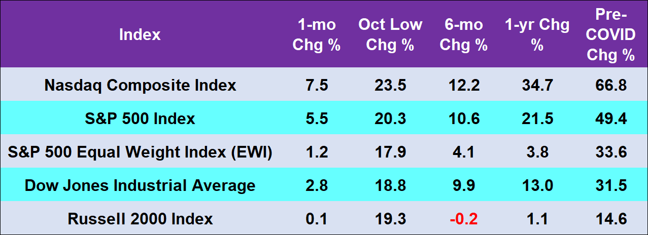
The above table might help, as it adds further context to how well the various groups of stocks represented in each index have performed since just before the pandemic to the current day. It shows a massive discrepancy among the performance of major indices, as well as clearly demonstrating larger capitalisation stocks have fared much better than their small-cap counterparts.
The data suggests the performance of the US stock market is not as rosy as the six o’clock news suggests when they gush about new record highs on the Dow or the S&P 500! If equal weight and broad small-cap measures are indeed the better measures of aggregate stock performance in the US, these are only barely positive over the past 12-months.
If you liked this deep dive on US stock indices, you might also like this one on China’s stock and property market indices. Also, if you want to learn more about how the US stock market is faring on a valuation basis then check out this article Have investors been valuing stock markets wrong?
This article first appeared on Market Index on 7 February 2024.
4 topics
7 stocks mentioned

