Mixed signals for Aussie equities
In a period of significant selloffs across risk assets, many investors take comfort that Aussie equities have held up better than nearly any other developed market in local currency terms.
The ASX 200 has held strong as one of the top performing large-cap indexes over the past year, whilst the ASX Small Ordinaries (despite being down far more aggressively) is still outperforming global small-cap indexes.
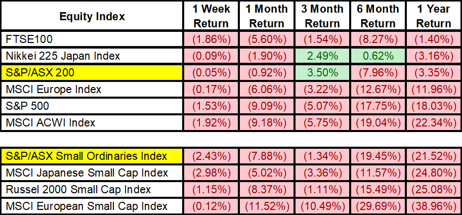
Source: Bloomberg, as of 14 October 2022
There are two reasons why an investor might take comfort in this fact:
- Our home country bias means many portfolios are perpetually overweight domestic equities – we feel we can understand Aussie companies better, they are easier/cheaper to access and there is a wider variety of professional managers with domestic equity strategies
- When an overweight in our portfolio is holding up, we fall pretty to durability bias, the idea that recent events will continue forward into the future. This is particularly true when things are going our way, at least on a relative basis to other market performance.
Being fiercely aware of biases and the role of risk management and portfolio construction to avoid them, we think point 2 is presenting a very real risk to investors. Durability bias is often an extension of confirmation bias, something which often skews our perspective when analysing a market – there are a hundred different indicators you could assess for Aussie equities, some will provide the story we want to see, and the others may get ignored depending on how objective the investor is.
Today we want to share some mixed signals we’ve found in our investigations of Aussie equities, aiming to present a balanced view within a multi-asset perspective, which we hope will help build upon your own view.
Market Indicators
As mentioned, there are multitudes of indicators you could pull for any equity market. To be expedient and avoid data mining, we will focus on three.
Price-to-Sales
One of our preferred methods for valuation is price-to-sales – unlike earnings (as in the price-to-earnings ratio), top-line revenue is much harder to fudge and so can offer a more honest representation of company valuation.
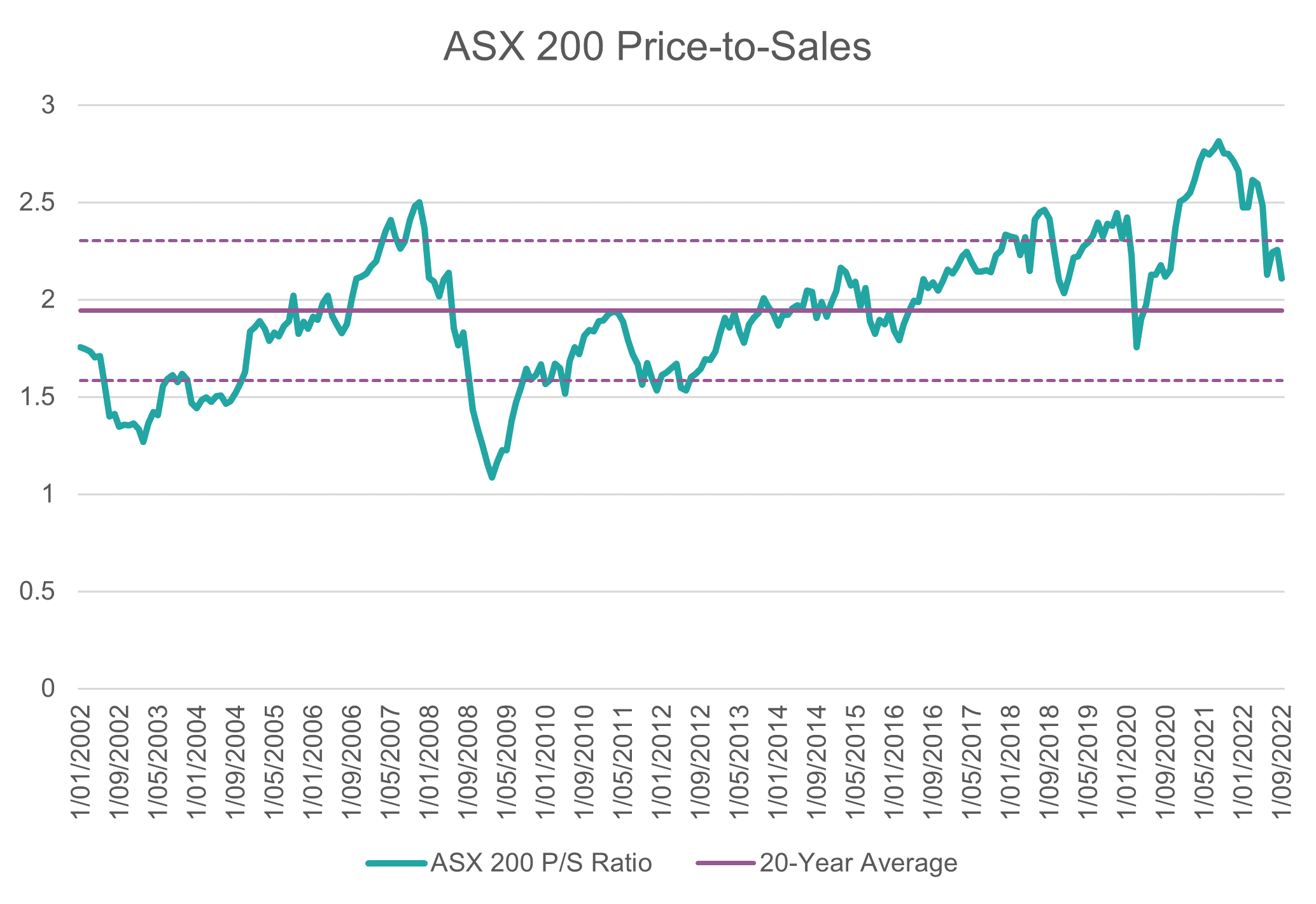

Valuations are certainly declining from the 2021 exuberance but remain above the 20-year average (solid purple line). To be considered “cheap”, you generally want to see indicators at least 1 standard deviation below the long-term average – on these charts, +1 and -1 standard deviations are marked by the dotted purple lines.
At an absolute level, you can see that small caps are actually priced cheaper than large at the moment, however, given that these are two very different allocations we care more about relative valuation to history than to other sectors/sizes for this note.
Price-to-Book
Price-to-book shows the premium that the market allocates to a company’s assets (book value), with book value essentially representing the remainder if a company sold all its assets and paid all its debt.
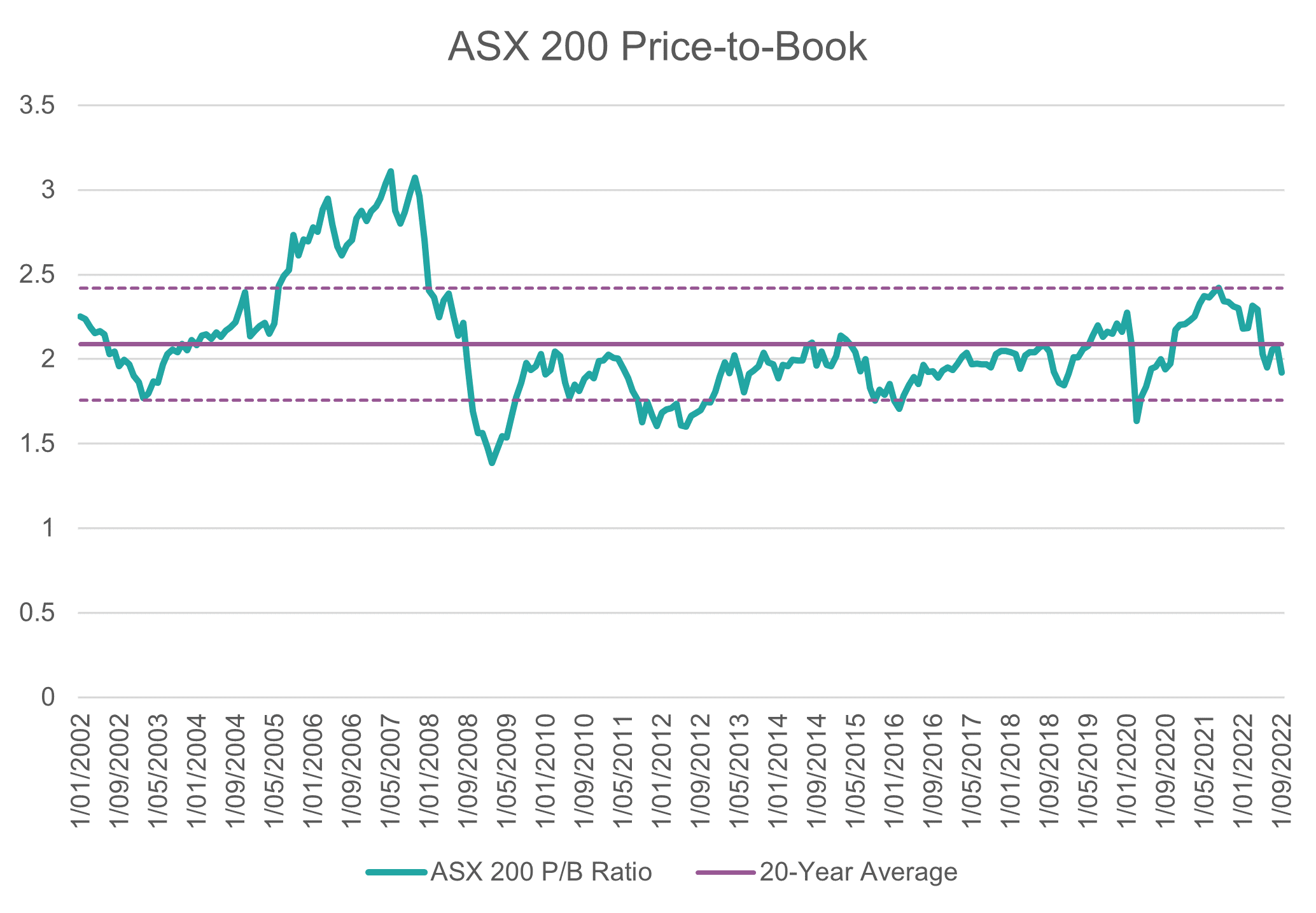
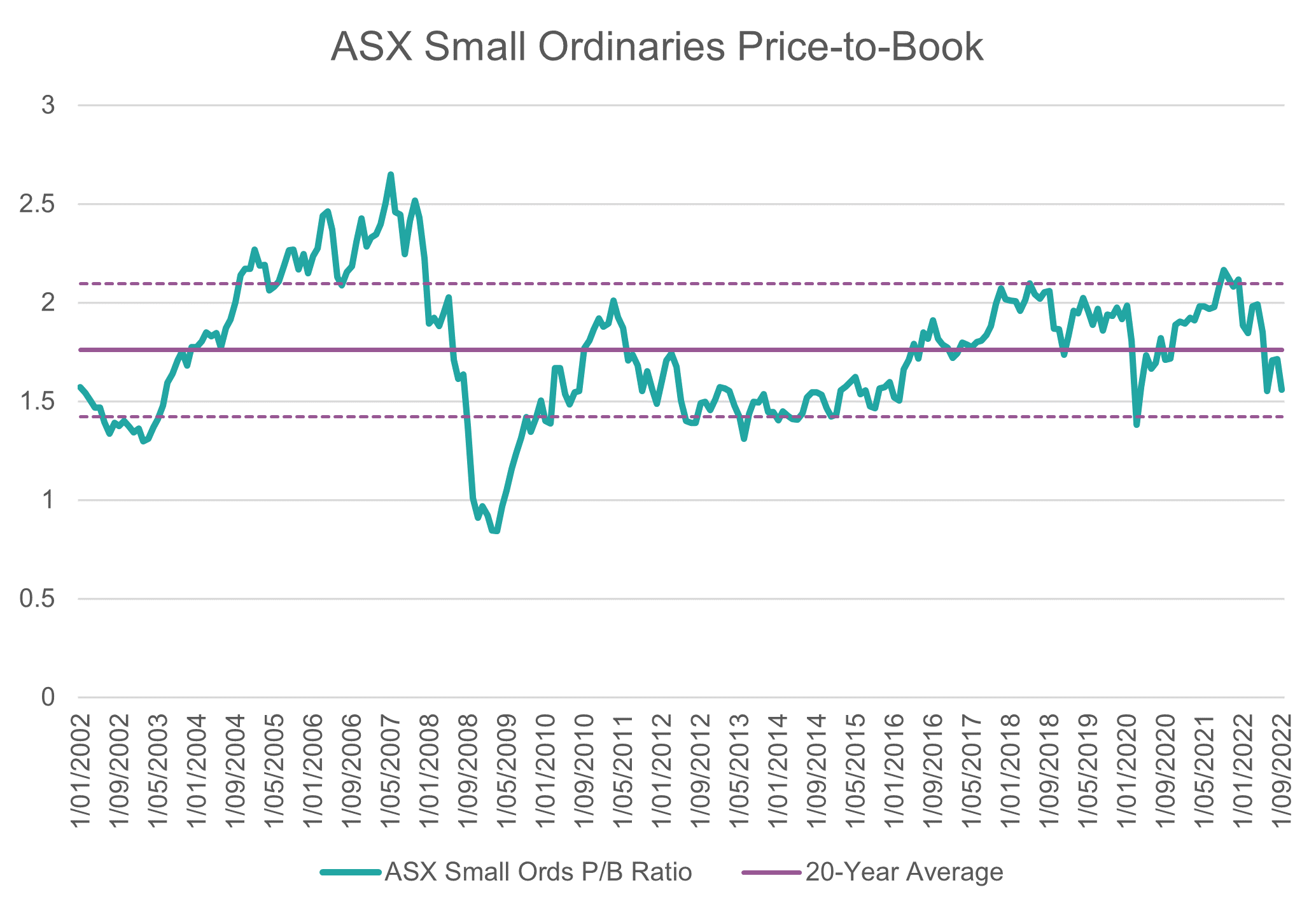
The market is pricing in far less premium to the book value of Aussie equities, generally, this is a good sign for value investors seeking undervalued companies relative to their balance sheet strength. To us, this is an interesting contrast to still a decently high price-to-sales metric, one of many conflicting signals Aussie markets are throwing off at the moment.
Market Cap to GDP
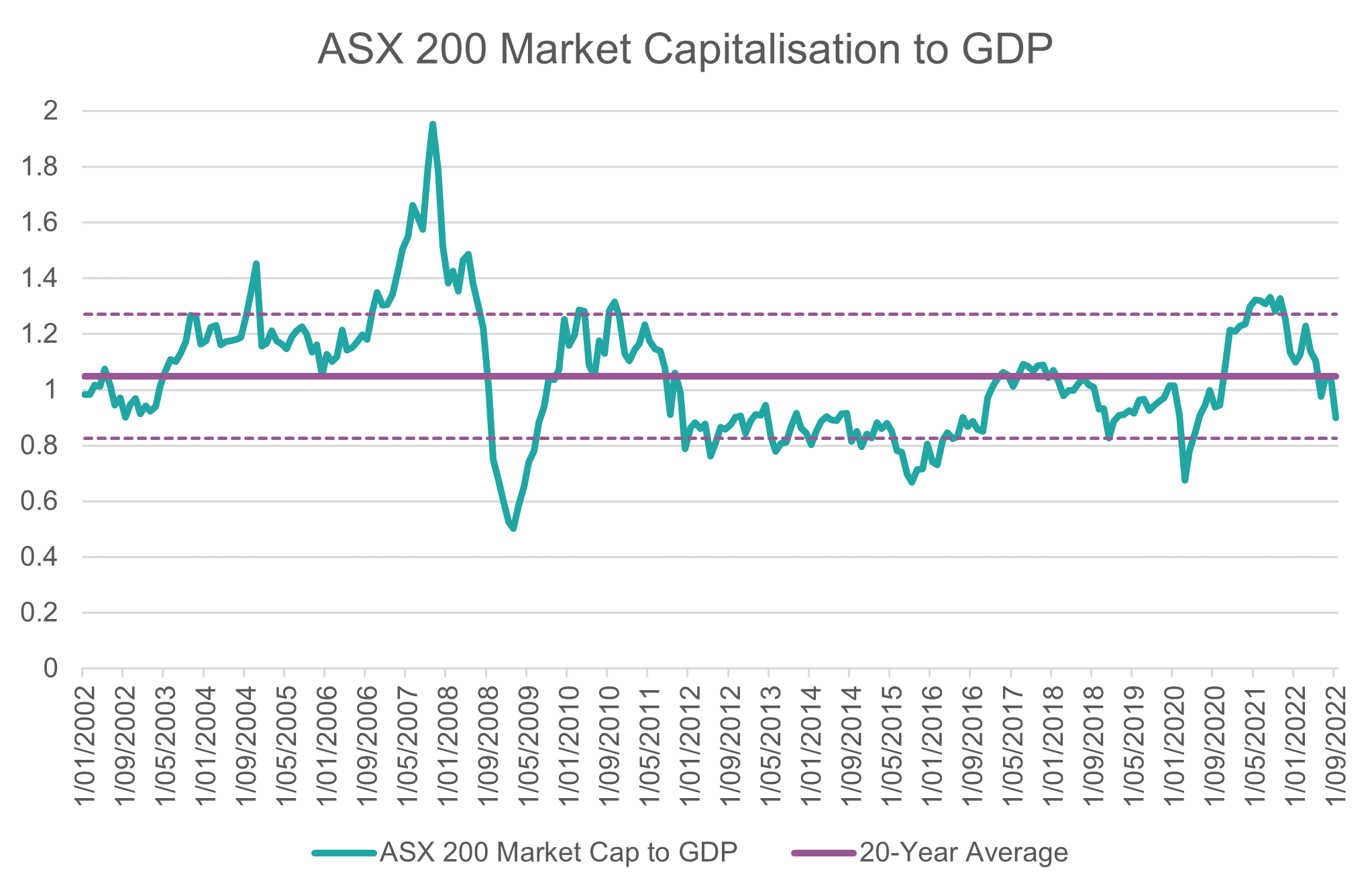
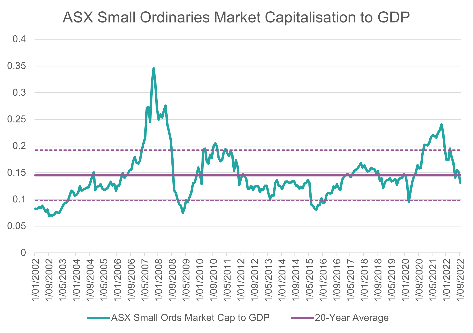
Market cap to GDP is also termed the “Buffett Indicator”, which is useful to judge at an overall index level if a certain market is over/undervalued relative to historical levels – one reason behind why this metric has value is there is significant academic literature to suggest that, in aggregate, companies cannot grow more than GDP over long time horizons.
Source: Bloomberg, Innova Asset Management
Source: Bloomberg, Innova Asset Management
In this indicator, large-cap equities appear significantly more attractive on a valuation basis than small caps, which are still trading close to their 20-year average.
So, we have three indicators, none of which are painting a particularly consistent picture beside the fact that valuations are generally coming down. It is in circumstances such as these where we believe investors fall into a confirmation bias trap; one might look at price-to-sales and go “I knew Aussie stocks were overvalued, I’m going to sell”, whilst another might look at price-to-book and go “Aussie stocks look like a bargain, I’m going to buy”.
Get the story straight
When the information is not telling you a cohesive story, it pays to expand your time horizon and incorporate more data. If you focus too much on recent information, your power to forecast long-term returns is dramatically reduced.
To illustrate the risk of only forming an investment view from recent history, let’s consider two examples of a model forecasting ASX Small Ordinaries returns;
- Model 1 is trained on the timeframe from 2007 – 2012, and forecasts the rolling 12m returns out to 2021
- Model 2 is trained on double the timeframe from 2007 – 2017, and forecasts the rolling 12m returns out to 2021
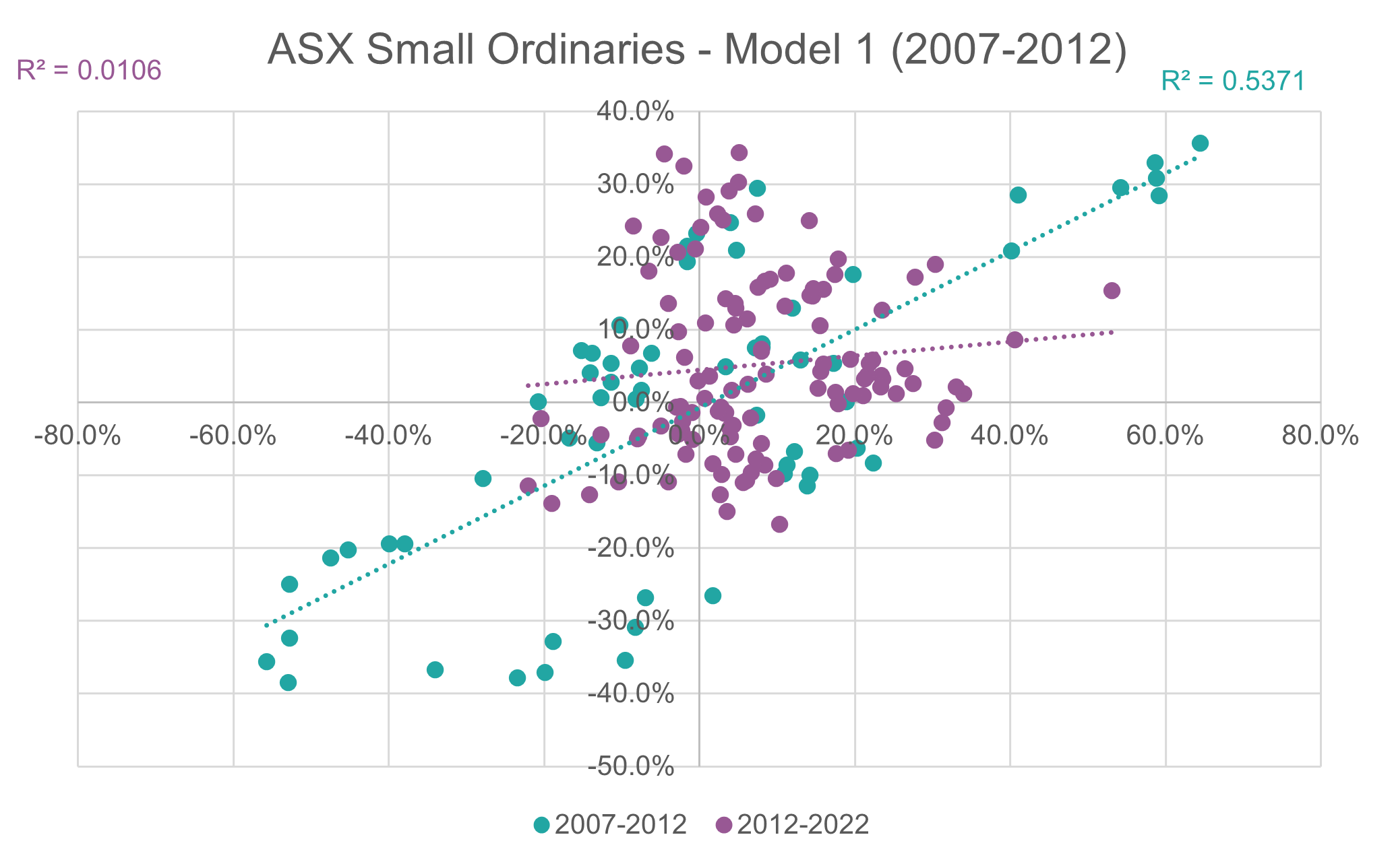
Model 1 is an example of forming your thesis based on only recent data:
Source: Innova Asset Management
That is a busy diagram, but we’ll break down the key information:
- Green dots = forecasts within the 2007-2012 training period
- The training period has an R2 of 53.7%, meaning the model correctly predicts 53.7% of market movements (a very high predictive power for a simple model)
- Purple dots = forecasts the model makes for 2012-2021, based on the training it received from the 2007-2012 data
- The forecast period has an R2 of 1.06%, meaning the model only predicts around 1% of market movements
The staggering drop in predictive power is a result of forming our assumptions (here assumptions = training the model) on too little data, and having too much recency bias when markets need time to go through different regimes.
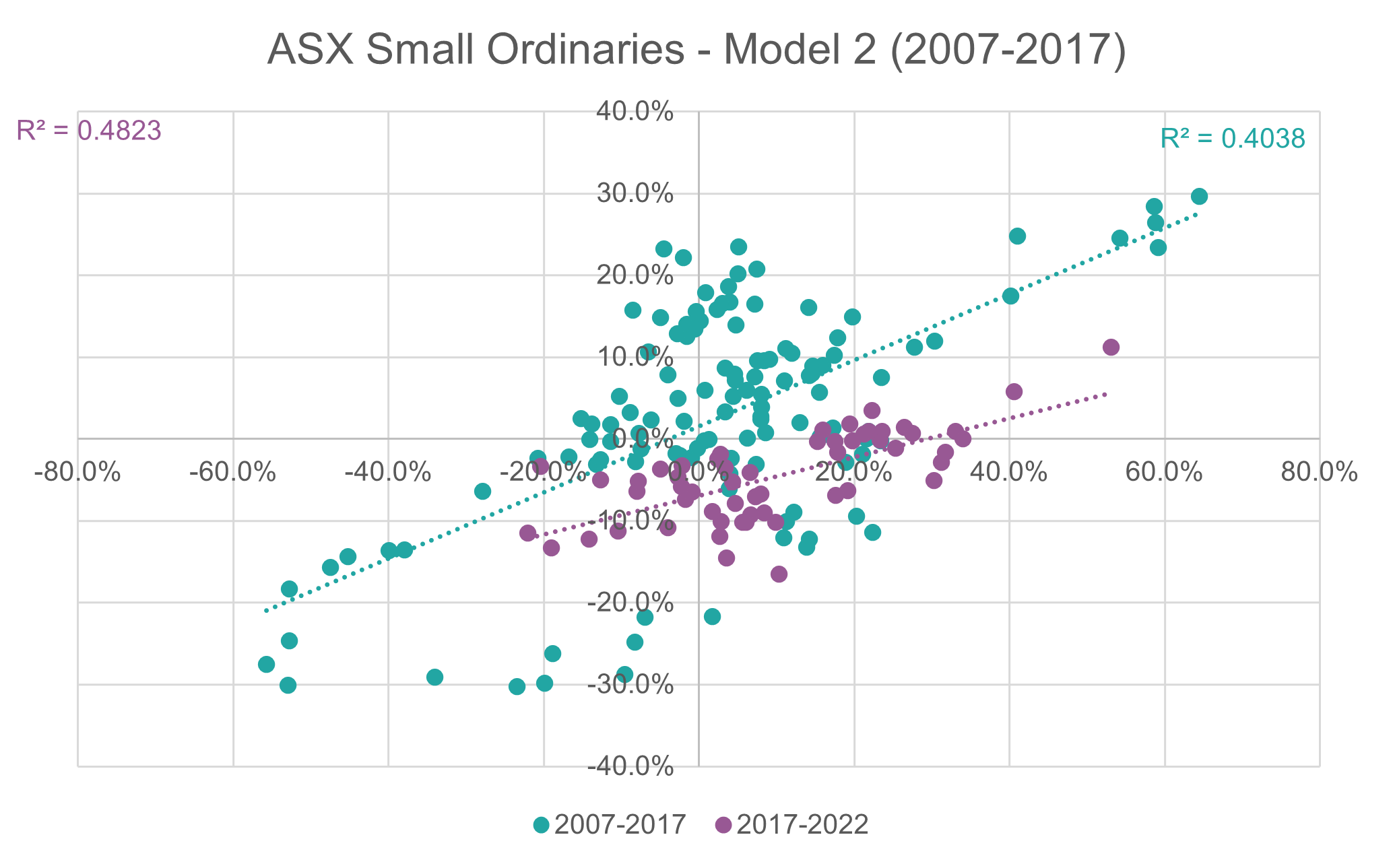
What happens if we expand that training period to 10 years, and allow our assumptions more data to get a better-informed view?
Source: Innova Asset Management
Our training period produces an R2 of 40.38%, still a very respectable predictive power. But more importantly, our forecast period now has a 48.23% R2, a massive increase from the previous model now that we have more information to determine our view of the future.
What’s the takeaway?
We hope this exploration through indicators and some light modelling has demonstrated that our ability to forecast future returns can be heavily impacted by our own biases.
As investors operating in volatile markets, with incomplete information, we need to be able to rely on finding the truth within the data rather than simply implanting our own subjective views onto numbers.
When you see indicators providing mixed signals for Aussie equities, this does not present an immediate buy or sell decision. Rather, it should prompt the risk-aware investor/manager to take a closer look at their existing assumptions, consider what the market and prices are trying to tell us, and make an informed view based on how the two interact.
Don’t base an investment decision only on one indicator, on a short time-frame model, or on a bias towards one asset or another – in the long run, more information will always steer a better course than less.
4 topics

