Scary Septembers for stocks, money supply and world inflation
.png)
As we move into the Northern Hemisphere autumn, this week’s charts begin with a visualisation of stocks in September – historically a month where equities have a habit of falling. We take a multi-pronged look at the US: the Atlanta Fed’s nowcast suggests bullish (perhaps too bullish) growth is taking place in the third quarter; a “soft landing” may be taking place in the job market; and Fed funds futures are on the move, predicting modest but steady rate cuts in 2024-25. Turning to Europe, we examine the shrinking money supply and parallels to (and differences with) 2009. Finally, we break down China’s construction slowdown between the office, industrial and residential sectors, and examine how HICP figures around the EU are showing persistent core inflation.
Remembering bearish Septembers in the stock market
.png)
Tip: this chart allows for change region functionality.
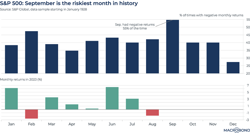
August was disappointing for US equities, with the S&P 500 posting a decline of almost 2 percent. Investors hoping for a rebound are facing the benchmark’s historically worst month.
As our chart shows, in 55 percent of the calendar years since 1928, the S&P 500 fell in September. (Macrobond users can click through here to a second chart showing another bearish stat: the average return for September is less than 1 percent, by far the worst monthly performance by this metric as well.*)
Should investors survive October (a month famed for some historic market crashes) and November, they can look forward to December: the historically most bullish month, when positive returns occurred almost 70 percent of the time.
* Macrobond users: this second chart will be in the same document. Open the file with the Macrobond app link, and look for "add chart: historical returns."
M3 money supply is shrinking the most in 14 years (but with important differences from the GFC episode)
.png)
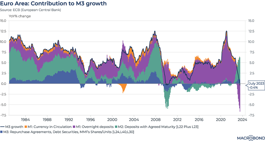
Last week, we examined the M2 measure of money supply globally; this week, we turn to Europe to look at recently released figures for M3, which is monitored closely by the European Central Bank. (M2 includes M1’s cash, chequing and savings account deposits, and other short-term saving vehicles; M3 adds repurchase agreements, money-market funds and debt securities with a maturity of up to two years.)
As the ECB considers the effects of its tightening cycle, it’s looking at a shrinkage in the money supply. For only the second time in the central bank’s history, the M3 aggregate is decreasing on a year-on-year basis. This last happened during the global financial crisis.
This chart shows another interesting trend that is much different than 2009. This time, rates are rising, so the the private sector has been moving money at a record pace out of overnight deposits (a component of M1, in purple – and now in negative territory) into higher-yielding deposit accounts (a component of M2, in surging green). During the GFC, the reverse was true; rates were rock-bottom and investors were switching to cash.
Chinese homebuilding’s outsized role in the construction downturn
.png)
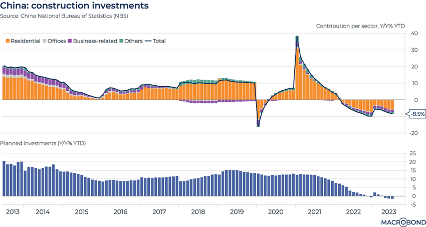
Last week, we examined how Chinese construction starts had deteriorated to the slowest pace since 2010. This chart breaks down construction investment by sector on a year-on-year, rolling year-to-date percentage basis, measuring trends in homebuilding, office development and the rest.
As our visualisation shows, residential construction has been the overwhelming driver over the past decade. After a plunge and rebound in the early days of the pandemic, total construction investment began shrinking on a year-on-year basis again in 2022. The market downturn is also reflected in the crises seen at developers Evergrande and Country Garden.
The second panel shows planned construction investments. This indicator had previously always increased on a year-on-year basis – but has been declining for three months.
The Atlanta Fed nowcast has been a bit too bullish lately
.png)
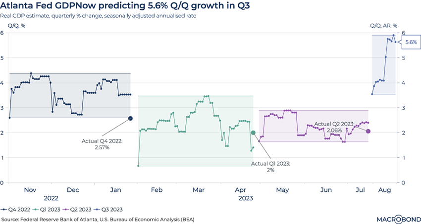
This chart looks at the Atlanta Fed’s GDPNow forecasts, comparing their evolution over the past four quarters to the ultimate data prints. (The methodology for these real-time “nowcasts” can be accessed here.)
For each quarter, we chart the evolution of the forecasts for annualised quarter-on-quarter economic growth. The forecasts’ range within each quarter is shaded.
As we can see, the final nowcasts for Q2 2023 and, especially, Q4 2022 were well above the ultimate GDP growth print.
The forecast for Q3 2023 is quite bullish, at 5.9 percent growth. Will there be a similar miss this time? One ominous sign is the latest data revision from the US Bureau of Economic Analysis: it reduced second-quarter GDP figures downward to an annualised quarter-on-quarter pace of 2.1 percent.
The US employment scenario gets jolted
.png)
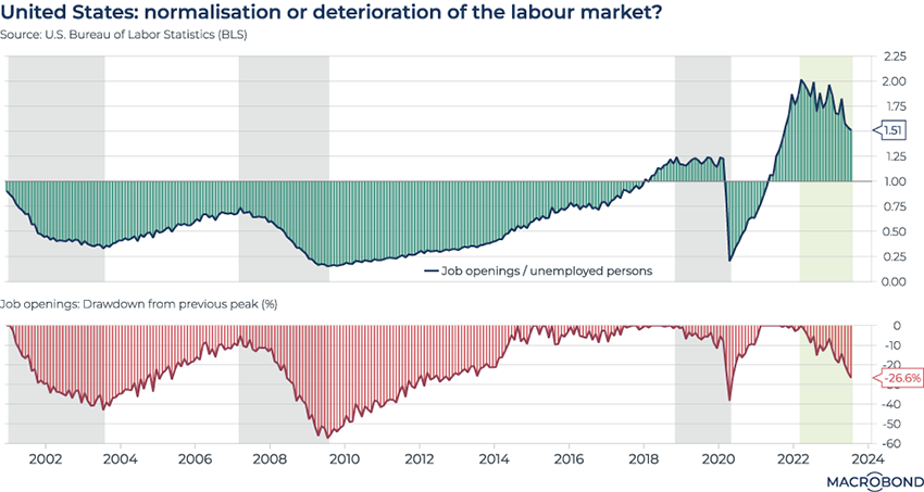
On Tuesday, the Bureau for Labor Statistics published weaker-than-expected July figures for JOLTS – the Job Openings and Labor Turnover Survey. Has the Fed’s tightening cycle finally punctured the resilient employment market?
The top pane of our chart shows how the ratio of job openings to unemployed persons is declining. And as the second pane shows, job openings decreased for the third month in a row and are now down 26 percent from the most recent peak (March 2022).
But is the labour market truly deteriorating, or just “normalising” as Jerome Powell seeks a soft landing? That 1.5 ratio of job openings to each unemployed person remains historically high. And the drawdown is much more gentle than it was in 2007-09 or 2020 – “hard landing” periods we highlight in grey.
Using futures to anticipate Fed rate cuts in 2024-25
.png)
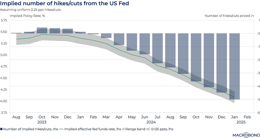
We’ve visualised the changing expectations for US interest rates several times over the past year and a half. As the economy stayed strong during a historic hiking cycle, expectations for a Federal Reserve “pivot” were repeatedly pushed further into the future.
This chart uses futures contracts to calculate an implied US effective Fed Funds rate for the next 18 months. This visualisation also shows the number of implied hikes and cuts on the right-hand axis (assuming that each policy hike or cut will be uniform at 0.25 percentage points).
A true “pivot” isn’t predicted until late spring at the earliest. And the Fed’s benchmark rate is still seen above 4 percent as 2025 begins – far higher than many observers would have thought possible a year ago.
Core inflation is worse than non-core in most of the EU
.png)
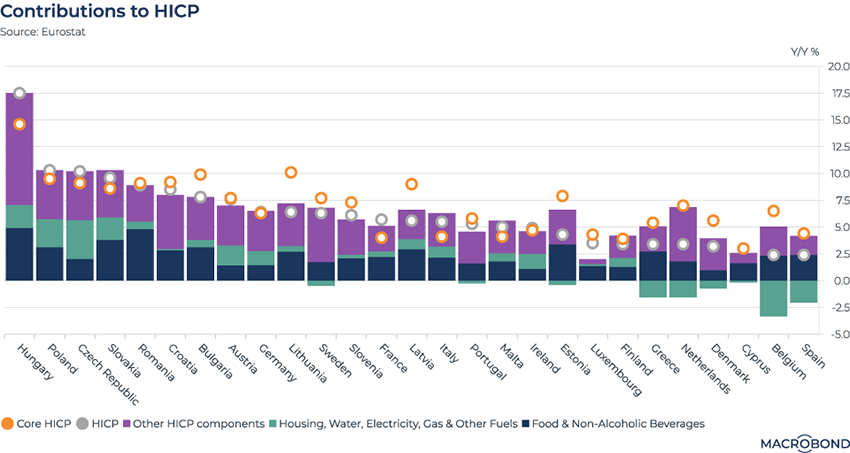
This chart visualises factors affecting the Harmonised Index of Consumer Prices in different European Union countries. HICP, with its standardised methodology across the EU, is the preferred inflation measure of the European Central Bank. (It principally differs from the US consumer price index by excluding owner-occupied housing.)
What stands out in this chart is that the orange dots show how core inflation (which excludes energy, food, alcohol and tobacco prices) is outpacing overall inflation in many EU nations. That’s a worry for ECB policy makers, as it potentially points to a wage-price spiral taking hold in many sectors of the economy.
This is reflected in the purple “other components” category in the individual nations’ bar charts. It’s the largest contributor to inflation for most of them, though food remains a significant factor pushing HICP higher. Meanwhile, the green section of the bars, which includes the energy prices that spiked last year, shows outright deflation in some countries.
The difference between nations is also quite stark. Hungary, with its weak currency, has long had Europe’s worst inflation problem. While President Orban has blamed sanctions on Russia for driving up gas prices, the energy component of Hungary’s inflation is now relatively minor, as it is for most of the rest of the EU.
5 topics
.png)
Macrobond delivers the world’s most extensive macroeconomic & financial data alongside the tools and technologies to quickly analyse, visualise and share insights – from a single integrated platform. Our application is a single source of truth for...
Expertise
.png)
Macrobond delivers the world’s most extensive macroeconomic & financial data alongside the tools and technologies to quickly analyse, visualise and share insights – from a single integrated platform. Our application is a single source of truth for...
.png)