The ASX 200 is falling again! This reliable indicator can help you spot when the bottom is finally in
The ASX 200 is in correction territory. If the correction turns into a bear market, you’ll want all the help you can get to spot the bottom.
Compared to the withering decline from the Valentine’s Day high, the rally in the ASX 200 may prove to be fleeting. Yesterday’s 2.6% bounce recouped only a small portion of the 12.8%, or 1,105 points fall the Australian benchmark share index had experienced by the close since February 14.
US stocks fell heavily again overnight, on ramping concerns that tit-for-tat threats of tariff increases by the Trump Administration and Beijing threaten to derail two of the most important economies in the world – and the Australian economy looks set to be stuck in the middle of the escalating conflict.
Investors are reeling, staring down the barrel of a protracted correction – or potentially a bear market – that could threaten the retirement savings of millions of hard-working Aussies. But with chaos comes opportunity. It must be the case that at the same time as share prices are melting down, the astute investor stands to pick up a swathe of potentially cheap stocks if they can get the timing right.
It's a big “if”, because the words “timing” and “right” are rarely used in the same sentence when it comes to mum and dad investors picking key turning points in the stock market – up or down!
This article aims to improve that statistic. There are certain signals from the charts, or from “technical analysis” as it’s more commonly known in financial circles, that are consistent with market tops and market bottoms. I will show that much of the negative impact of this correction could have been avoided for the astute investor, and that we’re very likely not at the bottom of the current correction just yet.
Good technical analysis isn’t about picking the top
I’ve seen a few bull and bear markets come and go in the thirty-plus years I’ve been watching markets. After losing a great deal of money in more of them than I’d like to mention, around the late-noughties I began to develop a technical model for trend change (that timing was no coincidence – thanks GFC!).
I’ve written about this model extensively over the years since, and I’ve taught it to many (probably even to some of you reading this now). More recently, I used it to correctly call the top of the post-COVID bull market in several media outlets, and over the last few weeks, I used it to call the end of the last bull market in my writings here on Market Index.
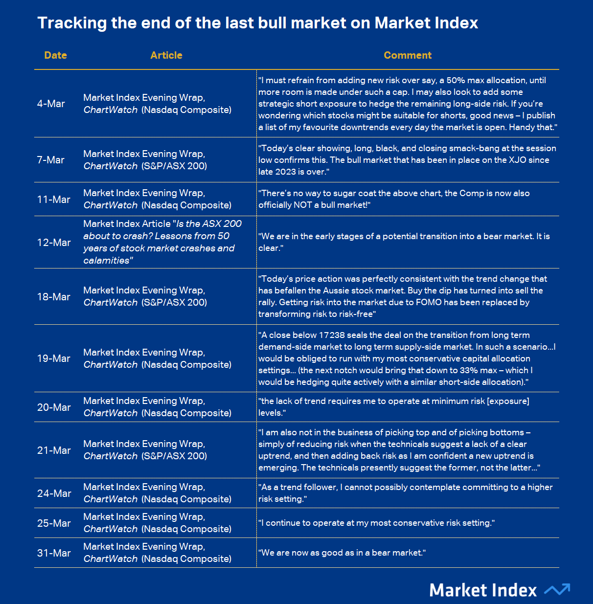
The table below shows the extensive warnings provided to Market Index readers as early as a few weeks into the correction.
To be fair, I had noted well prior to 4 March that the short term trend on the Nasdaq Composite – my favourite US index to chart – had turned from up to down. But it was the massive, engulfing supply-side candle of 3 March that sealed the deal for me: Something was definitely wrong with the prevailing bull market.
From there, the Nasdaq Composite, and our own ASX 200, began to confirm over and again my suspicions. I could say that I was abreast of all of the developments in the simmering trade crisis – or that I was predicting President Trump’s diabolical “Reciprocal Tariffs” announced at his 2 April Liberation Day speech – but I can’t.
These factors were irrelevant to any of my calls. All that mattered was the trends, the price action, and the candlesticks. They told me everything I needed to know about the developing crisis, because together, they were reflective of how professional investors were shifting from the demand-side of the market to the supply-side. Subtly at first – enough to flatten trends, swing price action, and blacken candles – and then as we’ve seen over the last few days – all at once.
This is the power of technical analysis – its ability to gauge at a glance how the market is voting with its cash and its stock. Good technical analysis has at its heart a respect for the most basic tenets of economics: Demand versus supply equals price. It assumes the market has done the research, and through its actions, has discounted all known risks accordingly. Who are we, then, to argue with it!?
Here are the basic elements of my trend change model:
Trend ribbons are proxies for the short and long term trends. Light/Dark green = Uptrends and Light/Dark pink = downtrends. In a healthy demand-side market, the trend ribbons will be green, rising, and the price action will tend to bounce up off them (I call this “dynamic support”. In a health supply-side market, the trend ribbons will be pink, falling, and the price action will bounce down off them (I call this “dynamic resistance”).
The price action is the relative position of peaks (A-shaped reversals from up to down) and troughs (V-shaped reversals from down to up). In a healthy demand-side market, the price action will be rising peaks and rising troughs indicating supply removal and demand reinforcement. In a healthy supply-side market, the price action will be falling peaks and falling troughs indicating supply reinforcement and demand removal.
Japanese candlesticks are single day price action indicators – who was in control of the price during a particular trading session? White-bodied candles and or downward pointing shadows are consistent with demand-side control, whereas black-bodied candles and or upward pointing shadows are consistent with supply-side control.
That’s the basics. If you read my ChartWatch section of the Evening Wraps I write daily for Market Index, you’ll already be very familiar with all the above concepts. If you don’t, then you probably should, or at the very least check out my ChartWatch Technical Analysis Primer for more information.
As for trend change, here are the key identifiers of trend change from up to down 📈📉:
The price will close below the short term trend ribbon, the short term trend ribbon will transition to neutral (amber), and then down. The short term trend ribbon will begin to act as a zone of dynamic supply (resistance).
There will be a predominance of supply-side candles.
The price action will transition to falling peaks and falling troughs.
The long term trend ribbon will transition to neutral (amber), and or the price will close below the long term trend ribbon. The long term trend ribbon will transition to down and or the long term trend ribbon will begin to act as a zone of dynamic supply.
By my reckoning, at “The long term trend ribbon will transition to neutral (amber)” in point 4, the previous bull market is over. At “The long term trend ribbon will transition to down and or the long term trend ribbon will begin to act as a zone of dynamic supply”, I consider that a new long term downtrend has begun. For me, this is akin to what the mainstream financial media would call a bear market.
For brevity, I won’t show you charts of trend change from bull to bear market here – I have posted so many charts on this topic over the last couple of months on Market Index – I now refer you to this content, particularly this: 50 years of stock market crashes and calamities and this: Wipe those tears investors. I couldn’t have been clearer!
Before we move to identifying market bottoms, I must express my view of the importance of having access to short selling functionality. How to short is beyond the scope of this article, but I did write a rather timely article on the topic back in December which you may wish to review sometime between now and the end of the next bull market.
Knowing when to go to cash is brilliant. It will increase your performance substantially over the very long term. But, when markets turn sour, short selling can take your returns to the next level again. Each day, I run my technical model over the major ASX listed stocks to identify the strongest downtrends, which I then put into a list. Many of our readers like to use these lists to help them identify short selling ideas.
I can say with confidence that there is a very good chance the worst stocks in your portfolio appeared in my downtrends lists many times over the last two months.
And it’s not about picking the exact bottom, either
Enough doom and gloom. The top of the last bull market is history. Either you picked it or you didn’t. Time to move on. That’s the beauty of markets, they’ll be open tomorrow and you’ll have another chance to improve your outcomes with what you’ve learned.
Teaching you how to spot market bottoms is easy: We’re just looking for the exact opposite signals that identify a market top. This should make perfect sense – if market tops are all about professional investors shifting from the demand-side of the market to the supply-side – then market bottoms should be all about them shifting back again.
Here are the key identifiers of trend change from down to up 📉📈:
The price will close above the short term trend ribbon, the short term trend ribbon will transition to neutral (amber), and then up. The short term trend ribbon will begin to act as a zone of dynamic demand (support).
There will be a predominance of demand-side candles.
The price action will transition to rising peaks and rising troughs.
The long term trend ribbon will transition to neutral (amber), and or the price will close above the long term trend ribbon. The long term trend ribbon will transition to up and or the long term trend ribbon will begin to act as a zone of dynamic demand.
Just as with up to down transitions, it’s at the point “The long term trend ribbon will transition to neutral (amber)” I consider that the previous bear market is over. Then, at “The long term trend ribbon will transition to up and or the long term trend ribbon will begin to act as a zone of dynamic demand”, I consider that a new long term uptrend has begun. For me, this is akin to what the mainstream financial media would call a bull market (note I also called the start of the last bull market in the media using this methodology also).
I will provide case study charts this time! See below the charts of how each of the bear markets of the last 30 years ended.
1997-98 - South-East Asian Crisis (x2!)
%201998%20bear%20market%20low.png)
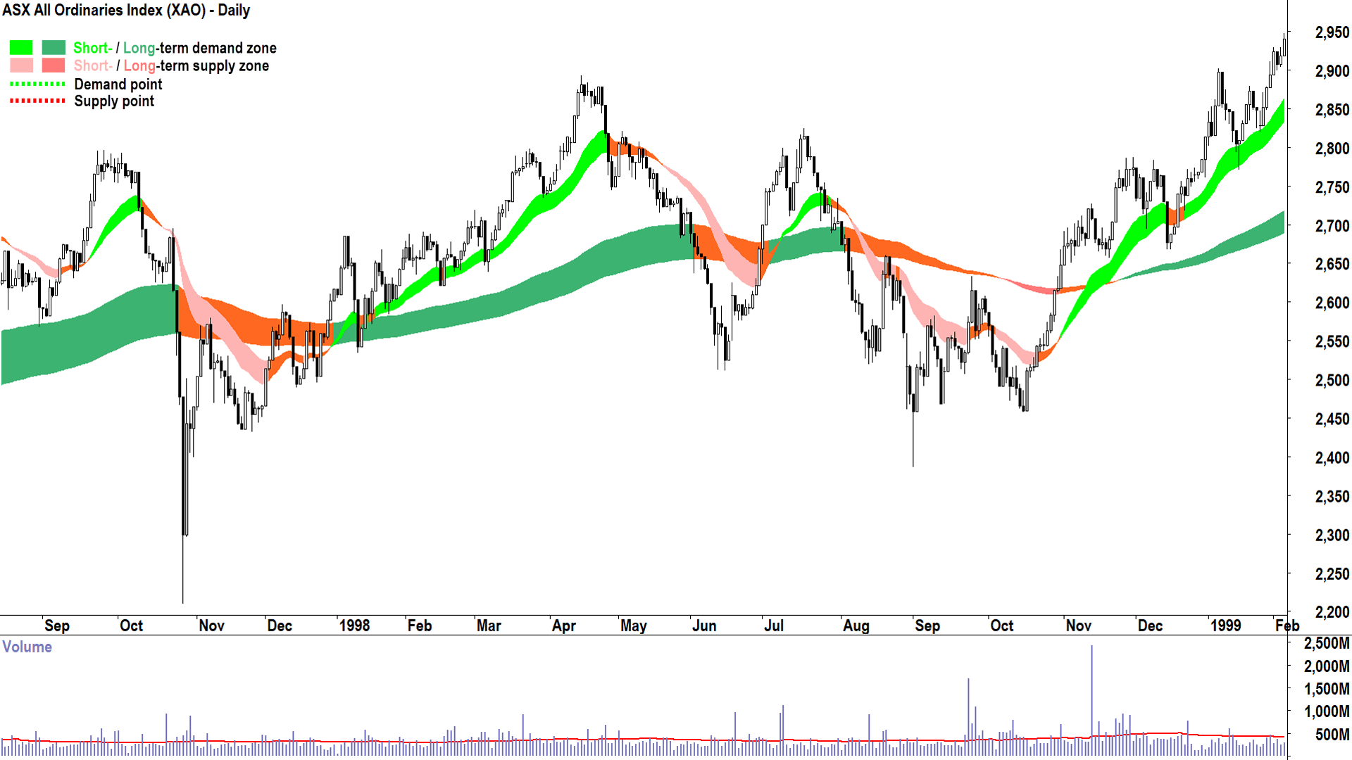
Ahhh 1997-98. My first taste of bear markets. Often considered as one event, the first blip started in September 1997 and lopped 21% from the All Ordinaries Index (the benchmark for Australian shares at the time), and the second started in April 1998 and lopped off 17.6%.
If only I knew then what I knew now. Sigh! 😢
Well, I would have taught younger Carl this strategy. I would have also warned him to stop trying to pick the exact bottom – it’s a fool’s errand. Instead I would have advised waiting for the short term trend ribbon to turn up, the price action to swing back to rising peaks and rising troughs, the candles back to predominantly demand-side, the long term trend to at least neutralise, and most importantly – for that long term trend to begin acting as a zone of dynamic demand.
Looking at the above chart, focus on the periods in January 1998 and November-December 1998 as valid examples of when my technical model would have called the start of a new long term uptrend.
2003 – Dot.com hangover and 2001-02 Recession
%202003%20bear%20market%20low.png)
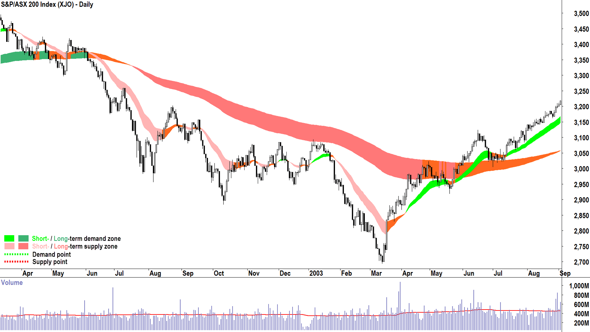
This was a particularly withering bear market in terms of duration, lasting 56 months and wiping 22.6% from Aussie shares (now benchmarked by the S&P/ASX 200).
Note here how well the long term trend ribbon repelled fledgling rallies, and to be fair – was a near-perfect delineation between bear and bull markets. I won’t keep repeating all of the aspects of trend change in this and subsequent charts, they are assumed knowledge, but note how the June 2003 pullback to the long term trend ribbon was met with dynamic demand. For me, that test and hold marks the start of the next bull market.
2009 – GFC “The Big Short”
%202009%20bear%20market%20low.png)
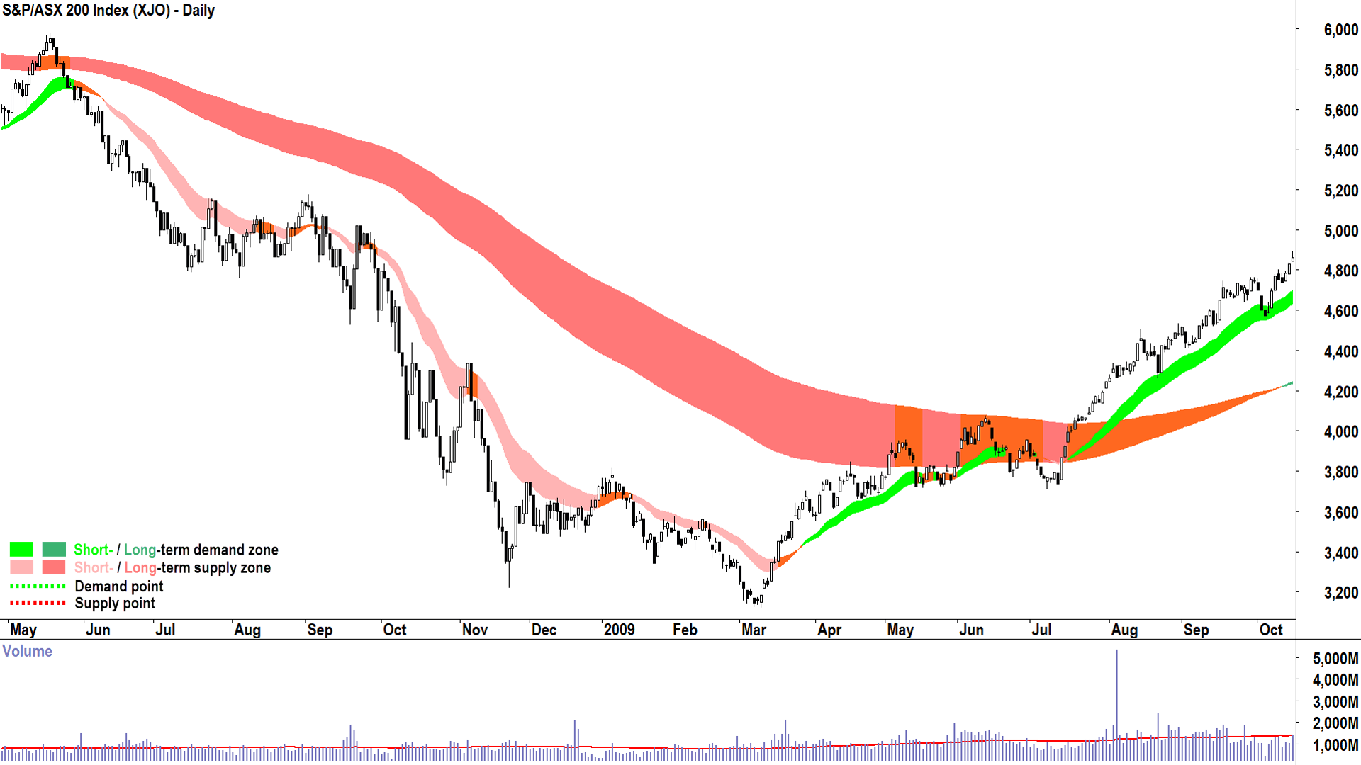
The Big Short indeed! This was the first bear market that I learned the power of short selling – it was like shooting fish in a barrel. There were few survivors among Aussie stocks in this devastating 55% drop over a painful 71 months. Let’s hope we never see anything like this again – but who’s to say we’re not about to?
That’s why it will be important to not be the hero that tries to catch the falling knife. I don’t pick bottoms, I can’t. My technical model makes it impossible. It requires too much evidence that the demand-side is moving back in again – and this means prices have likely already been rising by the time I can confidently make my call.
In this case study, it would not have been until August 2009 that I would have been able to say with confidence the bear market was over and that a new bull market had begun.
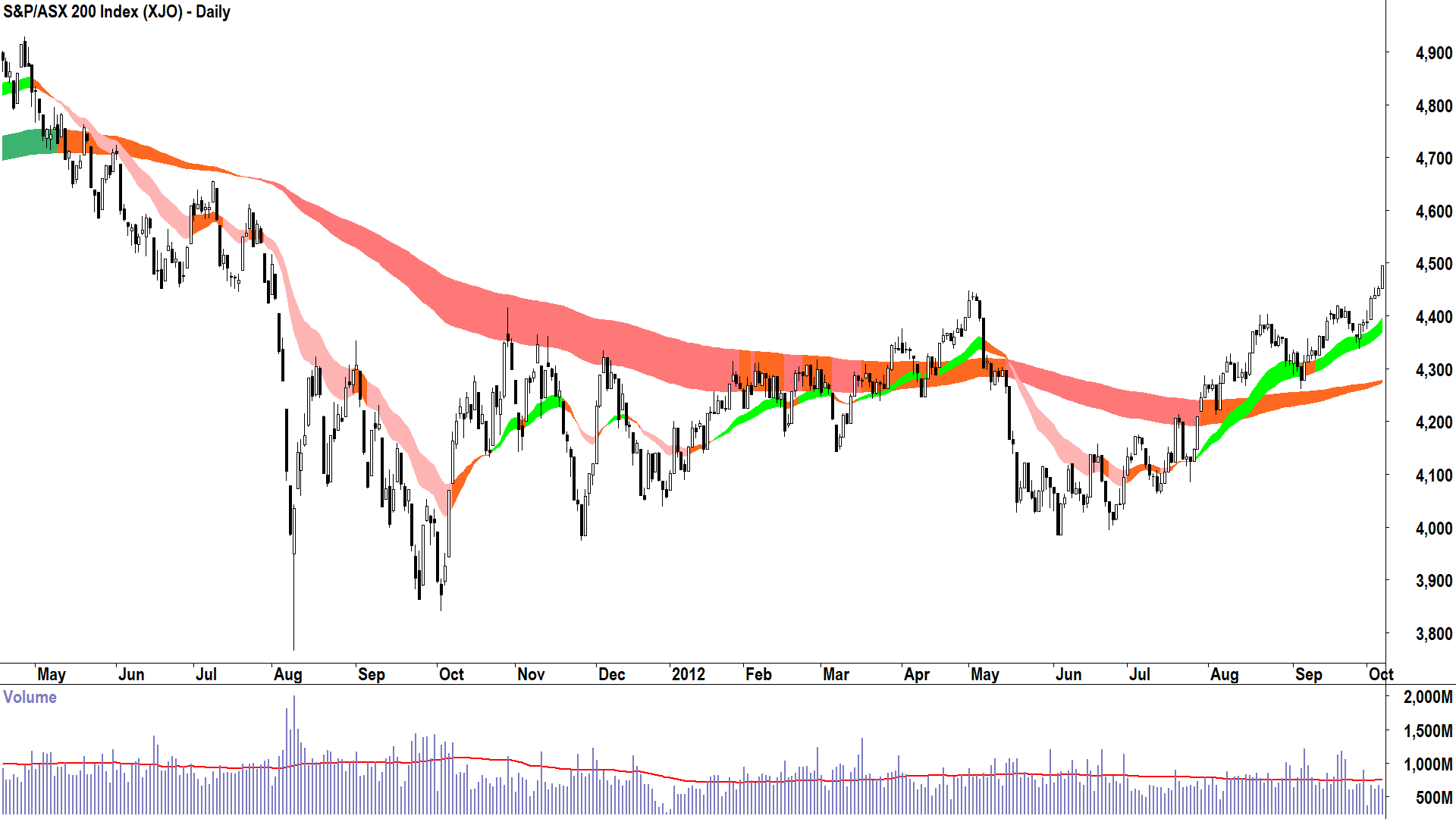
2012 – European Sovereign Debt Crisis
%202012%20bear%20market%20low.png)
In 2012 came the European Sovereign Debt Crisis, a calamity born from the GFC. But it wasn’t companies going under this time (like it was in the GFC) – it was whole countries! Remember the PIIGS? Italy, Ireland, Portugal and Spain. They had gorged on debt in the early 2000s, and as the credit crunch gripped – each was teetering on the verge of bankruptcy.
It seems like a distant memory now, but it should remind us that in markets, calamities often beget calamities. There’s an old saying about butterfly wings in Brazil…well one would argue old President Trump is flapping his wings pretty hard!
I trust by now your eye is in when it comes to spotting when my technical model would have called the end of the bear market / beginning of the bull market. This is a particularly interesting case study, because I hope you identified April 2012 as the first transition point. That would have been my first call that the worst was over – and it wouldn’t have taken long to be proven painfully wrong!
No model is infallible – and mine certainly isn’t. There will be false starts in many bear markets, as was the case here, but assuming one diligently manages one’s risk one should always be around to fight another day!
And, of course, to try to pick the start of the next bull market again. Which, in this example would have been called in September 2012 after the next occasion the price action rebounded from the long term trend ribbon. It was confirmed again in November 2012.
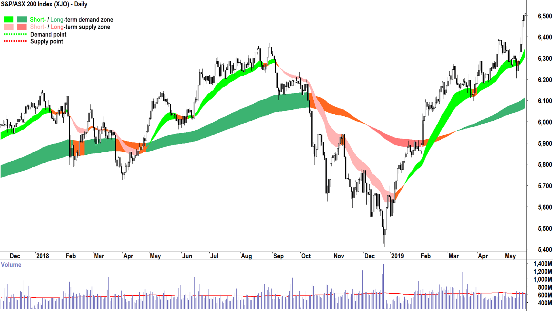
2018 – Trump Tariff War 1.0 & Fed Hikes Rates
%202018%20bear%20market%20low.png)
Another example of how quickly markets forget – arguably the first Trump trade war-induced bear market. Shorter and sharper than previous variants, it was still a painful example of how quickly sentiment can respond to fiscal policy.
I particularly like the strong emergence of the ASX 200 from below the long term trend ribbon here. Interestingly, there wasn’t much of a subsequent retest of the long term trend ribbon – it just kept rising. Even better! It simply demonstrates greater demand-side control.
I suggest the test and hold of the short term trend ribbon in March 2019 was sufficient to call beyond all reasonable doubt that the new bull market had begun.
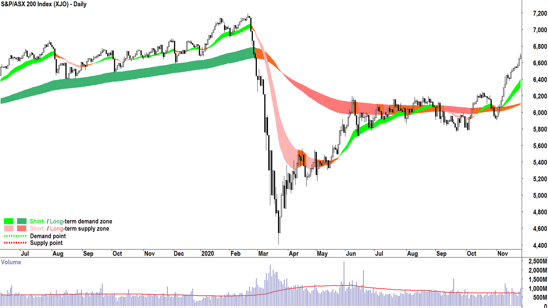
2020 – COVID-19 Pandemic
%202020%20bear%20market%20low.png)
Left field...outta nowhere! These are the scariest bear markets because they are so hard to predict – so little warning is given (can be given) in the price action because the bad news broke so quickly.
But, again, we can see the importance of the long term trend ribbon as a delineator between bear and bull market. I propose it was around early November 2020 that the new bull market began. Well, I did propose it, at the time I was a regular market commentator in my last role and I appeared in several media outlets with this very call.
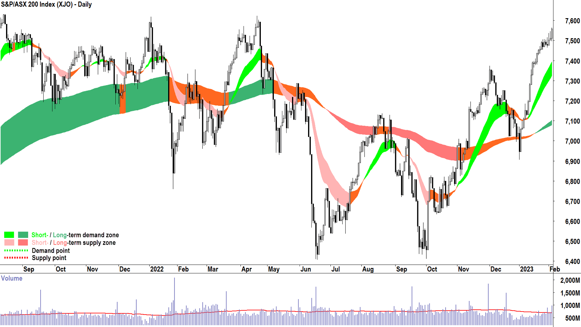
2022 – Central Banks rates “Lift-off” to fight post-pandemic inflation
%202022%20bear%20market%20low.png)
Another excellent example of how tricky calling market tops and market bottoms can be. They don’t all go to script, and the volatility of the 2022 “Lift-off” bear market was severe. Still, it should have been very clear by around February 2022 that something wasn’t quite right with the Australian stock market!
After a turbulent rest of the year, it wasn’t until the test and hold of the long term trend ribbon in January 2023 that one could say with confidence that the preceding bear market was over. It took a few more goes to finally shed the bearish uncertainty of this period, and I’ll leave it to you to confirm that 19 January 2024 was the true start of the last bull market phase.
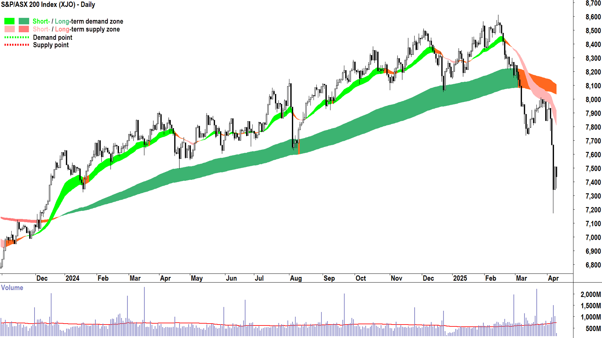
2025 – Trump 2.0 Tariff Trade War and Global Recession (???)
%202025%20potential%20bear%20market%20low.png)
Which brings us to now. A picture tells a thousand words. What is the picture above telling you about whether we’re at a market bottom or not? Do you see the same signs of transition in the demand-supply environment that indicates a shift from supply-side control to demand-side control?
For example, can you see 🧐:
⏹️ A short term uptrend ribbon?
⏹️ Rising peaks and rising troughs?
⏹️ A predominance of demand-side candles?
⏹️ The price trading above the short term trend ribbon and the short term trend ribbon acting as a zone of dynamic demand.
⏹️ (And most importantly) the price trading above the long term trend ribbon and the long term trend ribbon acting as a zone of dynamic demand?
If you can’t check each of these boxes – then my technical model does NOT indicate that we have yet made the transition to a new bull market – and by extension – it can’t call that the bottom is in.
It’s about understanding how trends change, and when it’s time to manage one’s risk
Put together the titles of sections in this article and you get:
Good technical analysis isn’t about picking the top, and it’s not about picking the exact bottom, either. It’s about understanding how trends change, and when it’s time to manage one’s risk.
There’s an old saying in markets taught to me by a trading mentor many years ago (thanks MB!).
“There are bold traders, there are old traders, but there are no old, bold traders”.
I also credit this person with reinforcing for me the importance of risk management above all else. If you don’t have any chips left, you can’t bet. This is why I prefer to take a conservative and measured approach to trying to pick market bottoms (and market tops).
As mentioned above, I can never hope to pick the exact top or bottom, my technical model just doesn’t facilitate it. I will leave this to the great prognosticators out there (you can find them on YouTube and TikTok!).
But that’s not really what I’m interested in anyway – it’s the bits in between I seek. The juicy bits: The trends. This is where the probabilities lie in favour of the trend follower. And as I always say: “Get the probability part of investing right, and the profitability part will take care of itself.”
My technical model is your technical model now.
This article first appeared on Market Index on Wednesday 9 April 2025.
Never miss an update
Enjoy this wire? Hit the ‘like’ button to let us know.
Stay up to date with my current content by
following me below and you’ll be notified every time I post a wire
Carl has over 30-years investing experience and has helped investors navigate several bull and bear markets over this time. He is a well respected markets commentator who specialises in how the global macro impacts Australian and US equities. Carl has a passion for technical analysis and has taught his unique brand of price-action trend following to thousands of Aussie investors.
........
Investing is risky. Inevitably you will endure losses. If you can't cope with losing, don't invest.

%201998%20bear%20market%20low.png)
%202003%20bear%20market%20low.png)
%202009%20bear%20market%20low.png)
%202012%20bear%20market%20low.png)
%202018%20bear%20market%20low.png)
%202020%20bear%20market%20low.png)
%202022%20bear%20market%20low.png)
%202025%20potential%20bear%20market%20low.png)
5 topics
9 stocks mentioned

Carl has over 30-years investing experience and has helped investors navigate several bull and bear markets over this time. He is a well respected markets commentator who specialises in how the global macro impacts Australian and US equities. Carl...
Carl has over 30-years investing experience and has helped investors navigate several bull and bear markets over this time. He is a well respected markets commentator who specialises in how the global macro impacts Australian and US equities. Carl...
Comments
Comments
Sign In or Join Free to comment